Wall Art Guide, Wall Art Tutoriels
Alpaca Wall Art: Cute Animal & Farm Decor
Jun
So I’ve been working with alpaca art for like three years now and honestly it started because a client saw one piece at a craft fair and suddenly everyone wanted their farmhouse kitchen to look like a petting zoo, but in a chic way?
The thing with alpaca wall art is it walks this weird line between quirky and actually sophisticated. You can go full children’s nursery or you can make it work in your living room where you also display your vintage bar cart. It’s all about which style you pick and where you stick it.
Finding the Right Style Without Looking Like a Kids’ Room
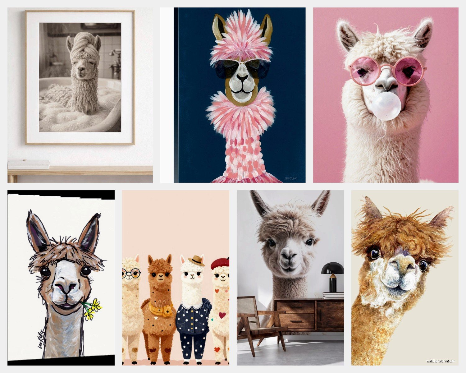
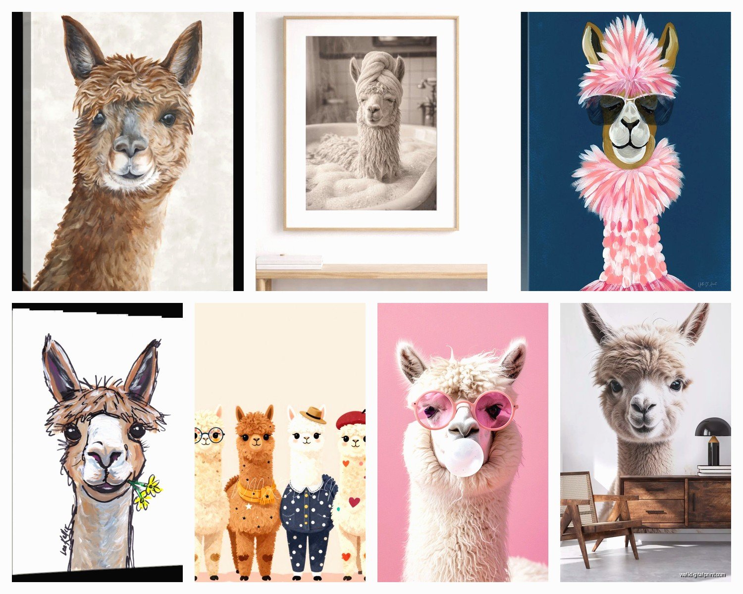
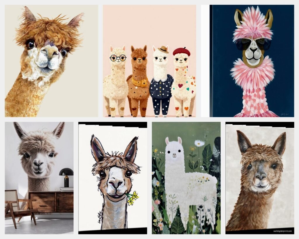
Okay so there’s basically four categories of alpaca art that actually work for adults. The watercolor minimalist ones—think single alpaca, neutral background, maybe some soft pinks or grays. These are your safest bet for a bedroom or office. I put one in my own hallway and my sister didn’t even realize it was an alpaca at first, she thought it was abstract? So that tells you how subtle they can be.
Then you’ve got the vintage-style illustrations. These look like old botanical prints but with alpacas. Usually on cream or aged paper backgrounds. Super good for farmhouse or cottagecore vibes. I used a set of three in a client’s dining room last month and they actually elevated the space instead of making it cutesy.
Photography prints are hit or miss. Real alpaca photos can look amazing but they can also look like you just… printed a photo of an alpaca. The ones that work best have interesting compositions—close-up of the face with shallow depth of field, or alpacas in dramatic landscapes. I found this one on Etsy where it’s an alpaca in the Andes at sunset and it’s genuinely beautiful, not corny.
And then there’s the boho/line art style which is everywhere right now. Simple black line drawings, sometimes with little flowers or geometric shapes. These work in literally any room but they’re also the easiest to mess up because they can look too trendy and dated in like two years.
Room by Room Breakdown
Living Room
I was watching The Great British Baking Show the other night while arranging a gallery wall and realized alpaca art works best in living rooms when it’s NOT the focal point. Like, if you have a big sofa, don’t put a huge alpaca right above it. Instead, include it in a gallery wall with other nature prints, landscapes, maybe some pressed botanicals.
Size matters here—go for 11×14 or 16×20 max unless you have a really specific vision. I made the mistake once of putting a 24×36 alpaca face in someone’s living room and it was… a lot. It dominated every conversation, literally.
Frames should be simple. Black, white, natural wood. I’ve seen people try to get fancy with ornate gold frames and it just confuses the aesthetic. Are we going elegant? Are we going farmhouse? Pick a lane.
Kitchen and Dining Areas
This is where you can have the most fun honestly. Kitchens can handle more whimsy because they’re already kind of chaotic spaces with all the appliances and stuff. I did a set of four small alpaca prints (8×10) in a client’s breakfast nook and they were all different alpacas with different expressions. Worked perfectly.
For dining rooms, go more sophisticated. That vintage illustration style I mentioned? Perfect here. Makes it feel curated, like you collect rare prints or something. Pair it with actual botanical prints for balance.
Oh and another thing—avoid putting alpaca art directly above where you eat if it’s too realistic or close-up. Something about eating while an alpaca stares at you is weird. Learned that from experience at my friend’s house, couldn’t focus on my pasta.
Bedrooms
Soft and minimal is the move here. Watercolor alpacas, muted colors, calming vibes. I have a single alpaca print in my bedroom that’s mostly white space with just a hint of the animal in pale gray. It’s peaceful without being boring.
For kids’ rooms obviously you can go wilder—colorful, cartoonish, multiple alpacas doing funny things. But even here I’d say avoid the super babyish stuff if you want it to last more than two years. Kids grow out of cutesy fast.
Home Office
Wait I forgot to mention this earlier but home offices are actually ideal for alpaca art? Especially if you do Zoom calls. It’s a conversation starter that’s not polarizing like political art or too personal like family photos. Just quirky enough to seem interesting.
I use a line art alpaca print behind my desk and people comment on it probably once a week during calls. It’s a nice icebreaker. Keep it simple though—you don’t want it distracting you or looking unprofessional. Black and white, clean lines, done.
Color Coordination That Actually Makes Sense
Okay so the colors in your alpaca art need to work with your existing palette or it’s gonna look random. If you have a neutral room—grays, whites, beiges—you can basically pick any alpaca art style. Lucky you.
If you’ve got color going on, pull one accent color from the print. Like if your alpaca art has dusty pink in it, maybe that echoes a throw pillow or a vase somewhere. Doesn’t have to be exact, just in the same family.
I see people make this mistake all the time where they have a blue room and then get alpaca art with zero blue in it. It can work if you’re going for eclectic, but usually it just looks like you grabbed whatever was on sale.
Natural wood tones almost always work with alpaca art because, you know, they’re farm animals. There’s an inherent connection there. So if you have wood furniture or floors, lean into that.
Mixing Patterns and Textures
This is gonna sound weird but alpaca art works really well with textile elements because alpacas are… fluffy. So like, pair it with a chunky knit throw, a jute rug, linen curtains. It creates this cohesive natural vibe.
I did a client’s reading nook where we had an alpaca print, a sheepskin rug, and this really textured basket for blankets. Everything just felt connected without being matchy-matchy.
Where to Actually Buy This Stuff
Etsy is obviously the goldmine. You can find digital downloads for like $5-10 if you wanna print it yourself, or actual prints for $20-50 depending on size. The benefit of digital is you can print it at whatever size you need and frame it however you want. I do this constantly.
Some shops I’ve used: there’s one called WhiteDoePrints that does really nice watercolor animals, their alpacas are soft and elegant. AndreaLaurenDesign has good line art if that’s your thing. For photography, search for “Peru alpaca print” and you’ll find gorgeous landscape stuff.
Society6 and Minted have options too but they’re pricier. You’re paying for the convenience of them handling printing and framing. Worth it if you don’t wanna deal with it yourself, but you can save money doing it DIY.
Oh and local art fairs—I’ve found amazing alpaca paintings at craft markets. Usually one-of-a-kind, actual texture, way more interesting than mass-produced prints. My cat knocked one off the wall last week though so maybe hang them higher than you think you need to.
Framing Without Spending a Fortune
Michael’s and Hobby Lobby run 50% off frame sales constantly. Wait for those. Or just use IKEA frames which are honestly fine for most applications. The Ribba and Hovsta lines work great.
For a more elevated look without custom framing costs, try Framebridge or Level Frames online. You upload your art, they frame it, ship it ready to hang. It’s like $65-150 depending on size but looks way more expensive.
If you’re doing a gallery wall, don’t stress about all the frames matching perfectly. Actually looks better if they’re slightly varied—all black but different styles, or all wood but different finishes. Makes it look collected over time instead of bought in a set.
Matting Decisions
Mats make everything look fancier, that’s just facts. Even a cheap print in a frame with a white mat suddenly looks intentional. For alpaca art specifically, I usually do white or cream mats. Keeps it feeling light and airy.
The exception is if you’re going for that vintage vibe—then an aged or off-white mat can add to the effect. Or no mat at all if it’s a photography print that you want to feel more modern and edgy.
Placement Height and Spacing
Standard rule is center of the art at 57-60 inches from the floor, which is average eye level. But honestly in rooms where you’re mostly sitting—living rooms, dining rooms—you can go a bit lower so it’s eye level when seated.
For gallery walls, lay everything out on the floor first. Seriously, don’t skip this step. Take a photo of it. Live with that photo for a day. I’ve saved myself so many mistakes this way.
Space between frames should be 2-3 inches typically. Closer feels tight and intentional, farther apart feels more relaxed. Match the vibe to your room.
Mixing Alpaca Art With Other Themes
The question I get most is “can I mix alpaca prints with my other stuff?” and yes, absolutely, but there’s a method to it.
Alpacas go great with:
- Other farm animals but keep the style consistent
- Landscape photography especially mountains or fields
- Botanical prints and pressed flowers
- Abstract art in complementary colors
- Vintage maps if you’re doing a travel/adventure theme
Alpacas are weird with:
- Beach/nautical themes unless you really commit to the juxtaposition
- Super modern geometric stuff sometimes clashes
- Dark moody art, the tones don’t usually mesh
I had a client who wanted alpaca art in her gothic-style library and we made it work but it took some doing. We went with black and white photography of alpacas in fog, very atmospheric. So it’s possible, just takes more thought.
Seasonal Rotation
Okay so funny story, I started rotating my wall art seasonally because I got bored easily and now it’s become this whole thing I recommend to clients. You don’t need different alpaca art for every season, but you can style around it differently.
Summer: pair with bright whites, add some dried flowers in a vase nearby, keep it light and airy.
Fall: bring in warmer tones with your frames or mats, add texture with a woven wall hanging next to it.
Winter: this is when alpaca art really shines because they’re cozy animals. Add string lights around a gallery wall, include some evergreen branches in your styling.
Spring: freshen it up with pastel accents, maybe swap in some floral prints alongside your alpaca.
Lighting Considerations
Don’t hang art where direct sunlight hits it for hours every day. It’ll fade, especially prints. I learned this the hard way with a beautiful alpaca watercolor that’s now basically a ghost of its former self.
If you want to highlight your alpaca art, picture lights are great but can be expensive. Budget option: use a floor lamp or table lamp positioned to throw light upward at the wall. Creates a gallery effect for like $30.
For really special pieces, consider UV-protective glass. It’s an extra cost when framing but worth it if you’re investing in original art or limited edition prints.
DIY and Budget Options
If you’re crafty, you can create your own alpaca art. Print a high-res photo from Unsplash (free for personal use), get it printed at Costco or Walgreens for cheap, frame it. Done.
Or try watercolor yourself—alpacas are actually not that hard to paint in an abstract way. Just fluffy shapes, some basic features, loose and imperfect is the whole vibe anyway.
Thrift stores sometimes have frames with ugly art that you can replace. I’ve found some really good vintage frames this way for $5-10, popped in my own alpaca print, looks custom.
My client canceled last week so I spent an hour comparing different printing services and here’s what I found: Printique (formerly AdoramaPix) has really good quality for the price, Nations Photo Lab is better quality but more expensive, and Printful is good if you want it already mounted on canvas.
Common Mistakes to Avoid
Going too literal with the farm theme. One alpaca print is cute, five alpaca prints plus cow art plus chicken signs is a petting zoo.
Choosing art that’s too small for the space. Better to go slightly bigger than you think you need. A tiny alpaca on a huge wall looks lost.
Ignoring the rest of your decor. If your whole house is minimalist Scandinavian and you throw up a colorful cartoon alpaca, it’s gonna feel random.
Buying art you don’t actually like just because it’s trendy. If you don’t genuinely enjoy looking at alpacas, don’t put them on your wall. Life’s too short.
Making It Feel Intentional Not Random
The difference between alpaca art looking curated versus looking like you panic-bought something at HomeGoods is all about context. Style the area around it. Add a plant, a small shelf with objects that complement the colors, a textured throw if it’s in a sitting area.
Repeat elements. If your alpaca art has a gold accent, bring in gold somewhere else in the room. Creates visual connection.
And honestly? Confidence. If you present your alpaca art like it’s a deliberate choice and you’re into it, people will accept it as part of your style. If you’re apologetic about it, they’ll think it’s weird.
I’ve got an alpaca print in my entryway and when people ask about it I just say “I love the texture and softness of it” not “haha yeah it’s kinda silly right?” Own your choices.
The whole point is creating a space that makes you happy. If alpacas do that for you, lean in. Get the art, frame it nicely, place it thoughtfully, and enjoy your slightly whimsical, totally valid design choice.