Wall Art Guide, Wall Art Tutoriels
Large Islamic Wall Art: Oversized Arabic Calligraphy
Jun
So I’ve been working with oversized Arabic calligraphy pieces for like three years now and honestly, it’s one of those things that sounds intimidating but once you figure out the basics it’s actually pretty straightforward. Let me walk you through what actually works because I’ve definitely made some expensive mistakes along the way.
The Size Thing Everyone Gets Wrong
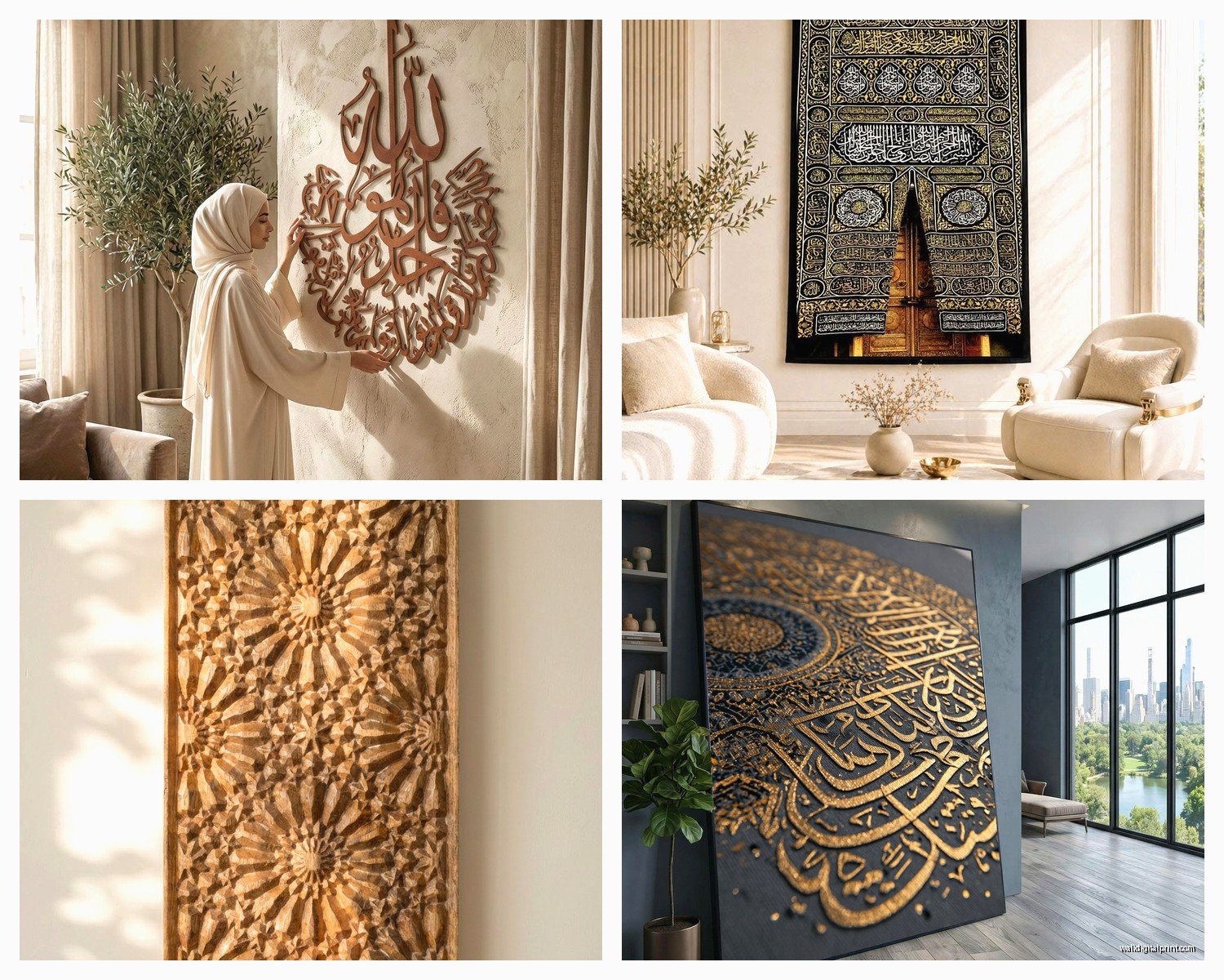
Okay so first thing – when people say “large” they’re usually thinking way too small. I’m talking at least 40 inches wide, bare minimum. I had this client last month who bought what they thought was a huge piece and it was like 24 inches and it just looked… sad? On a big living room wall it looked like a postage stamp. The rule I use now is measure your wall width and go for something that’s at least 60-75% of your furniture width below it. So if you’ve got a 90-inch sofa, you’re looking at 54-68 inches wide for the art.
The thing with Arabic calligraphy specifically is that it NEEDS space to breathe. The script is so detailed and intricate that if you go too small, it just becomes a blur from across the room. I’ve found the sweet spot is usually between 48-72 inches for most residential spaces.
Materials That Actually Hold Up
Canvas prints are gonna be your most affordable option but here’s what nobody tells you – the cheap ones curl at the edges after like six months. I learned this the hard way with a piece I got from one of those print-on-demand sites. Looked great in the photos, arrived and within half a year the corners were doing this weird wave thing.
What works better:
- Gallery-wrapped canvas with at least 1.5 inch depth – the thicker edge just looks more substantial
- Metal prints for modern spaces – they’re pricey but the contrast is insane
- Acrylic prints if you want that high-end gallery look
- Wooden panels for a more organic feel
I’m currently obsessed with metal prints for Quranic verses. There’s something about the way the metallic surface catches light that makes the calligraphy almost glow. Had one installed in a client’s entryway last week and every time you walk past it at different times of day it looks completely different.
The Framing Debate
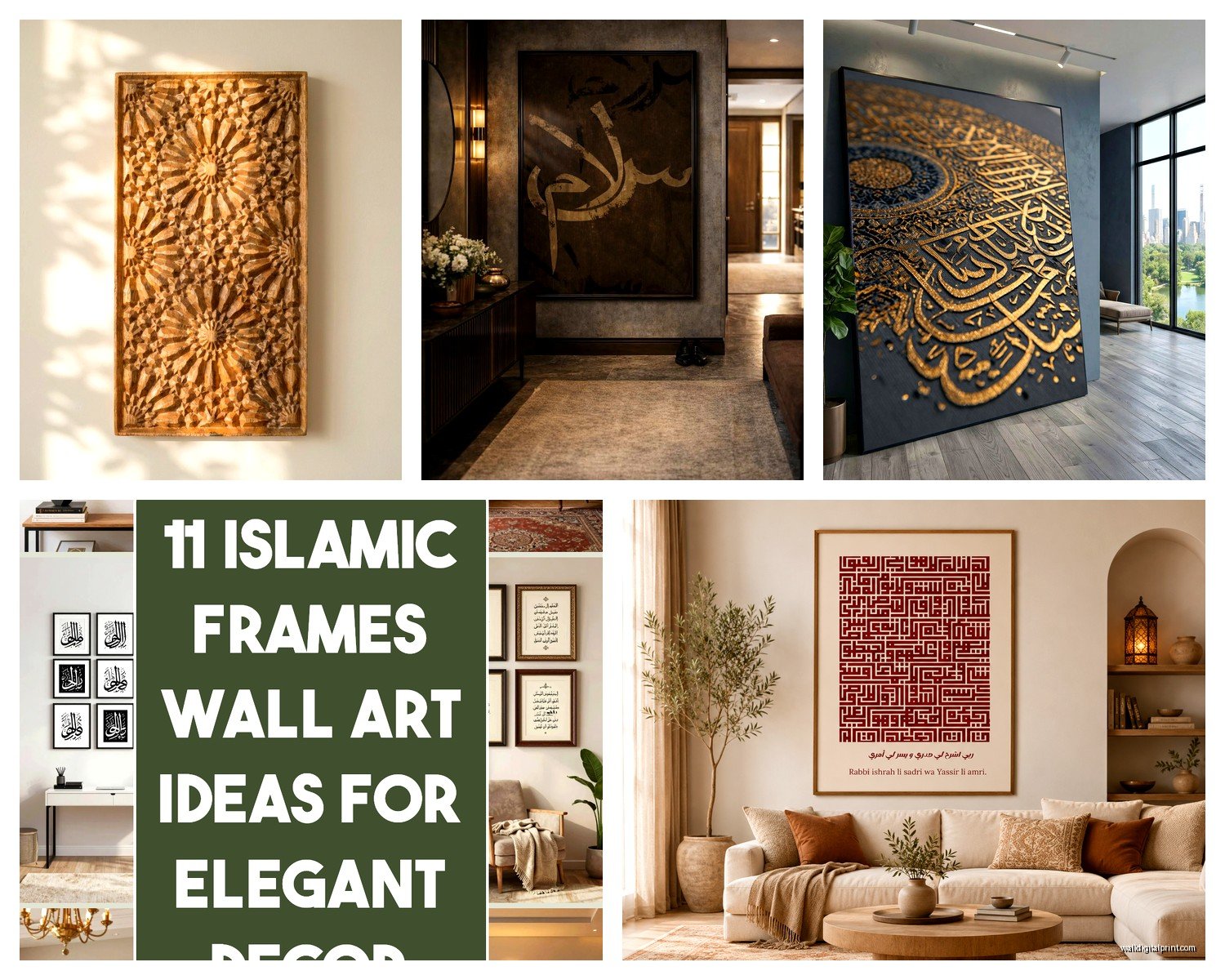
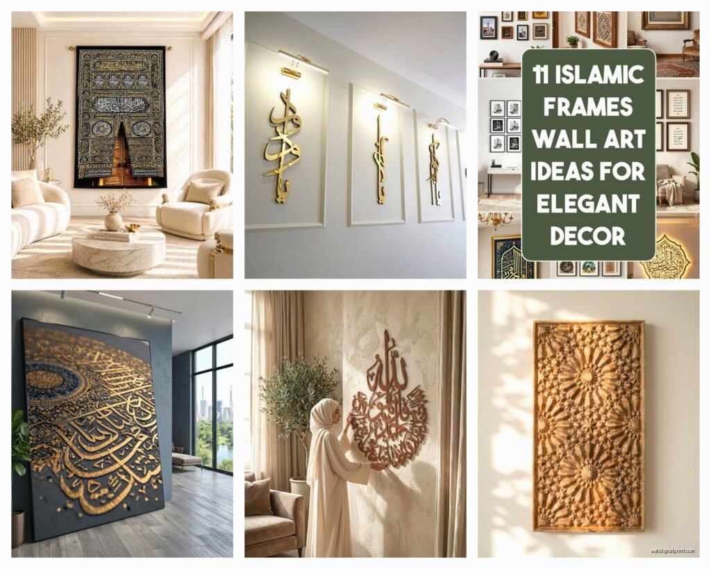
Okay so funny story – I used to think everything needed a fancy frame. Spent like $400 framing a piece only to realize it made the calligraphy feel too… formal? Too museum-like? For modern and contemporary spaces, frameless actually works better. The canvas wraps around the edges or you do a floating mount.
But if you’re working with traditional decor or you’ve got other framed pieces in the room, then yeah, frame it. Just keep it simple – thin black or gold frames work with pretty much any calligraphy style. Ornate frames compete with the script itself which is already decorative.
Placement That Makes Sense
Living room above the sofa is obvious but it’s popular for a reason – it works. The key is hanging it at the right height. Center of the artwork should be at eye level, which is usually around 57-60 inches from the floor. But if it’s going above furniture, leave 6-10 inches between the furniture top and the bottom of the art.
Wait I forgot to mention – entryways are actually my favorite spot for large calligraphy pieces. Think about it, it’s the first thing people see when they enter your home, and if you choose something like “Bismillah” or “Masha’Allah” it sets this intentional, welcoming tone. I did this in my own entryway with a 50-inch piece and literally every guest comments on it.
Other spots that work:
- Above the bed as a headboard alternative – super dramatic
- Dining room feature wall
- Staircase wall if you’ve got the vertical space
- Home office behind your desk for video calls
One thing though – avoid hanging it directly across from a window where it’ll get constant direct sunlight. The UV will fade it over time, especially if it’s a canvas print.
Color Combos That Actually Work
Black calligraphy on white background is classic and works with literally everything. You can’t mess this up. It’s the little black dress of Islamic wall art.
But if you want something more interesting:
- Gold calligraphy on navy or deep teal – looks expensive even when it’s not
- White or cream calligraphy on charcoal – modern and sophisticated
- Metallic copper or bronze on sage green – this is having a moment right now
- Black on warm beige or taupe for traditional spaces
I’m personally moving away from the super glossy gold metallic look that was everywhere a few years ago. It can read as dated now. If you want gold, go for a matte or brushed gold finish instead.
The Multi-Panel Question
So triptychs and multi-panel pieces – should you or shouldn’t you? Honestly it depends on your wall situation. If you’ve got a really wide wall, like 12+ feet, a three-panel piece can fill the space without looking overwhelming. Single large pieces on super wide walls sometimes look lost.
But here’s the thing – you gotta hang them correctly. The spacing between panels should be 2-3 inches, no more. I see people hang them like 6 inches apart and it just looks disconnected. They should read as one cohesive piece, not three separate artworks.
My cat just knocked over my coffee but anyway – I actually prefer single large-scale pieces when possible because there’s something more powerful about one strong statement versus multiple panels.
What Script Style to Choose
This is where it gets personal because different calligraphy styles have completely different vibes.
Thuluth script is probably the most common for wall art – it’s bold, geometric, highly decorative. Great for making a statement. This is what you see most often in mosques and it translates well to home decor.
Diwani script is super flowing and ornate, almost looks like waves. It’s beautiful but can be harder to read, so it works better as purely decorative art rather than something you want guests to necessarily decipher.
Kufic is angular and architectural – perfect for modern minimalist spaces. I used a large Kufic piece in a Scandinavian-style home last year and it was *chef’s kiss* perfect.
Naskh is more straightforward and readable, less decorative. Better for smaller pieces honestly.
Content Choices That Matter
Okay so what should the calligraphy actually say? This is personal but here’s what I see working well:
Ayat al-Kursi – probably the most popular choice for living spaces, it’s protective and meaningful
Bismillah ar-Rahman ar-Rahim – perfect for entryways or dining rooms
Alhamdulillah – simple, powerful, works anywhere
Allah and Muhammad – classic pairing, often done as a two-panel set
Surah Al-Ikhlas – the full surah makes a beautiful large-scale piece
Ya Rahim, Ya Rahman – the names of Allah work really well in modern calligraphy styles
One thing I always tell clients – make sure you know what the piece says and that it’s meaningful to you. Don’t just buy it because it looks pretty. There’s something about having meaningful words in your space that changes the energy of the room, sounds weird but it’s true.
Where to Actually Buy This Stuff
Etsy has a ton of options and you can find both prints and original pieces. Search for “large Islamic calligraphy” or “oversized Arabic wall art” and filter by size. Read the reviews though because quality varies wildly.
Instagram is actually where I find most of my favorite artists now. Search hashtags like #islamiccalligraphy #arabicwallart and you’ll find artists who do custom work. It costs more but you get exactly what you want in the exact size you need.
Local Islamic bookstores sometimes carry wall art but in my experience their selection of large-scale pieces is usually limited.
Custom is the way to go if you’ve got a specific vision or an unusual wall size. I work with a few artists who do commissioned pieces and yeah, you’re looking at $300-800+ for something large and high-quality, but it’s an investment piece.
The Budget Reality
Let’s talk actual numbers:
- Basic canvas print, 40×60 inches: $80-150
- Higher quality canvas with better printing: $200-350
- Metal or acrylic print: $300-600
- Original calligraphy or commissioned piece: $500-2000+
I know those commissioned prices sound high but think about it – you’re paying for an artist’s skill that took years to develop, plus it’s a one-of-a-kind piece. That said, there’s absolutely nothing wrong with a well-done print if that’s your budget. Just invest in good quality printing and materials.
Installation Tips Nobody Mentions
Heavy pieces need proper anchoring. We’re talking 20-30 pounds for large canvas pieces, more for framed. Use wall anchors rated for the weight, not just nails. I’ve had pieces fall and it’s not pretty.
For really large pieces – like 60+ inches – use two hanging points instead of one centered wire. It distributes weight better and keeps the piece more stable.
If you’re renting and can’t put holes in walls, there are those heavy-duty adhesive strips but honestly I only trust them up to about 15 pounds. Beyond that, you’re risking damage to both the wall and your art.
Command strips work for lighter canvas prints but read the weight limit and use more than you think you need. I usually go with 1.5x the recommended number just to be safe.
Styling Around the Piece
Once you’ve got your large calligraphy piece up, everything else should support it, not compete with it. This means:
Keep other wall decor minimal on the same wall. Maybe some small floating shelves below with simple objects, but don’t crowd it.
Your furniture should complement the color scheme. If you’ve got a black and white calligraphy piece, pull those colors into your throw pillows, rug, or other accessories.
Lighting matters more than people think. A picture light or track lighting aimed at the piece makes it look so much more intentional and gallery-like. I’m watching this design show while writing this and they just did exactly this in someone’s living room.
Plants can actually enhance calligraphy art – the organic shapes contrast nicely with the geometric script. I like putting a large fiddle leaf fig or monstera near calligraphy pieces.
Common Mistakes to Avoid
Hanging it too high – seriously, eye level means eye level, not ceiling level
Choosing a piece that’s too small for the wall – when in doubt, go bigger
Getting something super trendy that you’ll hate in two years – stick with classic styles
Ignoring the room’s color palette – your art should work with your existing colors
Buying without knowing what it says – just don’t, please
Not considering the room’s function – maybe don’t put Ayat al-Kursi in your bathroom, you know?
Okay I think that covers most of what you need to know. The main thing is just go for it – Islamic calligraphy is having such a moment right now and it’s a beautiful way to incorporate faith into your decor without it feeling heavy-handed. Start with one statement piece and build from there. You’re gonna love how it transforms your space.