Wall Art Guide, Wall Art Tutoriels
Geometric Mountain Wall Art: Angular Nature Landscapes
Jun
So I’ve been obsessing over geometric mountain art lately and honestly it’s become this whole thing where I can’t stop finding new pieces for clients. Like just last week I was supposed to be working on a beach house project but ended up down a rabbit hole looking at angular landscape prints instead.
Why This Style Actually Works in Real Rooms
The thing about geometric mountain art is it hits this sweet spot between nature vibes and modern design that’s really hard to mess up. I’ve used it in everything from minimalist apartments to those transitional homes where people can’t decide if they want contemporary or traditional. It just… fits? The angular shapes give you that clean aesthetic without feeling cold, and the mountain imagery keeps it grounded.
My golden retriever knocked over a frame last month and I learned the hard way that you gotta consider weight distribution but we’ll get to that.
Picking the Right Style for Your Space
Okay so there are basically a few categories you need to know about:
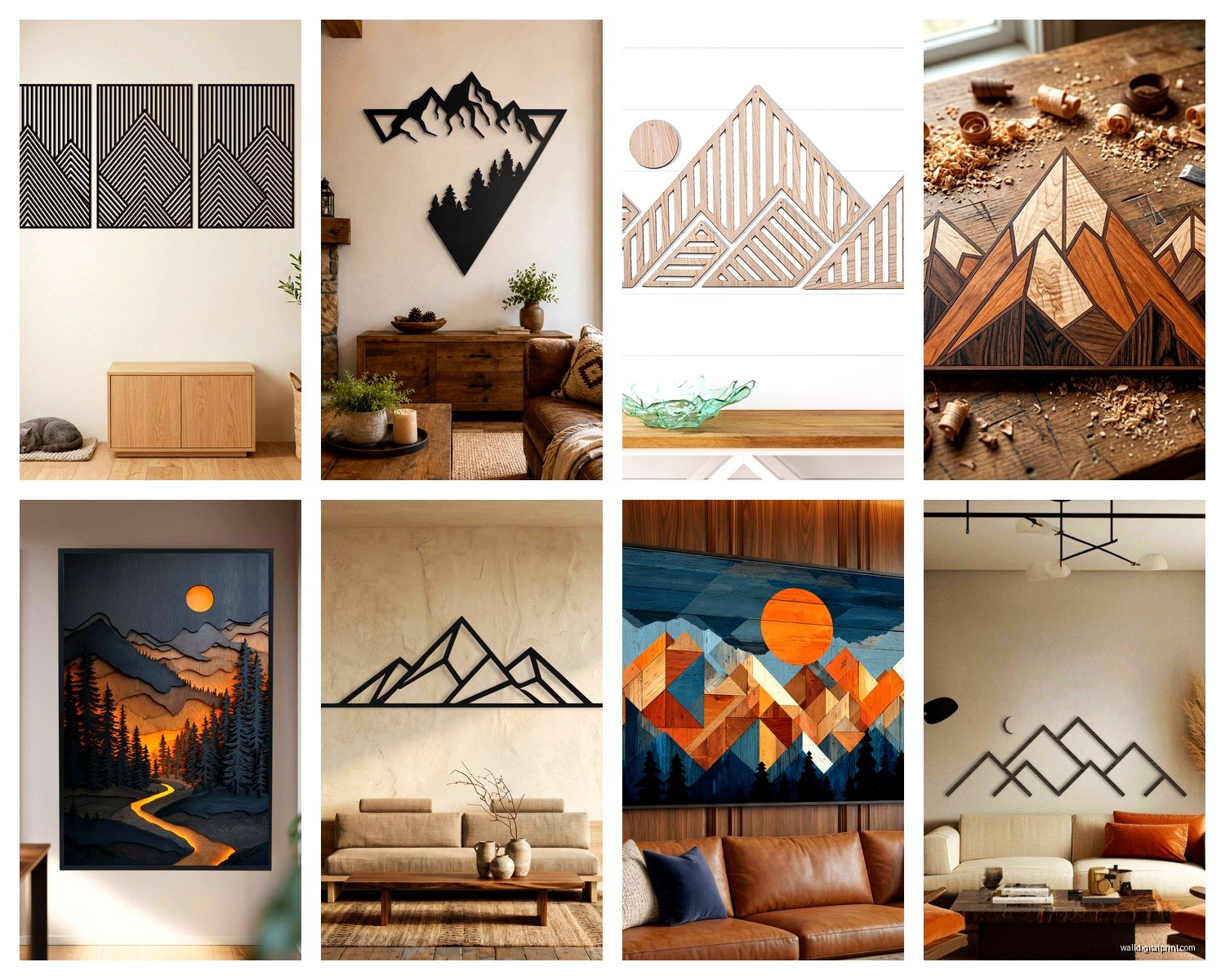
Line Art Mountains
These are the ones with just black lines creating geometric peaks. Super minimalist. I use these in bedrooms a lot because they don’t compete for attention. The thin lines work especially well above beds where you want something interesting but not overwhelming when you’re trying to sleep.
They look amazing in sets of three, but here’s what nobody tells you – make sure the line weight is thick enough to see from across the room. I ordered this gorgeous set once for a client’s living room and when we hung them you literally couldn’t see the detail from the sofa. Had to return them and get versions with bolder lines.
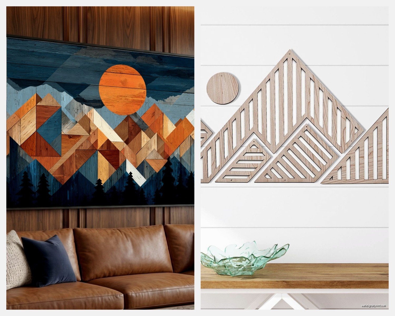
Color Block Geometric Mountains
This is where you get those triangle peaks in like rust orange, navy, sage green, those trendy dusty colors everyone’s into right now. These make more of a statement. I’ve found they work best as a single large piece rather than a gallery wall situation because the colors already create enough visual interest.
Pro tip that I learned after making mistakes – the colors need to pull from something else in your room or they’ll look random. Even if it’s just picking up the terracotta from a throw pillow or the blue-gray from your rug.
Textured or Layered Geometric Landscapes
These have depth to them, like multiple triangular layers creating that mountain range receding into the distance effect. Sometimes they’re printed, sometimes they’re actually dimensional with wood or metal. These are my favorite for dining rooms because they give you something interesting to look at during dinner but aren’t so detailed that they’re distracting.
The wood ones are heavier than you think btw, learned that the hard way.
Size and Placement Because This Is Where Everyone Messes Up
I’m gonna be real with you, most people buy art that’s too small. It’s like the number one mistake I see. For geometric mountain art specifically:
Above a sofa: You want something that’s roughly two-thirds to three-quarters the width of your sofa. So if you’ve got a 90-inch sofa, you’re looking at 60-68 inches of art width. You can achieve this with one large piece or a set of smaller ones arranged together.
Above a bed: Similar rule but you can go slightly smaller. I usually do about half to two-thirds the width of the headboard. If you don’t have a headboard, measure the mattress width instead.
In narrow spaces like hallways: This is actually where geometric mountain art shines because the vertical peaks draw your eye up and make the space feel less cramped. Go for portrait orientation or square pieces rather than landscape.
Wait I forgot to mention – height matters too. The center of your artwork should be at eye level, which is roughly 57-60 inches from the floor. But honestly in bedrooms I go a bit lower because you’re often sitting or lying down when you’re looking at it.
Color Schemes That Actually Work
Okay so funny story, I once put this beautiful teal and coral geometric mountain piece in a client’s living room and it clashed so badly with their existing stuff that we had to repaint. Now I always start with the color palette.
Neutral rooms: You can go bold here. Those multi-colored geometric mountains with jewel tones or saturated earth tones will pop without overwhelming. Think navy, emerald, burnt orange, deep burgundy.
Already colorful rooms: Stick with monochromatic or two-tone pieces. Black and white line art or maybe black with one accent color that’s already in your room.
Scandinavian/minimalist spaces: Black line art on white or those soft pastel geometric mountains in blush, sage, or dusty blue. Keep it simple.
Bohemian or eclectic rooms: This is where you can mix it up. I’ve done gallery walls with different colored geometric mountain pieces that share a similar style but vary in color. Just make sure they share at least one common element like the same frame color or similar line weights.
Framing Options and Why It Matters More Than You Think
So frames can make or break this whole thing. I’ve seen gorgeous geometric mountain prints look cheap because of bad framing and vice versa.
Floating frames: These are my go-to for this style. The art appears to float within the frame with a gap around it, which really complements the geometric aesthetic. They’re modern without being too trendy.
Thin black frames: Classic choice that works like 90% of the time. They don’t compete with the geometric design and they’re easy to find at every price point.
Natural wood frames: These work really well if you’re going for that organic modern vibe. The wood element ties back to the nature aspect of mountains while the geometric shapes keep it contemporary.
No frame: Canvas prints or wood prints can totally be hung without frames if the edges are finished nicely. This works especially well with the textured layered pieces I mentioned earlier.
My cat keeps trying to scratch the corner of one of my canvas pieces so maybe consider that if you have pets.
Matting Yes or No
I usually skip matting with geometric mountain art because it can make the piece feel too formal or traditional. The clean lines of geometric designs look better when they go right to the edge of the frame. Exception – if you’re framing a smaller print and need to make it fit a larger frame, then yeah, use a mat but keep it minimal, like a 2-inch border max.
Where to Actually Buy This Stuff
Gonna be honest, there’s such a huge range in quality and price. Here’s where I source from:
Etsy: Best for unique prints and custom sizes. You can find independent artists doing really cool geometric mountain work. Just read the reviews carefully and check what you’re actually getting – is it a digital download you print yourself or a physical print? I’ve accidentally ordered digital files before thinking I was getting a print and that was annoying.
Society6 and Redbubble: Good for affordable prints with lots of framing options. The quality is decent for the price. I use these for rental properties or when clients have tight budgets.
West Elm, CB2, Article: Mid-range options that are pretty reliable. You know what you’re getting and they have good return policies. The geometric mountain stuff from these places tends to be more refined and less Etsy-quirky if that makes sense.
Local art fairs and maker markets: Sometimes you find amazing wood or metal geometric mountain pieces here. They’re usually pricier but you’re getting something more unique and supporting local artists which clients love to mention when people compliment their art.
The Gallery Wall Approach
If you’re doing multiple geometric mountain pieces together, here’s what I’ve figured out through trial and error:
Keep the spacing consistent – I use 2-3 inches between frames. Any more and it starts looking disconnected, any less and it feels crowded.
Stick to odd numbers if you’re doing a symmetrical arrangement. Three or five pieces usually look more balanced than even numbers.
If you’re mixing sizes, lay them out on the floor first. Seriously. I know everyone says this but I still have clients who don’t do it and then we’re putting nail holes in the wrong places.
The biggest piece should be the focal point, usually in the center or slightly off-center. Then build around it with smaller pieces.
Oh and another thing – if you’re hanging multiple pieces, get a laser level. Those phone apps are okay but not accurate enough when you’re trying to line up several frames.
Styling Around Geometric Mountain Art
The art shouldn’t just float there on your wall by itself. You gotta integrate it with the rest of your space.
On a shelf or console: Layer a geometric mountain print behind some objects like a plant, small sculpture, or stack of books. This creates depth and makes the whole vignette more interesting.
With other wall decor: You can totally mix geometric mountain art with other stuff. I’ve done it with macrame wall hangings, mirrors, or floating shelves. Just make sure there’s enough visual space between elements so nothing feels cramped.
Lighting: Picture lights or wall sconces on either side can really make geometric mountain art pop, especially if it has metallic elements or interesting textures. Just make sure the light temperature matches the rest of your room.
Common Mistakes I See All the Time
Hanging it too high – already mentioned this but it’s worth repeating because everyone does it.
Choosing colors that don’t relate to anything else in the room. The art ends up looking like an afterthought.
Going too matchy-matchy with a set. Like those three identical pieces in slightly different colors? They can look catalog-y. Mix it up a bit or just do one larger statement piece instead.
Forgetting about the wall color. Geometric mountain art in dark colors gets lost on dark walls. You need contrast.
Not considering the room’s purpose. Super bold geometric mountains might be too stimulating for a bedroom where you want calm vibes.
My Current Favorite Combinations
These are setups I’ve done recently that actually worked:
Large navy and gold geometric mountain canvas above a tan leather sofa with brass floor lamp – very masculine but not too heavy.
Three small black line mountain prints in thin gold frames above a bed with white bedding and natural wood nightstands – simple but elevated.
Single large multi-colored geometric mountain piece (rust, sage, cream) in a floating frame on a gallery wall with family photos in matching frames – this balanced the personal stuff with something more artistic.
Textured wood geometric mountains in a dining room with live edge table and mixed metal light fixtures – the repetition of natural materials with modern shapes tied everything together.
Installation Tips Because Hanging Stuff Is Annoying
Use proper anchors if you’re not hitting studs. Those plastic ones that come with frames are usually garbage. Get the metal toggle bolts or the ones that expand behind the drywall.
For gallery walls, make a template with paper first. Trace your frames on kraft paper, tape them to the wall, adjust until you like it, then mark where the nails go through the paper.
If you’re hanging something heavy (like wood geometric mountains), use two hanging points instead of one centered point. It’ll be more stable and less likely to shift.
Command strips work for lighter prints but check the weight limit. I’ve had prints crash down because someone used the wrong strength strips.
Level as you go, not after everything’s up. Seriously. So much easier to fix one slightly crooked frame than to realize your whole gallery wall is tilted.
Okay I think that covers most of what I’ve learned through way too many hours installing geometric mountain art in various spaces. The main thing is just don’t overthink it – if you love a piece and the colors work with your room, it’s probably gonna look good. Start with one piece if you’re unsure and build from there.