Wall Art Guide, Wall Art Tutoriels
City Skyline Wall Art: Urban Architecture Silhouettes
Jun
So I just finished hanging three different skyline pieces in a client’s loft last week and honestly, the whole urban silhouette thing is having such a moment right now. But like, you gotta know what you’re doing or it looks really try-hard and corporate instead of cool.
Picking the Right City for Your Space
Okay first thing – don’t just automatically go with your current city. I see people do this all the time and sometimes it works but sometimes it’s just… obvious? Like if you live in Chicago and have a Chicago skyline, it can feel a bit on-the-nose unless you do something unexpected with it.
I actually prefer when people choose cities that mean something personal. Like my friend Anna has a Tokyo skyline in her bedroom because she studied there for a semester and it’s this whole thing. Way better story than “I live in Seattle so here’s the Space Needle again.”
That said, New York and Paris skylines are basically neutral at this point. They’re so iconic they work almost anywhere, kinda like how you can put an Eiffel Tower print in a house in Texas and no one questions it.
The Classics That Actually Work
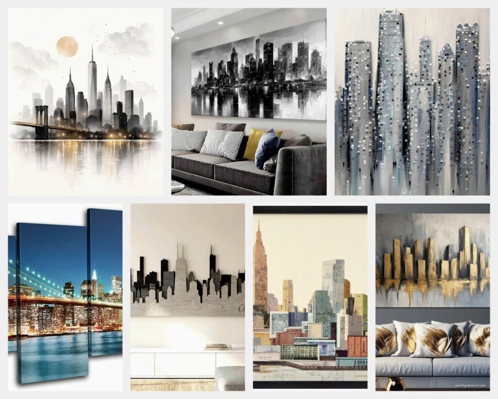
- New York – works in literally any room, the buildings are just architecturally interesting enough
- London – I love this one for dining rooms specifically, something about Big Ben reads as elegant
- San Francisco – Golden Gate Bridge silhouettes are their own category honestly
- Dubai – if you want something modern and vertical, those skyscrapers photograph like sculptures
- Hong Kong – underrated for home offices, the density creates this cool texture
Size and Scale Is Where Everyone Messes Up
Oh and another thing – people always go too small with skyline art. Like they’ll put this tiny 16×20 piece above a king bed and it just floats there looking sad. Skylines are horizontal by nature, so you need WIDTH.
I did a consultation where someone had bought this gorgeous metal London skyline but it was only 24 inches wide and they wanted it above their sectional. Just no. We ended up getting a 60-inch version and the difference was insane.
My general rule: measure your furniture width and go AT LEAST half that size, but ideally two-thirds. So if your couch is 90 inches, you want your skyline art to be 60 inches minimum. This is gonna sound weird but I literally keep a tape measure in my bag now because clients never believe me until I show them.
Room-Specific Sizing
Living room above sofa: 48-72 inches wide, seriously don’t go smaller
Bedroom above bed: 36-60 inches depending on bed size, queen needs at least 40
Home office: 24-40 inches works, you’re sitting closer so smaller scale is fine
Dining room: this is tricky because of the table, but I usually do 36-48 inches and hang it on the wall opposite the windows
Material Matters More Than You Think
Okay so funny story, I ordered a “metal” skyline from this Etsy shop and it arrived as like… printed metal? Not actual cut metal. My cat knocked it off the console table and it dented. Learned that lesson.
Actual cut metal is what you want if you’re going for that modern industrial vibe. It has dimension, casts shadows, changes throughout the day as light moves. Brands like Cityscape Art and Urban Designs do proper laser-cut steel. Expect to pay $150-400 depending on size but it’s worth it.
Canvas prints of skylines can look cheap really fast. The problem is skylines are basically line art, so on canvas you lose the crispness. If you’re gonna do canvas, make sure it’s a stylized version with color or texture, not just black silhouette on white.
Acrylic and plexiglass – this is having a moment and I’m here for it. The skyline gets printed on the back of clear acrylic and it has this floating effect. West Elm has some good ones. They catch light in a cool way and feel more upscale than their price point.
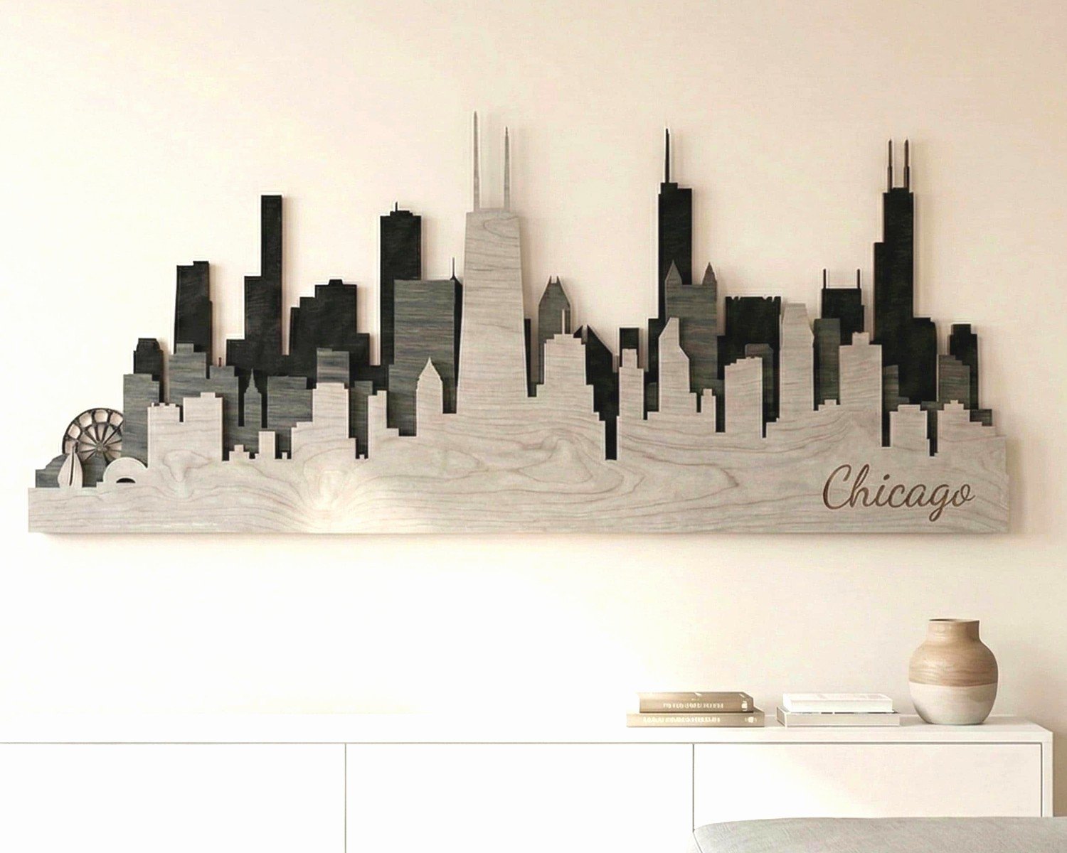
Wood cutouts give you that Scandinavian minimal thing. I used a wooden New York skyline in a nursery once and it was perfect because it felt softer than metal.
Color Choices That Don’t Look Like a Hotel Lobby
Black on white is classic but also very 2015 corporate office if you’re not careful. Wait I forgot to mention – the finish matters just as much as the color.
Matte black metal on a light gray or cream wall is chef’s kiss. The contrast works but it’s not harsh.
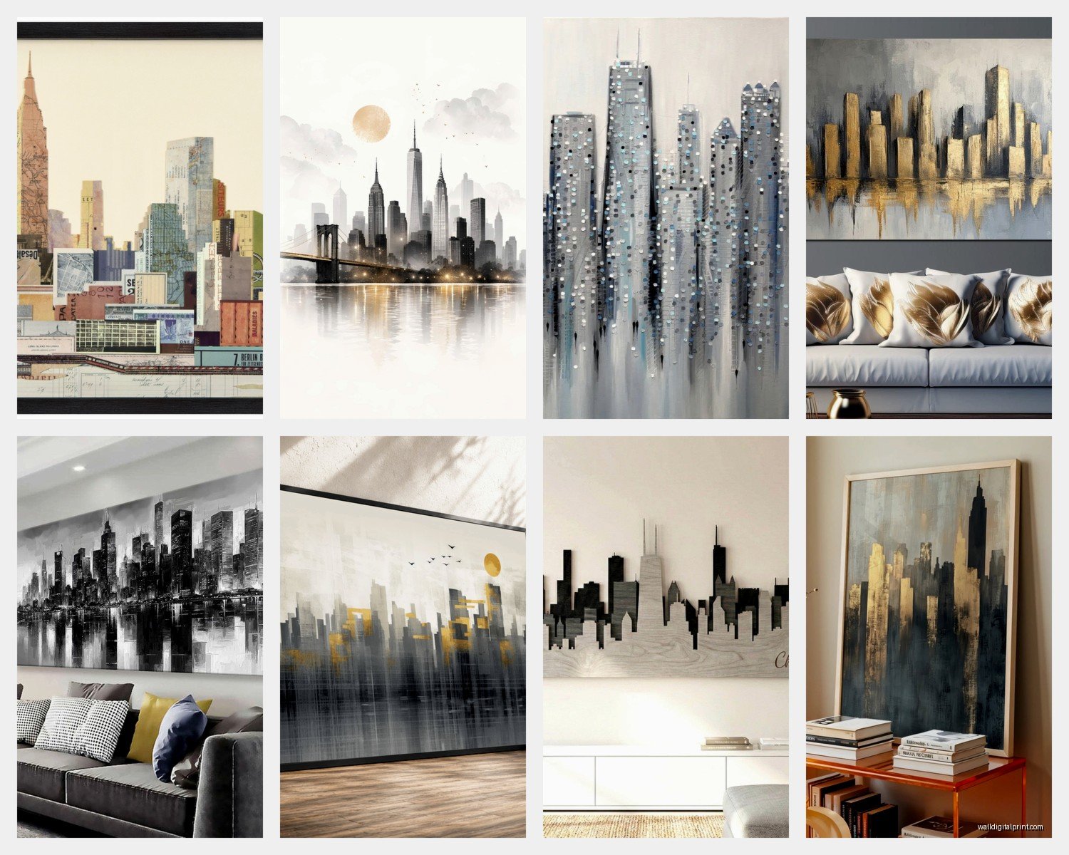
Gold or brass skylines sound tacky but in the right room they’re actually stunning. I did a brass London skyline in a room with navy walls and brass light fixtures and it was *cohesive* you know?
White on dark walls – this is underused. White metal skyline on a charcoal or navy wall in a bedroom creates this dreamy nighttime cityscape vibe.
Colored skylines with sunset gradients… tread carefully. They can go kitschy fast. If you want color, I prefer abstract geometric interpretations of skylines rather than realistic ones with orange and pink gradients.
The LED Backlit Situation
So there’s this whole category of skyline art with LED backlighting and I have mixed feelings. In a media room or modern bachelor pad? Yes. In a family living room? Probably too much.
If you go this route, make sure the LEDs are dimmable and warm-toned. The bright blue LED skylines look like a sports bar. I saw one at my friend’s place last month and every time we tried to watch a movie it was distracting.
Placement Rules That Actually Make Sense
Height is where people get paralyzed. The standard “57 inches to center” rule doesn’t always work with skylines because they’re so horizontal.
For above furniture: 6-8 inches above the furniture top. Not 12, not 4, somewhere in that range. I use 7 inches as my default and adjust from there.
For floating on a wall: center at 60 inches if there’s no furniture anchoring it. Skylines have a horizon line built in so they need to feel grounded.
One thing I learned the hard way – don’t put skylines directly across from windows. The silhouette thing gets confusing when there’s actual sky and buildings outside. Put them on perpendicular walls instead.
Mixing Skylines with Other Art
You can’t just slap a skyline next to your random art collection and call it a day. They’re strong graphic statements so everything else needs to play nice.
Gallery walls WITH skylines: the skyline should be the largest piece and positioned either center or slightly off-center. Then build around it with smaller pieces that complement the linear quality. Abstract geometric prints work, botanical prints work, photography works. Just avoid anything too busy.
I did a gallery wall where the skyline was the anchor and then added black and white architecture photos around it. The theme carried through and it felt intentional not chaotic.
What doesn’t work with skylines: ornate traditional art, florals in vintage frames, beach scenes, basically anything that fights with the urban modern vibe. Unless you’re deliberately doing an eclectic maximalist thing but that’s a whole different skill level.
Room by Room Breakdown
Living Room
This is skyline prime real estate. Above the sofa is the obvious spot but I’ve also done them on the wall behind the TV if you have space around your media console.
The key is making sure your skyline choice matches your overall aesthetic. Mid-century modern room? Go with a vintage travel poster style skyline with muted colors. Industrial loft? Raw metal cut skyline all the way. Scandinavian minimal? Wood cutout or simple line drawing.
Bedroom
Skylines in bedrooms can be really romantic actually, especially if you choose a city that has meaning for you as a couple. I always recommend going more subtle in bedrooms though – not the dramatic backlit situation.
Above the bed is traditional but I’ve also done them on the wall opposite the bed so it’s the first thing you see when you wake up. Kind of a nice “seize the day” energy without being cheesy about it.
Home Office
Perfect spot for skylines honestly. They convey professionalism and ambition without being corporate boring. Behind your desk on a Zoom background wall is smart – adds visual interest but isn’t distracting.
I personally have a small Tokyo skyline in my office and clients comment on it constantly. It’s a conversation starter.
Dining Room
This is tricky because you don’t want the skyline competing with your table centerpiece and the visual chaos of dinner. I usually go more minimal here – a simple line drawing style rather than detailed architectural rendering.
One of my favorite installations was a white skyline on a sage green wall in a dining room with brass fixtures. It was unexpected and elevated.
The Budget Breakdown
Since you’re probably wondering what this actually costs…
Budget tier ($30-80): Canvas prints from Amazon or Target, simple vinyl decals, basic wood cutouts from Etsy. These can look good in the right context but you’re limited on size and quality.
Mid-range ($80-200): Better Etsy sellers with actual cut metal, West Elm acrylic pieces, CB2 options. This is my sweet spot for most clients – good quality without the sticker shock.
Investment ($200-500+): Custom metal work, large-scale installations, LED integrated pieces. Worth it if this is a forever home and a room you’ll use daily.
I’ve seen people spend $400 on a skyline and it’s the only art they need in that room, so the cost per impact is actually reasonable.
Installation Tips Nobody Tells You
Metal skylines are heavier than they look. You need proper anchors, not just nails. I use heavy-duty picture hangers rated for at least 30 pounds even if the piece is only 15 pounds. Better safe than sorry and also walls are weird.
Most metal skylines come with a wire on the back but I actually prefer using D-rings on each end for better stability. The piece hangs flatter against the wall and doesn’t tilt.
For multi-panel skylines (like those three-piece sets): use a level and measure precisely between panels. Even an inch off makes the whole thing look janky. My client canceled last week so I spent an hour getting a three-panel San Francisco skyline perfectly spaced and it was honestly meditative.
Oh and if you’re renting, command strips CAN work for lighter pieces under 5 pounds but check your lease because some of them do pull paint. I’ve had mixed results.
Trends I’m Seeing Right Now
Minimalist line drawings are overtaking the detailed silhouettes. Just the bare outline of 3-4 iconic buildings rather than the entire skyline.
Mixed media where the skyline is part metal, part neon, part wood. Sounds chaotic but when done well it’s really cool and adds dimension.
Vintage travel poster style skylines with that retro color palette and typography. These feel less serious and work in more casual spaces.
Personalized skylines where you can highlight specific buildings or add coordinates underneath. Saw this on Etsy and thought it was gimmicky but it’s actually sweet for anniversary gifts or housewarming.
Honestly just avoid anything with too much going on. The beauty of skyline art is the simplicity and recognizability. When people try to make it too artistic or abstract, it loses what makes it special in the first place.