Wall Art Guide, Wall Art Tutoriels
Motivational Wall Art: Inspirational Quotes & Success
Jul
So I’ve been styling homes for like 15 years now and honestly the whole motivational wall art thing used to make me cringe? But then I started actually paying attention to which pieces made my clients feel good versus which ones just sat there being… words on a wall. There’s a huge difference.
The Problem With Most Motivational Quotes
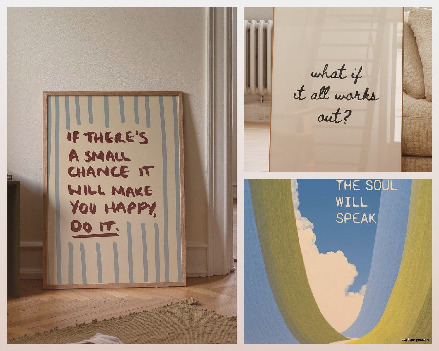
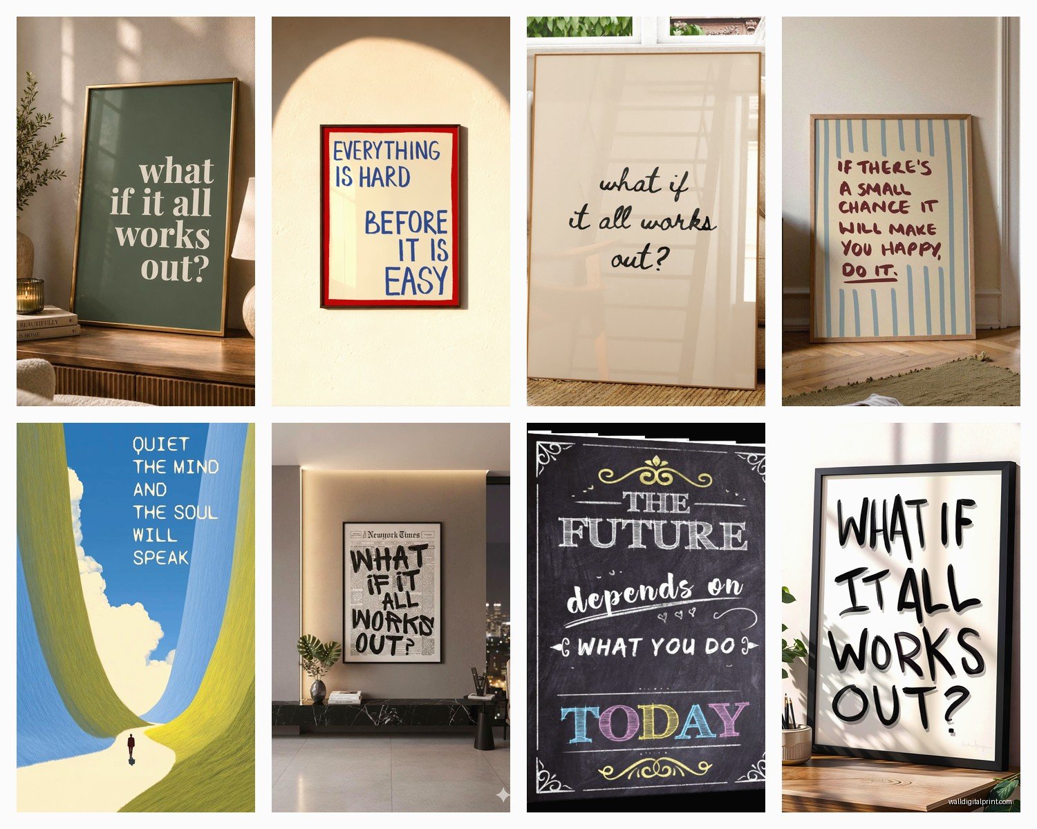
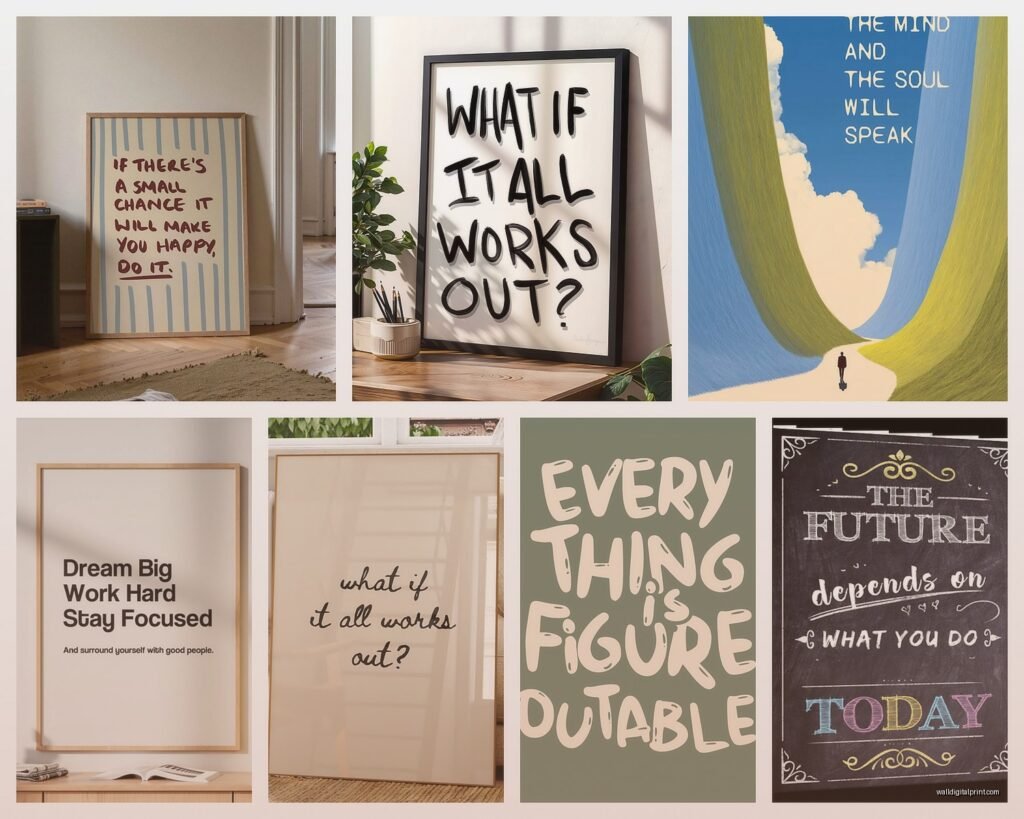
Okay so here’s what nobody tells you – most motivational wall art looks cheap because it IS cheap. Not in price necessarily, but in execution. You know those basic “Live Laugh Love” prints? They fail because they’re trying too hard and the typography is usually terrible. When you’re picking quote art, you gotta think about it like you’re choosing a piece of actual art that happens to have words, not just buying words that someone slapped a frame around.
I was reorganizing my studio last week (my cat knocked over an entire shelf of samples which was fun) and I realized I’ve collected probably 50+ examples of quote art over the years. The ones that actually work have a few things in common – the typography is interesting, the color palette fits the room, and honestly? The quote itself isn’t trying to solve your whole life.
Choosing Quotes That Don’t Make People Roll Their Eyes
Here’s my test: if you can imagine it on a throw pillow at HomeGoods, skip it.
Better options are:
- Short literary quotes from actual books
- Song lyrics that aren’t obvious (think album deep cuts not chorus lines)
- Single words in interesting typefaces
- Quotes in other languages that you actually connect with
- Historical figures saying something specific not generic
I had a client who wanted something motivational for her home office and she kept sending me these “She believed she could so she did” type things. We ended up using a line from a Toni Morrison interview instead – something about “if there’s a book you want to read that hasn’t been written yet, you must write it.” Way more specific, way more interesting, and it actually related to her work as a writer.
The Typography Thing Nobody Talks About
This is gonna sound weird but the font matters MORE than the actual quote sometimes. I’ve seen beautiful typography make mediocre quotes work and I’ve seen great quotes ruined by fonts that look like they came from Microsoft Word 2003.
What works:
- Hand-lettered styles if they’re actually well done (not the fake brush letter stuff)
- Clean sans-serif fonts for modern spaces
- Vintage typography for eclectic or traditional rooms
- Mixed fonts but ONLY if someone who knows design did it
What doesn’t work is when you can tell someone just opened Canva and picked the first script font they saw. You can feel the difference even if you don’t know why.
Size and Placement Because That’s Where Everyone Messes Up
Okay so funny story – I once hung a motivational piece for a client that was like 8×10 on a wall that was probably 12 feet wide. It looked ridiculous. She’d bought it online without measuring anything and just assumed it would work.
Here’s the actual rule I use: your art should take up about 2/3 to 3/4 of the furniture width below it. So if you’ve got a 60-inch console table, you want art that’s roughly 40-50 inches wide. This applies whether it’s one large piece or a gallery wall situation.
For motivational quotes specifically:
- Office spaces: go bigger than you think, like 24×36 minimum if it’s the focal point
- Bedroom: above the bed should be substantial, at least 2/3 the bed width
- Bathroom: smaller pieces work here, 8×10 or 11×14
- Entryway: this is actually a great spot for a statement quote piece, go large
The height thing matters too – center of the art should be at eye level which is usually around 57-60 inches from the floor. But if you’re putting it above furniture, leave 6-8 inches between the furniture and the bottom of the frame.
Mixing Quote Art With Other Art
This is where people either nail it or create chaos. You can absolutely mix motivational quotes with photography, abstract art, whatever. But you need a unifying element.
My go-to methods:
Same frame style: All black frames or all natural wood makes anything look cohesive
Color palette: If your quote art has navy and gold, echo those colors in your other pieces
Same subject matter: Nature photography + nature quotes, that kind of thing
Consistent spacing: Keep the same distance between all pieces in a gallery wall
I’m working on a gallery wall right now for a client’s staircase and we’re mixing two quote prints with four photographs and one abstract piece. They all have the same white mat and black frame, and we made sure the quotes weren’t competing – one’s a single word (WONDER) and one’s a short phrase. If we’d used two long quotes it would’ve been too much text.
The Gallery Wall Formula That Actually Works
Okay I’m gonna give you my actual process because I’ve done this maybe 200 times:
- Pick your largest piece first – this is your anchor
- Choose your quote pieces next and make them different sizes
- Fill in with 3-5 other pieces (photos, art, whatever)
- Lay it ALL out on the floor first and take a photo from above
- Keep heaviest visual weight toward the bottom
- Maintain 2-3 inches between frames consistently
The mistake everyone makes is hanging as they go. Don’t do that. Map it out completely first or you’ll end up with weird gaps and uneven spacing.
Where to Actually Buy This Stuff
So I used to source everything from high-end galleries but honestly? There are better options now that don’t cost $500 per print.
Etsy: Search for specific styles like “minimal motivational print” or “vintage typography quote” – you’ll find independent designers and can usually get instant downloads
Minted: Their art is curated well and the printing quality is solid, plus lots of size options
Society6: Hit or miss but good for finding unique artists
Local print shops: If you find a quote you love online, sometimes you can get better quality taking the file to a local printer
Frame it yourself: Buy prints online and get frames from Michael’s or Amazon – way cheaper than buying pre-framed
I recently got a custom quote printed at my local shop for like $35 (20×30 size) and the quality was better than a $200 print I’d bought online. Just saying.
Colors That Make Quotes Pop Without Being Obnoxious
The color of your text and background matters SO much. Most people default to black text on white and it’s fine but it’s also boring and doesn’t always fit the room.
Try these combinations:
- Navy or charcoal text on cream background (softer than black/white)
- White text on dark gray or black (dramatic for modern spaces)
- Terracotta or rust text on neutral background (warm and current)
- Forest green on light sage (nature vibes without being literal)
- One accent color pulled from other room colors
My client last month wanted motivational quotes for her workout room and we did white text on a deep burgundy background – matched her equipment and looked way more expensive than it was.
Frames Matter More Than You Think
I cannot stress this enough – a $15 print in a $60 frame looks like a $100 piece. A $100 print in a $15 frame looks like garbage.
Black frames: Modern, clean, works with everything, my default choice
Natural wood: Warm, casual, great for bohemian or Scandinavian spaces
White frames: Light and airy but shows dirt easily
Brass or gold: Elegant but commit to it elsewhere in the room too
No frame: Can work with canvas prints but looks unfinished with paper prints
Also get the mat cut properly if you’re framing yourself. A too-small mat makes everything look cheap. Standard is 2-3 inches on the sides and top, 3-4 inches on the bottom.
Rooms Where Motivational Quotes Actually Make Sense
Not every room needs words on the wall, real talk. Here’s where they work:
Home office: Obviously yes, this is prime territory
Workout space: Actually helpful to have something motivating staring at you
Kids rooms: But keep it age-appropriate and not preachy
Bathroom: Small affirmation-type quotes work well here
Entryway: Sets the tone for the whole house
Kitchen: Food-related quotes or family sayings can be sweet
Where they DON’T work as well:
- Living room unless it’s part of a larger gallery wall
- Formal dining room (too casual usually)
- Master bedroom if they’re aggressive motivation (nobody wants “HUSTLE” staring at them while they’re trying to sleep)
The Success Quote Trap
Oh and another thing – be careful with the whole “success” themed quotes because they can feel really intense. I had a client who filled his office with stuff like “Success is not an option it’s a requirement” and “Sleep when you’re dead” and honestly? It made the room feel stressful.
Better approach is mixing achievement-oriented quotes with balance-oriented ones. One about working hard, one about rest being productive too. That kind of thing.
Or just skip the obvious success language entirely and go with quotes about creativity, curiosity, growth – things that lead to success without being so in-your-face about it.
DIY Options If You’re On a Budget
You don’t need to spend hundreds of dollars on this stuff. I’ve seen amazing quote walls done for under $50 total.
- Print free downloads from design blogs and frame them
- Use Canva to design your own (but please use good fonts)
- Paint quotes directly on the wall if you’ve got steady hands
- Use vinyl lettering (temporary and affordable)
- Print on fabric and stretch over canvas boards
The key with DIY is keeping it simple. Don’t try to recreate complex designs – stick with clean typography and solid colors.
wait I forgot to mention – if you’re printing at home, invest in good paper. Regular printer paper looks flimsy. Get cardstock or photo paper minimum.
Making It Feel Personal Not Pinterest
The whole point of having quotes on your wall is that they mean something to YOU, not that they photograph well. I see so many people buying whatever’s trending without considering if they actually connect with it.
Questions to ask before buying:
- Does this quote actually resonate with me or do I just think it should?
- Will I still like this in 5 years?
- Does it fit my actual personality or am I trying to be someone I’m not?
- Is this inspiring or is it just more pressure?
Your home should support you, not make you feel guilty. If a motivational quote makes you feel bad about yourself, it doesn’t belong on your wall.
I’ve started steering clients toward quotes that feel more like gentle reminders than demands. Things like “You are exactly where you need to be” instead of “Make it happen.” Both can be motivating but one doesn’t feel like homework.
Anyway that’s pretty much everything I’ve figured out about motivational wall art over the years. The main thing is making sure it fits YOUR space and YOUR life, not just copying what looks good in someone else’s photos.