Wall Art Guide, Wall Art Tutoriels
Safari Wall Art: African Wildlife Animal Prints
Jul
So I’ve been totally obsessed with safari wall art lately and honestly it started because a client wanted to do this whole “refined jungle” vibe in their living room and I went down this rabbit hole of African wildlife prints that I can’t seem to climb out of.
The Thing About Safari Prints That Nobody Tells You
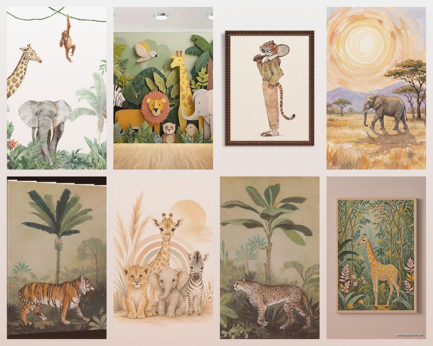
Okay first off, not all animal prints are created equal. I learned this the hard way when I ordered what looked like an amazing elephant print online and it showed up looking like a bad photocopy from a nature magazine circa 1987. The quality difference between a properly photographed wildlife print and those generic stock photos is MASSIVE.
What you’re gonna want to look for is prints that have actual depth and texture in the image. Like, can you see the individual hairs on a lion’s mane? Are the elephant’s wrinkles sharp enough that you can almost feel them? That’s the stuff that makes people stop and actually look at your wall instead of just glancing past it.
Photography vs Illustration vs Watercolor
This is where it gets interesting because each style totally changes the vibe of your room. I’ve used all three and here’s what I’ve figured out:
Photography prints are your go-to if you want that National Geographic drama. They’re intense, they’re real, and they make a statement. I put a massive black and white giraffe photo in my own hallway and my neighbor literally stopped mid-conversation to stare at it. The downside? They can feel a bit heavy if you overdo it. Like you don’t want your living room to feel like a museum exhibit.
Illustrations are way more versatile than you’d think. There’s this whole range from super detailed vintage botanical-style drawings to minimalist line art. I used a set of minimalist line drawing safari animals in a nursery last month and the parents were obsessed. The clean lines work really well in modern or Scandinavian-style spaces where a dramatic photo would be too much.
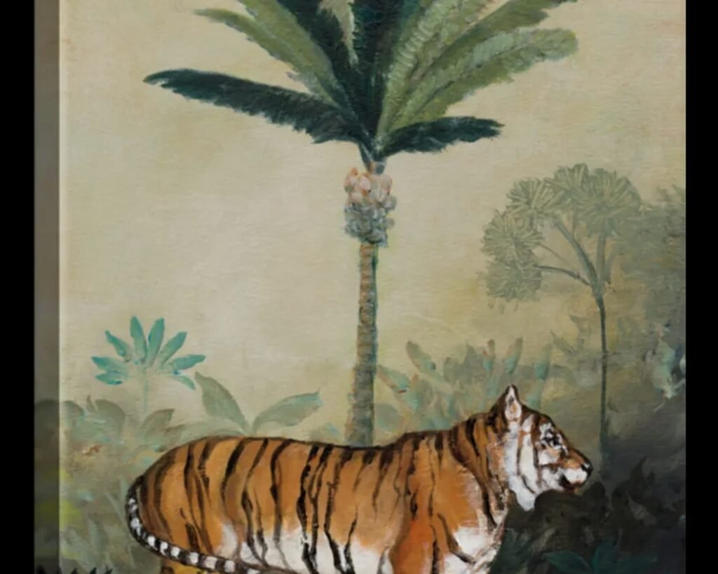
Watercolor prints are… okay this is gonna sound weird but they’re tricky. When they’re done well, they’re absolutely gorgeous and add this soft artistic element. When they’re done badly, they look like someone’s Etsy shop from 2012. You want watercolors that have bold color choices and confident brushstrokes, not those wishy-washy pastel things that look like they’re trying too hard to match your throw pillows.
Size Matters More Than You Think
I made this mistake in my first apartment where I bought these tiny 8×10 animal prints and hung them on this massive empty wall and they just looked… sad. Like little postage stamps floating in space.
Here’s what actually works:
For a statement wall, you want to go big. I’m talking 24×36 minimum, or even larger if you’ve got the space. A single oversized elephant or lion print can anchor an entire room. I did a 40×60 zebra print behind a client’s sofa and it completely transformed the space.
If you’re doing a gallery wall situation, mix your sizes but keep them in the same family. Like don’t put a 5×7 next to a 24×36 – it’ll look accidental. I usually stick to three sizes max: large (16×20 or bigger), medium (11×14), and small (8×10). And honestly the small ones should be used sparingly.
The Gallery Wall Layout That Actually Works
Oh and another thing about gallery walls – I see people stress about this constantly. They buy all these prints and then stand there with a tape measure for three hours trying to figure out spacing.
Here’s the cheat: lay everything out on the floor first. I’m serious, just clear your floor and arrange the prints until it looks balanced. Take a photo with your phone. THEN start measuring and hanging. I use painter’s tape to mark where frames go on the wall before I start hammering nails everywhere.
For safari prints specifically, I like doing an asymmetrical layout because it feels more organic and less “corporate office waiting room.” Group your elephants, giraffes, and lions in a cluster that’s weighted to one side, with maybe one piece breaking away. It creates visual interest without looking chaotic.
Color Schemes That Don’t Look Like A Zoo Gift Shop
This is crucial. You can absolutely do colorful safari art without your room looking like a kindergarten classroom.
Black and white photography is the safest bet and honestly the most sophisticated. Dramatic shadows, high contrast – it works in literally any decor style. I’ve used B&W safari prints in everything from industrial lofts to traditional homes. The zebra is obviously perfect for this since they’re already black and white, but elephants and rhinos photograph beautifully in monochrome too.
Sepia or warm tones give you that vintage safari expedition vibe. Think old explorer journals and leather-bound books. These work really well if you’ve got warm wood furniture or cognac leather pieces. I paired sepia-toned wildlife prints with a tan leather sofa last year and the client’s husband (who initially hated the idea) ended up loving it.
Bold colors can work but you gotta commit. I’m talking rich jewel tones – deep teals, burnt oranges, earthy terracottas. Not bright primary colors unless you’re specifically going for a kids’ room. I found these prints that had elephants against a rust-colored sunset sky and paired them with navy blue accents and lots of brass – it was stunning.
Framing Without Going Broke
Okay so funny story, I used to think you had to spend a fortune on custom framing. Then I discovered that IKEA frames in the right sizes are like… completely fine? Especially their Ribba frames in black or white. Nobody is gonna examine your frames that closely if the art itself is good.
That said, if you’re doing a really large statement piece, spring for the nicer frame. The difference between a cheap 30×40 frame and a quality one is noticeable because the piece is so big. But for smaller gallery wall pieces? Save your money.
Frame colors that work:
- Black frames are classic and make colors pop
- Natural wood frames add warmth and work great with earthy safari tones
- White frames keep things light and modern
- Gold or brass frames if you want to get fancy – these look amazing with B&W photography
The one rule I never break: keep your frame style consistent within a gallery wall. All black, all wood, all white – whatever. Mixing frame colors on the same wall makes it look unintentional and messy.
Matting: Yes or No?
I go back and forth on this. Mats add a more gallery-like, finished look and they’re especially good if your print is kinda small for your frame (you can use the mat to fill the space). But they also add cost and sometimes they create too much visual distance between pieces in a gallery wall.
My general rule: use mats for formal spaces like dining rooms or home offices. Skip them for more casual spaces like bedrooms or family rooms where you want the art to feel more approachable.
Where To Actually Buy Safari Prints
Alright so I’ve tested a LOT of sources because my client canceled last Tuesday so I spent an hour comparing print shops online instead of doing literally anything productive.
Etsy is hit or miss. There are some incredibly talented wildlife photographers and artists on there, but you gotta dig. Look for shops that show the actual print quality, not just digital mockups. Read reviews. Check if they offer different sizes. I’ve found some absolute gems but also received some disasters.
Print-on-demand sites like Society6 or Redbubble let you choose from tons of artists and they handle printing and framing. Quality is usually decent but not amazing. Good for trying out a style before you commit to something more expensive.
Photography sites – if you want REALLY high-quality stuff, look for actual wildlife photographers who sell prints. The prices are higher but the quality is noticeably better. I’m talking museum-grade printing, proper color calibration, the whole thing.
Home decor retailers like West Elm, CB2, or even HomeGoods sometimes have safari prints. The advantage is you can see them in person. The disadvantage is everyone else can too, so your art might not feel unique.
Wait I forgot to mention – if you’re on a tight budget, you can literally just buy the digital file from some Etsy sellers and print it yourself at a local print shop. It’s way cheaper than buying a finished print. Just make sure you’re getting a high-resolution file (300 DPI minimum for printing).
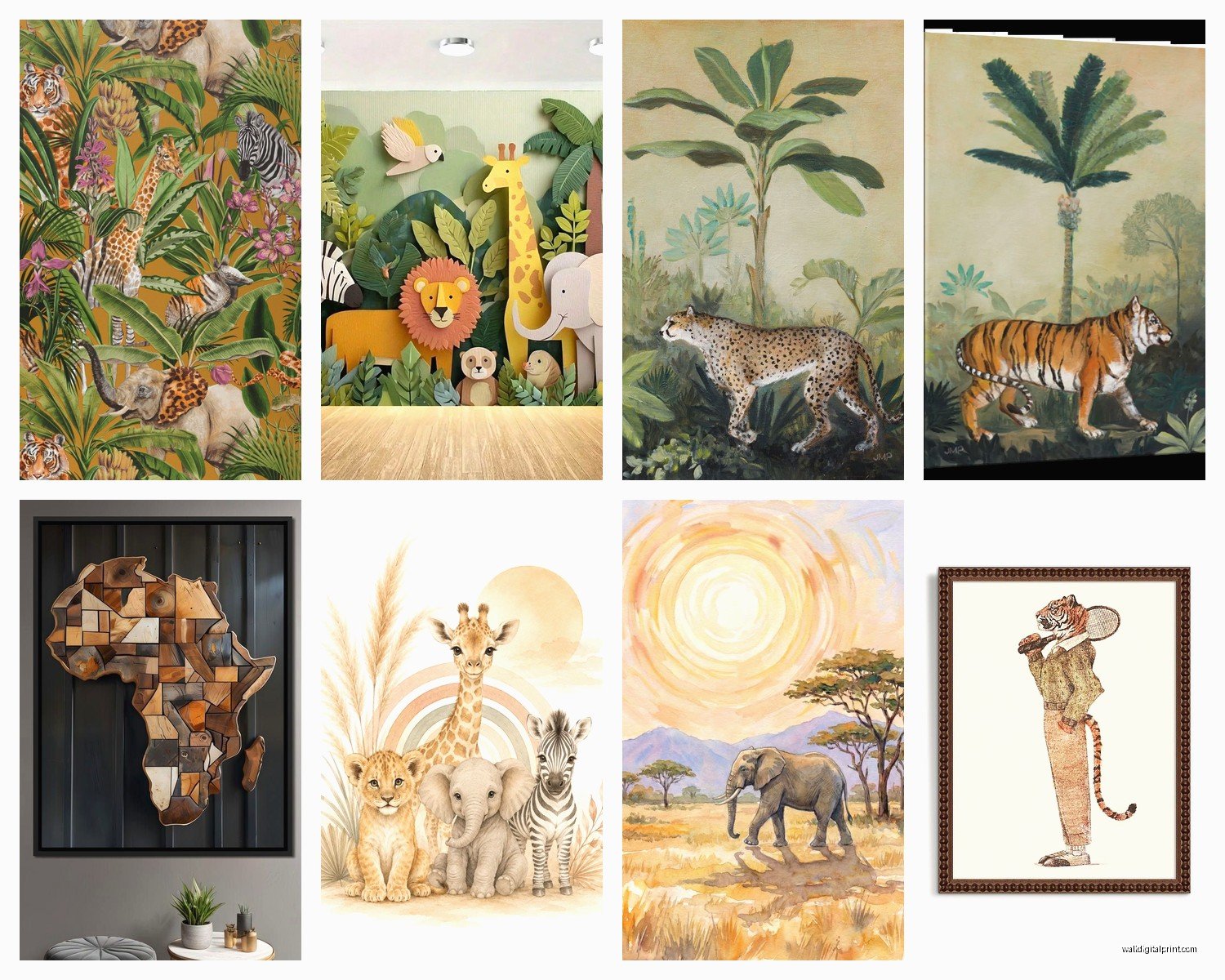
Mixing Animals: What Works Together
You don’t have to stick to one animal, obviously, but there’s an art to mixing them without it looking random.
I usually group by:
Geography/habitat – savanna animals together (lions, elephants, giraffes, zebras). Don’t randomly throw in a gorilla with your zebras because they don’t live in the same ecosystem and it’ll bug anyone who knows anything about wildlife.
Color palette – this matters more than the actual animals sometimes. Three different animals in the same color scheme will look more cohesive than three elephants in different styles and colors.
Style consistency – all photographs, all illustrations, all watercolors. Mixing styles can work if you’re really deliberate about it, but it’s harder to pull off.
My cat just knocked over my coffee which is perfect timing because I need a break anyway.
Styling The Rest Of The Room
Okay so you’ve got your amazing safari prints hung up, now what? The rest of the room matters because you don’t want the art to feel disconnected.
Textiles are your friend. I’m obsessed with mixing in natural textures – linen, jute, cotton. A chunky jute rug under your sofa, linen curtains, some woven baskets. It creates that organic safari-inspired feel without being literal about it.
Plants obviously. You can’t do safari art without some substantial greenery. I’m talking big leafy plants – monstera, fiddle leaf fig, bird of paradise. Not those sad little succulents (though I love succulents in other contexts). You want plants that have presence and create that lush, wild feeling.
Wood tones – warm woods work better than cool-toned woods with safari themes. Think walnut, teak, acacia. That mid-century modern vibe pairs surprisingly well with wildlife art.
Metallics – brass and bronze over chrome and silver. Gold accents can look really sophisticated with safari prints, especially if you’ve got some in your frame or in table lamps.
This is gonna sound weird but I’ve noticed that safari art works better with solid-colored furniture than busy patterns. Let the animal prints be your pattern. Your sofa should probably be a solid color – neutrals work great, or you can go bold with a deep color like navy or forest green.
What NOT To Do
Don’t buy those matching sets of four identical frames with four different animals all posed the same way. It’s too matchy-matchy and feels mass-produced.
Don’t go overboard on the theme. You don’t need elephant bookends AND a giraffe lamp AND zebra-print pillows. The art should be enough. Keep the accessories subtle.
Don’t hang everything at the same height if you’re doing multiple pieces. Vary the heights for visual interest, but keep the center point around eye level (roughly 57-60 inches from the floor to the center of the art).
Lighting Makes A Huge Difference
I cannot stress this enough – you can have the most beautiful safari print in the world and if your lighting sucks, nobody will appreciate it.
Picture lights are amazing if you’ve got a statement piece. Those little brass or black lights that mount above the frame and shine down? They add drama and make the art look way more expensive than it probably was.
If picture lights aren’t your thing, make sure you’ve got good ambient lighting in the room. I usually add a floor lamp near gallery walls or use track lighting that can be angled toward the art.
Natural light is tricky because you don’t want direct sunlight fading your prints, but you DO want enough light to see them properly. If you’ve got a sun-blasted wall, maybe hang your prints somewhere else or invest in UV-protective glass for the frames.
The One Thing I Wish Someone Had Told Me
Start with one really good piece instead of buying a bunch of mediocre ones. I wasted so much money in the beginning buying cheap prints that I ended up replacing anyway.
If you can only afford one print right now, buy the best quality version of your favorite animal in the size you actually need. You can always add more later, but that one piece needs to be something you genuinely love and that’s high enough quality to anchor your space.
And honestly? Safari art is one of those things where you can totally mix high and low. Splurge on one incredible wildlife photograph, then fill in around it with more affordable illustrated prints. Nobody’s gonna know which one cost more if you frame them all nicely and arrange them well.
Oh and another thing – these prints work in way more rooms than you’d think. Obviously living rooms and bedrooms, but I’ve done safari art in home offices, bathrooms (a elephant print in a powder room is unexpectedly chic), and even laundry rooms. Don’t limit yourself to “main” rooms.
Just commit to the vibe, get the sizing right, and make sure the quality is there. That’s really all you need to make it work.