Wall Art Guide, Wall Art Tutoriels
Feminist Wall Art: Women’s Rights Empowerment Decor
Jul
So I’ve been completely obsessed with feminist wall art lately and honestly it started because a client wanted to redo her home office and she was like “I want something that makes me feel powerful when I’m on Zoom calls” and that sent me down this whole rabbit hole of women’s rights decor that’s actually… good? Not cheesy?
The Typography Stuff That Actually Works
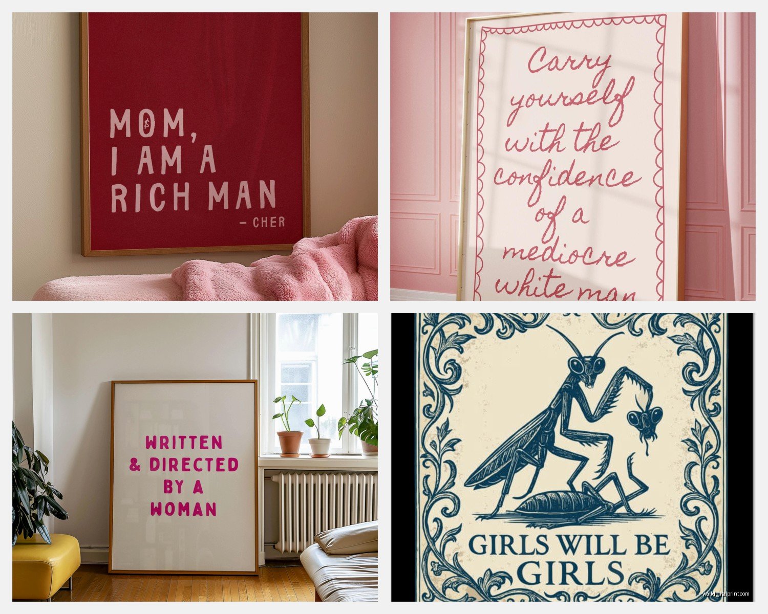
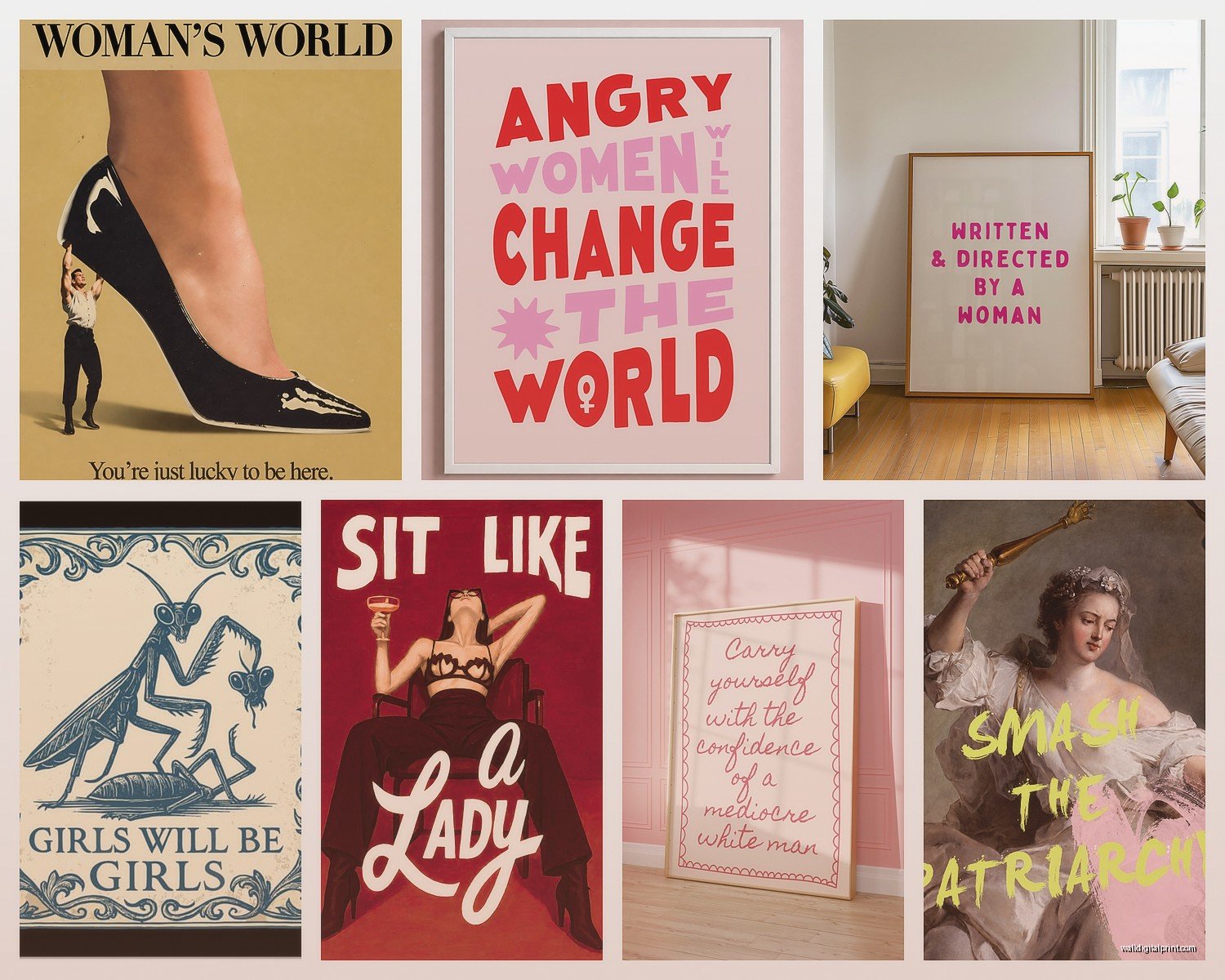
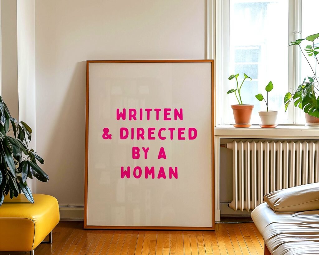
Okay so the easiest entry point is typography prints. I’m talking those quote-based pieces but you gotta be selective because some of them are SO cringey. The ones that work best are either super minimalist or they go full vintage poster vibes. I found this print that says “Well-Behaved Women Seldom Make History” in like a 1920s font and it’s chef’s kiss because it references the actual historical context instead of just being a generic girl boss thing.
What I’ve learned is you want to avoid anything that looks like it came from a 2015 Pinterest board. The “Nevertheless She Persisted” stuff can work but only if the design is really sophisticated. I got one for my living room that uses this gorgeous serif font with gold foil accents and it feels more like art than a slogan tee on your wall.
The size matters more than you’d think. I made the mistake of ordering an 8×10 for above a dresser and it just looked sad and lost. Go bigger – at least 16×20 for most walls, or if you’re doing a gallery wall situation you can mix smaller ones but you need like… purpose behind it.
Where to Actually Find Good Ones
Etsy is obvious but you gotta dig. Search terms that work better: “suffragette poster,” “feminist vintage print,” “women’s rights historical art” instead of just “feminist wall art” which brings up a lot of the mass-produced stuff. There’s this seller called… wait I have it bookmarked… okay I can’t find it right now but basically look for shops that do custom sizing and use archival paper. That’s usually a sign they’re taking it seriously.
Society6 has some gems if you filter by independent artists. The algorithm is gonna show you the basic stuff first but scroll down. I found this incredible illustration of RBG that’s styled like those old political campaign posters and it’s in my office now.
Portrait Art and Why It Gets Tricky
Alright so portraits of feminist icons – this is where people either nail it or it looks like a college dorm. The difference is in the artistic interpretation. A straight-up photo print of Frida Kahlo can work if it’s really high quality and large scale, but I’m more into illustrated or painted versions that bring something new to it.
I saw this series at a gallery last year that did women activists in the style of Renaissance paintings and I literally bought three of them. They’re conversation pieces because people don’t immediately recognize who they are until they get closer and it creates this whole thing. Way more interesting than another Rosie the Riveter print, you know?
Mixed media portraits are having a moment too. There’s artists doing collage work with newspaper clippings about women’s rights combined with painted portraits and it’s… it’s a lot visually but in a good way if your space can handle it. My sister has one in her dining room and initially I thought it would be too busy but it actually anchors the whole room.
The Color Palette Problem
Here’s something nobody tells you – most feminist wall art comes in this purple and pink palette and while I love those colors, they don’t work with every space. I had a client with a very neutral, earth-toned living room and she wanted women’s empowerment art but everything clashed.
Solution: look for black and white photography or prints, or seek out pieces that use unexpected colors. There’s this print I found of the women’s march that’s done in blues and greens and it’s stunning. Or go for natural tones – I’ve seen protest signs recreated in sepia that feel timeless instead of trendy.
If you DO love the pink and purple, commit to it. Make it a whole accent wall situation. Half-measure doesn’t work with bold colors.
Vintage Posters and Reproductions
Oh and another thing – vintage suffragette posters are having a resurgence and I’m here for it. The original graphic design from the 1900s-1920s women’s rights movement is genuinely beautiful. Strong geometric shapes, bold lettering, the colors have this faded quality that works in modern spaces.
You can find reproductions pretty easily. The Library of Congress has a bunch you can download for free and print yourself if you have access to a good printer, or there’s companies that specialize in museum-quality reproductions. I got one from a museum shop that’s a 1915 “Votes for Women” poster and it cost like $45 framed which is honestly a steal.
The cool thing about vintage pieces is they don’t feel preachy? They’re historical documents that also happen to be gorgeous design. I put one in a client’s entryway and her conservative mother-in-law complimented it not realizing it was feminist propaganda from 1917 and we all just… let that sit there.
Framing Makes or Breaks It
Okay this is gonna sound weird but I’ve spent an embarrassing amount of money on frames. The art itself might be $30 but if you put it in a cheap frame it looks like $5. For feminist art especially, because some of it already walks the line of looking mass-produced, a good frame elevates it.
Simple black or white frames work for most things. Wood frames if you’re going for that vintage vibe. I’m obsessed with floating frames right now – where there’s space between the art and the frame edge – because it makes even prints look more intentional.
Custom framing is expensive but sometimes worth it. I had this panoramic print of women’s march photos that was an weird size and getting it custom framed cost $180 but now it’s the centerpiece of my hallway and I don’t regret it. You can also do it yourself with frame kits from craft stores if you’re patient, which I’m not, so.
Abstract and Symbolic Feminist Art
Not everything needs to be literal. Actually some of my favorite pieces are abstract works by women artists that deal with feminist themes without spelling it out. There’s this painting I have that’s just bold red brushstrokes but the artist statement talks about anger and women reclaiming rage and like… you don’t need to explain that to guests but *you* know.
Symbolic imagery works too. Venus symbols, fists, chains breaking, female forms that aren’t sexualized. I found this line drawing of a woman’s silhouette filled with flowers and thorns that’s subtle but once you think about the metaphor it’s pretty powerful.
The benefit of abstract stuff is it works in literally any room. You can put it in a bedroom, living room, office, whatever. It doesn’t announce itself the way a protest sign print does, which sometimes is what you want.
Supporting Women Artists
Wait I forgot to mention – if you’re gonna do feminist wall art, maybe buy from women artists? Just a thought. There’s something weird about buying mass-produced feminist stuff from Amazon where you don’t know who’s profiting.
I try to buy directly from artists when possible. Instagram is actually great for this – search hashtags like #feministartist or #womenartists and you’ll find people selling original work or prints. It costs more usually but you’re getting something more unique and your money goes to an actual person.
Art fairs and local galleries are good too. I got this incredible mixed media piece at a women’s art collective show for $200 and it’s my most complimented piece of art. The artist signed the back and wrote a little note about what inspired it and that personal touch matters.
The Gallery Wall Approach
Alright so if you can’t commit to one large piece, gallery walls are your friend. I did one in my client’s office that mixed feminist quotes, portraits of women scientists, vintage ads that are unintentionally hilarious now, and some abstract pieces by women artists. The variety keeps it interesting.
The trick is having a unifying element. For that wall it was black frames and a consistent color palette even though the subjects varied. I’ve also seen gallery walls that are all the same size frames in different colors, or all different sizes but the same frame style.
Layout matters – I use painter’s tape to map it out on the wall first because I’ve definitely screwed this up before. My cat knocked over my coffee while I was doing this last week and it was a whole thing… anyway. There’s also apps that let you visualize it but I’m old school.
Start with your largest piece in the center or slightly off-center, then build around it. Keep 2-3 inches between frames consistently. Level everything properly because even slightly crooked frames will make the whole thing look amateur.
Mixing Eras and Styles
Don’t be afraid to mix vintage suffragette stuff with modern feminist art. I have a wall that has a 1920s poster next to a contemporary illustration of Malala and they work together because the framing and spacing creates cohesion.
You can also mix mediums – photographs with paintings with prints with embroidery. I saw someone on Instagram who included framed protest pins and patches in their gallery wall and it added this cool dimensional element.
Text-Based Art Beyond Quotes
Okay so beyond the typical quotes, there’s text-based art that’s more interesting. Blackout poetry using pages from sexist vintage books. Lists of women’s achievements in a given year. Timelines of women’s rights milestones designed like infographics but artistic.
I found this piece that’s just the text of the 19th Amendment in beautiful calligraphy and it’s both decorative and meaningful. Or there’s art that uses text from women’s speeches – I’ve seen pieces using excerpts from Sojourner Truth, Gloria Steinem, Audre Lorde that are designed more like concrete poetry than standard quotes.
The legal text stuff is having a moment too. Roe v. Wade decision excerpts, Title IX language, Equal Pay Act text. It’s a statement without being preachy because it’s literally just… legal documents made beautiful.
DIY Options That Don’t Look DIY
If you’re on a budget, there’s ways to do this yourself that don’t look crafty in a bad way. Print high-resolution images from free sources like Unsplash or museum archives, get them printed at a professional print shop (not your home printer), use quality frames.
I made my own protest sign art using photos I took at marches, edited them in Lightroom to look more artistic, printed them large format at Staples for like $8 each, framed them in simple black frames. Total cost maybe $50 for three large pieces and people think I bought them from a gallery.
You can also buy digital downloads on Etsy for $5-10 and print them yourself. Just make sure the resolution is high enough for the size you want – at least 300 DPI.
Placement and Room Considerations
Where you put this stuff matters. Home office is obvious – it’s motivating and personal. I have a bunch in mine and it genuinely does make me feel more focused.
Living room works if it fits your aesthetic. I wouldn’t do like, graphic protest imagery if you have a very traditional formal living room, but vintage posters or abstract pieces can work anywhere.
Bedroom is personal preference. Some people want empowering art where they get ready in the morning, others want their bedroom to be more restful. I have one piece in my bedroom – a subtle line drawing – and it’s enough.
Bathrooms are underrated for art placement and a small feminist print in a powder room is a fun surprise for guests.
The one place I’d avoid is kids’ rooms unless it’s age-appropriate and they’re into it. Putting adult feminist themes in a toddler’s room feels more about you than them, you know?
Lighting Actually Matters
Something I learned the hard way – proper lighting makes art look a million times better. If you have overhead lighting that creates glare on glass frames, it’s gonna look bad no matter how good the art is.
Picture lights are pricey but worth it for special pieces. I installed one above my RBG portrait and it looks museum-quality now. Track lighting or strategically placed lamps work too.
Natural light is tricky because it can fade art over time. UV-protective glass helps if you’re putting something valuable in a sunny spot. Or just rotate your art seasonally if fading becomes an issue.
Okay I think that covers most of what I’ve figured out through trial and error and spending too much money on art I didn’t need but definitely wanted. The main thing is buy what actually speaks to you, not what you think you’re supposed to have, and invest in decent framing because it makes all the difference.