Wall Art Guide, Wall Art Tutoriels
Sweet Dreams Wall Art: Bedroom Goodnight Nursery Decor
Jul
So I’ve been setting up nursery wall art for clients for like three years now and honestly the whole “sweet dreams” theme is probably the most requested thing after safari animals. Let me just dump everything I know because I literally just finished a consultation about this yesterday.
Why This Theme Actually Works
Okay so the sweet dreams aesthetic is basically moons, stars, clouds, sleepy animals, and soft typography that says stuff like “goodnight” or “sleep tight” or whatever. It sounds super basic but here’s why it’s actually genius for a nursery—it’s gender neutral so you’re not locked into anything, it grows with the kid better than like cartoon characters, and you can mix it with literally any color scheme. I had a client do it in navy and gold, another did blush pink and gray, and my sister did it in sage green and cream. All worked.
The key thing nobody tells you is that this theme can look either really expensive and curated OR really cheap and cluttered depending on how you approach it. It’s all about restraint which I know sounds annoying but wait lemme explain.
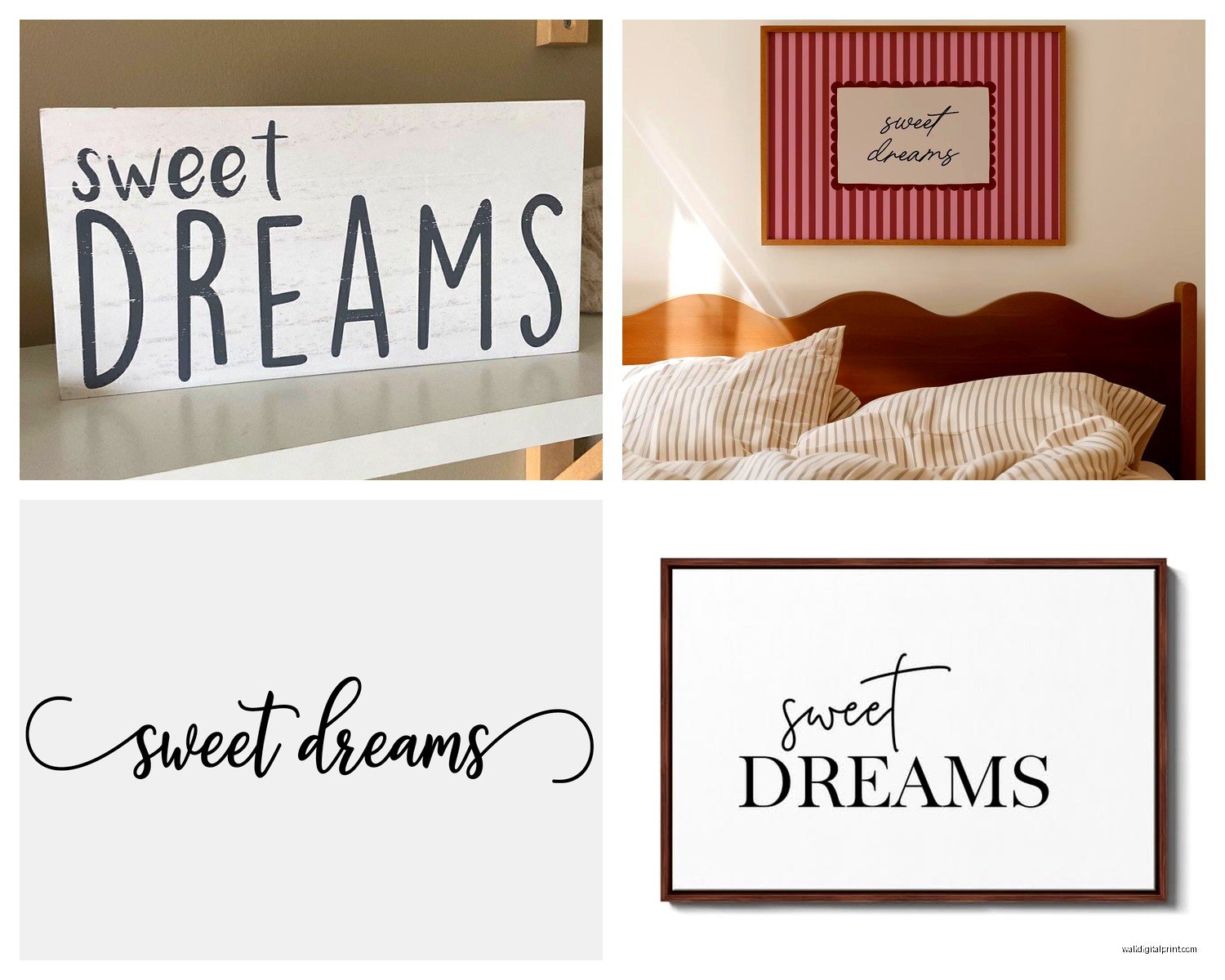
What Actually Looks Good on the Wall
You’re gonna see a million options on Etsy and Amazon and those print-on-demand sites. Here’s what I’ve learned from actually hanging this stuff:
Print Quality Matters More Than You Think
Digital downloads are tempting because they’re cheap but you gotta get them printed somewhere decent. I usually send clients to a local print shop or even Costco photo center works fine honestly. The resolution needs to be at least 300 DPI or it’ll look fuzzy from across the room. I learned this the hard way when a client printed something themselves on their home printer and it looked…not great.
For sweet dreams stuff specifically look for prints that have:
- Simple line drawings rather than super detailed illustrations
- Limited color palettes (3-4 colors max)
- Good contrast so the image doesn’t just disappear into the wall
- Typography that’s actually readable not just decorative squiggles
The Three-Piece Rule
This is gonna sound weirdly specific but three pieces almost always looks better than one big piece or five small pieces. I don’t know why it just does. For a sweet dreams theme I usually do:
One moon or star piece as the focal point, one with text like “goodnight” or “sweet dreams,” and one with a sleepy animal or cloud. Arrange them in a triangle formation rather than a straight line because your eye moves around the composition better.
My cat literally just knocked over my coffee while I’m writing this but anyway—
Size Guidelines Nobody Mentions
Over the crib (or where the crib will be) you want something in the 16×20 to 24×36 range. Bigger than that starts feeling overwhelming for a small nursery. If you’re doing a gallery wall situation the individual pieces can be smaller like 8×10 or 11×14 but then you need at least three of them.
I see people put these tiny 5×7 prints on a huge wall and it just looks lost. Scale is everything and I know that sounds like design school talk but it’s true.
Frame Choices That Don’t Look Basic
Okay so frames. You can go cheap here but you gotta be strategic about it. IKEA Ribba frames are fine actually—I use them all the time. The trick is getting them all in the same finish. Don’t mix black and white frames in a nursery it looks too busy.
For sweet dreams themes I usually recommend:
White frames if the walls are gray or any color. Natural wood frames if you want it to feel more organic and less crisp. Black frames only if the room has other black elements like a crib or changing table otherwise it looks random.
There’s this thing I do with IKEA frames where I swap out the mat for a custom cut one from a craft store in a soft color that picks up something from the print. It makes the $7 frame look way more expensive and takes like five minutes.
Floating Frames for Texture
Oh and another thing—floating frames (where you can see the paper edge) work really well for this theme because it adds dimension. I got some from Framebridge for a client’s nursery last month and they looked so good but they’re pricey. There are cheaper versions on Amazon that work fine if you’re not doing like a magazine photoshoot.
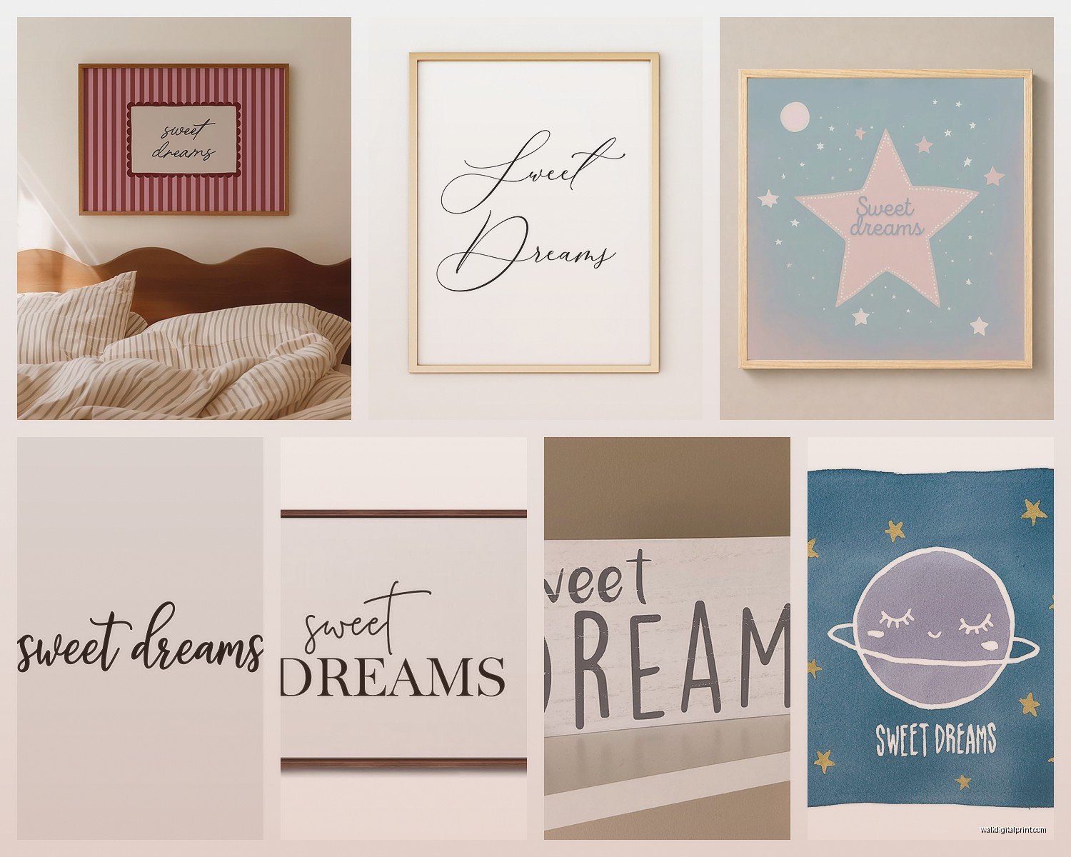
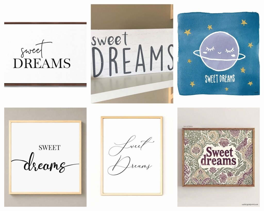
Color Combinations I’ve Actually Used
Let me just list what I’ve done that turned out really well:
- Charcoal gray + mustard yellow + white (modern and unexpected)
- Navy + white + metallic gold accents (classic but not boring)
- Sage green + cream + soft peach (very trendy right now)
- Dusty blue + gray + white (safe choice that always works)
- Terracotta + cream + olive green (if you want earthy vibes)
The metallic thing is tricky with prints—you can’t actually print metallic gold obviously so you either need foil prints which are expensive or you add metallic elements through the frames or other decor. Just something to know.
Where to Actually Buy This Stuff
Real talk: I source from a mix of places depending on budget.
Etsy is great for digital downloads and you’re supporting actual artists. Search for “moon nursery print” or “sweet dreams wall art” and filter by best selling. Read the reviews to make sure the files are actually high quality. I’ve gotten burned by pixelated downloads before.
Minted has really nice printed options that come framed. They’re more expensive but the quality is consistently good. They do sales pretty often so wait for like 20% off.
Project Nursery and Pottery Barn Kids if you want the whole curated look and don’t wanna think about it. You’re paying for convenience but sometimes that’s worth it.
Amazon has pre-framed sets that are honestly fine for temporary solutions or if budget is super tight. Just manage expectations—they’re not heirloom quality but they’ll look good in photos and last until the kid redecorates at age 5.
The Digital Download Route
If you go digital downloads here’s the actual process: Buy the files (usually PDF or JPG), upload them to a print service, choose your size and paper type (I like matte finish for nurseries), pick them up or have them shipped, then frame them yourself.
It sounds like more work but you can get three 16×20 prints for like $40 total this way versus $150+ for pre-framed. Time versus money situation.
Hanging Without Losing Your Mind
Okay so actually getting these on the wall. You need:
- A level (use your phone app it’s fine)
- Painter’s tape or those 3M Command strips
- Pencil for marking
- Measuring tape
The center of your main piece should be at eye level which is roughly 57-60 inches from the floor. But in a nursery you’re often hanging over furniture so the rules change. Over a crib I do about 6-8 inches above the crib rail. Over a dresser or changing table same thing.
Here’s my weird trick that actually works—cut out paper templates the size of your frames and tape them to the wall first. Move them around until it looks right THEN measure and mark for real. Saves so many nail holes.
Wait I forgot to mention—never hang anything heavy directly over where the baby sleeps. Use lightweight frames and secure hanging hardware. Safety first even though it sounds obvious.
Gallery Wall Layout
For a three-piece gallery wall I usually do an asymmetrical triangle. Put the largest piece slightly off-center at eye level, then flank it with the two smaller pieces—one higher and to the left, one lower and to the right. Keep about 2-3 inches between frames.
Or you can do a straight horizontal line which is easier to execute but looks more formal. Depends on your vibe.
What Doesn’t Work (Learned This The Hard Way)
Things I’ve seen fail:
Too many words. Like five different text prints all saying “sleep tight” and “dream big” and whatever else just becomes visual noise. Pick one maybe two text pieces max.
Mixing illustration styles. A watercolor moon with a geometric star with a realistic photograph of clouds looks confused. Stick to one artistic style.
Going too literal. You don’t need a print that says “nursery” in a nursery. We know where we are.
Ignoring the rest of the room. If you’ve got a really busy crib sheet and patterned curtains, keep the wall art simple. If the room is minimal, you can go bolder with the art.
I had a client once who wanted to use like eight different prints and I had to gently talk her down to four. It’s hard because everything’s cute but more isn’t always better.
Making It Feel Personal
Okay so this is where you can get creative beyond just buying standard prints. Mix in:
- A custom star map from the baby’s birth date
- The baby’s name in coordinating typography
- A meaningful quote that’s not the same one everyone uses
- Vintage-style illustrations if that matches your aesthetic
I did a nursery last year where we included a small framed piece with the lyrics from the lullaby the mom’s grandmother used to sing. It made the whole sweet dreams theme feel specific to their family instead of just Pinterest generic.
DIY Elements That Don’t Look DIY
If you’re crafty or wanna save money you can make some of this stuff. I’m not super crafty myself but I’ve seen clients do:
Simple moon phase paintings using a round sponge and acrylic paint on canvas. Looks impressive, takes like 30 minutes. Or print out a template, trace it onto nice watercolor paper, paint it with soft colors, and frame it. The handmade quality actually adds to the sweet dreams vibe.
Just don’t go overboard with the handmade stuff unless you’re actually good at it. One handmade piece mixed with professional prints looks intentional. All handmade can look…well it depends on your skill level honestly.
Lighting Considerations
This is something people forget—how the art looks in different lighting. Sweet dreams themes often have a lot of white or light colors so they can wash out in bright sunlight. If the nursery has big windows consider using non-glare glass in the frames or positioning the art on a wall that doesn’t get direct sun.
Also these pieces look really good with a small picture light or even those battery-operated puck lights stuck to the wall above them. Creates a nice ambiance for nighttime which fits the whole sleepy theme.
When to Switch It Up
Real talk this theme works best from newborn to about age 3 or 4. After that kids start having opinions and wanting dinosaurs or unicorns or whatever. So don’t stress too much about making it perfect for the long term. It just needs to work for the baby and toddler years.
I always tell clients to buy frames they can reuse and keep the art simple enough that swapping in new prints later is easy. The sweet dreams stuff can move to a playroom or you can save it for a future kid or honestly just donate it.
The whole point is creating a calm space that helps with sleep routines and looks nice when you’re in there at 2am for the fifth time that night. If it does that job you’re good.