Wall Art Guide, Wall Art Tutoriels
Versace Wall Art: Luxury Fashion Brand Designer Decor
Jul
So I’ve been obsessing over Versace wall art lately and honestly it started because a client wanted to do this whole maximalist thing in her penthouse and I went down this rabbit hole of designer decor that I still haven’t climbed out of.
Why Versace Wall Art Actually Works (When It Shouldn’t)
Okay so here’s the thing about Versace pieces on your walls – they’re loud, they’re expensive, and they absolutely shouldn’t work in most spaces but somehow they DO when you get the formula right. I’ve hung probably like 15 different Versace prints and canvases in various homes over the past two years and the success rate is maybe 60%? Which sounds bad but for statement art that’s actually pretty good.
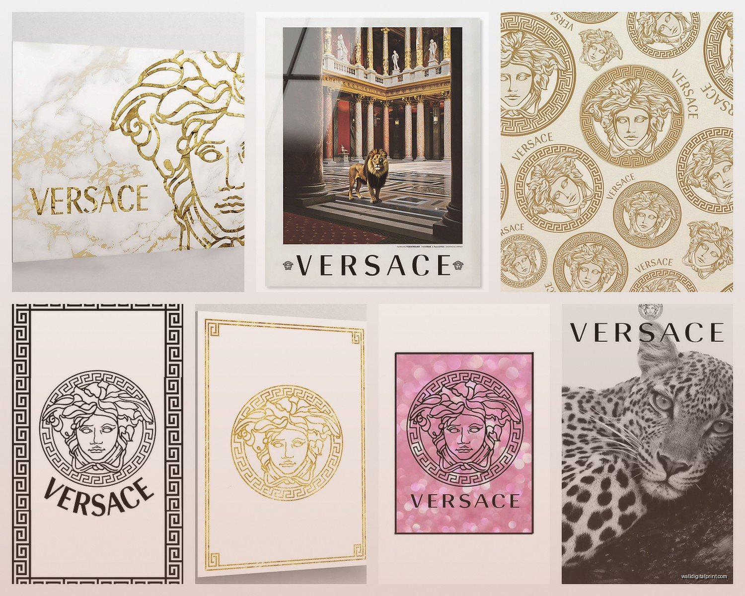
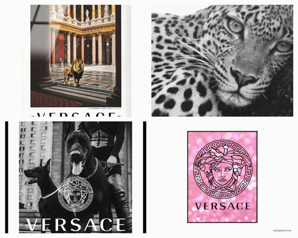
The signature Medusa head pieces are obviously the most recognizable. You can find official licensed prints ranging from $200 to like $2000 depending on size and whether it’s just a print or actual canvas. The baroque pattern stuff with all the gold scrollwork and those ornate borders? That’s where people either absolutely nail it or create what I call a “hotel lobby disaster.”
What Actually Looks Good vs What Looks Try-Hard
I’m gonna be real with you – the giant Medusa head in gold on black? It works in exactly three scenarios and I’ve tested this:
- Above a bar cart in a room that already has other metallic accents
- In a walk-in closet where you’re already going full glam
- As part of a gallery wall where it’s balanced by simpler pieces
Where it DOESN’T work is just slapped on a random beige wall in your living room. Trust me I tried this in my own apartment last year and my sister walked in and was like “are you okay?”
The baroque pattern prints are actually more versatile than you’d think. I found these amazing Versace-inspired canvas sets on Etsy – not official but the quality is surprisingly good – and they come in sets of three for around $180. The trick is getting ones where the pattern has some breathing room, not just solid busy-ness edge to edge.
Mixing Versace With Your Actual Life
This is where everyone gets nervous because like, how do you put luxury fashion brand art in a room where you also have your IKEA bookshelf and your dog’s bed? (My cat Miso literally scratched the corner of a $400 print once and I almost cried)
The answer is actually about creating intentional contrast. I did this room last month where we put a large Versace baroque print above a very minimal mid-century console and the juxtaposition was *chef’s kiss*. The console was walnut, super clean lines, and the ornate gold and cream Versace pattern above it made both pieces look more expensive.
Color Coordination That Doesn’t Make You Look Like A Versace Store
Okay so the classic Versace palette is black, gold, white, and those rich jewel tones. You don’t want to match everything exactly because then yeah you’re just living in a boutique. What I do:
Pull ONE accent color from the Versace piece and repeat it in like two other places max. So if your print has those signature teal-blue accents, maybe you have a throw pillow in that color and a small decorative object. That’s it. Don’t go buying a whole teal sofa.
The metallics are actually the easiest to work with. Gold in Versace art plays nice with brass, bronze, and even rose gold if you’re careful. I mixed a gold Medusa print with rose gold picture frames in my friend’s bedroom and it worked because we kept everything else super neutral – gray walls, white bedding, light wood floors.
Where To Actually Buy This Stuff
Official Versace Home collection pieces are gonna run you serious money. We’re talking $500-3000 for legitimate wall art from their home decor line. I’ve sourced these through luxury furniture retailers and honestly? Sometimes worth it if you’re doing a high-end space.
But let’s be real most people need alternatives. Here’s what I’ve found actually works:
Licensed prints on canvas – These are officially licensed but more affordable, usually $150-600 depending on size. The quality is solid and you’re not gonna have authenticity issues. I get these from specialty art retailers online.
Vintage Versace advertisement prints – This is actually my favorite hack. Original Versace fashion ads from the 90s and early 2000s framed as art? SO good. You can find these on eBay, Etsy, vintage poster sites for like $50-200 and they have that authentic luxury feel without being obvious.
High-quality reproductions – Controversial maybe but if you find a really good reproduction artist who does museum-quality printing, you can get the look for $100-300. Just don’t try to pass it off as real if you’re selling your house or whatever.
Oh and another thing – home goods stores like HomeGoods and TJ Maxx sometimes get licensed Versace home decor including wall art. It’s random and you gotta hunt but I’ve found pieces there for under $100 that were totally legitimate.
The Size Question Everyone Gets Wrong
People always go too small with statement art and then wonder why it looks weird. If you’re doing a Versace piece as your focal point, you need it to actually BE a focal point.
For above a sofa: minimum 40 inches wide, ideally closer to 60 inches
For above a bed: at least 2/3 the width of your headboard
For a gallery wall: the Versace piece should be one of the largest in the collection
I literally just measured this out in a client’s space yesterday – we initially tried a 24×36 Medusa print above her king bed and it looked like a postage stamp. Swapped it for a 48×60 and suddenly the whole room made sense.
Styling Around The Piece Without Overdoing It
This is gonna sound weird but I think of Versace wall art like wearing a statement necklace. You wouldn’t wear a statement necklace with statement earrings AND a bold hat AND a printed dress right? Same logic.
If your Versace piece is busy baroque patterns, keep your furniture pretty simple. Clean lines, solid colors, minimal decorative objects. Let the art be the “outfit” and everything else is just the simple black dress underneath.
If you went with something simpler like a monochrome Medusa head, you have more freedom to play with texture and pattern in your furniture and textiles. I did a room with a simple black and white geometric Versace print and we went crazy with a velvet tufted sofa and patterned rug because the art wasn’t competing.
Lighting Makes Or Breaks These Pieces
Okay so funny story – I hung this gorgeous gold baroque Versace canvas in a dining room and in natural daylight it looked amazing but at night with just overhead lighting it looked flat and honestly kinda cheap. We added two picture lights and the transformation was insane.
Versace art NEEDS proper lighting because:
- The metallic elements need light to catch and reflect
- The rich colors get muddy without good illumination
- The whole luxe vibe depends on the piece looking dimensional
I usually do either picture lights mounted above the frame or if that’s not possible, strategically placed track lighting or spotlights. Warm white bulbs, not cool white – you want that golden glow not harsh white light.
Different Versace Styles And Where They Actually Belong
The Medusa head stuff – bedrooms, closets, entryways, home offices. Anywhere you want that power statement energy.
Baroque patterns – dining rooms, living rooms, above mantels. These are your “entertaining spaces” pieces.
Fashion sketch style prints – these are more casual honestly, work great in dressing areas, creative studios, even bathrooms if you get the sizing right.
Abstract pieces with Versace branding – these are your gateway drug pieces for people nervous about going full Versace. They work in basically any room because they’re more subtle. I put one in a minimalist Scandinavian-style apartment once and it was just enough edge without disrupting the vibe.
The Gallery Wall Approach
Wait I forgot to mention this earlier but it’s actually super important – if you’re nervous about one big Versace statement piece, doing a gallery wall where Versace is just ONE element is way less risky.
I did this in my own hallway: three small Versace prints mixed with six other pieces including some black and white photography, a vintage fashion illustration, and abstract gold leaf art. The Versace pieces added that luxury touch without taking over.
The formula I use: 30% Versace or statement designer pieces, 70% complementary art that’s simpler. Mix sizes and frame styles but keep a consistent color story.
Framing Matters More Than You Think
You can’t just shove a Versace print in a cheap poster frame from Target I mean you CAN but it’s gonna look wrong. The framing needs to match the luxury level of the art itself.
For baroque patterns: ornate gold or black frames with some detail but not competing with the art
For Medusa heads: sleek modern frames, floating frames, or even no frame with wrapped canvas edges
For fashion sketches: simple black or white gallery frames
I usually spend $75-200 on custom framing for these pieces because it’s worth it. Michael’s and other craft stores do sales constantly – wait for 50% off custom framing and it becomes reasonable.
What Doesn’t Work And I Learned The Hard Way
Putting Versace art in rooms with too much other pattern. I tried this in a client’s guest room that had floral wallpaper and the Versace baroque print just… died. Everything was fighting for attention and nothing won.
Using fake gold frames with real Versace pieces – the quality difference is SO obvious and it cheapens the whole thing.
Hanging multiple large Versace pieces in the same sightline. One room, one major Versace moment. Maybe a smaller secondary piece if you’re careful but I’ve never seen three+ work.
Going full matchy-matchy with Versace branded everything. The art plus Versace throw pillows plus Versace inspired furniture is… a lot. Pick your battles.
The Investment Question
Is Versace wall art worth the investment compared to other art? Depends what you mean by investment honestly. It’s not gonna appreciate in value like actual fine art unless you’re getting rare vintage pieces or limited editions.
But as an investment in your space? If you genuinely love maximalist luxury aesthetic and you’re committed to that style, then yeah it’s worth spending $300-800 on a quality piece that’s gonna anchor your room design.
I always tell clients to buy the best quality they can afford rather than getting multiple cheaper pieces. One really good Versace canvas is better than three mediocre prints.
The middle ground I’ve found is mixing one investment piece with more affordable complementary art. So like a $600 official Versace baroque canvas as your centerpiece and then $50-100 supporting pieces from Etsy or home goods stores around it.
oh and if you’re renting definitely get canvas pieces not ones that need heavy mounting – you don’t wanna deal with filling massive wall holes when you move.
Just make sure whatever you get actually speaks to you and isn’t just because you think you SHOULD have designer art or whatever. I’ve seen too many people buy expensive pieces they don’t even really like because it seemed like the “right” choice and then they’re stuck with it. Your space should make you happy not anxious about whether you made the correct design decision.