Wall Art Guide, Wall Art Tutoriels
Fairy Wall Art: Magical Fantasy Woodland Creature Decor
Jul
So I’ve been deep in the fairy wall art rabbit hole lately because three different clients asked about it in the same week and honestly it’s become kind of my thing now. Let me just dump everything I know because there’s actually a method to making this work without your space looking like a six-year-old’s birthday party exploded.
Finding Pieces That Don’t Read as Childish
Okay so the biggest issue everyone runs into is that fairy art can skew really young really fast. You want magical but not juvenile, right? I spent like two hours last Thursday (my dog was sick so I was up anyway) comparing different artistic styles and here’s what actually works for adult spaces.
Look for pieces with muted color palettes first. Think deep forest greens, dusty rose, sage, maybe some gold or copper metallics. The super saturated rainbow glitter fairy stuff? That’s gonna read young no matter how you style it. I found this one print on Etsy from a seller who does watercolor fairies in mostly earth tones and grey-blues and it completely changed how I approach this theme.
The art style matters SO much. Realistic or semi-realistic interpretations work better in grown-up spaces. Like botanical illustration style fairies, or ones that look more like fine art paintings. There’s this artist who does fairies that look almost Pre-Raphaelite and those are chef’s kiss for sophisticated spaces.
Mixing Fairy Art with Other Elements
You can’t just slap fairy prints everywhere. Well you can but it’s gonna be a lot. What I do is treat fairy pieces as accent art within a broader woodland or nature theme. So maybe one statement fairy piece and then the rest is mushrooms, ferns, moths, moon phases, that kind of thing.
I did this gallery wall last month where we had one large fairy portrait as the centerpiece, then surrounded it with pressed botanical prints, a vintage-looking moon chart, and some abstract forest photography. The fairy element becomes this little magical surprise instead of the whole personality of the wall.
Size and Placement Strategy
This is gonna sound weird but I almost never recommend going huge with fairy art unless it’s really sophisticated. Medium-sized pieces (like 16×20 or 18×24) tend to work better because they feel intentional rather than overwhelming. Although I did see someone do a massive vintage-style fairy tapestry behind a bed and it worked because the style was so muted and artistic.
For placement think about sightlines. Fairy art works really well in spaces where you want a sense of whimsy but not necessarily as the first thing people see when they walk in. So like above a reading nook, in a hallway, bathroom, bedroom. I’m more careful about putting it in main living areas unless the whole vibe of the home is already leaning cottage-core or maximalist.
Framing Makes or Breaks It
Oh and another thing – the frame is doing like 40% of the work here. Cheap plastic frames will make even gorgeous fairy art look like a poster from a teen store. I always go for:
- Natural wood frames in medium to dark tones
- Ornate vintage-style gold or brass frames for a romantic look
- Simple black frames if the art itself is busy
- No frame at all for canvas prints with gallery wrapped edges
I picked up a bunch of thrifted frames last month and painted them this deep forest green and they’re perfect for fairy prints. Cost me maybe $4 per frame plus paint I already had.
The Woodland Creature Expansion Pack
So fairy art works way better when you build out a whole woodland creature ecosystem. This is where it gets fun because there are SO many options and you can really personalize it.
Foxes are having a moment and they pair beautifully with fairy themes. Deer and stags especially with those antlers give you that mystical forest vibe. Rabbits and hedgehogs keep things feeling whimsical. Owls add a magical element. I’m also seeing a lot of moths and butterflies which work as a bridge between fairy art and nature art.
Wait I forgot to mention – one of my favorite tricks is mixing illustrated creatures with photographic nature prints. So you might have a painted fairy, an illustrated fox, but then actual photographs of mushrooms or forests. It grounds the fantasy elements and makes the whole thing feel more curated.
Where to Actually Buy This Stuff
Etsy is obviously the goldmine for this. You can find independent artists doing really unique interpretations. I search for terms like “woodland fairy art print,” “cottagecore fairy,” “vintage fairy illustration,” or “botanical fairy.” The preview images will tell you immediately if it’s too childish or not.
Society6 and Redbubble have some good options too and the nice thing is you can get the same design in different formats. I’ve used them for clients who want like a print plus throw pillows in the same artwork.
For actual original art or higher-end prints, I’ve found amazing stuff on Saatchi Art and Artfinder. More expensive but if you want a statement piece it’s worth it. There’s this one artist on Artfinder who does mixed media fairy pieces with actual pressed flowers incorporated and they’re stunning.
Thrift stores and antique shops can be surprisingly good for vintage fairy prints or illustrations. I found a set of 1970s fairy book plates at an estate sale and had them professionally framed and they’re some of my favorite pieces.
Color Schemes That Actually Work
Okay so you gotta think about your existing color palette. Fairy art can work with a bunch of different schemes but you need to be intentional.
For a moody romantic vibe go with deep jewel tones. Think emerald green, deep plum, navy, burgundy, with touches of gold. Your fairy art should have similar depth. I just finished a bedroom with this scheme and we used fairy prints that had a lot of shadow and deep forest colors.
The cottagecore soft aesthetic uses a lot of creams, soft greens, blush pink, lavender. This is probably the easiest palette for fairy art because there’s tons available in these colors. Just watch that it doesn’t get too precious or overly sweet.
For something more modern you can actually do black and white or sepia-toned fairy art. Sounds counterintuitive but it can look really sophisticated. Pair it with natural wood, black metal, lots of green plants, and suddenly your fairy art reads as artistic rather than fantastical.
Lighting Considerations
This might seem minor but lighting changes everything with this type of art. Fairy themes benefit from warm, soft lighting. If you have harsh overhead lights it’s gonna make everything look flat and kind of cheap honestly.
I like to use:
- Picture lights above larger fairy pieces
- String lights nearby (but not like directly on the art, that’s too on-the-nose)
- Table lamps with warm bulbs
- Candles if it’s safe – the flickering light actually enhances the magical feeling
There’s also battery-operated picture lights now that you can stick right on frames and they’re surprisingly good for creating that gallery effect.
Building a Cohesive Gallery Wall
Alright so if you’re doing a gallery wall situation with fairy art, here’s my formula that works every time. Start with an odd number of pieces, 5 or 7 usually works best. Pick ONE fairy-specific piece as your focal point. Then build around it with complementary woodland elements.
My go-to mix is something like: one fairy print, two botanical prints (mushrooms or ferns work great), one moon or celestial piece, one forest scene or tree, and maybe one abstract piece that pulls in your color palette. Sometimes I throw in a small mirror or a dimensional element like a wooden cutout.
Layout-wise I either do a structured grid which feels more modern and intentional, or an organic salon-style layout which feels more whimsical and collected-over-time. For fairy themes I actually lean toward the salon style because it reinforces that magical forest found-treasures vibe.
The Scale Problem Nobody Talks About
Okay so funny story, I did a whole gallery wall for a client last year and didn’t pay attention to the scale of the actual subjects in the art and it looked completely off. Like we had this tiny delicate fairy next to a massive close-up of a mushroom and it just felt wrong.
Try to keep the scale of subjects somewhat consistent. If your fairy is small and distant in the composition, pair it with other pieces that have similar perspective. If it’s a close-up portrait of a fairy face, match that intimacy with other close-up nature shots or creature portraits.
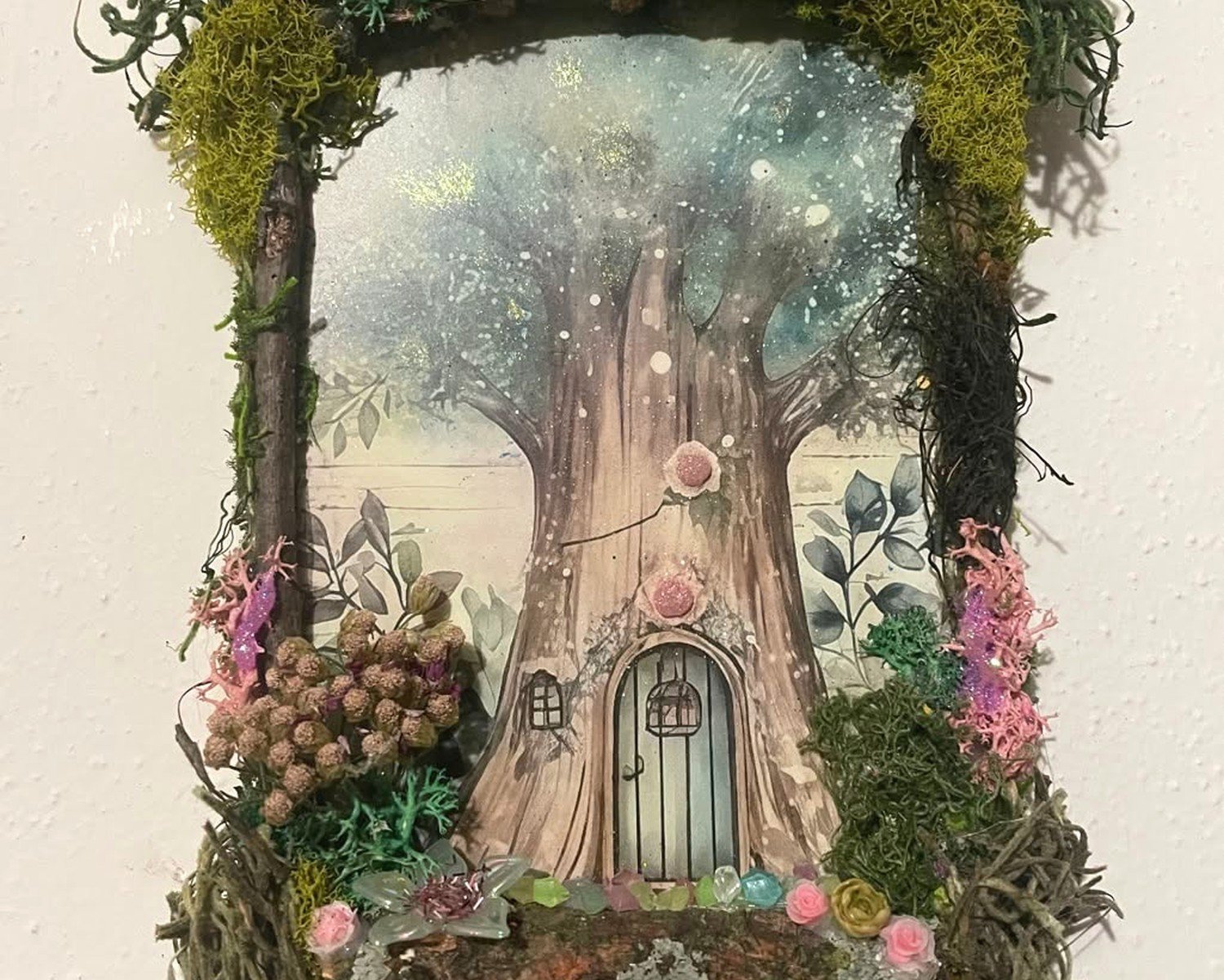
3D Elements and Mixed Media
Wall art doesn’t have to be flat and honestly adding some dimension makes fairy themes feel more immersive. I’m obsessed with mixing 2D prints with 3D elements lately.
Wooden or resin mushroom decorations on floating shelves near your fairy art. Fairy doors (okay hear me out, they can be cute if they’re well-made and not too literal). Shadow boxes with natural elements like moss, crystals, or dried flowers. Macrame plant hangers with trailing plants. Small decorative branches or driftwood mounted on the wall.
The key is not going overboard. Pick maybe two or three dimensional elements max or it starts feeling cluttered. I did a setup recently where we had fairy prints on the wall and then one floating shelf below with a few small mushroom figures and some air plants and it felt perfect.
Avoiding the Theme Park Effect
Look the line between magical and tacky is real and I’ve definitely crossed it before. Here’s what pushes things too far:
Glitter. Just no. Unless it’s very subtle metallic shimmer and even then be careful. Anything with actual chunky glitter is gonna look cheap. Also avoid anything with gems or rhinestones glued on unless it’s genuinely vintage and kitschy in an intentional way.
Too many words. Fairy art with quotes or sayings almost never works in adult spaces. Maybe if it’s like an antique book page with text that happens to have fairy illustrations but dedicated quote art is tough.
Cartoon styles. There are some stylized illustration styles that work for adults but straight-up cartoon fairies are hard to pull off. You want some level of artistic sophistication even if the subject matter is whimsical.
Seasonal Rotation Option
Wait I forgot to mention this earlier but one thing I do with clients who are nervous about committing fully to fairy decor is set it up as seasonal. Like you go hard on the woodland fairy theme in fall and winter when that cozy magical vibe feels right, then swap in some pieces for spring and summer.
You keep your core woodland elements year-round (the forest scenes, the mushrooms, whatever) but rotate the specifically fairy pieces. This also gives you an excuse to collect more art over time without overwhelming your walls.
Budget Breakdown Reality Check
Since everyone always wants to know what this actually costs… you can do this at basically any budget but there are tiers.
Budget tier (under $100 total): Digital downloads from Etsy that you print yourself at a local print shop, thrifted frames, maybe one small original if you find a student artist. This can genuinely look good if you’re thoughtful about it.
Mid-range ($100-$300): Mix of quality prints from independent artists, decent frames (maybe some new, some thrifted and painted), one nicer piece as a focal point. This is where most of my clients land and you can create something really beautiful here.
Investment tier ($300+): Original art or limited edition prints, custom framing, maybe a commissioned piece, higher-end sources. I have one client who spent like $800 on a single fairy painting and it’s absolutely gorgeous and worth it for her.
The thing is you don’t have to do it all at once. I actually think fairy/woodland galleries look better when they’re built over time anyway. Feels more collected and personal rather than like you bought a matching set from HomeGoods.
Making It Work in Different Rooms
Bedrooms are the easiest – people expect whimsy and personality there. Go as magical as you want. I’ve done everything from subtle single pieces to entire fairy forest feature walls in bedrooms.
Living rooms need more restraint usually. I stick to one or two sophisticated pieces mixed into a broader gallery wall or design scheme. Unless the whole home aesthetic is already leaning cottagecore or maximalist then you’ve got more freedom.
Bathrooms are actually perfect for fairy art and people don’t think of this enough. Small space, private, you can afford to be more playful. A few small fairy prints in a bathroom with plants and natural elements is adorable.
Home offices or creative spaces – yes definitely. Especially if you’re going for that inspirational magical creative energy. Just keep it from being distracting if you actually need to focus in there.
Kids rooms obviously work but that’s not really what we’re talking about here since you want adult-appropriate styling.
Okay I think that’s everything I’ve learned from like six months of being weirdly into fairy wall art. My cat just knocked over my coffee so I gotta go but hopefully this helps you figure out what direction to go with your space.