Wall Art Guide, Wall Art Tutoriels
Golden Retriever Wall Art: Dog Breed Portrait Pet Decor
Jul
So I’ve been absolutely obsessed with golden retriever wall art lately because my sister got one for her living room and I was like, wait, this is actually gorgeous? Not cheesy at all? And now I’m helping like three different clients figure out which style works for their spaces.
The Styles That Don’t Look Tacky
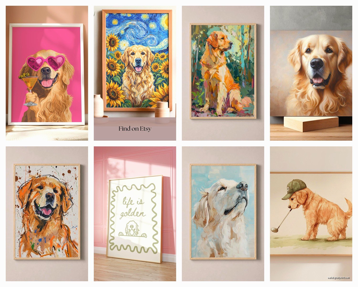
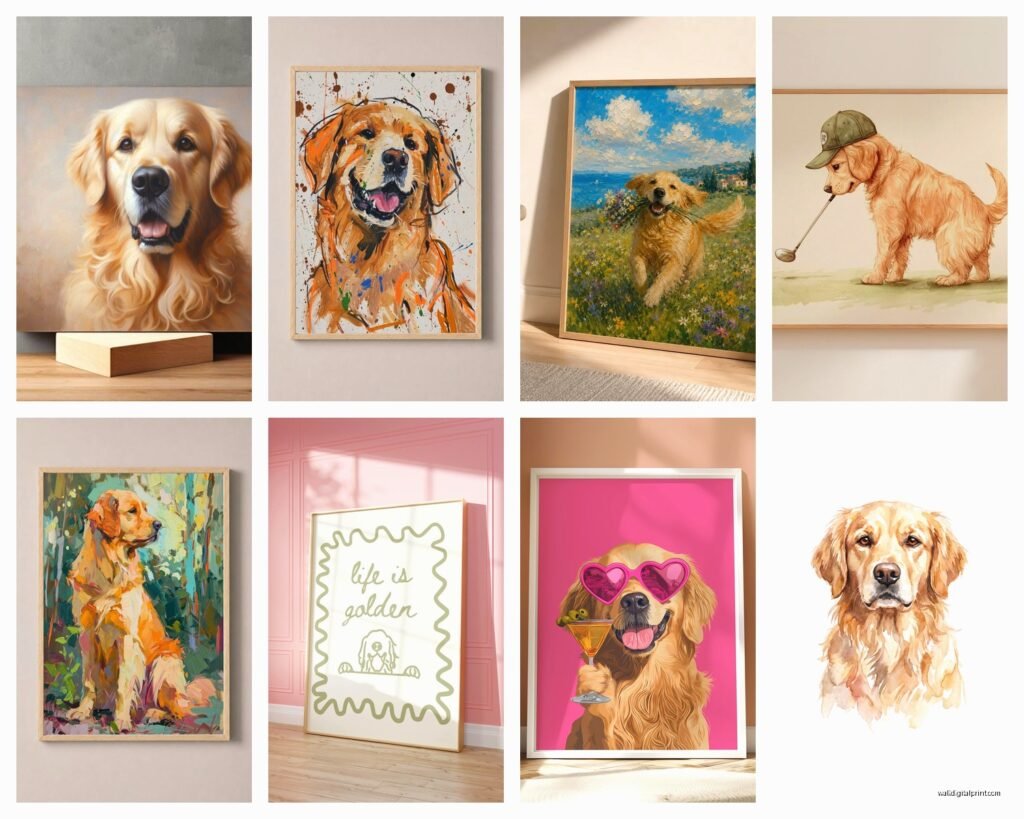
Okay so first thing – there’s basically five main styles and some are WAY better than others depending on your vibe. The photorealistic portraits are stunning but honestly they can read a bit formal? I did one in a client’s home office and it works because the rest of the room is pretty minimal, all whites and natural wood. But if you’ve got a lot going on already, it might be too much.
The watercolor ones are my current favorite and I’m gonna tell you why. They have this softness that makes them feel artistic rather than “I really love my dog” energy. Not that there’s anything wrong with loving your dog but you know what I mean. The edges are usually loose and dreamy, lots of cream and gold tones that pick up the natural coloring of goldens. I found this one on Etsy from a seller who does custom work and the way she handles the fur texture with those loose brushstrokes… chef’s kiss.
Line art is having a MOMENT right now. Super minimalist, usually black ink on white or cream paper. Works incredibly well in modern spaces or Scandinavian-style rooms. My friend Anna has three different dog breeds done in this style in her hallway and it looks like a legitimate gallery wall, not like a crazy dog lady situation.
Vintage Style Prints
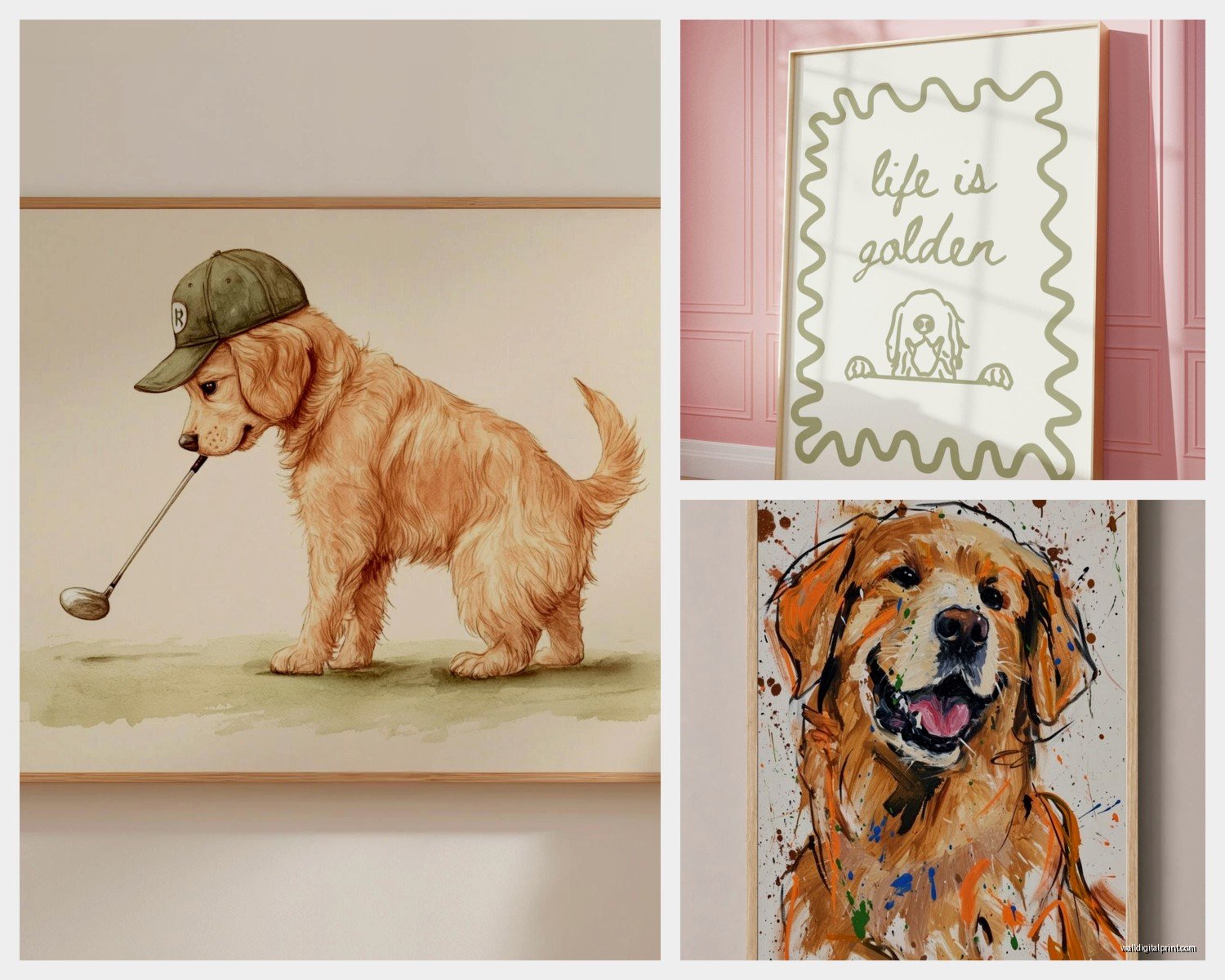
The vintage-inspired ones with those muted colors and almost poster-like quality – think 1950s illustration style – are perfect if you’re going for that eclectic maximalist thing. They pair really well with other vintage finds and don’t take themselves too seriously. I hung one in my own kitchen actually, next to some old botanical prints, and people always ask about it.
Pop art style is divisive. Bright colors, Andy Warhol vibes, multiple panels sometimes. Only works if your space already has that bold colorful energy. Otherwise it’s gonna stick out in a weird way.
Size Actually Matters More Than You Think
This is where people mess up constantly. They order an 8×10 thinking it’ll make a statement and then it arrives and it’s just… sad and tiny on their wall. For a living room or bedroom focal point, you want AT LEAST 16×20, honestly 24×36 is better. I learned this the hard way in my first apartment where I had this tiny print above my couch that looked like it was floating in an ocean of blank wall space.
If you’re doing a gallery wall situation, you can mix sizes, but make sure you have at least one larger piece (16×20 minimum) to anchor it. The rest can be 8×10 or 11×14.
Oh and another thing – measure your wall space before you order. Sounds obvious but I cannot tell you how many times clients have bought art that doesn’t fit their intended spot. Take painter’s tape and actually mark out the dimensions on your wall. You’ll see immediately if it’s the right scale.
Frame Choices That Won’t Ruin Everything
Okay so you found the perfect print but the frame can absolutely make or break this. Natural wood frames are your safest bet with golden retriever art because they complement the warm tones in the dog’s coat. Light oak, walnut, even bamboo frames work beautifully.
Black frames look super sophisticated and modern, especially with line art or black and white photography. But with full color golden retriever portraits, black frames can sometimes feel too harsh? Really depends on your room though. If you’ve got other black accents, go for it.
White or cream frames are tricky. They can look amazing in an all-white room or with very minimalist art, but with the warm golden tones of the dog, sometimes there’s not enough contrast and everything gets washed out.
Metal frames – I’m seeing more gold and brass frames with pet portraits and when it works, it REALLY works. There’s something about gold tones with a golden retriever that feels intentional rather than matchy-matchy. Just make sure you have other metal accents in the room in the same finish.
Matting Decisions
White or cream matting almost always elevates the piece. It gives the eye a place to rest and makes even a simple print look more expensive and gallery-worthy. I usually do a 2-3 inch mat for smaller prints, 3-4 inches for larger ones.
You can also do double matting where there’s a thin inner mat in a contrasting color. Like cream outer mat with a thin gold inner mat. Very elegant but also more expensive and honestly not necessary unless you’re really trying to make it fancy.
Where To Actually Buy These
Etsy is honestly my go-to because you can find independent artists doing custom work. Search for “golden retriever portrait” or “golden retriever art print” and filter by your style preference. Read the reviews though – some sellers are amazing, some are just dropshipping generic stuff.
Society6 and Redbubble have tons of options from different artists and the nice thing is they handle all the printing and framing. Quality is pretty consistent. Not as special as commissioning something custom but way easier.
For photography prints, there are specialty pet photography sites but honestly they can be overpriced. I’ve found beautiful golden retriever photos on Unsplash and had them printed at a local print shop for like a third of the cost.
If you want something truly custom of YOUR golden retriever, commission an artist. Expect to pay anywhere from $150-500 depending on size and medium. I worked with a watercolor artist last year for a client’s anniversary gift and it was absolutely worth the investment.
Placement Ideas That Actually Work
Above the couch is classic for a reason. Center it over the middle cushion and hang it so the center of the art is at eye level when you’re standing (usually around 57-60 inches from the floor to the center of the piece).
In a hallway gallery wall mixed with family photos and other art. This keeps it from feeling too theme-y. My cat literally knocked over a frame last week and I’m still finding glass pieces… anyway, the gallery wall approach is great because the dog art becomes part of a larger story.
Home office or study – I’m seeing this more and more and it totally works. Adds personality without being unprofessional if you’re on Zoom calls.
Bedroom above the nightstand or dresser. Creates a sweet, personal vibe. One client put a watercolor golden retriever portrait above her nightstand and it’s the first thing she sees every morning.
Wait I forgot to mention – mudrooms or entryways! If you have a golden retriever, putting their portrait near where you enter is kind of perfect? Especially if you do hooks below for leashes.
Styling Around The Art
The art shouldn’t just float on the wall by itself. Add some dimension with a small plant or sculptural object nearby. I like putting a simple vase with dried grasses or pampas on a console table below the art.
If it’s on a shelf or mantle, layer it with other frames and objects. Lean it casually against the wall rather than hanging it for a more collected, relaxed look. This works especially well with smaller prints.
Lighting makes SUCH a difference. If you can add a picture light above the frame or position it where natural light hits it during the day, it’ll look ten times better. I installed battery-operated picture lights for a client who didn’t want to deal with wiring and they work great.
Color Coordination
Pull colors from the art into your room with pillows, throws, or other accessories. If your golden retriever portrait has lots of warm golds and creams, echo those tones elsewhere. But don’t go overboard – you’re not trying to match everything exactly.
Actually this is gonna sound weird but I sometimes pick up an accent color from the background of the portrait rather than the obvious gold tones. Like if there’s a blue-gray background, I’ll bring in blue pillows. Creates a more sophisticated connection.
Custom vs. Generic Prints
Generic breed portraits are fine if you just love the look of goldens in general. They’re cheaper, readily available, and can look really beautiful. No shame in going this route.
But if you actually HAVE a golden retriever, getting custom art of your specific dog is on another level emotionally. I watched my client tear up when she saw the portrait of her dog who had passed away. That kind of meaningful art is worth the extra cost and wait time.
For custom work, you’ll need to provide really good photos. Natural lighting, clear focus on the face, ideally taken at the dog’s eye level rather than looking down at them. The artist can only work with what you give them.
Common Mistakes I See All The Time
Hanging art too high. Seriously, everyone does this. It should be at eye level, not ceiling level.
Choosing a style that doesn’t match the room at all. Like putting a super modern geometric golden retriever print in a traditional farmhouse room. It’s gonna look confused.
Going too small. I mentioned this but it bears repeating – size up from what you think you need.
Not considering the orientation. Vertical spaces need vertical art, horizontal spaces need horizontal art. A square golden retriever portrait can work in either but might not fill the space as well.
Forgetting about the color temperature. If your room has cool tones (grays, blues, whites), a super warm golden retriever portrait might clash. Look for prints with cooler backgrounds or black and white options.
Oh and people forget to think about glare if they’re putting glass-fronted frames in rooms with lots of windows. Non-reflective glass costs more but might be worth it.
Budget Breakdown
You can totally do this affordably. An 8×10 print from Etsy runs like $15-30. Frame it yourself with something from Target or Amazon for another $20-40. You’re looking at under $75 total.
Mid-range would be a larger custom print (16×20) for $50-100, professional framing for $100-150. So $150-250 total.
High-end custom painted portrait with professional framing can easily hit $500-800. Worth it if it’s meaningful to you and you’re gonna keep it forever.
I usually tell clients to invest more in the frame and matting than the print itself if you’re working with a budget. A cheap print in a beautiful frame looks expensive. An expensive print in a cheap frame looks cheap.
Trends I’m Seeing Right Now
The minimalist line drawings are everywhere. Clean, simple, works with any decor style.
Watercolor is still going strong and I don’t see it going anywhere because it has that timeless quality.
Abstract or impressionistic golden retrievers where you can barely make out the dog shape but you KNOW it’s a golden from the color palette. Very sophisticated for people who want something artistic but still dog-related.
Black and white photography with just a hint of gold color editing on the dog. Creates this really striking effect.
Multiple panels – like a triptych of the same golden retriever in different poses. Haven’t tried this myself yet but I’m kinda tempted for my own place.
The thing is, if you love golden retrievers, you should absolutely put their art on your walls. Life’s too short to only have generic abstract art you don’t care about. Make it work with your style, choose quality materials, and hang it properly. That’s really all there is to it.