Wall Art Guide, Wall Art Tutoriels
Farm Wall Art: Agriculture Barnyard Rural Country Decor
Jul
So I’ve been working on this farmhouse project for like three months now and honestly the whole farm wall art thing is WAY more specific than I thought it’d be. Like you can’t just throw up any barn picture and call it done, there’s actually a whole science to making it look authentic versus that mass-produced Hobby Lobby vibe everyone’s trying to avoid.
The Scale Thing Nobody Talks About
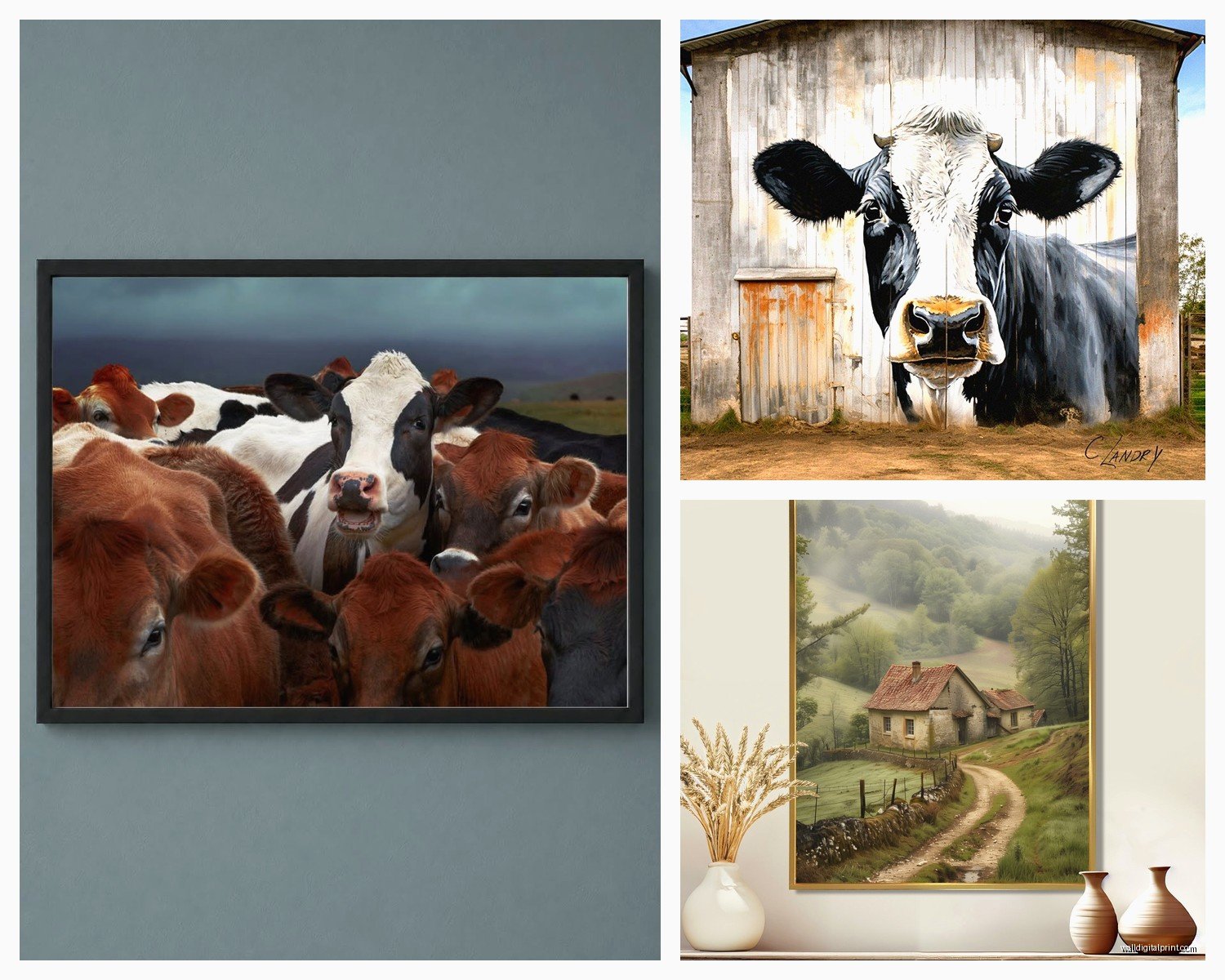
Okay so first thing – and I learned this the hard way after ordering what I thought was gonna be this massive cow print that showed up the size of a placemat – you gotta think about proportion differently with farm art. Agricultural scenes need breathing room. Like, a 16×20 minimum for anything with livestock or barn structures because otherwise it just looks cluttered and you can’t appreciate the details. I did a client’s dining room last month and we went with this 30×40 tractor print and everyone thought it was too big until we hung it and suddenly the whole room made sense.
The weird thing about rural imagery is it works best when it’s either really large and commanding OR in a gallery wall situation where you’ve got multiple smaller pieces creating a story. That middle ground like 11×14 single prints? They get lost unless you’re putting them in a really tight space like a powder room.
What Actually Reads as Authentic Farm Decor
Here’s what I’ve noticed works versus what screams “I bought this at Target”:
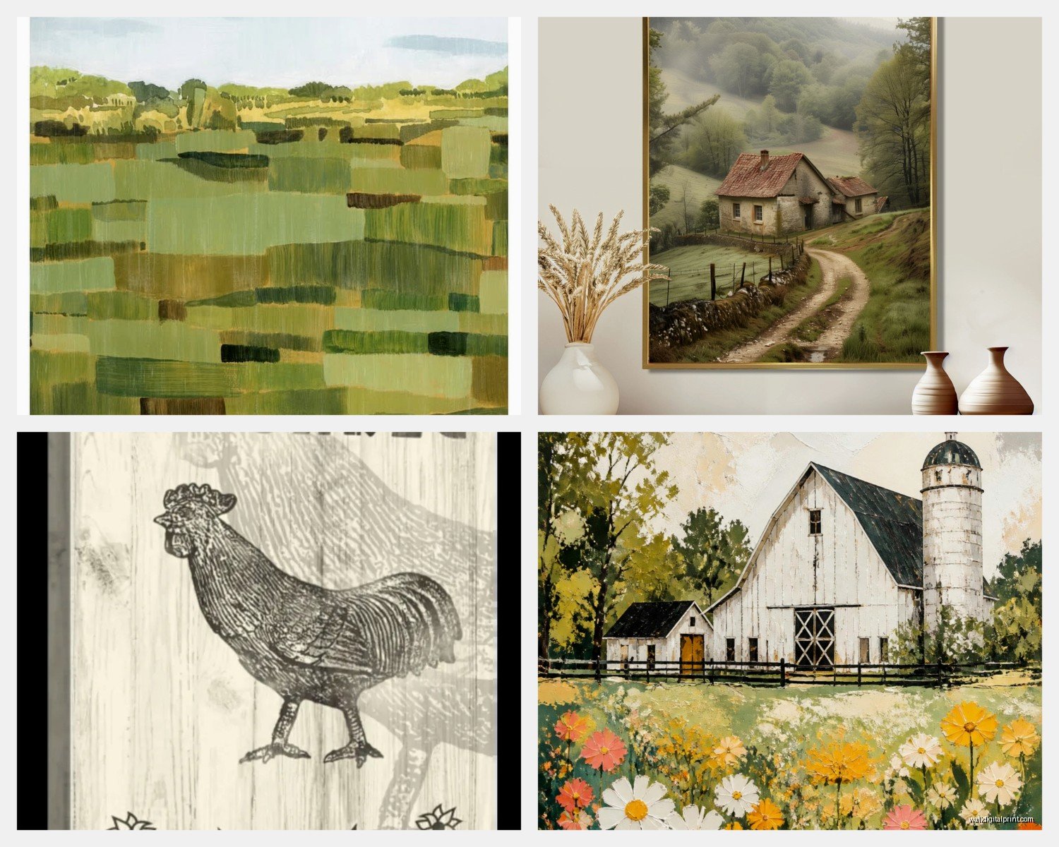
- Black and white photography of actual farms – not the over-filtered Instagram stuff but like archival-looking images with real grain to them
- Vintage seed catalog prints or agricultural advertisements from the 1920s-1940s
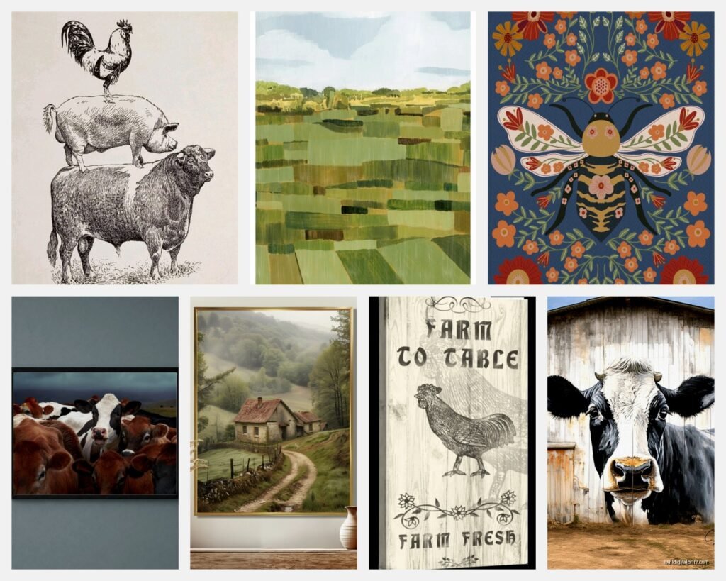
- Simple line drawings of farm animals – chickens especially are having a moment
- Botanical prints of wheat, cotton, corn – the actual crops not just decorative flowers
- Old farm equipment rendered in a clean graphic style
- Topographical or property survey maps if you’re going for that land-owner heritage vibe
What doesn’t work is those cutesy signs with phrases like “Fresh Eggs Daily” unless you’re actually running a farmstand. My neighbor has one and doesn’t even own chickens and it drives me crazy every time I see it.
The Color Palette Situation
This is gonna sound weird but the colors matter more with farm art than almost any other decor style. You want earth tones obviously but there’s a difference between muddy browns that make your room feel dark and rich warm tones that actually enhance the space.
I usually stick with:
– Cream and off-white backgrounds instead of stark white
– Warm grays and taupes
– Deep barn reds but used sparingly as accents
– Sage greens and muted olives
– Weathered wood tones in the frames
The mistake people make is going too matchy-matchy with the whole red-barn-white-fence thing. Real farmhouses have evolved over decades so your art should feel collected not coordinated. I mixed a black and white cattle print with a color grain silo piece in my own kitchen and it works because the tones are similar even though one’s monochrome.
Where to Actually Find Good Stuff
Okay so funny story, I was watching this restoration show the other night and got completely distracted looking up antique farm prints during the commercial breaks. Found some of my best sources that way honestly.
Etsy sellers who specialize in vintage agricultural prints – but you gotta dig past the first three pages of results. Look for sellers who are clearly scanning actual vintage materials not just reselling the same public domain images everyone uses. I’ve found incredible seed packet collections and livestock registry documents that way.
Estate sales in actual rural areas – I drove out to this sale in Pennsylvania last fall and got a whole box of original farm photography for like $20. The family was cleaning out their grandfather’s farmhouse and had no idea what to do with all these amazing images. You’re not gonna find that stuff in the suburbs.
Local artists at farmers markets – sounds precious but hear me out. There’s usually at least one person doing watercolors or photography of the actual landscape around you. That regional specificity makes it feel so much more genuine than generic “farmhouse style.”
Museum reproduction shops – The agricultural museums nobody thinks about have incredible print collections. The Smithsonian’s agriculture section, regional historical societies, even some university agricultural programs sell reproductions of their archival materials.
wait I forgot to mention – avoid Kirkland’s and those mall stores entirely. I know it’s tempting because it’s easy but that art is designed to appeal to everyone which means it appeals to no one specifically. It’s like decor wallpaper.
Framing Makes or Breaks It
This is where I see people blow their whole budget on the wrong thing. You don’t need expensive custom framing for farm art – actually the simpler the better.
I use a lot of:
– Basic black frames with no matting for a modern farmhouse look
– Weathered wood frames but ONLY if they’re actually weathered not that fake distressed stuff from Michael’s
– Clipframes for a utilitarian vibe especially with botanical prints
– Vintage frames from thrift stores that I don’t refinish, just clean up
The key is keeping the frame from competing with the image. Farm imagery is already busy with texture and detail so ornate gold frames or thick decorative molding just muddies everything up.
My cat knocked over this whole stack of frames I was prepping last week and honestly it helped me see which ones were too fussy – if the frame breaking would bother me more than the print being damaged, it’s the wrong frame.
Gallery Wall Configurations That Work
Oh and another thing – if you’re doing a gallery wall with farm art you gotta have a strategy. Can’t just randomly place stuff and hope it works.
What I do is pick one larger anchor piece – usually 20×24 or bigger – and build around it with smaller complementary images. For farm themes I like:
- Start with a substantial barn or landscape as your anchor
- Add 2-3 animal portraits in similar tones (all chickens, all cows, etc – don’t mix the barnyard)
- Include at least one text-based piece like a vintage ad or seed catalog cover
- Fill gaps with small botanical prints or tool diagrams
- Keep spacing consistent – I use 2-3 inches between frames always
The biggest mistake is trying to include every farm animal and crop in one wall. Pick a lane – either you’re doing a poultry theme, or dairy farming, or grain agriculture. Mixing them looks like a petting zoo exploded.
Placement Strategy for Different Rooms
Kitchen gets the food production stuff – chickens, dairy cows, vegetable garden imagery, vintage canning labels. Makes sense thematically and the humidity doesn’t matter as much with prints behind glass.
Living room can handle the big landscape pieces and dramatic barn photography. This is where you go large scale and establish the overall vibe. I did floor-to-ceiling barn doors as a print once in a two-story entryway and it was honestly perfect.
Bedrooms I keep quieter – maybe pastoral sheep scenes or simple wheat stalks. You don’t want energetic rooster prints staring at you while you’re trying to sleep. Learned that one from experience when a client called me at like 11pm saying she couldn’t stop thinking about the chickens on her wall.
Bathrooms are tricky with farm themes but vintage seed packets or simple botanical prints work. Just avoid anything that requires a lot of contemplation because nobody’s doing that in there.
The Authenticity Test
Here’s my rule – if you saw this exact piece of art in a hotel lobby or a Cracker Barrel, keep scrolling. Farm decor should feel personal and collected not corporate-approved country aesthetic.
Ask yourself: Could this image have actually existed on a working farm at some point? Vintage advertising, family photos, equipment catalogs, crop documentation – all yes. Distressed wood sign saying “Gather” with a rooster silhouette – absolutely not unless you’re going for that specific mass-market farmhouse look which is fine but own it.
Mixing Eras and Styles
This is where it gets interesting – you can totally mix a 1930s seed catalog print with contemporary black and white farm photography if the tones work together. The aged patina of vintage pieces actually makes modern photography look more intentional and curated.
I’ve got this whole wall in my office that’s half archival agricultural documents and half photos I took myself at a local dairy farm. Works because there’s a consistent color story even though they’re from different centuries essentially.
The thing people don’t realize is that actual farmhouses accumulate stuff over generations so having multiple style periods represented is more authentic than trying to make everything match a specific decade.
Budget Real Talk
You don’t need to spend a fortune on this. Some of my favorite pieces cost under $15 as digital downloads that I printed at Costco. Yeah the paper quality isn’t archival but for a breakfast nook who cares.
Save your money for one or two really special pieces – maybe an original watercolor from a local artist or a genuine vintage print – and fill in around those with affordable reproductions. Nobody’s gonna inspect your whole wall to verify authenticity, they’re just gonna get an overall impression.
I probably spend $200-300 total to do a full gallery wall of 8-10 pieces including frames. That’s ordering prints online, using simple frames from Amazon or thrift stores, and doing the hanging myself. You could definitely go cheaper or way more expensive depending on your situation.
What’s Trending Right Now
Okay so currently I’m seeing a lot of requests for:
– Chickens in any form but especially vintage poultry breed charts
– Aerial farm photography showing the geometric field patterns
– Minimalist line art of farm animals
– Vintage John Deere and International Harvester advertisements
– Cotton and tobacco botanical prints especially in Southern homes
The whole roosters-and-sunflowers thing from like 2005 is completely dead which honestly good riddance. We’ve moved into more sophisticated agricultural imagery that celebrates farming as a profession not just a decorative theme.
Also noticing people moving away from words entirely – just images. The text-heavy farmhouse sign trend is fading and I think everyone’s relieved because it was getting really cluttered looking.
Anyway I gotta wrap this up but seriously just start with one piece you genuinely love and build from there. Don’t try to do the whole farmhouse aesthetic in one shopping trip or you’ll end up with a bunch of stuff that doesn’t quite work together. I’ve seen it happen so many times and then people call me to fix it and honestly it’s harder to undo bad choices than start from scratch.