Wall Art Guide, Wall Art Tutoriels
Spring Wall Art: Season Renewal Flower Blossom Decor
Aug
So I’ve been completely obsessed with spring wall art lately and honestly it started because my living room was looking so dead after taking down all the winter stuff, you know? Like that weird in-between phase where your walls are just… blank.
The thing about spring art is you don’t wanna go too literal with it. I made that mistake three years ago and bought this massive canvas that was basically just tulips everywhere and it looked like a garden center exploded on my wall. Not cute. What actually works is being more subtle about the whole renewal thing.
The Color Palette That Actually Works
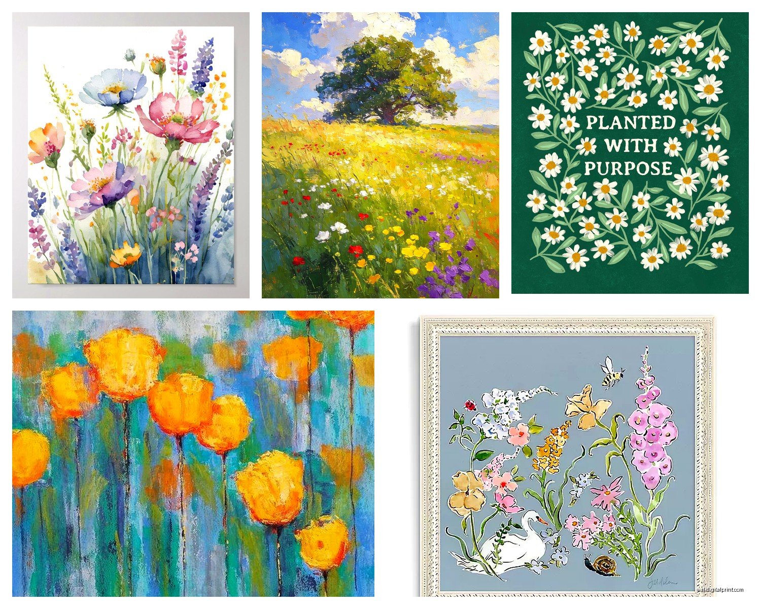
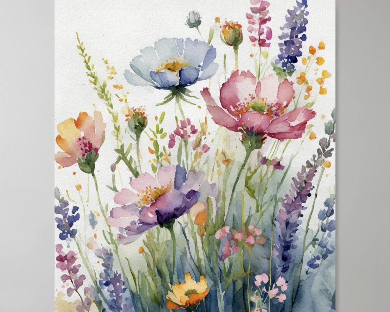
Okay so here’s what I figured out after way too many returns to HomeGoods – you want soft pastels but not Easter egg pastels if that makes sense. Think more like… faded blush pink, sage green, the palest yellow that’s almost cream, maybe a soft lavender. I hung this print above my desk that’s basically abstract watercolor blooms in these muted tones and my neighbor asked if it was expensive original art. It was $40 from Etsy.
The trick is mixing in neutrals so it doesn’t feel too sweet. I pair spring florals with black frames or natural wood, and suddenly it’s sophisticated instead of looking like a craft fair threw up on your wall. My cat knocked over my coffee while I was hanging frames last week and I swear the stress made me realize that the contrast is what makes it work.
Botanical Line Drawings vs Full Bloom Prints
Line drawings are having such a moment right now and they’re perfect for spring because they suggest flowers without being overwhelming. I have this set of three – one’s a cherry blossom branch, one’s a magnolia, one’s just an abstract stem situation – all in simple black ink on cream paper. Cost me maybe $25 for the set as digital downloads that I printed at Staples.
But here’s the thing… if your room already has minimal vibes, you might actually need something with more color and texture. I worked with a client who had this very Scandinavian apartment, all white and light wood, and the line drawings just disappeared. We switched to these gorgeous watercolor peony prints with actual pink and coral tones and suddenly the room felt alive.
Size and Placement (This Is Where People Mess Up)
Oh and another thing – everyone goes too small with their art. I’m guilty of this too. You walk into a store and see a cute 8×10 spring print and think that’ll be perfect, then you get home and it looks like a postage stamp on your wall.
For over a sofa or bed, you want your art to take up about two-thirds to three-quarters of the furniture width. So if your couch is 84 inches wide, you’re looking at around 56-63 inches of art total. This could be one large piece or a gallery wall situation.
I did a gallery wall in my bedroom last spring with nine frames – mix of 8x10s and 11x14s – arranged in a grid. All different spring botanicals but same frame style. Took me like three hours and SO many nail holes to get it right but it’s still up and I love it. The key was laying it all out on the floor first and measuring the total dimensions before touching the wall.
Gallery Wall Layouts for Spring Themes
If you’re gonna do a gallery wall with spring art, here’s what actually works:
- The grid layout – everything same size, evenly spaced, very clean and modern
- The salon style – different sizes clustered together, more organic feeling but harder to pull off without it looking messy
- The horizontal line – three to five pieces in a row, easiest option honestly
- The corner cluster – starts from one corner and expands, good for awkward spaces
I prefer the grid for spring stuff because the symmetry balances out the organic flower shapes. But my sister did this amazing salon wall with vintage botanical prints in mismatched gold frames and it’s stunning, so like… depends on your vibe.
Where to Actually Buy This Stuff
Okay so funny story, I spent probably six months just browsing and comparing sources because my client canceled and I had time to kill. Here’s what I learned:
Etsy is your best friend for digital downloads. You buy it, download the file, print it yourself at a print shop or online service. I use Printique or sometimes just Staples if I’m being cheap. A good quality print in 16×20 costs maybe $15-20 to print versus buying a pre-made print for $60+.
Society6 is great if you want something more unique and don’t wanna deal with printing and framing separately. They do the whole package. Their spring collection usually drops in February and the quality is pretty solid. I got this abstract cherry blossom piece from them that’s held up really well.
Target and HomeGoods are hit or miss but when you find something good it’s such a deal. I found these pressed flower shadow boxes at Target last year for $25 each and they’re real flowers, not prints. Perfect for spring.
Minted if you’ve got more budget – their art is genuinely beautiful and they have these great floral abstract pieces that feel very spring without being obvious about it. Wait for a sale though, they’re always having 20% off or whatever.
Digital vs Physical Prints
This is gonna sound weird but I actually prefer buying digital files now. You have so much more control over the final product. I can print something in whatever size I need, on whatever paper I want, swap it out seasonally without spending much money.
The downside is you gotta frame everything yourself and framing is honestly expensive. But IKEA frames are fine for most situations. I use their Ribba frames constantly – they come in tons of sizes and look way more expensive than they are. Michael’s also always has frame sales.
Specific Spring Themes That Work
Cherry blossoms are like the ultimate spring art subject and they’re not as overdone as you’d think. The key is finding artistic interpretations rather than straight-up photographs. I have this one that’s almost abstract – you can tell they’re cherry blossoms but it’s more about the pink washes and delicate branches than being realistic.
Peonies are having their moment too. Big, lush, romantic but not too feminine if you style them right. Put a peony print in a thick black frame and suddenly it’s moody and sophisticated.
Wildflower meadows – this is more my personal taste but I love art that shows fields of mixed blooms. It feels more natural and less “I went to a flower shop” than single-stem stuff. There’s this print I have in my hallway that’s basically just a watercolor impression of a spring meadow and people always comment on it.
Wait I forgot to mention – abstract spring art is probably the most versatile. You get the fresh colors and renewal feeling without it being obviously flowers. I’m talking about pieces with soft pastels, organic shapes, maybe some gold leaf accents. These work year-round honestly but feel especially right in spring.
Mixing Spring Art with Your Existing Decor
You don’t have to make your whole room spring-themed just because you’re adding spring art. Actually please don’t do that unless you wanna redecorate every season which sounds exhausting.
What I do is keep my main furniture and decor pretty neutral, then swap out art and small accessories seasonally. So in spring I might put up floral prints, add some pastel throw pillows, maybe a vase with fresh branches. Come summer I’ll switch to different art but the room still feels cohesive.
If your room is already colorful, stick with more neutral spring art – those botanical line drawings I mentioned or black and white floral photography. If your room is neutral, that’s when you can go for the watercolor blooms and soft pastels.
Framing Choices Matter More Than You Think
Natural wood frames are perfect for spring art. They have that organic feel that complements botanical subjects. I use light oak or maple frames mostly.
White frames work if your walls are white and you want a really airy, fresh feeling. But they can wash out sometimes – depends on your wall color.
Black frames make everything feel more sophisticated and collected. This is what I use when I want spring art to feel less seasonal and more permanent.
Gold frames are tricky with spring art. They can look amazing with vintage botanical prints but feel too fancy with modern watercolors. Proceed with caution.
The Seasonal Rotation Strategy
Okay so this might be extra but I have a whole system now. I keep art for each season in a flat file folder under my bed (the kind architects use, got it on Amazon for like $30). When the season changes, I swap things out. Takes maybe an hour twice a year and keeps things feeling fresh.
For spring specifically I put up the art usually around mid-March and keep it through May. Then summer stuff goes up – that’s more beaches and bright colors and whatever. The spring art goes back in the folder till next year.
You don’t have to rotate everything. I have some pieces that stay up year-round because they’re more neutral or expensive or just favorites. But having even two or three pieces that change with seasons makes such a difference.
DIY Spring Art Projects Worth Trying
If you’re crafty at all (I’m barely crafty but I’ve done these):
Pressed flower frames are actually pretty easy. Get some flowers, press them in a heavy book for a week or two, arrange them on pretty paper, frame it. Looks expensive, costs almost nothing. I did this with cherry blossoms from my neighbor’s tree and it turned out surprisingly good.
Paint chip art – stick with me here. Get a bunch of paint chips in spring colors from the hardware store, cut them into flower petal shapes, arrange them into blooms on a canvas. It’s very abstract and modern and totally free.
Watercolor washes – even if you can’t paint, you can do abstract watercolor backgrounds in spring colors. I literally just blob different pastels on watercolor paper, let them blend, and once it dries it looks intentional. Frame it and done.
Common Mistakes to Avoid
Don’t buy art that matches your couch exactly. This seems like it should work but it ends up looking too matchy and catalog-like. Pick up one accent color from your room in the art but don’t try to match everything.
Don’t hang everything too high. The center of your art should be at eye level, which is usually around 57-60 inches from the floor. I see so many people hang stuff way too high and it throws off the whole room.
Don’t be afraid of bold spring art if that’s your thing. I’ve been talking a lot about soft and subtle but if you want a massive pink peony that takes over your wall, do it. Your space should make you happy, not follow rules.
Also don’t feel like you gotta stick with traditional flower art. I’ve seen amazing spring pieces that are just abstract shapes in spring colors, or landscape photography with blooming trees in the distance, or even modern geometric designs in pastels. Spring renewal can be interpreted lots of ways.
The main thing is just to pick stuff that makes your space feel lighter and fresher when you walk in. That’s the whole point of spring decor anyway – shaking off winter and bringing in new energy. Whether that’s through a huge floral canvas or minimal line drawings or something totally abstract doesn’t really matter as long as it works for you.