
Wall Art Guide, Wall Art Tutoriels
Black and White Photography Wall Art: Monochrome Fine Art Photos
Aug
So I’ve been obsessing over black and white photography for wall art lately and honestly it’s way more complicated than you’d think but also kinda straightforward once you get the basics down?
Why Black and White Actually Works Better Sometimes
Okay so here’s the thing – I was helping this client last month who had this gorgeous living room with like every neutral color you can imagine, and we tried colorful art first and it just… didn’t work. The space kept fighting with the art. But then we switched to monochrome photography and suddenly everything clicked. Black and white photos don’t compete with your existing color scheme, they just enhance it. It’s like they create this visual anchor without being bossy about it.
The real magic is that b&w photography makes you focus on composition, texture, and emotion instead of getting distracted by colors. I had this Ansel Adams print in my hallway for years and only recently realized why I never got tired of it – there’s always something new to notice in the shadows and highlights.
Choosing the Right Subject Matter
This is where people mess up constantly. Not every photo looks good in black and white, and definitely not every b&w photo works as wall art.
Landscapes are the obvious choice and yeah, they work great. Mountains, beaches, forests – anything with strong contrasts and dramatic skies. I’ve got this print of Icelandic cliffs in my office and the texture of the rocks is just insane in monochrome. You lose the mossy greens but you gain this almost sculptural quality.
Architecture is honestly my favorite for modern spaces. Clean lines, geometric shapes, the interplay of light and shadow on buildings – chef’s kiss. I recently hung a series of three photos showing different angles of the Guggenheim and it’s become the focal point of my entire dining area. The curves and repetition work so well without color distraction.
Portraits can be hit or miss. Studio portraits with dramatic lighting? Amazing. That candid shot of your cousin at a BBQ converted to b&w? Probably not wall-art worthy unless the composition is really something special. The key is intentional contrast and meaningful expression.
Abstract and minimalist subjects – think single feathers, water droplets, fabric textures – these can be stunning. I found this photo of crumpled linen sheets that sounds boring but looks like a topographical map when you actually see it printed large.
Oh and another thing – avoid subjects where color is the main point. Like autumn leaves or a sunset where the oranges and reds are doing all the work. Those just look sad in black and white.
The Technical Stuff You Actually Need to Know
Gonna be real with you, I spent way too much time learning about this when I started curating photos for clients. You don’t need to become a photographer but understanding a few things helps you pick better pieces.
Contrast range is everything. A good b&w photo should have true blacks, true whites, and a full range of grays in between. If it looks muddy or flat, it’s not gonna look better on your wall – it’ll look worse at a larger size.
Grain vs digital noise – film grain can add character and texture, especially in fine art photography. Digital noise just looks like a mistake. Learn the difference by comparing images up close on your screen before buying.
Sharpness and detail matter more in monochrome because you’re relying on texture and definition without color to create interest. Slightly soft focus can work for portraits but for most subjects you want crisp details.
Print Quality Makes or Breaks Everything
This is gonna sound weird but I once bought the same image from two different sellers just to compare print quality and the difference was shocking. Like, same exact photo, completely different impact.
Paper types:
- Glossy – shows maximum detail and contrast, but you’ll get glare from windows or lights. I use these in hallways or darker spaces.
- Matte – no glare, more sophisticated look, but blacks aren’t quite as deep. My go-to for living rooms and bedrooms.
- Fine art paper – textured, museum-quality, usually cotton-based. Expensive but worth it for statement pieces. The texture adds another dimension to the photo.
- Metallic – okay so I was skeptical about this but metallic prints give b&w photos this luminous quality that’s hard to describe. The highlights almost glow. Great for modern or industrial spaces.
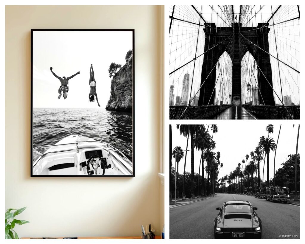
I learned the hard way that cheap prints fade. Like, I had this beautiful photo of the Brooklyn Bridge that turned yellowish-gray after two years near a window. Now I only buy archival-quality prints with pigment-based inks, not dye-based. It costs more upfront but you’re not replacing them every few years.
Sizing and Placement Strategy
My cat knocked over a frame while I was figuring this out last week and honestly it made me rethink the whole arrangement so maybe it was helpful?
The bigger the better is usually true for b&w photography. A single large-scale print (like 40×60 inches or bigger) creates way more impact than several small ones. I have a massive print of foggy pine trees in my bedroom that’s literally 5 feet tall and people always comment on it. It’s the first thing you see when you walk in.
But if you’re doing multiple prints:
- Keep consistent matting and framing – mismatched frames make even expensive photos look cheap
- Odd numbers work better visually (3, 5, 7 pieces)
- Maintain consistent spacing – I use 2-3 inches between frames as a rule
- Theme matters – don’t mix portrait orientation with landscape randomly, and keep subject matter cohesive
For placement height, the center of your photo should be at eye level, which is roughly 57-60 inches from the floor. But honestly I adjust based on furniture – if there’s a sofa underneath, I go slightly higher so it feels connected to the furniture arrangement.
Framing Options That Don’t Suck
Okay so funny story, I spent like three hours at a framing store once trying to decide between black and white frames for black and white photos and the employee thought I was losing it.
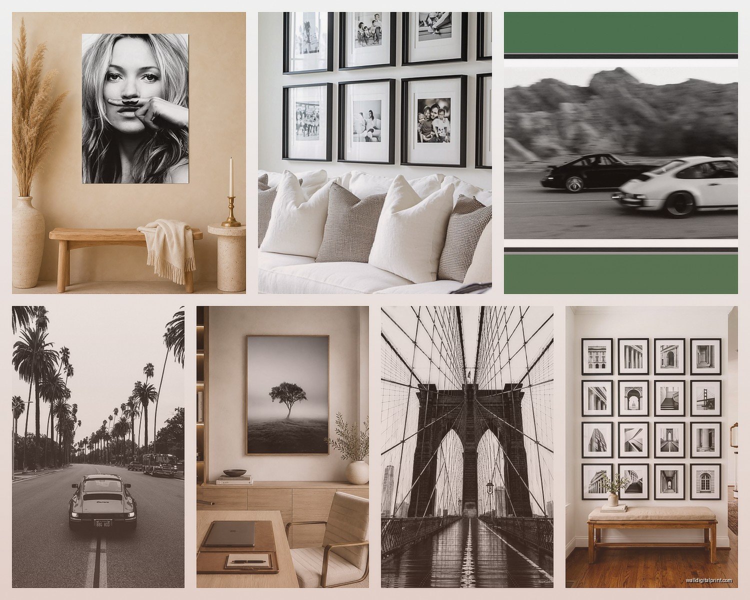
Black frames are classic and safe. They create a strong border and work in literally any space. Matte black is more modern, glossy black is more traditional. I use black frames probably 70% of the time.
White or light frames create more breathing room and feel lighter, less formal. Perfect for Scandinavian or coastal aesthetics. They also work really well in smaller spaces where black frames might feel heavy.
Natural wood frames add warmth to monochrome photography, which can otherwise feel cold. I love light oak or walnut with b&w nature photography especially.
Metal frames – thin aluminum or steel frames in black, silver, or brass – these are my favorite for contemporary or industrial spaces. They’re sleek without being boring.
Wait I forgot to mention – the mat matters as much as the frame. A good mat (usually white, cream, or black) creates separation between the image and frame, gives the photo room to breathe. I typically use 2-3 inch mats for smaller prints, 3-4 inches for larger ones. Double matting (two layers of mat board in different colors) adds even more sophistication but it’s pricey.
Where to Actually Buy Good Monochrome Prints
This depends on your budget but I’ve tried basically everything at this point.
Fine art galleries and photographer websites – most expensive but you’re getting limited editions, signed prints, highest quality. I bought a signed Sebastião Salgado print once and yeah, it cost as much as a used car, but it’s an investment piece. For emerging photographers, you can find stunning work for a few hundred dollars.
Online marketplaces like Saatchi Art, Artsy, or Minted – mid-range pricing, good quality control, tons of options. I’ve had good luck here for client projects where we need specific subjects or sizes.
Print-on-demand sites – cheaper, but quality varies wildly. Read reviews carefully and order sample prints before committing to large sizes.
Vintage and antique stores – you can find incredible original b&w photography from decades ago, already framed. I found a series of 1960s architectural photos at an estate sale for like $40 total and they’re some of my favorite pieces.
Questions to Ask Before Buying
- Is this a limited edition or open edition? Limited editions hold value better
- What type of paper and inks are used? (Look for archival/museum quality)
- Is it a genuine photographic print or a digital reproduction? Both can be fine but pricing should reflect the difference
- What’s the return policy if the print quality isn’t what you expected?
- Does it come with a certificate of authenticity for fine art pieces?
Creating a Cohesive Gallery Wall
I’m working on one of these right now in my stairwell and it’s taking forever but it’s gonna be amazing when it’s done.
Pick a unifying element – same subject matter, same photographer, same era, same orientation, same frame style. You need at least one consistent thread or it looks chaotic. I’m doing all architectural details from different cities, all vertical orientation, all black frames, different sizes.
Layout options:
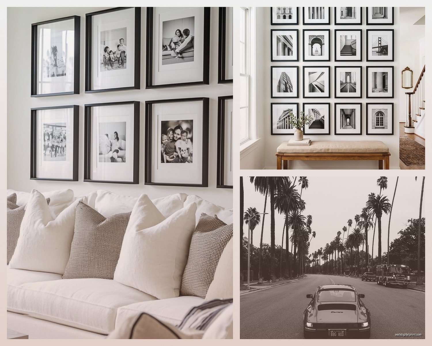
- Grid layout – most formal, all frames same size, evenly spaced. Clean and modern.
- Salon style – mixed sizes, organic arrangement, fills the wall. More eclectic and casual.
- Linear arrangement – single row of frames, same or varied sizes. Great for hallways or above furniture.
- Asymmetric balance – mixed sizes but balanced visually with larger pieces anchoring smaller ones.
Pro tip that saved my walls: arrange everything on the floor first, take a photo, then use that as your guide when hanging. Or trace your frames on kraft paper, tape the paper to the wall, and hammer through the paper to mark your nail spots.
Maintenance and Longevity
Nobody talks about this but it matters. UV-protective glass or acrylic is non-negotiable if your prints are anywhere near windows. I had a beautiful print basically bleached by afternoon sun before I learned this lesson.
Dust frames regularly with a microfiber cloth – sounds obvious but dust accumulation is real and makes everything look dingy. For the glass, use proper glass cleaner but spray it on the cloth, not directly on the frame, so moisture doesn’t seep behind the glass.
Keep prints away from humidity (bathrooms, kitchens) unless they’re properly sealed and protected. Moisture causes warping and can create mold or foxing on paper over time.
Mixing Black and White with Color Art
You can totally do this but you gotta be thoughtful about it. I usually go with a 70/30 or 80/20 ratio – mostly b&w with pops of color, or vice versa. A completely 50/50 mix feels indecisive.
In my living room I have mostly monochrome photography but one colorful abstract painting, and the b&w photos actually make the colorful piece stand out more. They support each other instead of competing.
Keep color pieces and b&w pieces in different zones or on different walls if you’re not confident about mixing them. Like b&w in the dining area, color in the living area – same room but visually separated.
Okay I think that’s everything I wish someone had told me before I started collecting monochrome photography. The main thing is don’t overthink it – if a photo makes you feel something and you can imagine looking at it every day without getting tired of it, that’s probably the right choice. I’ve definitely bought pieces because they seemed “sophisticated” or “on-trend” and ended up storing them in a closet within months, while the prints I connected with emotionally are still on my walls years later.
