Wall Art Guide, Wall Art Tutoriels
Gold and Silver Wall Art: Mixed Metallic Luxury Combo
Aug
So I’ve been obsessing over mixed metallic wall art for like the past three months and honestly it started because a client wanted to combine gold and silver in their dining room and I was like… can we even do that? Isn’t there some design rule against it? Turns out that whole “never mix metals” thing is completely outdated and actually mixing them looks SO much more expensive and collected than matching everything.
The trick with gold and silver wall art specifically is getting the proportions right. You can’t just throw up random pieces and hope they work together. I learned this the hard way when I bought this gorgeous silver abstract piece from West Elm and then added a gold sunburst mirror and they just… fought with each other? Like visually screaming across the room.
Start With Your Dominant Metal
Pick one metal to be your main player, probably around 60-70% of your metallic elements. For most spaces I’m working with, I actually lean toward silver or chrome as the dominant because it reads more modern and doesn’t compete as hard with lighting fixtures. Gold should be your accent unless you’re going for like full maximalist glam vibes.
The thing is you gotta look at what’s already in your room. Your light fixtures, cabinet hardware, picture frames, even that random decorative bowl on your console table. Count up what you’ve got more of naturally. If you’re already 70% silver hardware and fixtures, making silver your dominant wall art metal is gonna feel way more cohesive.
The Ratio Thing That Actually Matters
Okay so this is gonna sound weirdly specific but I’ve tested this in probably fifteen different spaces now. Your metallic wall art should follow roughly this breakdown:
- 60-70% your dominant metal
- 20-30% your accent metal
- 10-20% can be mixed pieces that incorporate BOTH metals
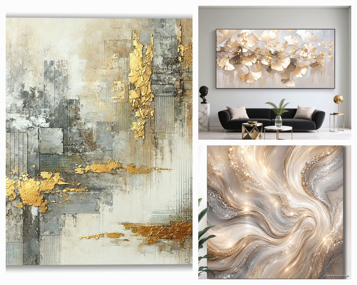
Those mixed pieces are actually the secret weapon because they act as visual bridges. I found this amazing piece on Etsy that has both gold leaf and silver leaf in an abstract pattern and it literally ties my whole gallery wall together. Cost like $180 but worth every penny for what it does to the space.
Finding Pieces That Actually Mix Both Metals
This is harder than you’d think? Most wall art is solidly one metal or the other. But there are a few types that naturally incorporate both:
Abstract geometric pieces with layered metals work really well. Look for artists who specifically work in mixed media metallics. I follow this one artist on Instagram who does resin pours with gold and silver leaf embedded and they’re stunning… wait I’m getting distracted.
Mirrors with mixed metal frames are easier to find. Anthropologie does a bunch of these, and also check out CB2’s mirror section. They usually have at least a couple options with both warm and cool metals in the frame design.
Metal wall sculptures that have dimensional layers often incorporate multiple finishes. The depth means the different metals don’t compete as much because they’re literally on different planes.
Placement Strategy That I Wish Someone Told Me Earlier
Don’t cluster all your gold pieces on one wall and silver on another unless you want it to look like your room has a personality disorder. Distribute them so your eye travels around the space and sees both metals in every sightline.
I usually do this thing where I lay everything out on the floor first in the approximate arrangement. Take a picture from above with your phone. Look at that picture and squint your eyes… if the gold or silver “clumps” stand out super obviously, redistribute.
The height matters too and this is something I see people mess up constantly. Your largest pieces should generally be at eye level (that’s like 57-60 inches to the center of the piece for most people). But with mixed metallics, I actually like varying the heights more dramatically than usual because it creates visual movement that helps the different metals feel intentional rather than random.
Mixing Finishes Within Each Metal
Oh and another thing that makes this whole thing look more expensive… don’t use all shiny gold and all shiny silver. Mix in different finishes:
- Brushed or matte gold with polished gold
- Antiqued silver with bright chrome
- Rose gold as a transitional tone between yellow gold and silver
- Champagne or brass tones that read somewhere between gold and silver
That variety in finish makes it look collected over time instead of bought all at once from the same store. Which is the whole vibe we’re going for right? My cat just knocked over my coffee while I’m writing this, typical.
Size Relationships and Visual Weight
Metallic pieces read as heavier visually than other wall art because they reflect light. A 24×36 inch gold abstract is gonna have more visual presence than a 24×36 inch matte painting. Keep this in mind when you’re planning scale.
I usually go slightly smaller with metallic pieces than I would with regular art for the same wall space. Like if I’d normally do a 48 inch wide piece above a sofa, I might do a 36-40 inch metallic piece instead because it’ll still have plenty of impact from the reflective quality.
When mixing gold and silver in the same arrangement, the gold pieces can usually be a bit smaller than the silver ones and still hold their own visually. Gold just pops more, especially in warm lighting.
Gallery Wall Approach
For a mixed metallic gallery wall I usually do something like:
One large silver piece as an anchor (this is often a mirror for me because the reflection adds even more dimension). Then three to four medium gold pieces scattered around it. Two or three small mixed metal pieces to tie it together. And honestly I’ll usually throw in one or two non-metallic pieces too… like a black and white photo or a textured white piece because too much metal can feel cold.
The non-metallic elements give your eye a place to rest and make the metallics pop more by contrast.
Lighting Considerations You Can’t Ignore
This is huge and I wish I’d paid more attention to it earlier. The lighting in your room completely changes how gold and silver wall art looks and whether they’ll actually work together.
Warm lighting (those yellowy bulbs around 2700-3000K) makes gold look amazing and rich but can make silver look kinda dingy or yellow. Cool lighting (4000K+) makes silver pop and look crisp but can make gold look washed out or greenish.
My solution? Use 3000-3500K bulbs which are neutral enough to let both metals look good. Or get smart bulbs that you can adjust depending on time of day and mood.
Also think about natural light. A room with tons of natural light can handle more silver because daylight is cool-toned. A room with limited natural light might need more gold to keep it from feeling cold.
Where to Actually Buy This Stuff
Okay so real talk about sourcing because this took me forever to figure out. HomeGoods and TJ Maxx have surprisingly good metallic wall art but it’s totally random what they’ll have. I check probably once a week when I’m near one.
West Elm and CB2 have reliable selections but you’re gonna pay for it. Their stuff is good quality though and the finishes are consistent which matters when you’re trying to match metals across pieces.
Etsy is amazing for custom and unique pieces but the quality is ALL over the place. Read reviews obsessively and look at customer photos not just the listing photos. I’ve been burned by pieces that looked gorgeous online but showed up looking cheap and plasticky.
Amazon has a ton of options and honestly some of them are fine? You gotta really zoom in on the photos and again read recent reviews. Anything under $40 is probably not gonna have a real metal finish, it’ll be printed or vinyl which can look okay from a distance but won’t have that reflective quality.
wait I forgot to mention Society6 and Minted which both have some cool metallic options from independent artists. The quality is generally good and you’re supporting actual artists which feels nice.
The Frame Situation
If you’re framing metallic prints or adding frames to metallic pieces, the frame finish matters SO much. I usually go with:
Black frames with gold art (classic and lets the gold pop). White or natural wood frames with silver art (keeps it from feeling too industrial). Mixed metal frames when you can find them are obviously perfect.
Avoid matching your frame metal to your art metal exactly… like don’t put a gold print in a gold frame. It’s too matchy and loses definition. You want some contrast between the frame and the art itself.
Common Mistakes I See All The Time
Putting all metallic pieces in a tight cluster. Spread them out or they’ll look like a disco ball exploded on your wall.
Mixing too many different metal tones. Gold, silver, copper, brass, rose gold, bronze… pick like three max or it gets chaotic.
Ignoring the undertones. Some golds are very yellow, some are more rose or champagne. Some silvers are bright chrome, some are pewter or gunmetal. Make sure your golds generally match each other in undertone and same with your silvers.
Hanging everything at the same height in a straight line. This can work in some modern spaces but usually you want variation in height with metallic pieces to create movement.
Going too small. Metallic wall art needs to be substantial enough to make a statement or it just looks like you stuck up some random shiny things.
Styling Around Your Metallic Art
The rest of your decor needs to support the mixed metal thing or it’ll look confused. I usually pull in metallic accents in other areas:
Table lamps with mixed metal bases or finishes. Throw pillows with metallic thread or beading in both gold and silver. Decorative objects like vases or bowls in coordinating metals. Even your coffee table books can have gold or silver lettering that ties in.
But don’t go overboard… you want the wall art to be the star. The other metallic elements should be supporting players not competing for attention.
Seasonal Adjustments
This is gonna sound weird but I actually swap out some of my metallic pieces seasonally. In summer I lean heavier on silver because it feels cooler and crisper. In winter I bring in more gold pieces for warmth. The bones of the arrangement stay the same but switching out like two pieces can completely change the vibe.
You don’t have to do this but if you get bored easily like me it’s a way to refresh your space without buying all new stuff. Store the off-season pieces carefully though… metallics scratch easily.
Making It Work in Different Room Styles
Modern minimalist spaces look great with mostly silver and just touches of gold in geometric shapes. Keep lines clean and don’t overcrowd.
Traditional or transitional rooms can handle more gold overall with silver as the accent. Ornate frames and classical subjects work here.
Bohemian or eclectic spaces are actually perfect for mixed metallics because the more-is-more vibe makes the combination feel intentional. Layer in lots of textures and patterns to support the metals.
Industrial spaces benefit from raw steel or iron pieces mixed with warmer brass or copper tones rather than shiny gold and silver.
The key is making sure your metallic art matches the overall vibe of your room not fighting against it. A super ornate gold baroque frame is gonna look weird in a minimalist space no matter how well you balance it with silver pieces.
Anyway that’s basically everything I’ve learned from trial and error and probably too many hours scrolling through online galleries at midnight. The mixed metallic thing really does look more luxe and collected when you get the balance right, just gotta be intentional about it rather than random.