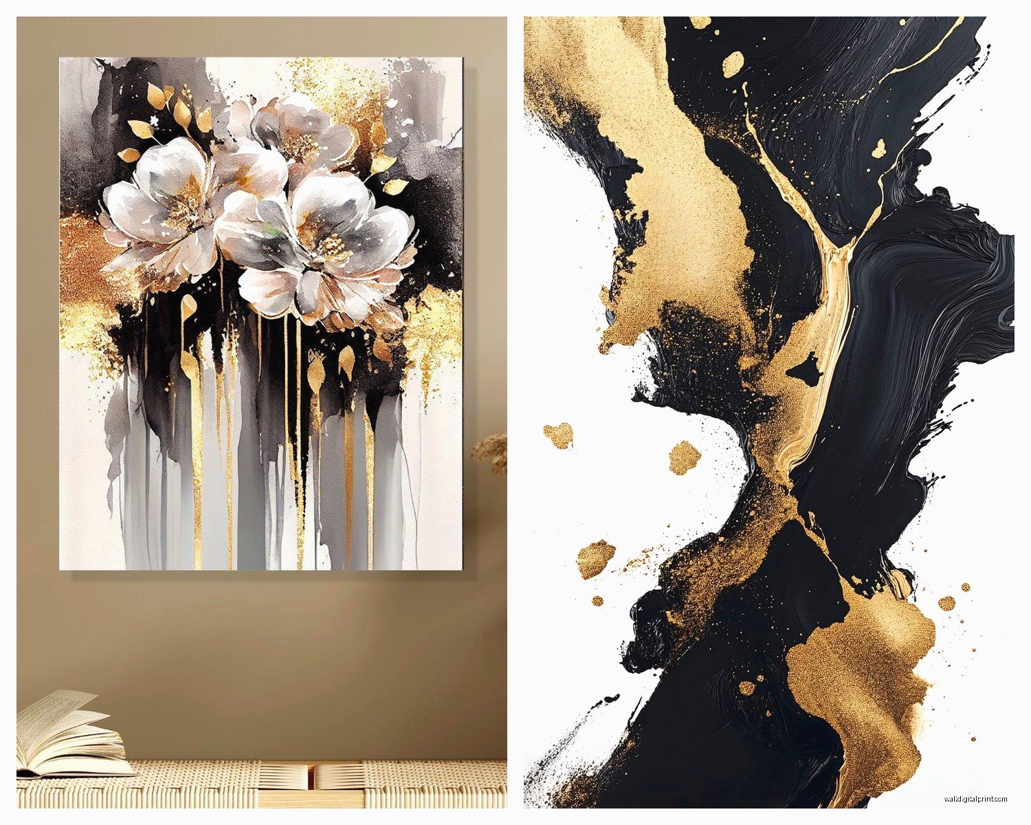
Wall Art Guide, Wall Art Tutoriels
Black White and Gold Wall Art: Tri-Color Luxury Contrast
Aug
So I was literally reorganizing my studio last week and got totally sucked into this whole black white and gold wall art thing because a client texted me at like 9pm asking which pieces she should get for her dining room and honestly? It’s one of those color combos that looks SO easy but you can mess it up real fast if you don’t know what you’re doing.
The Ratio Thing Nobody Tells You About
Okay so here’s what I figured out after buying way too many pieces myself – the ratio matters SO much more than anyone admits. You can’t just throw equal amounts of all three colors on your wall and expect it to look expensive. That’s gonna look like a Pinterest fail.
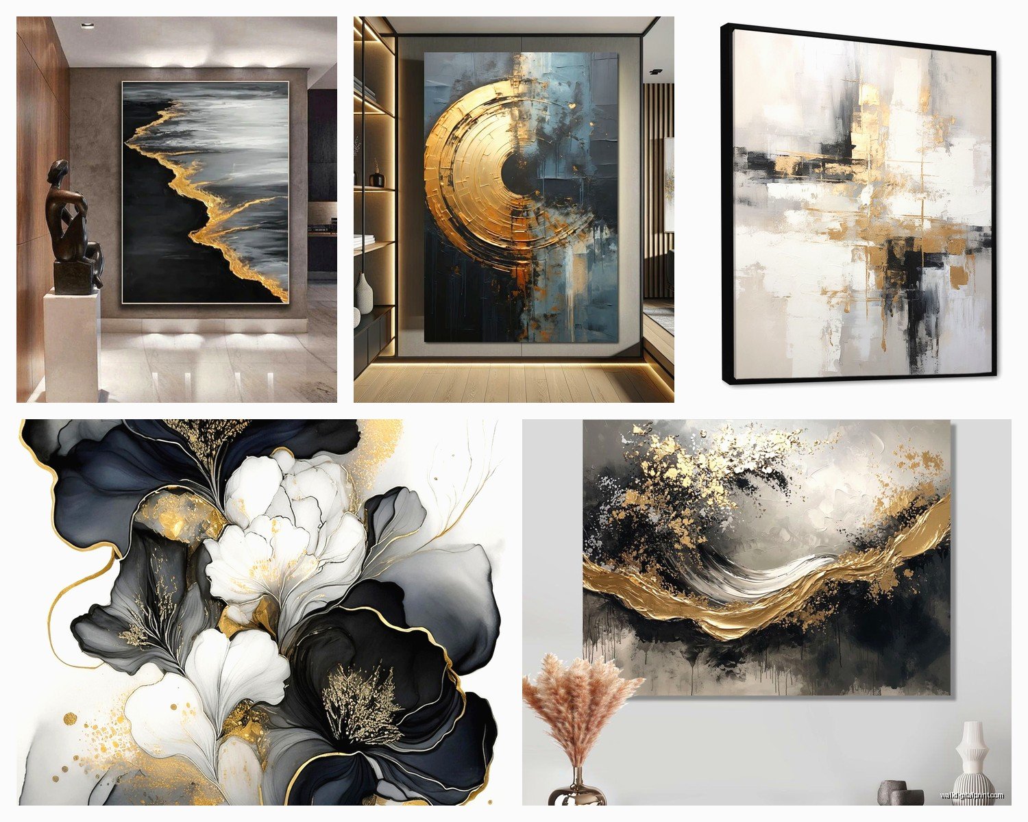
The rule I use is like 60-30-10 but for wall art specifically. So you want your dominant color to be either black or white (usually white for smaller rooms, black for dramatic larger spaces), then your secondary color is the opposite, and gold is always your accent. Always. If you do too much gold it looks like a Vegas hotel lobby, and not in a good way.
I learned this the hard way when I bought this huge canvas that was like 50% gold and it just screamed at everything else in the room. Returned it immediately.
Where to Actually Start Looking
Target has some surprisingly decent stuff in their Project 62 line – I got this abstract black and white piece with gold leaf accents for like $40 and my friends thought it was from an actual gallery. The trick is you gotta go in person because the online photos make everything look weirdly flat.
Etsy is obviously where I find most of my unique pieces but you need to search super specifically. Don’t just type “black white gold art” because you’ll get 10 million results. Try:
- Black and white abstract with gold foil
- Minimalist line art gold accents
- Geometric gold leaf print
- Marble texture gold vein art
Oh and another thing – check the seller reviews specifically for comments about the gold. Some prints use this weird yellow color that’s supposed to be gold but looks like mustard. You want actual metallic gold or at least a warm champagne tone.
Mixing Frame Styles Without Looking Messy
This is where people get tripped up constantly. You’re working with three colors already so your frames need to be SIMPLE. I usually go with:
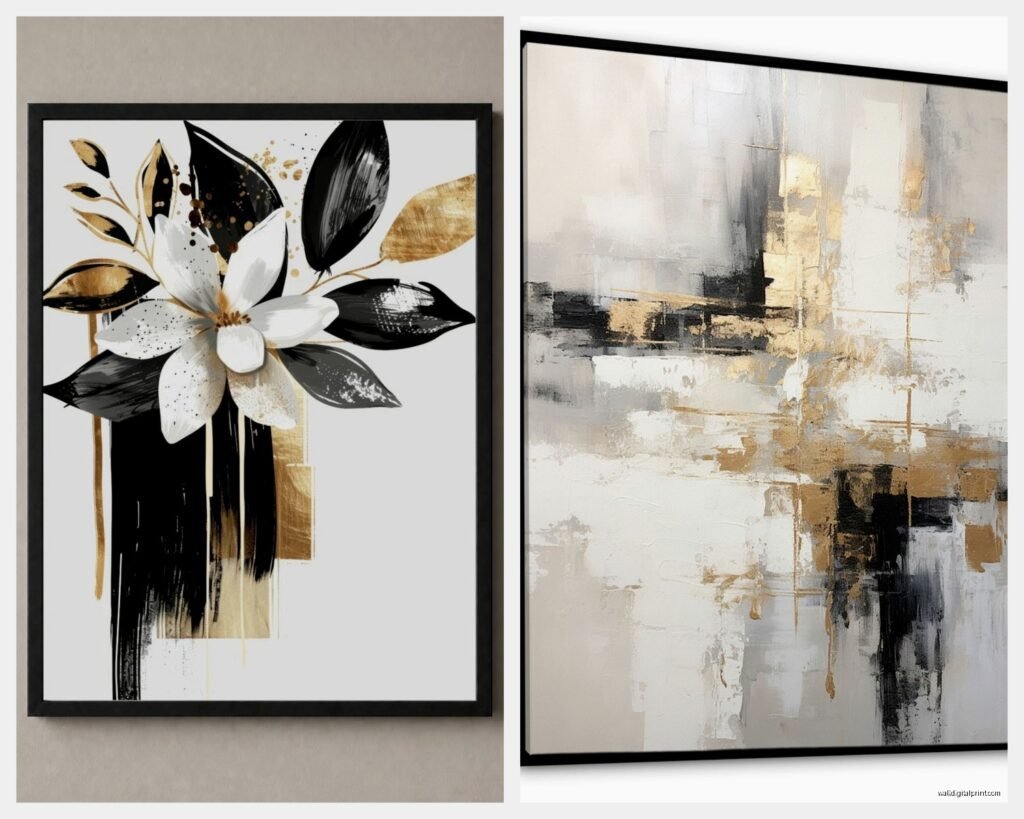
Black frames for white-dominant pieces. White or natural wood frames for black-dominant pieces. And for pieces that already have gold in them – thin gold frames or no frame at all if it’s a canvas.
My living room has this gallery wall situation and I mixed black and white frames but kept them all the same width (about 1 inch). That consistency is what makes it look intentional instead of chaotic.
Wait I forgot to mention – if you’re doing a gallery wall with this color scheme, you need at least one purely black and white piece with NO gold. It gives your eye a place to rest. I have this simple line drawing of a woman’s face that’s just black on white and it anchors the whole wall.
The Texture Question
Okay so funny story, I bought three pieces once that looked amazing individually but when I hung them all together they were ALL glossy and it was like staring at mirrors. Too much reflection, super distracting.
You want texture variety:
- One matte piece
- One with actual physical texture like impasto or embossing
- One with metallic elements that catch light
Canvas prints tend to have that nice matte quality naturally. Then you can add a framed gold foil print under glass for shine. And maybe something with raised brushstrokes for that tactile element.
HomeGoods is actually great for finding textured pieces at random – you just gotta go weekly because their inventory changes constantly. I found this black and white abstract with actual gold leaf chunks embedded in it for $35 and I still can’t believe it.
Size and Placement Math
This is gonna sound weird but I measure everything with my phone first. Like I’ll hold my phone up against the wall and take a picture to see proportions before buying anything large.
For over a sofa, you want your art to be about 2/3 the width of the sofa. So if your sofa is 90 inches, look for pieces or groupings that are around 60 inches wide.
For a single statement piece, bigger is usually better unless your room is tiny. I see people buying these wimpy little 16×20 prints for huge walls and it just looks lost. Go at least 30×40 if you’re doing a single piece in a main room.
My cat knocked over a piece last month and I had to replace it and realized I’d sized it way too small originally – the new one is literally twice the size and the room finally feels balanced.
The Three-Piece Configuration That Actually Works
If you’re doing a triptych situation (three connected pieces), here’s what I do:
Center panel should have the most gold. It draws the eye and creates a focal point. The side panels can be more black and white heavy. This creates this nice visual flow where your eye goes to the middle first then explores outward.
I have this setup in my bedroom – center panel is this abstract gold marble thing, and the sides are black ink washes with just tiny gold specks. It’s chef’s kiss perfect and cost me like $120 total from an Etsy seller in Poland.
What Not to Buy
Okay real talk – avoid anything that says “glam” or “Hollywood Regency” in the description unless that’s specifically your aesthetic. Those pieces tend to go too heavy on the gold and look dated really fast.
Also skip anything with words unless it’s like a vintage poster or something architectural. Those “live laugh love” type things in these colors just look cheap even when they’re not.
And I’m gonna say it – those gold palm leaf prints? They were everywhere in 2019 and they’re already feeling tired. If you love them get them, but just know you might be replacing them in a couple years.
Lighting Considerations Nobody Mentions
Your lighting is gonna completely change how these pieces look. Gold especially shifts depending on whether you have warm or cool bulbs.
I switched all my bulbs to 2700K (warm white) and suddenly all my gold accents looked cohesive. Before that, with the cool daylight bulbs, the gold looked brassy and weird.
Picture lights are worth it if you’re investing in nicer pieces. You can get battery-operated LED ones for like $20 on Amazon and they make even affordable art look expensive. Just angle them right so you don’t get glare on any glass.
Mixing Art Styles in This Color Scheme
You can totally mix abstract with photography with line drawings – the colors unify everything. But here’s the thing… you need to pick ONE dominant style.
So like, you could do mostly abstract with one photographic piece as an accent. Or mostly geometric with one fluid abstract piece. But if you try to do equal amounts of everything it gets visually noisy.
My office has four pieces – three are abstract (different styles but all abstract), and one is an architectural photograph. The photo is the conversation starter but the abstracts create the mood.
DIY Option If You’re Crafty
Not gonna lie, I made two of my pieces myself and they’re some of my favorites. You just need:
- Canvas boards from Michael’s (wait for the 50% off sale)
- Black and white acrylic paint
- Gold leaf sheets or gold acrylic paint
- Mod Podge for sealing
I watched The Crown while making mine and just did random abstract strokes. The imperfection actually makes it look more expensive somehow? Just don’t overthink it.
The key with DIY is to use actual gold leaf sheets for at least some elements. The fake stuff looks fake. Gold leaf is like $15 for a pack and it goes further than you think.
Where This Color Combo Works Best
Dining rooms are like MADE for black white and gold art. Something about the formal nature of these colors fits perfectly. I did a client’s dining room with a huge black and white abstract that had gold veining through it and every dinner party someone asks where she got it.
Living rooms obviously work great. Bedrooms can work but you gotta be careful it doesn’t feel too cold – maybe add some warm wood tones in your furniture to balance it.
Bathrooms are underrated for this scheme. A small gold-accented print in a black frame above the toilet? Instantly elevated.
Oh and another thing – entryways! First impression spaces love this color combo because it reads as expensive immediately.
Seasonal Flexibility
One thing I love about this palette is it works year-round. Some color schemes feel very seasonal but black white and gold transitions through everything.
In winter it feels sophisticated and formal. In summer it feels crisp and clean. You don’t have to swap anything out seasonally unless you want to.
I have kept the same pieces up for two years now and they still feel current. That’s saying something because I usually get bored and change things every six months.
Budget Breakdown Reality Check
You can totally do this on different budgets. Here’s what I’ve spent at various price points:
Budget version (under $150 for 3-4 pieces): Target, HomeGoods, Etsy prints with cheap Amazon frames.
Mid-range ($300-500): Mix of West Elm sale items, nicer Etsy originals, custom framing for one statement piece.
Splurge ($1000+): Gallery pieces, original art from local artists, professional framing, maybe one sculptural piece.
Honestly the budget version can look just as good if you’re thoughtful about it. I’ve mixed $30 prints with $300 originals and nobody can tell which is which.
The Grouping Formula
If you’re hanging multiple pieces, odd numbers look better. Three or five pieces, not four. Something about visual balance and asymmetry.
I usually do a triangle configuration – one larger piece up top, two smaller pieces below. Or a horizontal line of three with the middle one slightly lower.
And leave like 2-3 inches between frames. Closer than that feels cramped, further apart and they stop reading as a group.
My client texted me back after I sent her all this and ended up getting two large pieces from West Elm (on sale thank god) and one small gold leaf piece from this artist on Etsy and her dining room looks absolutely incredible now. She’s already planning to do her bedroom next.
Just remember the ratio thing and don’t go overboard with the gold and you literally cannot mess this up. It’s such a forgiving color scheme once you understand the basics.