Wall Art Guide, Wall Art Tutoriels
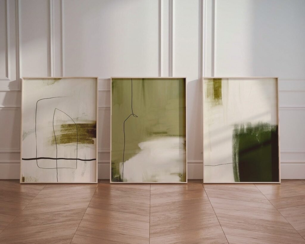
3 Prints Wall Art: Trio Poster Gallery Collection
Sep
So I’ve been setting up trio print galleries for like three years now and honestly it’s one of those things that looks super simple until you actually try to hang three posters and they’re all crooked and different heights and you’re standing there with a hammer wanting to cry.
Why Three Prints Actually Work (and why not two or four)
Okay so the thing about three prints is they create this visual triangle that your eye naturally follows. Two prints feel unfinished, four can look too corporate unless you’re doing that perfect grid thing which is a whole different vibe. Three gives you that “I curated this” look without trying too hard.
I had this client last month who insisted on four prints and we spent like forty minutes rearranging them before she was like “yeah okay I see what you mean about three now” and we just removed one and suddenly the whole wall came together.
Picking Your Three Prints (the part everyone overthinks)
You basically have a few directions you can go here and honestly none of them are wrong:
The Matching Set Approach
This is when you buy three prints that are literally designed to go together. Same artist, same color palette, usually sold as a set. This is honestly the easiest route if you’re not confident in your eye yet. I use this for clients who get decision paralysis because it takes like 90% of the guesswork out.
The downside is it can look a little… catalogue-ish? Like sometimes I walk into someone’s place and I’m like “ah yes, the botanical triptych from that one website we all know.” Not bad, just not super personal.
The Theme Variation Method
This is where you pick three different prints but they share something. Maybe they’re all landscapes but different locations. Or all abstract but different color stories that complement each other. Or all vintage typography.
I did this in my own bedroom actually with three different desert photographs and it’s still one of my favorite things. One’s the Mojave, one’s Sedona, one’s this random spot in Arizona I found on a road trip. They’re all different photographers but the warm terracotta vibe ties them together.
The Chaotic Good Approach
This is gonna sound weird but sometimes just grabbing three prints you genuinely love works even if they “shouldn’t” go together. I’ve seen someone mix a vintage Paris poster with abstract watercolor with a line drawing of a dog and it worked because the frames were identical and the sizing was consistent.
The key here is you gotta commit to the chaos. If you’re gonna mix styles, really mix them. Don’t try to make them match because then it just looks confused.
Size Combinations That Don’t Suck
Oh man this is where people mess up constantly. Here’s what I’ve learned actually works:
Three identical sizes is the safest bet. Like three 16×20 prints or three 11x14s. You can’t really screw this up arrangement-wise. Hang them in a straight line at the same height and you’re done. I probably use this configuration 60% of the time.
One large, two small is more interesting visually but trickier to balance. Usually I’ll do like a 24×36 in the middle with two 11x14s flanking it. Or the large one on one end with the two small ones stacked on the other end. This creates more visual movement which is cool for bigger walls.
Three graduated sizes going from big to medium to small can work but honestly it’s hard to pull off without it looking like you just grabbed whatever was on sale. I’ve only done this successfully like twice and both times it was very intentional with custom sizing.
What doesn’t work: three random sizes that have no relationship to each other. Like a 12×16 with an 18×24 with an 8×10. Your eye doesn’t know where to land and it just feels messy.
Frame Situation (more important than you think)
Okay so funny story, I once spent $400 on three gorgeous art prints and then put them in mismatched frames from Target because I was being cheap and the whole thing looked like a college dorm room. Frames matter SO much.
For a cohesive look, your frames should match. Same color, same style, same width. Black frames are foolproof. Natural wood frames are having a moment and they’re warmer. White frames can work but they show damage easily and my cat knocked one off the wall once and it chipped immediately.
Mat or no mat is a whole debate but here’s my take: mats make everything look more expensive and gallery-like, but they also make the actual image smaller which can be frustrating if you paid for a certain size print. I usually do mats for smaller prints (like 8×10 or 11×14) and skip them for anything 16×20 or larger.
Budget Frame Options
IKEA Ribba frames are actually decent and like $15-30 depending on size. They’re basic black, they work, whatever.
Framebridge is pricier but if you’re doing custom sizing they’re worth it and their quality is genuinely better.
Amazon has tons of frame sets specifically for gallery walls and some are fine and some are garbage. Read the reviews and look for ones that mention the glass is actually glass not plastic.
The Actual Hanging Part (grab a beer first)
Listen I’ve hung probably three hundred gallery walls at this point and I still use painters tape to map everything out first because I am not drilling multiple holes in a wall just to realize the spacing looks weird.
The Tape Method That Saves Your Sanity
Cut pieces of painters tape or paper the exact size of your frames. Stick them on the wall. Move them around until it looks right. This sounds so simple but I cannot tell you how many people skip this step and regret it.
For three prints in a horizontal line, I usually do 3-5 inches of space between each frame. Less than 3 inches and they look crowded, more than 6 inches and they look disconnected.
The center of your middle print should be at eye level, which is supposedly 57 inches from the floor but honestly I adjust based on the room. In a dining room where people are seated, I go lower. In a hallway, sometimes I go higher.
Actually Measuring and Leveling
You need a level. Your phone has a level app, use it. Things that look level to your eye are almost never actually level.
Measure from the top of your frame to where the hanging wire or hook sits when pulled taut. This measurement is crucial because this is how far below your pencil mark you’ll actually hammer.
I use regular picture hanging hooks for anything under 20 pounds and those heavy duty ones for bigger frames. Anchors if you’re going into drywall with something heavy.
Wait I forgot to mention – if you’re renting and can’t put holes in the wall, Command strips work for lightweight frames but read the weight limit. I’ve had frames crash down at 2am and it’s not fun.
Arrangement Layouts That Work
Horizontal line: Classic, clean, works in most spaces. All three frames at the same height, evenly spaced. This is my go-to for above a sofa or bed.
Vertical stack: Good for narrow walls like beside a doorway or in a hallway. Center them vertically and keep consistent spacing.
Triangle formation: One print higher, two below it creating a triangle shape. More dynamic but harder to pull off. I only do this in bigger spaces.
Asymmetrical cluster: This is where you get creative with different heights and spacing but it still feels balanced. Honestly requires a good eye and lots of stepping back to check if it looks right.
Color Coordination Without Making It Boring
Your three prints should share at least one color or they should all be black and white. That’s basically the rule. You can have one print that’s mostly blue, one that’s mostly yellow, and one that’s mostly pink, but if they all share like a cream background or similar tone, your eye connects them.
All black and white prints are almost impossible to screw up together. Just saying. When I’m working with a client who’s very “I don’t know what I like,” I often steer them toward black and white photography or line drawings because it’s so forgiving.
Oh and another thing – consider what’s already in the room. If your sofa is navy blue and you hang three prints that have navy in them, that’s gonna tie everything together nicely. If everything in your room is neutral and you bring in three colorful prints, they’ll really pop as a focal point.
Where to Actually Buy Trio Prints
Etsy is like 70% of where I source prints for clients now. You can find independent artists, lots of instant download options which are cheaper, and the variety is insane. Search for “set of 3 prints” or “trio wall art” and you’ll find tons.
Society6 and Redbubble have curated collections and the print quality is pretty consistent. More expensive than Etsy downloads but they handle the printing and shipping.
Minted is bougie but their stuff is legitimately beautiful and they often have sales.
Desenio is having a moment on Instagram and their minimalist prints are very on trend right now. Scandinavian vibes.
For budget options, honestly Canva has templates now where you can create your own trio prints and just get them printed at a local print shop for cheap. I’ve done this for clients who want something super custom.
Common Mistakes I See Literally All the Time
Hanging everything too high. Your gallery wall shouldn’t be floating near the ceiling, it should feel connected to the furniture below it.
Buying frames first then trying to find prints that fit. Do it backwards, pick your prints then get frames for them.
Not considering the wall color. Three white-matted prints on a white wall can disappear. Sometimes you need contrast.
Mixing frame colors trying to be ecleatic but it just looks unfinished. If you’re gonna mix metallics like gold and silver, you gotta really commit and repeat those metals elsewhere in the room.
Using all landscape orientation or all portrait orientation without considering the wall space. A wide horizontal wall needs horizontal prints, a tall narrow wall needs vertical prints.
Making It Feel Personal and Not Basic
The difference between a trio print gallery that looks like everyone else’s and one that actually reflects you is usually in the print selection itself. Yeah you can buy that same eucalyptus botanical print set that’s everywhere, or you can find three vintage botanical illustrations of plants that mean something to you.
I always tell people to think about what they actually want to look at every day. Travel photos from places you’ve been. Art styles that make you happy. Colors that energize you or calm you down depending on the room.
One of my favorite trio galleries I ever did was for someone who was obsessed with their three rescue dogs, so we did minimalist line drawing portraits of each dog. Simple black frames, white background, absolutely perfect for them and totally unique.
Anyway that’s basically everything I’ve learned from doing this over and over. The main thing is just to plan it out before you start drilling holes, keep your frames consistent, and pick prints that actually make you happy when you look at them instead of just what you think is supposed to go there.