Wall Art Guide, Wall Art Tutoriels
Gold Wall Art for Bedroom: Metallic Luxury Sleep Space Accents
Sep
So I’ve been obsessing over gold wall art for bedrooms lately and honestly it’s kinda changed how I think about metallic accents entirely. Like, I used to think gold was too fancy or whatever, but then I redid my sister’s bedroom last month and now I’m that person who won’t shut up about it.
The Thing About Gold Tones Nobody Tells You
Okay so first thing – not all gold is the same and this matters SO much. You’ve got your bright shiny gold that looks like a trophy, then there’s brushed gold which is more matte and sophisticated, and then antique gold which has like a vintage patina thing going on. I learned this the hard way when I ordered what I thought was gonna be a subtle gold leaf print and it arrived looking like someone bedazzled my wall.
For bedrooms specifically, I usually steer people toward brushed or antique gold because the shiny stuff can be really intense when you’re trying to sleep. The light bounces off it weirdly and if you have any natural light coming in at sunrise you’re basically sleeping in a disco ball. Not great when you’re hungover on a Saturday, trust me.
Where to Actually Put Gold Art
The above-the-bed spot is obvious but it’s also tricky. You want something substantial enough that it doesn’t look like you just slapped up whatever was on sale, but not so massive that it feels like it’s gonna fall on your face while you sleep. I typically go for pieces that are about two-thirds the width of your bed. So like if you have a queen bed, you’re looking at around 48 to 60 inches wide.
But here’s what I’ve been doing more recently – asymmetrical arrangements on the wall opposite the bed. You see it when you’re lying down and it doesn’t have that same pressure to be perfectly centered and matchy-matchy. I did this in a client’s space last week with three different sized gold abstract pieces and she literally texted me at midnight being like “I can’t stop staring at this wall” which is either really good or slightly concerning.
The Gallery Wall Approach
Gallery walls with gold accents are having a moment but you gotta be careful. Too much gold and it looks like a rapper’s mansion (no offense to rappers). What works is mixing gold frames with black or white frames, or doing gold art mixed with black and white photography.
I usually do a ratio thing – like 30% gold maximum in the overall composition. So if you’ve got nine pieces, maybe three have gold elements. The rest should be neutral or have colors that complement gold like navy, emerald green, or even blush pink.
Mixing Metals Because Life’s Too Short
People get so stressed about the whole “don’t mix metals” rule and honestly it’s kinda outdated? In bedrooms especially, you can totally have gold wall art with silver lamps or brass hardware. The key is making sure one metal is dominant. So if your wall art is gold, that should be your main metallic moment, and then you can have like one or two other metal finishes as accents.
I’ve got gold art in my own bedroom with nickel drawer pulls and it’s fine. My cat knocks stuff off my dresser way more than anyone notices the mixed metals, so there’s that.
Types of Gold Wall Art That Actually Work
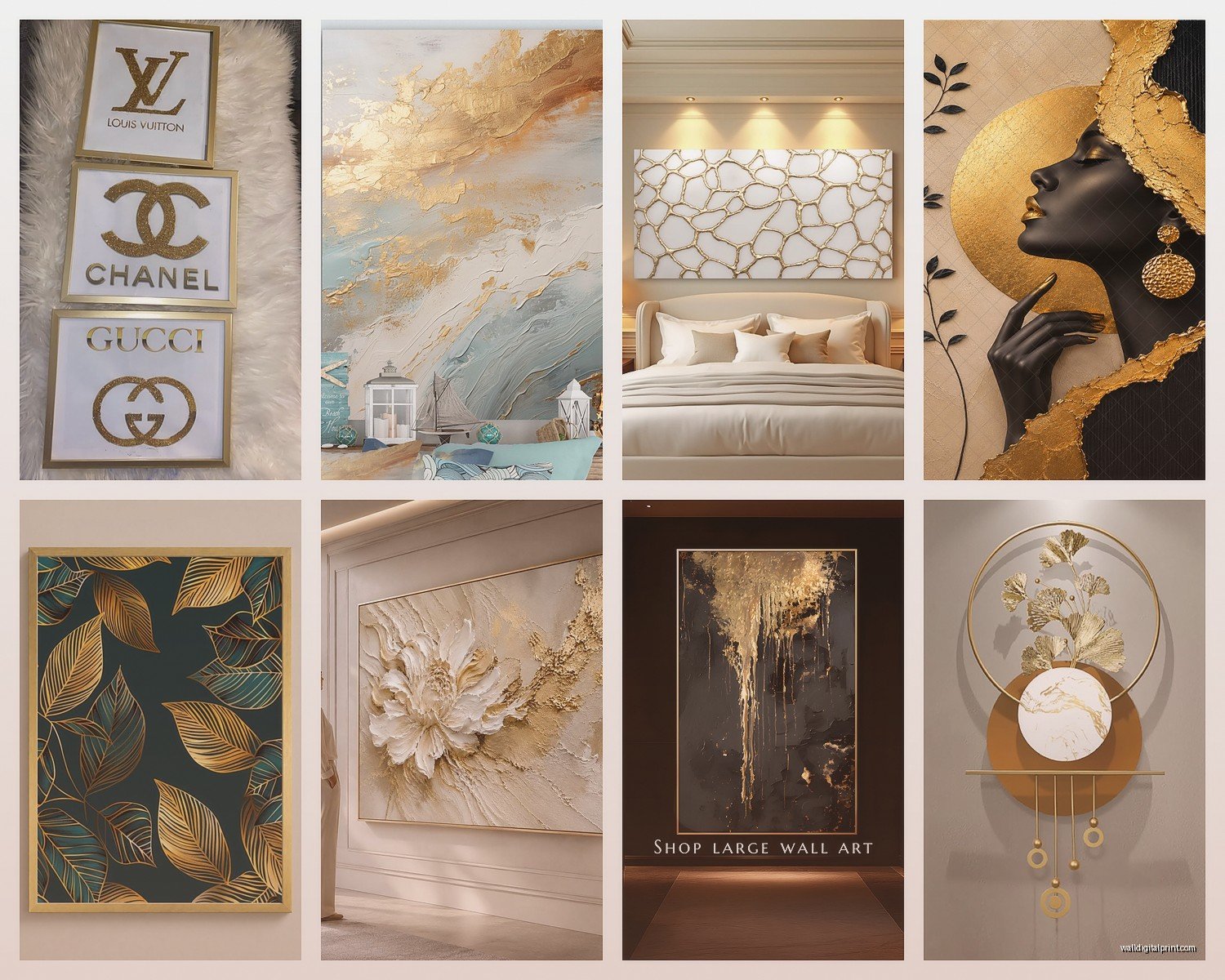
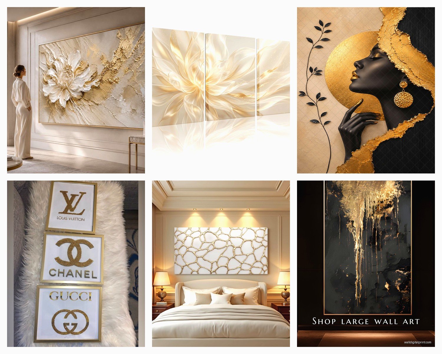
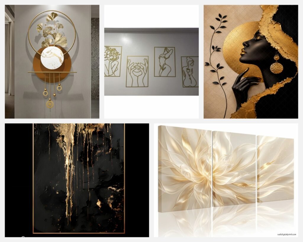
Abstract gold leaf prints are probably the easiest to work with. They’re not too literal, they catch light in interesting ways, and they work with pretty much any decor style. I order a lot of these from independent artists on Etsy – the ones where they use actual gold leaf or gold paint with texture. Way better than the printed poster versions.
Gold metal wall sculptures are having a huge moment right now. Like those geometric ones or the organic branch-looking things. They create actual shadows and dimension which is cool, but make sure you have enough wall space. I made the mistake of putting a large gold sunburst mirror-art-thing (it was art, not a mirror, but mirror-shaped?) on a wall that also had a gallery ledge and it was just too much happening.
Gold Frame Situations
Sometimes the easiest way to bring in gold is just through frames. You can frame literally anything – pressed flowers, fabric swatches, pages from old books, your kid’s art if you’re into that. I framed some vintage botanical prints in thin gold frames for a client and it cost maybe $200 total but looked like a thousand bucks.
Thrift stores are amazing for gold frames btw. You can find ornate vintage ones and either use them as-is for that maximalist look or spray paint over them with a more modern gold finish. I did this last weekend while watching that new cooking show – bought five frames for like $30 and they turned out great.
Scale and Proportion Stuff
This is gonna sound obvious but I see people mess this up constantly – measure your wall before you buy anything. I know, I know, but seriously. I use painter’s tape to map out the size on the wall before ordering. Looks crazy but saves you from that thing where you hang something and it’s either comically small or way too big.
For standard 8-foot ceilings, I usually don’t go bigger than 40 inches tall for a single piece above a bed. Higher ceilings you can go bigger. Lower ceilings keep it under 30 inches or it starts to feel cramped.
Lighting Makes or Breaks Gold Art
Okay so funny story – I installed this gorgeous gold abstract piece in a bedroom and in the daytime it looked amazing but at night with just the bedside lamps it looked kinda muddy and brown. Ended up adding a picture light above it and boom, completely different vibe.
Gold needs light to do its thing. If your bedroom is naturally dark or doesn’t get much natural light, you might wanna reconsider how much gold you use. Or just commit to the lighting situation – add sconces, picture lights, or even just brighter bulbs in your existing fixtures.
I’m a big fan of warm white bulbs (around 2700K) with gold art because cool white makes gold look brassy and weird. This is super specific but it matters when you’re lying in bed looking at your walls for hours because you can’t sleep and decided scrolling isn’t allowed after 11pm anymore.
The Textured Gold Thing
Textured gold pieces – like canvas with actual dimensional gold paint or mixed media with gold leaf – these are my favorite lately. They change depending on the time of day and where you’re standing. Way more interesting than flat prints.
There’s this one artist I found (I think through Instagram?) who does these textured pieces with gold and cream and they’re expensive but not insane, and they photograph really well which matters if you’re ever gonna post your bedroom online. Not that that should be the priority but like, it doesn’t hurt.
Budget-Friendly Options That Don’t Look Cheap
You don’t gotta spend a fortune. I’ve used gold washi tape to create geometric designs directly on walls – costs like $15 and looks intentional if you plan it out. Gold leaf flakes applied to a painted canvas is another cheap option. You can buy composition gold leaf (not real gold) for pretty cheap and just go wild.
DIY gold art is actually pretty forgiving because the metallic quality hides a lot of imperfections. I made some abstract pieces using gold acrylic paint and a palette knife and honestly they look more expensive than some of the stuff I’ve bought.
What to Avoid
Those word art things in gold that say like “dream” or “breathe” – just no. Unless you’re really into that vibe but even then, there are more interesting ways to bring in gold.
Also super shiny gold plastic frames. They just look cheap no matter what’s in them. If you’re going budget, matte gold or brushed gold reads way better.
And this might be controversial but those giant gold lips or fashion illustration prints? They’re everywhere right now and they’re gonna look so dated in like two years. If you love them go for it but just know you’re probably gonna wanna switch them out soon.
Styling Around Gold Art
Your bedding doesn’t need to match your gold art but it shouldn’t fight with it either. I usually go neutral with bedding when there’s gold on the walls – whites, creams, grays, maybe a muted blue or green. Keeps things calm.
If you wanna bring the gold theme through the room, do it sparingly. Gold drawer pulls, a gold-framed mirror, maybe a gold base on a lamp. But don’t go crazy. My client last month wanted gold everything and I had to talk her down from gold curtain rods AND gold bed frame AND gold everything because it would’ve been too much.
The Rest of Your Furniture
Gold plays really well with wood tones, especially walnut and darker woods. Also works great with white or cream furniture for that airy luxe look. I’m less sold on gold with gray furniture but I’ve seen it work if the gold is more antique/vintage looking rather than bright and shiny.
Maintaining Gold Art
Dust is your enemy with metallic art. Shows up way more than on regular prints. I just use a microfiber cloth every couple weeks, nothing fancy. For textured pieces, sometimes a soft brush attachment on a vacuum works better.
If you’ve got actual gold leaf pieces, don’t spray them with cleaner directly. The finish can get damaged. Just dry dusting usually does it.
Making It Work Long-Term
The cool thing about gold art in bedrooms is it’s actually pretty versatile for different styles. Like if you get tired of your current vibe, gold can transition. It works with modern, traditional, boho, even industrial if you do it right.
I’ve moved the same gold abstract piece through three different design schemes in my guest room over the past couple years and it’s worked every time. Just changed what was around it.
One last thing – don’t overthink it too much. I spent like three weeks deliberating over gold art for my bedroom and then just ordered something on a random Tuesday and it was fine. Sometimes you just gotta commit and see how it feels. You can always return stuff or move it to another room if it doesn’t work out. That’s what I tell my clients when they’re being super indecisive and it usually helps them just pull the trigger already.