Wall Art Guide, Wall Art Tutoriels
Inhale Exhale Wall Art: Breathe Yoga Meditation Reminder
Sep
So I’ve been obsessing over inhale exhale wall art lately because honestly, every space needs that visual reminder to just breathe, you know? Like I was reorganizing my studio last month and realized I’d been holding my breath while sorting through fabric swatches which is ridiculous but also very on-brand for me.
Finding the Right Style Without Overthinking It
Okay so here’s the thing about breathe art – there’s approximately eight million versions out there and they’re not all created equal. I spent way too much time (my cat knocked over my coffee during this research session, still annoyed) comparing different styles and here’s what actually matters.
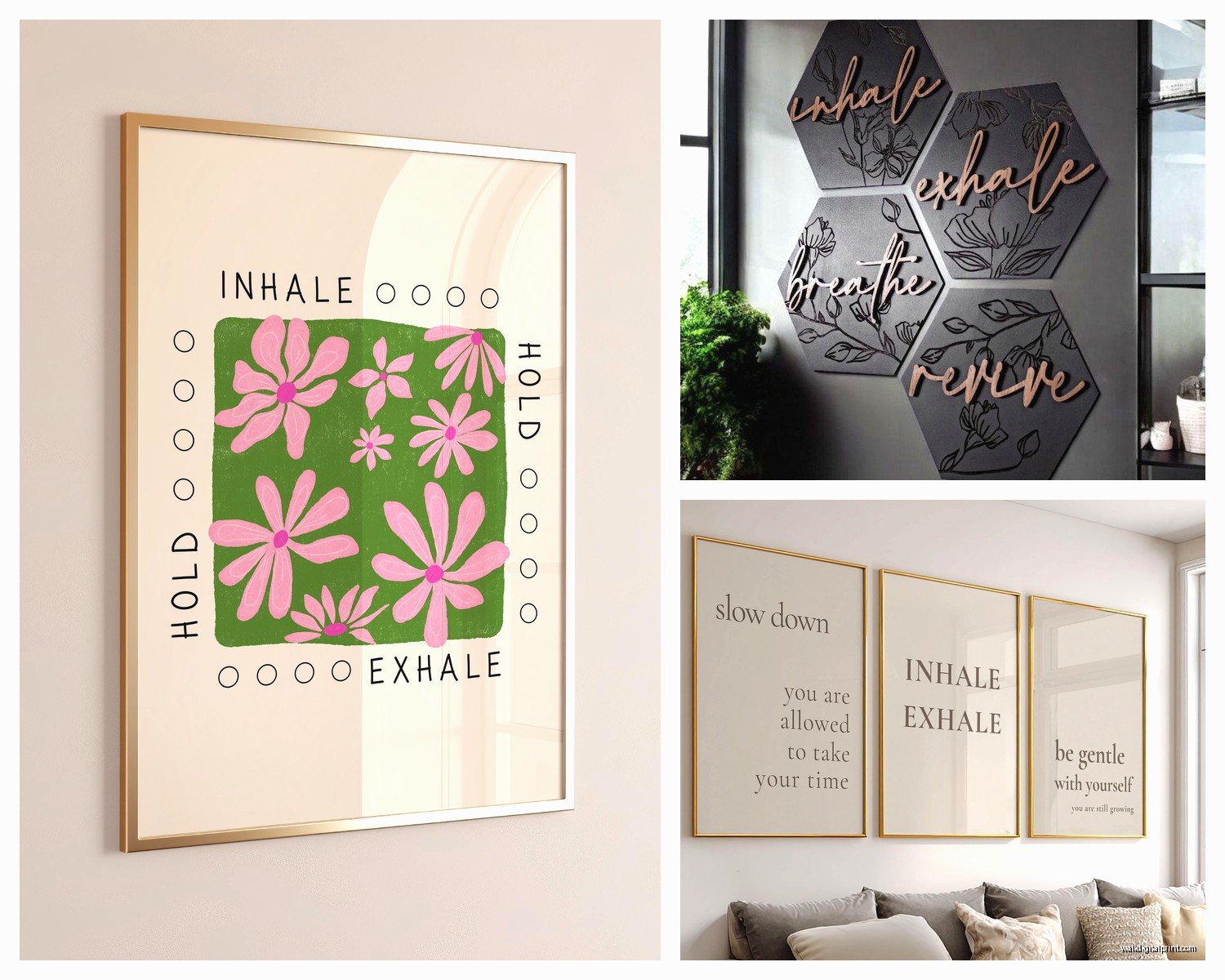
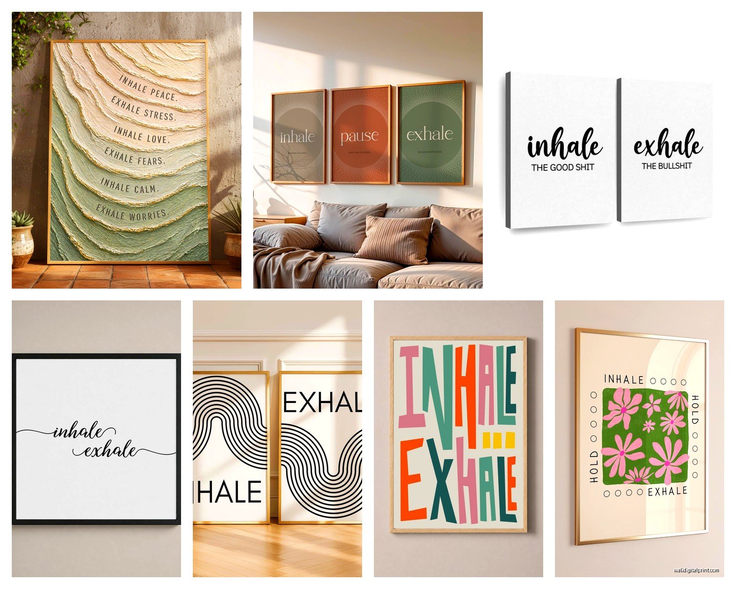
The minimalist black and white ones? They work literally everywhere. I put one in a client’s bathroom and another in someone’s home office and both looked perfect. You want clean sans-serif fonts for modern spaces – think Helvetica or Futura vibes. The fancy script versions are gorgeous but they only work if your room already has that soft, flowing aesthetic going on. I made the mistake of putting a super swirly “inhale exhale” piece in a mid-century modern living room once and it just… fought with everything else.
Typography Actually Matters Here
The weight of the font is gonna make or break this. Thin, delicate lettering reads as spa-like and calming. Bold, chunky letters feel more motivational and gym-adjacent. I personally prefer medium weight fonts because they don’t disappear on the wall but also don’t scream at you, which kinda defeats the purpose of a breathing reminder.
Oh and another thing – watch out for the spacing between “inhale” and “exhale.” Some designs stack them vertically, some horizontal, some do this weird diagonal thing. Vertical stacking works best above narrow spaces like between windows or on a thin wall section. Horizontal layouts need more wall real estate but they feel more balanced in wider rooms.
Size and Placement Because Everyone Gets This Wrong
This is gonna sound weird but I have a whole system for this now. Your inhale exhale art should be at eye level when you’re in whatever position you’ll be in most often in that room. So like, in a yoga space, think about where your eyes naturally go during practice. In a bedroom, consider where you look when you’re lying down or sitting up in bed.
I tested this in my own meditation corner – hung the piece at standing eye level first and it was completely wrong. When I was actually sitting on my cushion, I was staring at the baseboard. Moved it down about eight inches and suddenly it actually worked as a focal point.
The Size Thing Nobody Talks About
Too small and it looks like an afterthought. Too big and it’s overwhelming, which again, not exactly calming. Here’s my rough guide:
- Small spaces like bathrooms or reading nooks: 8×10 to 11×14 inches
- Medium walls in bedrooms or offices: 16×20 to 24×36 inches
- Large statement walls: 30×40 inches or bigger
- Above furniture: should be roughly 2/3 the width of whatever’s below it
But honestly I break these rules all the time depending on the vibe. Sometimes a tiny breathe reminder on a massive wall creates this interesting moment of discovery.
Print vs Canvas vs Metal vs Everything Else
Okay so I’ve tried basically every material at this point because I’m apparently incapable of just picking one thing and moving on with my life.
Paper prints are the cheapest option and they work fine if you frame them properly. Get a mat board, use actual glass, don’t cheap out on the frame. I see so many people buy a beautiful print and stick it in a flimsy frame from the discount store and wonder why it looks bad. The print isn’t the problem, the presentation is.
Canvas prints have that gallery vibe without needing a frame. They’re more expensive but the edges wrap around so it looks finished from all angles. I love these for modern and contemporary spaces. The texture adds depth which photographs don’t really capture – you gotta see it in person.
Metal Prints Are My Secret Weapon
Wait I forgot to mention metal prints and they’re actually my favorite for certain situations. The colors are SO vibrant and they have this subtle sheen that catches light differently throughout the day. I installed one in a client’s gym space and the way it reflects the morning sun is chef’s kiss. They’re pricey though, not gonna lie.
Acrylic prints are the fancy option – super glossy, very gallery-like, definitely makes a statement. The inhale exhale text appears to float off the wall slightly because of the depth. These work best in spaces where you want that wow factor, like an entrance or a dedicated meditation room.
Wood prints give you that organic, earthy feel. The wood grain shows through the design which can be beautiful but also means you need to be careful about the artwork style. Simple, bold designs work better than intricate ones.
DIY Options If You’re Into That
So funny story, I was watching this home reno show last week and they did a whole segment on DIY wall art and I was yelling at the TV because they made it look way harder than it actually is.
You can make your own inhale exhale art pretty easily. Get a canvas from any craft store, use vinyl letter stickers or a stencil, and either paint or use a marker. The key is using a level and measuring carefully – I’ve seen so many crooked DIY pieces and my eye twitches every time.
Or print your own design on nice cardstock. There are tons of free downloadable inhale exhale printables out there. Just make sure the resolution is high enough – at least 300 DPI or it’ll look pixelated and cheap.
The Digital Frame Option
Okay this is gonna sound extra but digital frames are actually perfect for this. You can rotate between different breathe designs, change them seasonally, or switch between meditation reminders. I set one up to show “inhale exhale” during the day and switch to something else at night. My sister thinks I’m ridiculous but whatever, it works for me.
Color Choices That Actually Impact Your Space
Black and white is the safe choice and honestly it works 90% of the time. It’s neutral, it matches everything, you can’t really mess it up.
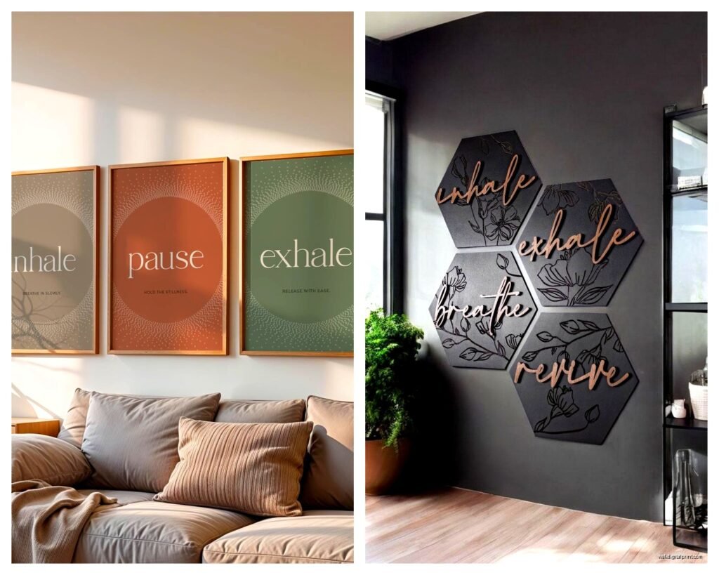
But color can be strategic here. Blue tones promote calmness – I use these in bedrooms and bathrooms. Sage green or muted earth tones work beautifully in yoga spaces and feel very grounding. Warm neutrals like beige or soft gray are versatile without being boring.
I’d avoid really bright, saturated colors for breathe art specifically. Like, a hot pink “inhale exhale” might look cool on Instagram but living with it every day? It kinda defeats the calming purpose. Unless your whole aesthetic is bold and energetic, then maybe it works.
Matching Your Existing Decor
The art should complement your color scheme without exactly matching it. If you have gray walls, a black and white piece might disappear. Try adding a subtle color that pulls from your textiles or other decor. I did a soft blue inhale exhale print in a gray bedroom that also had blue throw pillows and it tied everything together perfectly.
Where to Actually Buy This Stuff
Etsy is honestly my go-to for unique options. You can find independent artists who do custom sizing and colors. Read the reviews though – some sellers are amazing, others send you blurry prints that look nothing like the listing photos.
Society6 and Redbubble have tons of designs and they’re pretty reliable for quality. The nice thing is you can get the same design on different materials – print, canvas, tapestry, whatever.
For budget options, check Amazon but be careful. The quality varies wildly and the photos are often misleading. I’ve had good luck with certain sellers but also received some absolute garbage that went straight to donation.
Local Artists and Custom Work
If you want something truly unique, commission a local artist or calligrapher. It’s more expensive but you get exactly what you want in terms of size, style, and materials. I worked with a calligrapher last year who created this gorgeous inhale exhale piece with actual gold leaf accents for a client’s meditation room and it was absolutely worth the investment.
Installation Tips Nobody Tells You
Use the right hardware for your wall type. Drywall needs anchors, plaster needs different anchors, brick needs masonry bits. I cannot tell you how many times I’ve seen beautiful art crash to the floor because someone used the wrong fastener.
For lightweight frames under 5 pounds, regular picture hanging strips work fine. Anything heavier needs actual hooks or nails. Canvas and metal prints are usually lightweight enough for strips but check the weight first.
Level it properly. Use an actual level, not your eyeball. Even if you think you’re good at eyeballing it, you’re probably not. I use a laser level now because I got tired of rehinging things.
Gallery Wall Situations
If you’re incorporating your inhale exhale piece into a gallery wall, it should probably be one of the central or larger pieces. It’s a statement word art so it needs some visual weight in the arrangement. I usually place these pieces slightly off-center but in a prominent position where your eye naturally lands.
Map out your gallery wall on the floor first. Take a photo, look at it upside down to check the balance. This sounds weird but turning the photo upside down helps you see composition issues you might miss otherwise.
Maintaining and Updating
Dust regularly with a microfiber cloth. Sounds obvious but dust accumulation dulls the impact of any wall art. Glass-covered prints can be cleaned with glass cleaner, canvas needs just dry dusting, metal can handle a slightly damp cloth.
Switch things up seasonally if you want. I rotate between different meditation reminders throughout the year – inhale exhale in winter when I need that grounding reminder, other mantras in different seasons. Keeps the space feeling fresh without a complete redesign.
If your print fades over time (especially with direct sunlight exposure), it’s time for a replacement. UV-protective glass helps prevent fading but nothing lasts forever.
Common Mistakes I See All The Time
Hanging it too high is the number one issue. The center of your art should be at eye level, which is roughly 57-60 inches from the floor. Adjust based on your ceiling height and furniture placement.
Choosing a style that doesn’t match the room’s energy. A super formal calligraphy piece in a casual, modern space feels off. A minimal sans-serif design in a bohemian room with lots of texture and pattern might feel too stark.
Forgetting about lighting. Your inhale exhale art needs adequate lighting to be visible and effective as a reminder. I’ve installed picture lights, used existing ambient lighting, or repositioned pieces to catch natural light better.
Buying something just because it’s trendy. If the specific font or design doesn’t resonate with you personally, it’s not gonna serve its purpose as a meditation or breathing reminder. It’ll just be generic wall decor.
The whole point is having that visual cue to pause and breathe, so make sure it actually speaks to you and fits naturally into your daily space. Otherwise you’ll stop seeing it after like two weeks and it becomes invisible wallpaper.