Wall Art Guide, Wall Art Tutoriels
Steampunk Wall Art: Victorian Industrial Gears Clockwork

Sep
So I’ve been down this steampunk wall art rabbit hole for like three months now and honestly it started because a client wanted their home office to look like “a Victorian inventor’s workshop but make it chic” and I was like okay challenge accepted.
First thing you gotta know is that steampunk wall art isn’t just slapping some gears on your wall and calling it a day. I mean you CAN do that but it’s gonna look like a Hot Topic threw up in your living room. The key is mixing the industrial metal stuff with actual Victorian elegance, which sounds pretentious but just means you need some balance.
Finding the Right Pieces Without Breaking the Bank
Okay so where do you even start. I’ve tested basically every source at this point and here’s what actually works. Etsy is obviously the first place everyone goes and yeah there’s good stuff there but you’re gonna pay premium prices. I found this one seller who does custom gear shadowboxes and they’re gorgeous but like $300 for a medium-sized piece. Worth it if you’ve got the budget but most people don’t.
Amazon has surprised me honestly. There’s a ton of mass-produced stuff that looks terrible in photos but I ordered like five different pieces just to see and two of them were actually really solid. The metal quality was way better than expected. Look for anything that specifically mentions “hand-finished” or “antiqued bronze” because that coating makes such a difference. The shiny brass stuff reads as cheap immediately.
Wayfair and Overstock have some options too but it’s hit or miss. I got this three-panel gear triptych from Wayfair that my cat immediately tried to climb so that was fun, but once I secured it properly it actually became one of my favorite pieces in my own place.
The Gear Situation
Let me talk about gears specifically because this is where people mess up the most. Not all gear art is created equal and the sizing matters SO much more than you’d think.
Small gears clustered together can work but they need to be on a contrasting background. I tried mounting a bunch of 3-inch brass gears on a dark wood panel and from more than five feet away it just looked like a blurry blob. Switched to a cream-colored background and suddenly you could actually see the detail.
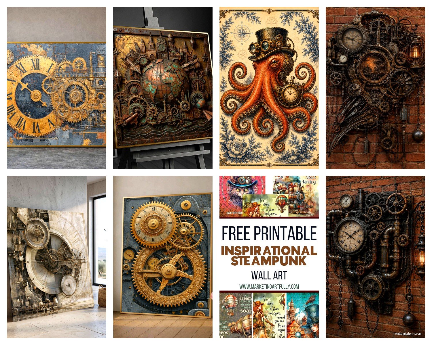
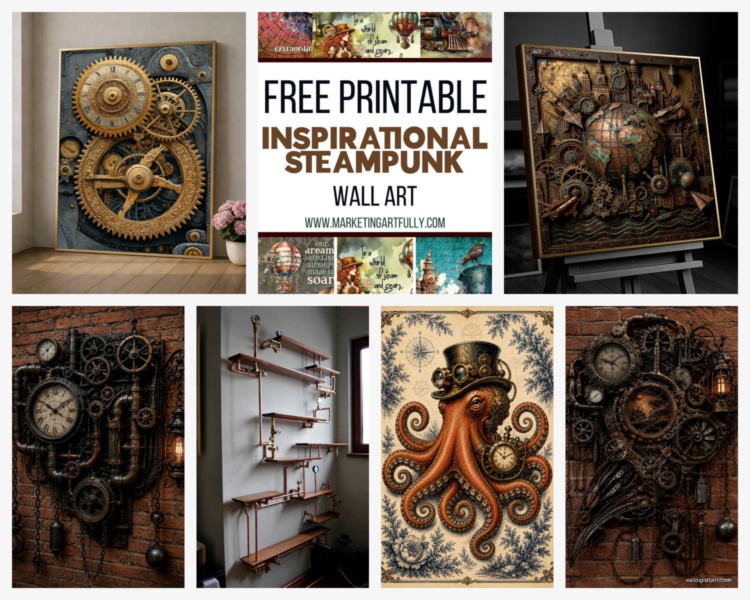
Large statement gears are easier to work with honestly. I’m talking like 24 inches or bigger. These work as standalone pieces and you don’t need to worry as much about composition. There’s this one gear clock I keep recommending that’s about 30 inches across, has Roman numerals, and the whole thing is made from layered metal. It’s like $180 but it makes such an impact that you don’t need anything else on that wall.
Oh and another thing, mixing gear sizes creates depth. If you’re doing a gallery wall situation, use one or two large gears as anchor pieces then fill in with smaller clockwork elements. I did this in a client’s hallway and the dimensional aspect makes people stop and actually look at it instead of just walking past.
Real vs Fake Gears
This is gonna sound weird but I’ve started haunting antique stores and salvage yards for actual old clock parts and machinery gears. It’s more work obviously but the authenticity shows. Real vintage gears have this patina and weight that reproductions just can’t match. Plus there’s something cool about knowing your wall art was actually functional once.
That said, real gears are harder to mount and you’re gonna need some DIY skills. I’ve used everything from shadow boxes to mounting them directly on painted boards with industrial adhesive. E6000 is your friend here, just use it in a ventilated area because that stuff is toxic as hell.
For the reproduction stuff, look for anything described as “distressed” or “vintage-inspired.” The manufacturing process where they artificially age the metal actually works pretty well. Avoid anything that’s too perfect or uniform looking.
Clockwork and Watch Mechanisms
Okay so moving into the clockwork side of things. I’ve found that actual clock faces and movements create a softer steampunk vibe that works better in living spaces versus home offices. The gear stuff can feel aggressively industrial but clocks have this nostalgic quality that balances it out.
Oversized wall clocks with exposed gears are everywhere right now. I’ve tested probably ten different ones and here’s what matters. The mechanism needs to be quiet. I cannot stress this enough. I installed this gorgeous 36-inch clock in a client’s bedroom and the ticking was so loud they made me take it down after two days. Now I always check reviews specifically for noise complaints.
The best ones have a sweeping second hand or no second hand at all. The ticking ones are the loud ones. Also make sure it takes a regular AA battery because some of these require weird specialty batteries that you can’t find anywhere.
Layering Clock Elements
Wait I forgot to mention something important about composition. You can layer smaller clock faces and watch parts in shadow boxes or under glass domes. I did this thing where I got a bunch of old pocket watch movements from eBay (they’re surprisingly cheap if they don’t work anymore), arranged them in a large ornate frame, and backed it with vintage book pages. It’s become one of my signature pieces that clients always ask about.
The key is creating depth. Use foam mounting squares to raise some elements off the background. It makes the piece more three-dimensional and catches light differently throughout the day.
Color Schemes That Actually Work
Steampunk has this default color palette of brass, copper, bronze, and dark wood but you don’t have to stick with that. I mean you CAN and it looks fine but I’ve had more success mixing in unexpected colors.
Deep teals and emerald greens work incredibly well with brass tones. There’s some science-y reason about complementary colors but basically the blue-green shades make the warm metals pop. I did a whole accent wall in a dark teal and hung bronze gear art and it looked expensive as hell.
Burgundy and deep reds also work, very Victorian parlor vibes. And honestly even navy blue can work if you’re going for a more nautical steampunk thing, which yes is a whole subset I’ve discovered.
The background matters as much as the art itself. Exposed brick is the obvious choice but painted brick in a dark charcoal or even black creates serious drama. Regular drywall works fine too, just go darker rather than lighter. White walls can work but you need substantial pieces that create enough contrast.
DIY Options If You’re Crafty
My client canceled last Tuesday so I spent like three hours in my studio making my own gear art just to experiment and honestly it’s not that hard if you’re even remotely handy.
You can buy bags of assorted gears and watch parts online for pretty cheap. I got a pound of mixed gears for $25 and it was enough for multiple projects. Then you just need a base (wood panel, canvas, metal sheet, whatever), some strong adhesive, and a vision of what you want.
I’ve done pieces where I arrange gears in geometric patterns, ones where I create actual functional gear trains that move, and abstract compositions that are more about texture than precision. The functional ones are harder because you need to understand how gears actually mesh together but YouTube has tutorials for that.
For mounting, you can use shadow boxes from craft stores, build your own frames, or go frameless and mount directly to the wall. The frameless look is more industrial and works well in modern spaces that need just a touch of steampunk without going full theme.
Painting and Finishing
If you’re working with new gears or parts that look too shiny, you can age them yourself. There are chemical patina solutions that work on brass and copper. I’ve used liver of sulphur which sounds gross but creates amazing aged effects. You can also just use acrylic paint in bronze and black, dry brush technique to create artificial aging. Not as authentic looking as chemical patina but way easier and less toxic.
Sealing your finished piece is important especially if it’s going somewhere with humidity. I use a matte clear coat spray, multiple thin layers. The matte finish maintains that antique look whereas gloss makes everything look plastic-y.
Gallery Wall Compositions
Okay so if you’re doing a whole gallery wall situation with multiple pieces here’s what I’ve learned through trial and error and one spectacular failure where everything looked cluttered and terrible.
Start with your largest piece and build around it. This is basic design stuff but people forget it when they get excited. Your eye needs somewhere to land first before taking in the rest.
Mix your mediums. Don’t just do all metal gear art. Throw in some framed vintage patent drawings of machines, maybe a piece with clockwork under glass, some Victorian-era photographs in ornate frames. The variety keeps it interesting and less theme-park-y.
Spacing matters more than you think. I usually do 2-3 inches between pieces for a cohesive look. Too much space and it feels disconnected, too little and it’s chaotic.
Use templates before you start drilling holes. I trace each piece on kraft paper, tape the paper to the wall, and move things around until the composition feels right. Then I mark through the paper where the hanging hardware goes. Saves so many extra holes in your wall.
Lighting Considerations
This is something I didn’t think about initially but lighting can make or break steampunk wall art. The metallic elements need light to show their texture and dimension.
Picture lights work great for larger pieces. There are battery-operated LED ones now that are super easy to install. Position them to create shadows and highlights on the gears and it adds so much depth.
If you have the ability to install track lighting or adjustable spotlights, even better. I did a whole wall in someone’s study with dramatic uplighting and it looked like a museum installation.
Natural light is trickier because you don’t want direct sun fading any fabric or paper elements but indirect natural light near a window can be beautiful. The metal catches the changing light throughout the day.
Where to Place Steampunk Art
Not every room can handle heavy industrial steampunk vibes. I’ve found it works best in home offices, studies, libraries, man caves (ugh that term but you know what I mean), and dining rooms surprisingly.
Bedrooms can work but go lighter and more clockwork focused rather than heavy gears. You don’t want your sleeping space feeling like a factory.
Kitchens are tough unless you have an industrial kitchen already. The Victorian elegance clashes with modern appliances usually.
Bathrooms can actually be amazing for steampunk if you commit to it. Exposed pipe fixtures, vintage mirrors, gear art, Edison bulbs – it creates this whole vibe. But it’s a commitment to the aesthetic.
Living rooms need balance. One statement piece or a small gallery wall works but don’t go overboard or it’ll dominate the space in a way that makes it hard to decorate around.
Maintenance and Long-term Care
Metal art collects dust like crazy. I dust mine every couple weeks with a soft brush or microfiber cloth. For deeper cleaning you can use a slightly damp cloth but dry immediately because moisture can mess with any patina or finish.
If pieces start looking dull you can revive brass and copper with metal polish but honestly I kinda like when they develop natural patina over time. It adds to the vintage aesthetic.
Check mounting hardware periodically especially for heavier pieces. The last thing you need is a ten-pound gear clock falling off the wall at 3am.
Oh and keep an eye on any mechanical elements if you have functional clocks. Replace batteries before they leak because battery acid will corrode metal fast.
So yeah that’s basically everything I’ve figured out about steampunk wall art through way too much experimentation and probably too much money spent but whatever it’s research right. The main thing is just don’t overthink it too much – if a piece speaks to you and fits your space it’s gonna work better than trying to follow rules too strictly.