Wall Art Guide, Wall Art Tutoriels
Lake Wall Art: Water Reflection Cabin Dock Photography

Sep
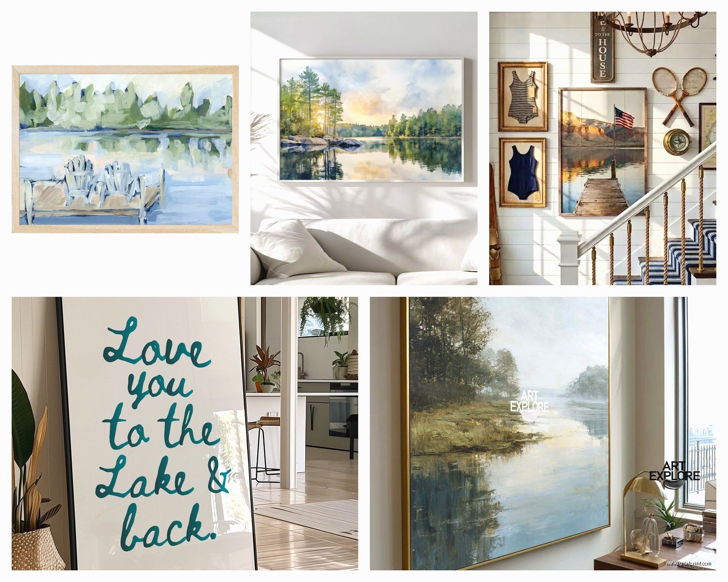
So I’ve been obsessing over lake photography prints lately and honestly it started because this client wanted something for their lake house that wasn’t the typical cheesy “welcome to the lake” sign situation. Spent like three days deep diving into water reflection photography and now I kinda can’t stop looking at dock images…
Why This Specific Style Actually Works
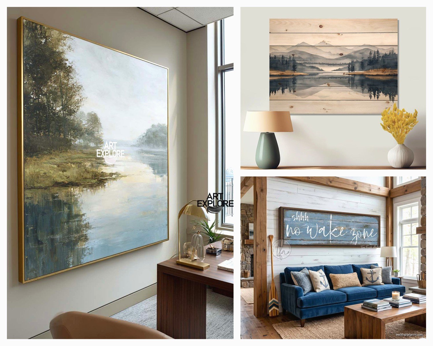
Okay so the cabin dock reflection thing – it’s weirdly versatile? I thought it would only work in like, super rustic spaces, but I’ve used it in modern lofts, traditional living rooms, even a minimalist bedroom. The water reflection part is what makes it flexible because depending on the time of day the photo was taken, you get completely different vibes.
Morning shots with that misty look? Super calming, almost abstract. Golden hour reflections? Warm and romantic without being obnoxious about it. Overcast day photos? Moody and architectural. I hung one in my own dining room last month and my sister thought it was an abstract painting until she got closer.
What to Actually Look For When Shopping
The composition matters SO much more than I thought it would. Here’s what I learned the hard way after returning like four prints:
Symmetry is your friend – photos where the waterline sits roughly in the middle create this satisfying balance. Your eye doesn’t know where to rest if the dock is crammed into the top third with tons of water below.
Check the reflection clarity – some photos have those perfect mirror reflections which look almost too perfect? But then some have ripples that add texture. Both work but for different reasons. The super clear reflections feel more formal and structured. The rippled ones feel alive and natural. I use clear reflections in offices and formal spaces, rippled for bedrooms and casual areas.
Look at what’s IN the reflection – is it just the dock or can you see trees, the cabin, clouds? More elements in the reflection = more visual interest but also busier. Less is better for small walls.
The Color Temperature Thing Nobody Tells You
This is gonna sound weird but I actually check photos on my phone AND my laptop before buying because the color temperature can look completely different. That “peaceful blue” lake might actually have green undertones that’ll clash with your gray couch.
Cool-toned lakes (blue/gray water) work with: modern furniture, cool grays, whites, navy, black frames
Warm-toned lakes (golden reflections, brownish water) work with: wood furniture, warm grays, beiges, cream, cognac leather, walnut frames
I made the mistake once of ordering this gorgeous sunset dock photo and when it arrived the orange was SO intense it made my client’s living room look like a 1970s ski lodge. Not in a good way.
Size and Placement Strategy
Okay so here’s where I have strong opinions based on what’s actually worked in real spaces:
Above a sofa: Go bigger than you think. Like, the print should be roughly 2/3 the width of your sofa. A tiny 16×20 above a full-size couch looks lost. I usually do 40×60 or even larger. The horizontal orientation of most dock photos works perfectly here.
Bedroom: Above the bed, similar rule – wide and substantial. But here’s what I do differently – I often go for the more abstract, misty morning shots because you don’t want too much visual stimulation where you sleep. The clearer, more detailed photos work better in living spaces.
Hallways: This is actually my favorite spot for lake photography? A long horizontal print in a hallway creates this pull that draws you through the space. 24×36 or 30×40 usually works.
Dining rooms: Weirdly good spot. People don’t think about it but you’re sitting there for extended periods, you want something to look at that’s calming. The reflection photos give you something to discover – you notice new details each time.
Print Quality Stuff That Matters
Oh and another thing – not all prints are created equal and I learned this the expensive way. My dog knocked over my coffee onto a cheap canvas print last year and it basically disintegrated, so there’s that.
Canvas vs. Metal vs. Acrylic vs. Photo Paper:
Canvas is most common and works for that traditional cabin feel but honestly? For water reflections, I’m obsessed with metal prints lately. The way light hits them creates this depth that actually mimics water surface. They’re more expensive but the effect is unreal. I did one for a client’s modern lake house and people literally ask about it every time they have guests.
Acrylic is gorgeous for the really crisp, clear reflection shots – it adds this glossy dimension. But it’s heavy and spendy and shows every fingerprint, so maybe not if you have kids.
Photo paper in a frame is classic and lets you change the matting/frame to update the look. More flexible long-term.
Resolution and detail: For anything over 30 inches wide, you want at least 300 DPI. Zooming in on the preview – can you see individual ripples in the water? Good. Is it pixelated? Move on. The whole point of these photos is the detail in the reflection.
Finding the Right Photographer or Print
So I usually start on Etsy because you can find actual photographers selling their work, not just mass-produced stuff from who-knows-where. Search terms that actually work:
- “lake dock reflection photography”
- “water mirror cabin print”
- “peaceful lake morning photo”
- “dock sunset reflection”
- “minimalist lake photography”
Wait I forgot to mention – check if they offer custom sizing. Most photographers will print in different dimensions which is clutch when you have a weird wall space.
I also look at their other photos to see if they have a consistent style. Someone who shoots lots of water/landscape work probably knows what they’re doing with reflections vs. someone who has like, one lake photo among random stuff.
The Location Question
Okay this might not matter to everyone but I kinda like knowing where the photo was taken? Some people specifically want Adirondack lakes vs. Minnesota lakes vs. Pacific Northwest. The vegetation and water color is noticeably different. If you’re decorating an actual lake house, maybe get a photo from a nearby lake? I did this for a client on Lake Tahoe and they loved that detail.
Styling Around the Print
The print isn’t gonna work in isolation – learned this during my first year doing interiors when I hung beautiful art in terribly styled spaces.
What works with lake dock photography:
Natural materials – the photo already has wood (the dock) and water, so continue that. Wood coffee tables, linen curtains, stone accessories, rattan baskets.
Neutral foundation – let the photo be the moment. White walls, gray walls, even black walls work. I wouldn’t do this on a bold colored wall unless the photo has similar tones.
Minimal competition – don’t hang it on a gallery wall with ten other things. These photos need breathing room. Maybe one other smaller piece nearby or nothing at all.
Lighting considerations:
This is huge and I see people mess it up constantly. If you hang a lake reflection photo on a wall that gets harsh direct sunlight, the glare will kill the whole effect. I use these specific for walls with indirect natural light or artificial lighting.
Picture lights can be nice but make sure they’re warm-toned LEDs, not those harsh white ones. You want to enhance the photo not make it look like an interrogation room.
DIY Framing or Pre-Framed
So here’s my honest take – if you’re good with measuring and patient, buy the print and frame separately. You’ll save money and have more control. But if you’re gonna procrastinate for six months (like I did with three prints currently sitting in my closet), just buy it framed.
For DIY framing of lake photography:
Frame color: Black frames make the image pop and feel more gallery-like. Natural wood frames enhance the rustic cabin vibe. White frames make it feel more coastal/modern. I use black probably 70% of the time.
Matting: White mat is classic and creates breathing room around the image. For really moody, dark water photos, I sometimes do a darker gray mat. No mat at all (full bleed to frame) feels more contemporary and immersive – like you’re looking through a window.
Glass: Get the anti-glare museum glass if you can afford it, especially for rooms with lots of windows. Regular glass creates annoying reflections that compete with the water reflections in the photo itself, which is… not the vibe.
Seasonal Considerations
Wait okay so this might sound overthinking but the season shown in the photo actually affects how it feels in your space year-round. Summer lake photos with lush green reflections can feel wrong in winter. But winter/late fall photos with bare trees and gray water work all year because they’re more abstract.
I tend to recommend either: early morning mist photos (season-neutral), overcast day photos (also neutral), or golden hour shots that could be any warm-weather month.
Common Mistakes I See All the Time
Hanging it too high – the center of the print should be at eye level, roughly 57-60 inches from the floor. People hang art way too high and then wonder why their room feels off.
Choosing photos with too much going on – boats, people, ducks, signs, whatever. The beauty of dock reflection photography is the simplicity. Just dock, water, maybe some trees and sky. That’s it.
Not considering the room’s existing lines – if your space already has lots of vertical elements (tall windows, vertical paneling), a horizontal lake photo provides balance. If everything’s horizontal (low furniture, long windows), you might actually want a vertical orientation dock shot.
Matching it too literally to a theme – just because it’s a lake photo doesn’t mean you need to add fish pillows and anchor decor. Let it be sophisticated and standalone.
My Actual Recommendations
If I had to choose right now for different scenarios:
Modern living room: Large metal print, minimal morning mist reflection, black floating frame, 48×32 or bigger
Traditional bedroom: Warm golden hour dock photo, canvas or framed photo paper, wood frame, 40×30
Office space: Crisp clear reflection with strong symmetry, acrylic or framed print, 30×20
Rental/temporary space: Affordable canvas print with pre-installed hanging hardware, 24×36, neutral tones
The nice thing about this whole genre is that it’s timeless? Like, lake docks haven’t really changed aesthetically in decades, so you’re not gonna look at this in five years and think “wow that’s so 2024” the way you might with other trendy art.
Oh and one more thing – if you’re ordering online, check the return policy before buying because colors and scale can look totally different in person. I always tell clients to expect that the first one might not work and that’s okay, better to return it than live with something you don’t love.
My cat just knocked over my water glass while I’m writing this which feels weirdly appropriate given the topic…
Anyway yeah, that’s basically everything I’ve figured out about lake dock reflection photography after way too many hours researching and installing these in actual homes. The key is really just finding one with good composition, getting it in the right size, and not overthinking the styling around it.