Wall Art Guide, Wall Art Tutoriels
Hydrangea Wall Art: Blue Pink Flower Bush Garden Bloom
Sep
So I’ve been totally obsessed with hydrangea wall art lately and honestly it started because a client asked me to find something for her powder room and then I went down this whole rabbit hole. Like, I thought it would be simple but there’s actually so much to consider when you’re picking the right piece.
Finding the Right Style That Won’t Look Cheesy
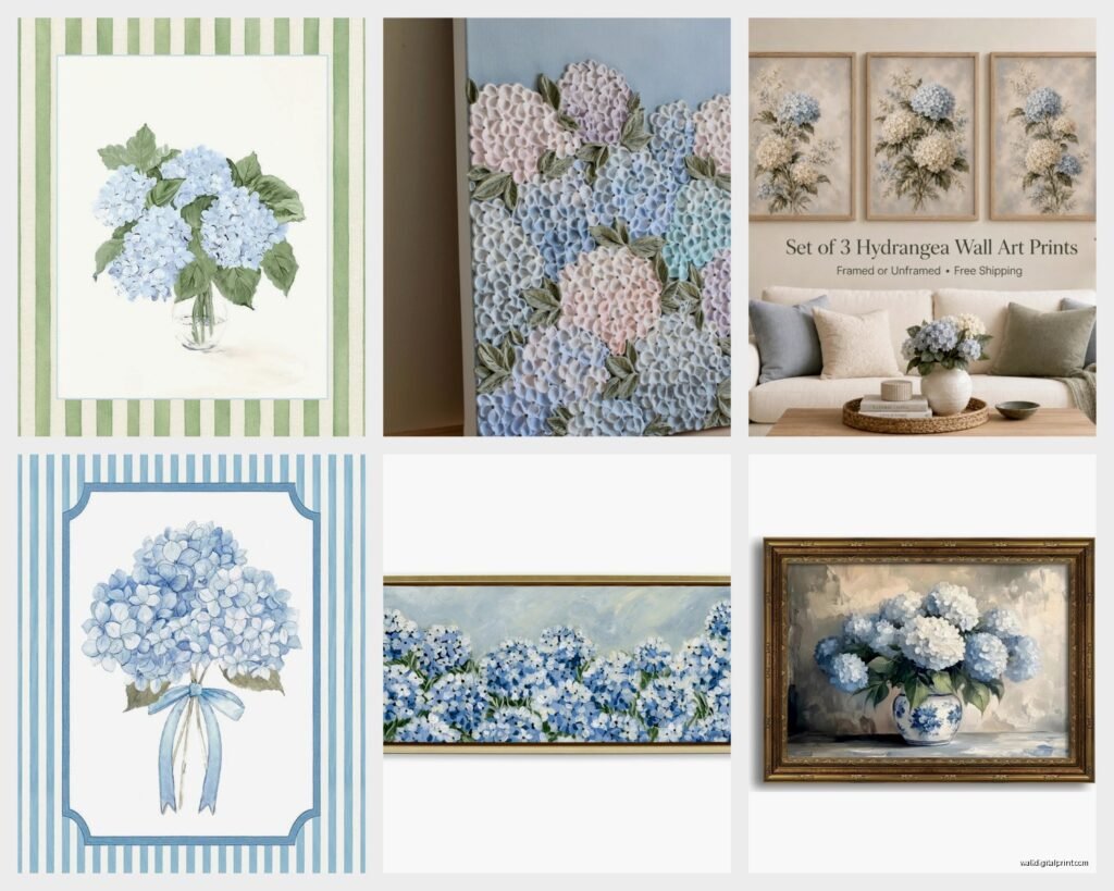
Okay first thing – hydrangea art can go really wrong really fast. I’ve seen some pieces that look like they belong in a 2003 bed and bath catalog, you know what I mean? The key is figuring out whether you want photographic prints, watercolor vibes, or something more abstract.
The photographic ones work best when they’re either super crisp and modern OR deliberately vintage-looking. I found this amazing print last month that was shot in like, overcast light so the blues looked almost dusty and it was perfect for a contemporary space. But then I also love the really saturated, vibrant photos for more traditional rooms.
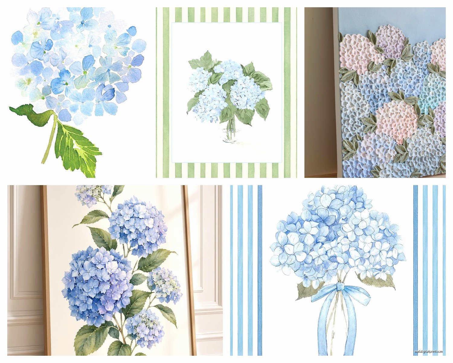
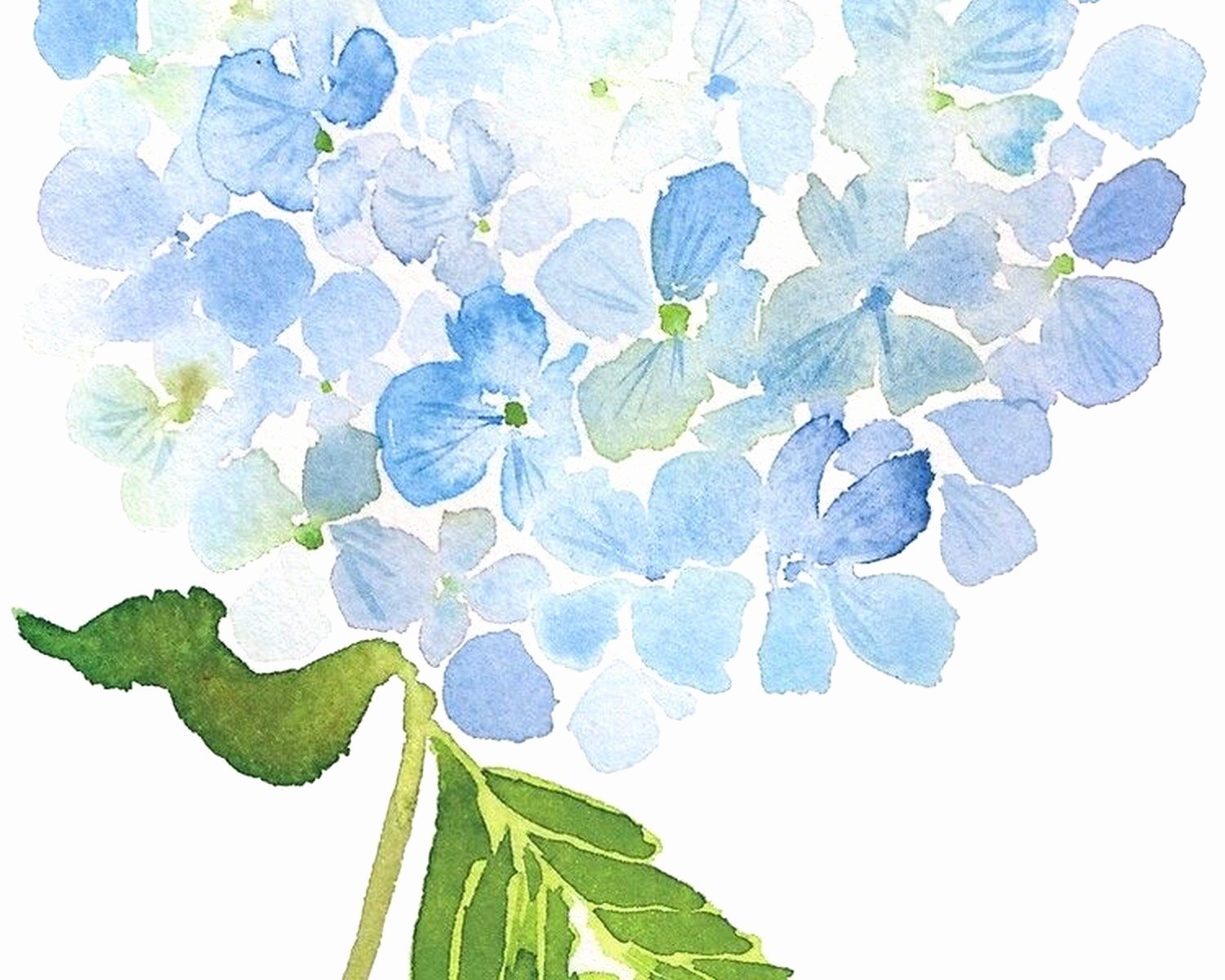
Watercolor hydrangeas are tricky because they can read as too feminine or cottage-core if you’re not careful. What I’ve learned is that the background matters SO much. White backgrounds tend to feel more versatile, but sometimes a moody dark background makes the whole thing feel more sophisticated. My friend Sarah has this navy background hydrangea piece and it completely transformed her dining room.
The Blue vs Pink Debate
Here’s where it gets interesting – and this is gonna sound weird but the color you choose actually affects the entire room more than you’d think. Blue hydrangeas give off this calm, slightly melancholic vibe that works amazing in bedrooms or reading nooks. Pink ones are cheerier, more energetic, better for spaces where you want things to feel lively.
But wait the BEST option if you can’t decide? Get a piece that has both colors. Real hydrangea bushes often bloom in these gorgeous mixed shades anyway, and having both blues and pinks in one piece gives you way more flexibility with your decor. You can pull accent colors from either side depending on what you’re doing with pillows, throws, whatever.
I tested this theory in my own guest room – got a large canvas with mixed blue and pink blooms, and I’ve completely changed the throw pillows and bedding twice now and it works with everything. Sometimes I go full blue with the accessories, sometimes I lean pink, and it never looks mismatched.
Size Matters More Than You Think
Okay so funny story, I once ordered what I thought was a 24×36 print and it arrived and it was 24×36 CENTIMETERS. I was so mad at myself for not reading carefully. But that disaster taught me to really think through sizing.
For above a bed or sofa, you generally want something that’s about two-thirds the width of the furniture. So if your bed is 60 inches wide, you’re looking at around 40 inches for the art. BUT hydrangea art is kinda different because the blooms create this natural cluster effect, so you can sometimes go a bit smaller and it still has impact.
Gallery Wall vs Single Statement Piece
I’m personally team single statement piece for hydrangeas, but I know a lot of people love doing gallery walls. If you go the gallery wall route, here’s what actually works:
- Mix hydrangea prints with solid color mats or abstract pieces in complementary colors
- Vary the sizes but keep the frames consistent – all black, all white, or all natural wood
- Include at least one close-up of individual blooms and one that shows the whole bush
- Don’t go overboard with the hydrangea theme – like three hydrangea pieces max in a gallery of 7-9 total
The problem I see constantly is people doing ALL hydrangeas in a gallery wall and it becomes too matchy, too theme-park-gift-shop vibes. You gotta break it up.
Framing Options That Don’t Cost a Fortune
Custom framing is insanely expensive – I priced out a 30×40 piece last week and they wanted $380 just for the frame and mat. No thanks. Here’s what I actually do:
Look for ready-made frames at HomeGoods, Target, or even Amazon. The trick is buying the frame first and THEN finding art that fits those standard sizes. Most print-on-demand services offer standard sizes like 16×20, 18×24, 24×36, etc.
If you want a more elevated look, get a frame with a mat. The mat creates breathing room around the image and honestly makes even a $15 print look way more expensive. I usually go with white mats for hydrangea art because it keeps things fresh and doesn’t compete with the colors.
Oh and another thing – floating frames are having a moment and they work really well with hydrangea prints. You know those frames where the art seems to float between two pieces of glass? They give this modern, gallery feel and you can find affordable versions at places like CB2 or West Elm during sales.
Canvas vs Paper Prints
I get asked this constantly. Canvas has that gallery-wrapped look and you don’t need a frame, which saves money. But here’s the thing – cheap canvas prints can look really flat and the colors often aren’t as vibrant. If you’re going canvas, spend a bit more for a quality print with good color saturation.
Paper prints behind glass give you richer colors and more detail, especially for photographic hydrangea images. The glass protects the print too, which matters if you’re hanging it somewhere with direct sunlight or moisture (like a bathroom).
For my own house I usually do paper prints with frames because I’m weirdly picky about image quality, but I recommend canvas to clients who want something quick and easy that still looks pulled together.
Where to Actually Buy This Stuff
Etsy is my go-to for unique hydrangea prints. You can find independent artists who sell digital downloads for like $5-8, then you just get it printed at your local print shop or through an online service. This gives you control over the size and you’re supporting small artists which feels good.
For physical prints ready to hang:
- Society6 has tons of options and they do sales pretty regularly
- Minted for higher-end prints with really good paper quality
- Desenio for affordable Scandinavian-style botanical prints
- Framebridge if you want the whole thing done for you but it’s pricey
I also find amazing stuff at HomeGoods and TJ Maxx but it’s hit or miss. You gotta go regularly and when you see something good, grab it immediately because it won’t be there next week.
Placement Ideas That Actually Work
Okay so beyond the obvious above-the-bed or above-the-sofa spots, here’s where hydrangea art really shines:
Bathrooms – the blue tones especially work amazing in bathrooms. There’s something about the water element that just feels right. I hung a large blue hydrangea print in my master bath and every single person who visits comments on it.
Dining rooms – this might sound random but hydrangea art in dining spaces creates this garden party vibe that makes meals feel more special. Works especially well if you have white or light wood furniture.
Home offices – if your office feels too sterile or corporate, a soft hydrangea piece adds life without being distracting. I prefer the more muted, vintage-style prints for offices though, not the super vibrant ones.
My cat keeps sitting in front of my office art which is annoying but also kind of cute? Anyway.
Lighting Considerations
This is something people forget – lighting changes everything with hydrangea art. If you have a piece with lots of blue tones and you put it in a room with warm yellow lighting, the colors will look muddy and weird. Cool white or natural light works best for blue hydrangeas.
Pink hydrangeas are more forgiving with warm lighting, actually they can look even prettier under soft warm lights in the evening.
If you’re hanging art in a space with no natural light, consider adding a picture light above it. Makes such a difference and creates this intentional gallery moment.
Mixing Hydrangea Art with Other Decor
The mistake I see people make is going too literal with the garden theme. You don’t need to add actual flowers, more botanical prints, green everything just because you have hydrangea art. Sometimes the best pairings are unexpected.
I love pairing blue hydrangea art with:
- Brass or gold accents
- Marble or stone textures
- Geometric patterns in complementary colors
- Velvet fabrics in deep jewel tones
For pink hydrangeas try:
- Gray and white color schemes
- Natural wood tones
- Matte black accents for contrast
- Linen textures
The key is balance. If your art is the focal point (which it should be), keep other decor more minimal and let the hydrangeas be the star.
DIY Options If You’re Crafty
Wait I forgot to mention – if you’re at all artistic or just want something truly unique, you can create your own hydrangea art. I’m not saying paint it yourself unless you actually paint, but there are other options.
Pressed flower art using real dried hydrangeas looks incredible. You can buy dried hydrangeas online or dry your own if you have access to fresh ones. Press them in a heavy book for a few weeks, then arrange them in a shadow box frame. It’s time-consuming but the result is stunning and totally one-of-a-kind.
Or do what my sister did – take your own photos of hydrangeas at a botanical garden or in your neighborhood, edit them on your phone with apps like Snapseed or VSCO, and print them. She got a gorgeous moody shot of purple hydrangeas that she printed on metal through Fracture and it’s honestly better than most stuff you can buy.
Seasonal Swapping Strategy
Here’s something I started doing that my clients love – treating hydrangea art as seasonal decor. The full bloom pieces are perfect for spring and summer, but then in fall and winter they can feel out of place depending on your style.
What I do is have a rotation system. Spring/summer I display the bright, fresh hydrangea pieces. Fall/winter I swap them for moodier botanical prints or other subjects. This keeps your space feeling current and you don’t get tired of looking at the same art year-round.
You don’t need a huge storage space for this – I keep my off-season art wrapped in kraft paper under my bed. Takes like 15 minutes twice a year to swap things out and it completely refreshes the vibe of your rooms.
The Vintage Route
Antique stores and estate sales sometimes have amazing vintage hydrangea paintings or prints. I found this incredible oil painting of hydrangeas at an estate sale for $45 and had it reframed for another $60. Total cost under $110 for something that looks like it cost ten times that.
The cool thing about vintage pieces is they have actual texture and history. The colors might be slightly faded which gives them character, and you know nobody else has the exact same thing hanging in their house.
Just make sure to check the condition carefully – look for water damage, tears, or fading that’s too severe to work with your space.
Common Mistakes to Avoid
Hanging it too high – the center of your art should be at eye level, which is usually around 57-60 inches from the floor. I see people hang stuff way too high all the time and it throws off the whole room.
Choosing art based on what matches your current throw pillows – your pillows will change but your art is more permanent. Pick pieces you genuinely love, not just what coordinates with your current accessories.
Going too small – when in doubt, size up. Tiny art on big walls looks lost and sad. Better to go slightly too large than too small.
Ignoring the undertones – if your walls have warm beige undertones and you get hydrangea art with cool gray tones, they’ll fight each other. Pay attention to whether your blues lean warm or cool, same with pinks.
Okay I think that covers pretty much everything I’ve learned through way too much trial and error with hydrangea wall art. The main thing is just to pick something that makes you happy when you look at it, because you’re gonna be looking at it every day and trends don’t really matter in your own home.