Wall Art Guide, Wall Art Tutoriels
African American Wall Art for Dining Room: Black Culture Eating Space
Oct
So I was just redoing my own dining room last month and honestly this whole journey into finding the right African American wall art turned into like… way more research than I expected but in a good way?
First thing – and I wish someone had told me this earlier – is that you gotta figure out if you want the art to be THE statement or part of a conversation with everything else in the room. Because I made the mistake of buying this gorgeous large-scale piece of a jazz musician (think like 48×36 inches) and then realized my dining table was already this bold reclaimed wood situation and it was just… too much competing energy, you know?
Size Actually Matters More Than You Think
Okay so the standard rule is your art should take up about two-thirds to three-quarters of the wall space above your sideboard or wherever you’re hanging it. But with African American art specifically, especially pieces that feature rich cultural symbolism or portraits, I’ve found you can go a bit larger because these pieces tend to draw the eye in rather than overwhelm. Like there’s this print I got from an Etsy seller – BlackArtDepot I think? – of a Black family at Sunday dinner and it’s HUGE but because of the warm tones and the intimate subject matter it doesn’t feel aggressive on the wall.
For dining rooms specifically I’m usually telling people to think 30×40 minimum if it’s going above a buffet or console table. Anything smaller and it just gets lost when people are sitting down eating. Your sightline is different when you’re seated versus standing in a gallery.
What Actually Works Theme-Wise
This is gonna sound weird but I keep a notes app list of themes that consistently work in dining spaces and here’s what I’ve got:
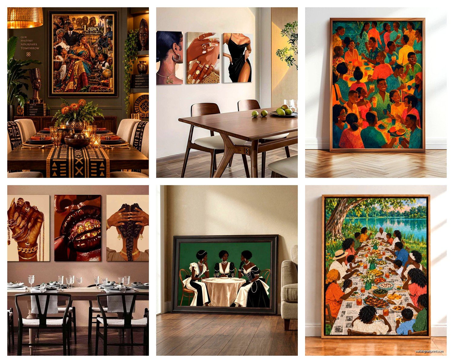
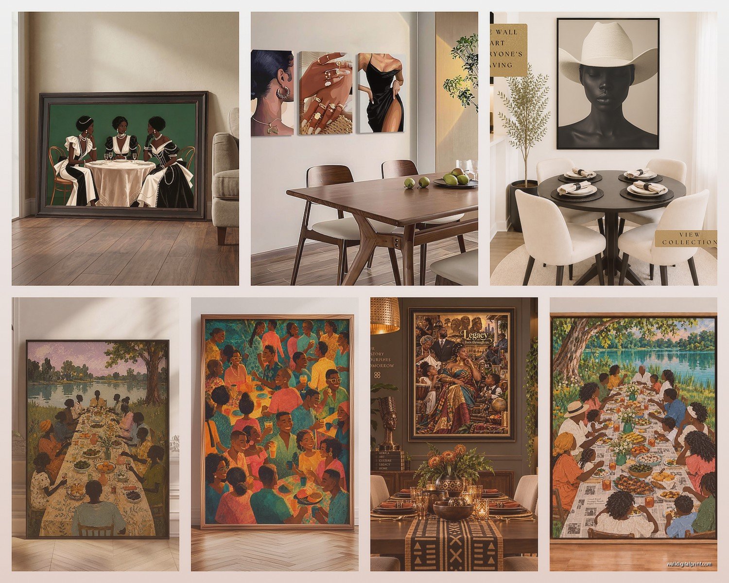
- Food and gathering scenes – anything showing Black families or communities sharing meals
- Jazz and music imagery – there’s something about jazz art that just WORKS in dining rooms, maybe because both are about rhythm and gathering?
- Abstract work in jewel tones – emerald, sapphire, deep amber
- Botanical prints featuring African plants or African American gardening traditions
- Historical figures in more relaxed poses – not like stiff presidential portraits but candid moments
- Afrofuturism pieces if your dining room skews modern
The one thing I’d avoid – and I’ve tested this in like six different client spaces – is super intense protest or struggle imagery. Not because it’s not important or powerful, but because dining rooms are about nourishment and conversation and I’ve noticed people subconsciously tense up. Save the more confrontational pieces for offices or living rooms where you want to spark different kinds of dialogue.
Where to Actually Buy This Stuff
Oh and another thing – sourcing is honestly half the battle. I’ve got my rotation of places I check:
The Artsy app has a whole category for African American artists and you can filter by price and size which is clutch when you’re working with specific dimensions. I found this incredible piece by a Chicago-based artist there last year, mixed media with fabric and paint, depicting a Juneteenth celebration.
Etsy is obvious but you gotta be careful about print quality. Always message the seller and ask if they’re printing on actual art paper or just cardstock. I learned this the hard way when a print I ordered showed up looking like it came from a office printer. Look for sellers who specifically mention giclée printing or archival paper.
Society6 and Redbubble are fine for budget-friendly options but the artist gets pennies so if you can afford to buy directly, do that. I use those sites more for discovering artists then tracking them down on Instagram to buy originals or limited prints.
Local galleries obviously – every city I’ve worked in has at least one gallery focusing on Black artists. The framing is usually better quality than what you’ll do yourself and you’re supporting the actual community.
wait I forgot to mention – estate sales and antique shops in historically Black neighborhoods. I’ve found some INCREDIBLE vintage pieces this way. Like actual paintings from the 60s and 70s that have so much more soul than mass-produced prints.
The Framing Situation Nobody Talks About
Okay so funny story, my cat knocked over this beautiful print I had just bought – unframed like an idiot – and it ripped and I had to order another one. Frame your stuff immediately.
For African American art specifically, I’ve noticed a few framing approaches that really work:
Gold frames – sounds bougie but a simple gold frame on artwork featuring Black subjects is just *chef’s kiss*. There’s historical weight there, like reclaiming the ornate framing that was typically reserved for European subjects. Michael’s usually has decent gold frames on sale.
Natural wood in darker tones – walnut, mahogany, anything that echoes the warm undertones in Black skin. This works especially well with portraits.
Black frames for abstract work – keeps the focus on the color and form.
No frame at all – if you’re doing canvas prints, sometimes the gallery wrap edge is enough. I’ve got a piece in my breakfast nook that’s just raw canvas edges and it feels more casual and accessible.
The mat situation is personal preference but I usually skip mats for dining rooms because they can make the piece feel too formal? Like you’re in a museum instead of a space where people spill wine and laugh too loud.
Creating an Actual Gallery Wall vs Single Statement
So this depends entirely on your wall size and commitment level. Gallery walls are having a moment but they’re also a pain to execute well.
If you’re doing a gallery wall with African American art, I’d suggest picking a unifying element – either all portraits, all the same color palette, all from the same era, or all the same size frames. I did one last year that was all 11×14 frames, different Black artists, different subjects, but the uniformity of size made it feel cohesive instead of chaotic.
Template galleries are your friend here – you can buy these paper templates on Amazon that you tape to your wall to figure out spacing before you start making holes. My client canceled last week so I spent like an hour comparing different template sets and the one from “VIVAGLORY” was actually the most accurate.
But honestly? In dining rooms I usually push people toward one large statement piece instead. It’s easier to change out if you get bored, easier to hang level (gallery walls always have that one frame that’s slightly off and it haunts you), and it creates a focal point for conversation.
Mixing Mediums and Textures
This is something I’ve been experimenting with lately – combining traditional framed art with sculptural elements. Like I’ll do a painting of a Black woman in a headwrap as the main piece, then flank it with small woven baskets mounted on the wall. Or pair abstract art with a wooden mask on a floating shelf below.
The texture thing is important because dining rooms already have texture from the table, chairs, maybe a rug, dishes. Your wall art should contribute to that conversation. All flat prints can feel one-dimensional (literally). Think about pieces with fabric elements, collage work, mixed media.
Lighting Makes or Breaks Everything
You can have the most amazing piece of art but if it’s in a dark corner or getting weird shadows from your chandelier, it’s not gonna hit right. I installed picture lights above two pieces in my dining room – the battery-operated LED ones from Amazon, nothing fancy – and the difference is insane.
If you’ve got overhead lighting, make sure it’s not creating a glare on the glass. This is where non-glare glass or acrylic glazing is worth the extra money. Or just skip glass entirely if you can.
Natural light is tricky with art generally because of fading, but in dining rooms you’re usually not dealing with all-day direct sun? Most dining rooms are interior-ish. Still, UV-protective glass if you’re investing in original work.
Color Coordination Without Being Matchy-Matchy
I hate when people try to match their art exactly to their throw pillows or whatever. It’s boring. BUT you do want some color conversation happening.
What I do is pull out 2-3 accent colors from the artwork and echo them elsewhere in the room. So if you’ve got a piece with deep blues and burnt orange, maybe your dining chairs have blue velvet cushions and you’ve got orange tapers in your candlesticks. It feels intentional without being themed-restaurant vibes.
Also – and this is important – a lot of African American art features really vibrant colors, patterns, textiles. If your dining room is currently all white and gray minimalist situation, you might need to warm it up a bit first or the art will feel dropped in. Add some wood tones, some brass, some warmth in your textiles.
Supporting Living Artists
Look I’m not gonna get preachy but if you can swing it, buy from living Black artists. The markup from galleries is real but so is the fact that these artists are trying to make rent. Instagram is probably the best place to discover emerging artists – I follow a bunch of hashtags like #blackartist #blackartwork #contemporaryblackart and just scroll when I’m watching TV (currently rewatching The Bear for the third time, don’t judge me).
Commission work is also more accessible than people think? I had a client who wanted art of their specific family traditions and we found an artist who did a custom piece for like $800. Not cheap but not insane for original art.
The Practical Stuff Nobody Mentions
Hanging height: center of the artwork should be 57-60 inches from the floor. This is eye level for most people. I always measure twice because once I hung something at what I thought was right and it was like six inches too high and I had to redo all the holes.
Command strips work for lighter pieces but anything over 10 pounds needs actual wall anchors or studs. I’ve had too many late-night texts from people whose art fell during dinner parties.
If you’re renting, those 3M picture hanging strips are genuinely good now. The damage-free ones. I was skeptical but they hold up to like 16 pounds if you use enough.
Switching out seasonal art is a thing you can do but store the off-season pieces properly – flat, wrapped in acid-free paper, not in a damp basement.
Budget Real Talk
You can absolutely do this on a budget. Prints start around $30-50 for decent quality. Frame it yourself for another $40-80 depending on size. So you’re looking at under $150 for a good-sized piece that’s gonna make your dining room feel intentional and culturally rich.
If you’ve got more to spend, original work from emerging artists runs $500-2000 typically. Established artists, sky’s the limit obviously.
The investment pieces I always recommend are the ones featuring family, food, or gathering – those themes don’t go out of style and they appreciate both financially and emotionally over time.
Also gotta mention – some museums and cultural institutions sell reproduction prints of work from their collections. The Smithsonian African American History Museum has an online shop with really high-quality prints that are historically significant. That’s a good middle ground between Etsy prints and original work.
Anyway I think that covers most of what I figured out through trial and error. The main thing is just start somewhere – even one piece changes the whole energy of the room.