Wall Art Guide, Wall Art Tutoriels
Flamingo Wall Art: Pink Tropical Bird Florida Beach Decor
Oct
So I’ve been obsessed with flamingo wall art lately and honestly it started because this client wanted a “Florida vibe but not cheesy” for her beach condo and I fell down this whole rabbit hole of pink tropical birds that I’m still not out of.
First thing you gotta know is that flamingo art can go really wrong really fast. Like spring-break-in-Panama-City wrong. The key is treating it like actual art instead of just…a pink bird on your wall. I learned this the hard way when I ordered what I thought was a sophisticated watercolor print and it showed up looking like a beach towel design.
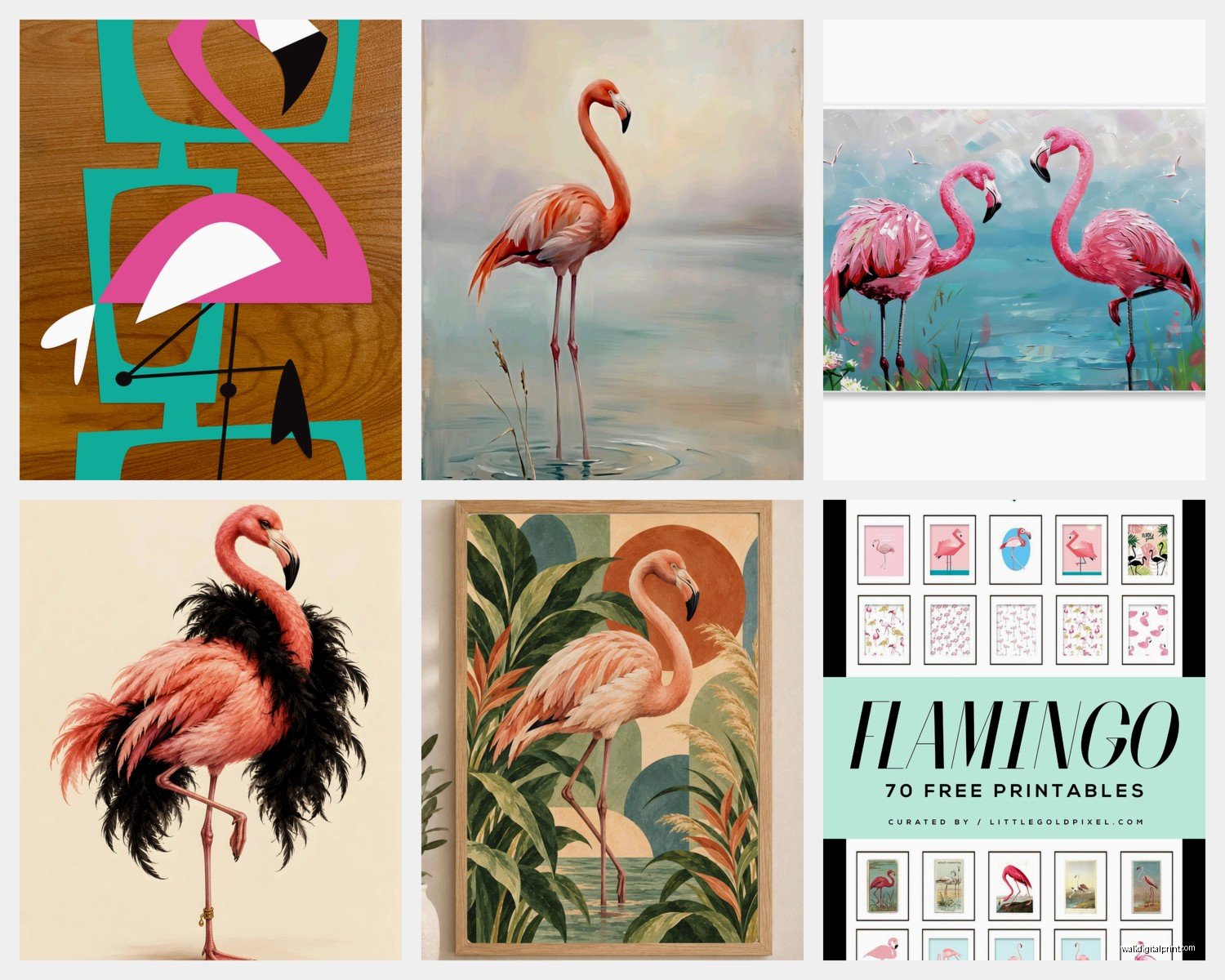
The Different Styles That Actually Work
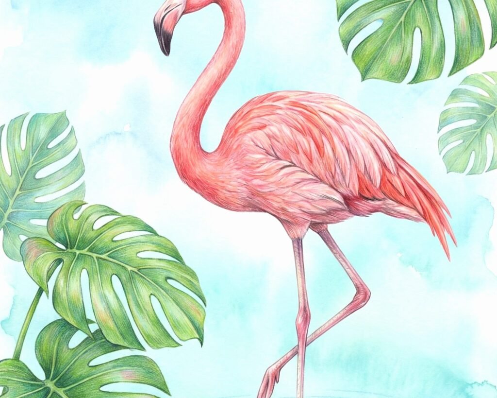
Okay so there are basically four categories that don’t look ridiculous in an actual adult home. Watercolor flamingos are huge right now and they work because the softness keeps them from being too literal. I found this one artist on Etsy—wait I’m gonna find the name, hold on my dog is losing it at the mailman—anyway, watercolor gives you those beautiful pink washes without the cartoon effect. Look for pieces where the flamingo almost dissolves into the background or has that loose, painterly quality.
Then there’s the minimalist line art situation which is probably my favorite if you’re nervous about committing to the whole tropical thing. Single continuous line drawings or simple black outlines on white backgrounds. Super elegant, works in modern spaces, and you can still get that flamingo moment without your living room looking like a tiki bar. I put three small line art flamingo prints in a client’s hallway and her husband didn’t even realize they were flamingos at first, he thought they were “just modern art” which was exactly the point.
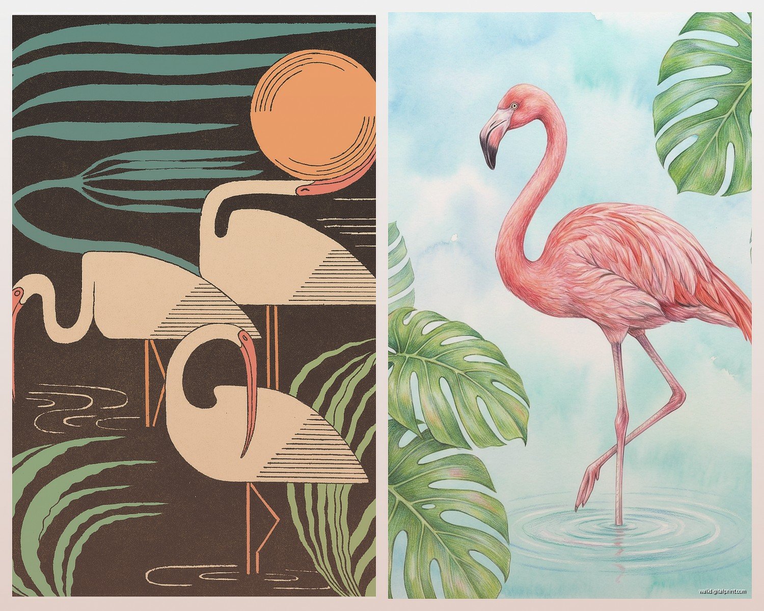
Vintage-style flamingo posters are another direction that’s surprisingly versatile. Think 1950s Florida travel posters or retro Audubon-style illustrations. There’s something about that aged, nostalgic quality that makes the flamingo feel more intentional? Less “I bought this at HomeGoods” and more “I collect vintage Florida ephemera.” You can find reproduction prints pretty easily but the real vintage ones on eBay or at estate sales have this patina that’s just…chef’s kiss.
And then there’s photography which is tricky because it can go really literal really fast. But if you find the right shot—flamingos at sunset, close-up of feathers, abstract groupings—it can be stunning. I saw this one that was basically just pink flamingo legs in turquoise water and it was more about color and pattern than “hey look a bird.”
Size and Placement That Makes Sense
This is where people mess up constantly. They either go too small and it looks like an afterthought or too big and it dominates the entire room in this weird way.
For a living room, you want something substantial but not overwhelming. I usually do 24×36 inches or larger for over a sofa, but it depends on your wall size obviously. If you’re doing a gallery wall situation, mix your flamingo piece with other coastal or tropical elements—palm leaves, abstract ocean colors, maybe some coral imagery. The flamingo shouldn’t be the only thing happening unless you’re really committing to a theme.
Bedrooms can handle more whimsy weirdly? I did a client’s guest bedroom with a large flamingo canvas over the bed and it worked because guest rooms can be a bit more playful. Your own bedroom though…I’d probably go smaller or more abstract unless you really love waking up to a giant pink bird.
Bathrooms are actually perfect for flamingo art and I dunno why more people don’t do this. Small prints, maybe 8×10 or 11×14, in simple frames. The humidity won’t matter if you get the right materials and it’s a fun surprise in a space that’s often boring. I have a vintage flamingo print in my powder room and guests always comment on it.
Oh and another thing—hallways and entryways are great for setting a tone. A striking flamingo piece right when you walk in says “this house doesn’t take itself too seriously” which I love. But make sure it’s well-lit because flamingo art in a dark hallway just looks muddy.
Frame and Material Choices
Okay this matters more than you’d think. The frame can either elevate your flamingo art or make it look cheap.
For watercolor or soft styles, I love a simple white mat with a light wood or white frame. Keeps it fresh and beachy without trying too hard. Natural wood frames in light oak or maple work great for that casual coastal vibe. Avoid anything too ornate or heavy—you’re not framing Renaissance art here.
Minimalist line drawings look amazing in thin black metal frames or even floating in clear acrylic frames. The simplicity of the art needs a simple frame situation. I did acrylic frames for a client’s flamingo triptych and it felt very gallery-like.
For vintage-style prints, you can go a bit more decorative. I’ve used gold leaf frames, distressed white frames, even some rattan-style frames that played up the tropical thing. The aged quality of the art can handle more frame personality.
Canvas prints are popular and honestly they’re fine if you get good quality. But I’m gonna be real with you—a lot of the cheap canvas prints online look terrible in person. The colors are off, the canvas texture is weird, and they start sagging after a few months. If you’re doing canvas, spend a bit more and make sure it’s gallery-wrapped with proper stretcher bars.
Wait I forgot to mention—acrylic prints are having a moment and they work really well for photography or bold graphic flamingo art. The acrylic gives this depth and vibrancy that’s really cool, almost 3D-looking. They’re pricier but worth it for a statement piece.
Color Coordination Without Looking Matchy-Matchy
So you’ve got this pink bird art and now you’re wondering what to do with the rest of your room and this is where it gets fun.
The obvious move is pink and turquoise/teal which is very Florida, very beachy, but can also feel very 2015 if you’re not careful. I still use this combo but I add in neutrals—lots of white, cream, maybe some warm wood tones—to keep it from feeling like a themed restaurant.
Coral and navy is another direction that feels more sophisticated. The flamingo brings the pink/coral element, you add navy through pillows or a throw or even painted furniture, and suddenly it’s nautical but fresh.
Actually my favorite way to do flamingo art is in an otherwise neutral room. Like all white and natural textures with just the flamingo print as your color moment. It makes the art feel intentional rather than part of a whole tropical explosion. One of my clients has a mostly greige living room with white furniture and a huge flamingo canvas and it’s so striking because it’s the only hit of color.
Metallics work surprisingly well too. Gold accents with flamingo art feels very Palm Beach chic. I’m talking gold mirror frames, brass table legs, maybe some gold-rimmed glassware. It elevates the whole thing.
Where to Actually Buy This Stuff
Etsy is honestly my first stop for unique flamingo prints. You can find independent artists doing really beautiful work and often they’ll do custom sizes. Search for “flamingo art print” or “flamingo watercolor” and filter by reviews. I’ve ordered probably 20 different flamingo pieces from Etsy over the years and only had one that was disappointing.
Society6 and Redbubble are good for more graphic, contemporary styles. They print on demand so quality can vary but their return policies are decent. Plus you can get the same design on different products which is kinda fun.
For photography, check out 500px or even Instagram—a lot of wildlife photographers sell prints directly and you’re supporting actual artists. I found this photographer who shoots at the Miami zoo and her flamingo photos are incredible.
Local art fairs and coastal markets if you’re in Florida or other beach areas. Original flamingo paintings can be pricey but you might find affordable prints or smaller originals. Plus you meet the artist which is cool.
Anthropologie has some surprisingly good flamingo art options if you want something more curated. It’s gonna cost more but the quality is consistent and their framing is usually on point.
Target and HomeGoods are hit or miss honestly. Sometimes you find a gem but a lot of it skews too cutesy or literal. If you go this route, really scrutinize it in person before buying.
Avoiding the Tacky Trap
This is gonna sound weird but the flamingo art itself isn’t usually the problem—it’s everything around it that tips into tacky territory. If you have flamingo art AND flamingo pillows AND flamingo string lights AND a flamingo planter…it’s too much. Pick your flamingo moment and let it shine.
Also consider scale and realism. Cartoonish flamingos with sunglasses or doing silly poses? That’s lawn ornament energy. Realistic or artistic interpretations? That’s wall art energy. There’s a place for whimsical stuff but know what vibe you’re creating.
The color intensity matters too. Neon hot pink flamingos are gonna read very different than soft blush pink or coral flamingos. Think about your existing palette and what intensity works.
Grouping and Gallery Walls
If you’re doing multiple flamingo pieces or a gallery wall situation, odd numbers work better—three prints, five prints, etc. And vary the sizes for visual interest.
I did a client’s dining room with three flamingo watercolors in different sizes, all in matching white frames with white mats. They were hung horizontally above a console table and it felt cohesive but not boring. The flamingos were in different poses which helped.
For gallery walls, mix your flamingo art with complementary pieces. Palm fronds, monstera leaves, abstract coastal landscapes, even some typography prints with beach quotes if that’s your thing. The flamingo becomes part of a larger story instead of the whole story.
Symmetry can work too though—two identical or similar flamingo prints flanking a mirror or window. Very Palm Beach, very classic.
Lighting Considerations
Okay so I was watching this home renovation show the other night and they completely ignored lighting which drove me crazy because it matters SO much with art.
Flamingo art—especially pink tones—can look completely different depending on your lighting. Warm white bulbs will enhance the pink and coral tones, making everything feel cozier but potentially more intense. Cool white or daylight bulbs will tone down the pink a bit, making it feel fresher and more modern.
If you can, use picture lights or track lighting to highlight your flamingo art. It creates drama and makes the piece feel important. Plus it helps with evening ambiance when you don’t want all the overhead lights on.
Natural light is tricky because it can fade prints over time, especially watercolors or photography. Use UV-protective glass or acrylic if your art is in direct sunlight. I learned this the hard way with a beautiful flamingo watercolor that got totally washed out after a summer in a west-facing room.
Seasonal and Temporary Options
If you’re not ready to commit fully, removable wallpaper with flamingo patterns is a thing and it actually doesn’t look terrible. You could do one accent wall or even just a section behind shelving. Easy to change out when you get bored.
Tapestries are another temporary option—flamingo tapestries can work in casual spaces like bedrooms or covered outdoor areas. They’re inexpensive and you can swap them out seasonally.
Large canvas prints that lean against the wall instead of hanging are very “effortless coastal” if that’s your aesthetic. You can move them around, layer them, change your mind without putting holes in walls.
I think the main thing is just…don’t overthink it? Flamingo art is supposed to be fun and a little bit extra. If you love it and it makes you happy when you look at it, you’re doing it right. My beach condo client ended up with a vintage flamingo poster in the kitchen and every time I see it I smile, which is kinda the whole point of decorating your space anyway.
Just stay away from anything that looks like it should be holding a cocktail and you’ll probably be fine.