Wall Art Guide, Wall Art Tutoriels
Blue and White Wall Art: Classic Nautical Coastal Combo
Oct
So I’ve been styling coastal spaces for like eight years now and honestly blue and white wall art is probably the easiest way to nail that nautical look without making your house look like a seafood restaurant, you know?
First thing – and I learned this the hard way after a client returned literally everything I picked – is that not all blues work with white. Navy is safe, super safe, almost too safe sometimes. But if you’re going with navy and white prints, make sure your room has enough natural light because it can read really dark in north-facing rooms. I did a condo in Boston last year and we had to swap out these gorgeous navy nautical charts for a lighter slate blue because the room just felt like a cave.
The safest combo is that crisp white background with medium-to-light blue imagery. Think like… Santorini blue? That Mediterranean shade that’s not quite royal but not pale either. Works in literally every lighting situation I’ve tested it in.
Okay so for actual pieces, let me break down what actually works:
Nautical Charts and Maps
These are like the foundation of coastal wall art honestly. I probably use them in 60% of my coastal projects. The vintage-looking ones with all the depth markings and coastline details – chef’s kiss. You can find reproductions on Etsy for like $30-50, or if you wanna go authentic there are antique shops that sell real NOAA charts but those run $100+.
Pro tip that nobody tells you: pick a map that actually means something. Your hometown coastline, where you got married, wherever. I had this couple who hung a chart of Cape Cod where they met and guests always ask about it. Way better conversation than random French coastline you’ve never been to.
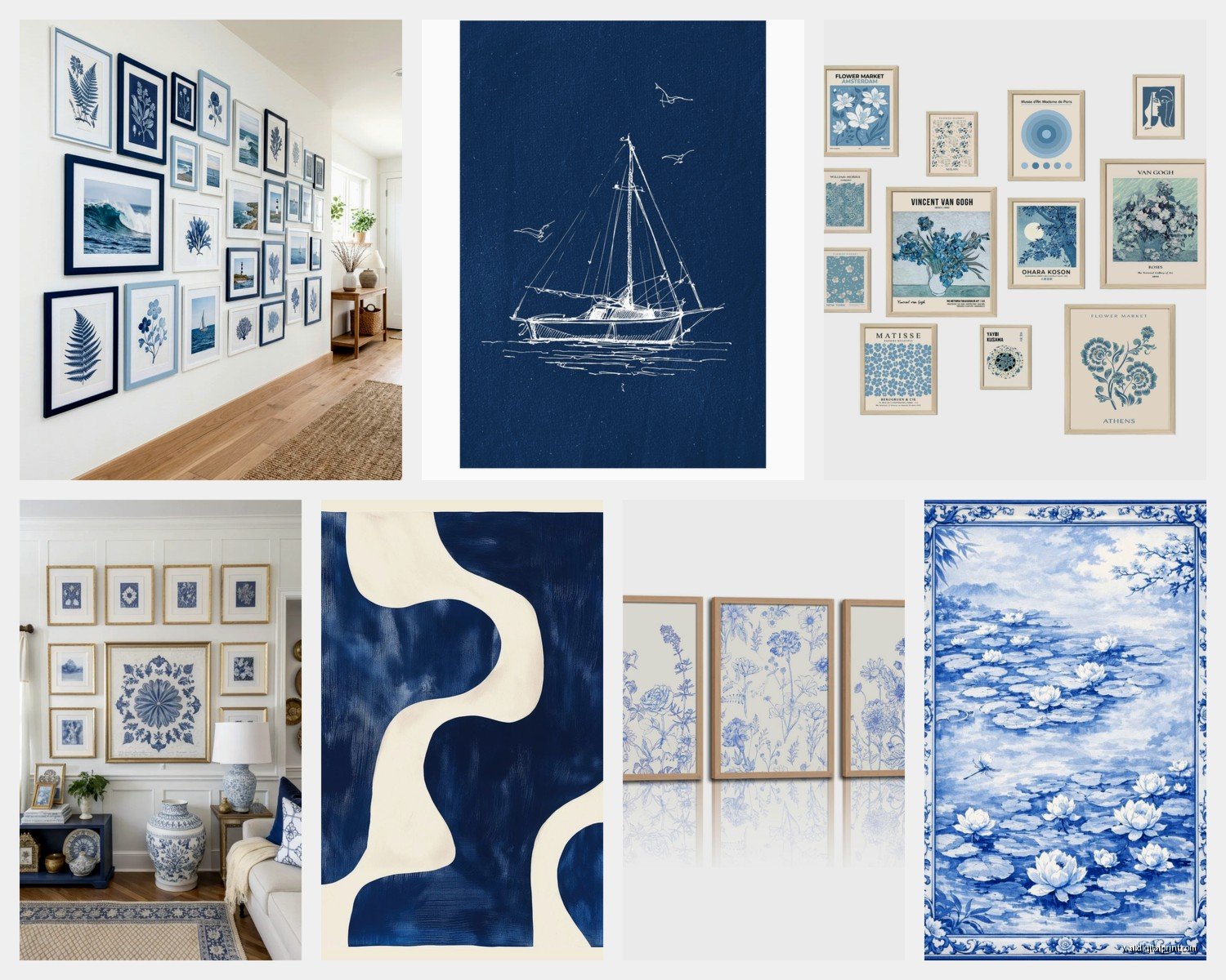
The framing matters SO much here. White frame = casual beachy. Navy frame = more formal nautical. Natural wood frame = organic coastal (my personal fave lately). I’m obsing over these light oak frames from Framebridge right now, they make the blue pop without competing with it.
Ship and Boat Illustrations
This is where people get it wrong all the time. You don’t need a massive clipper ship taking up your entire wall unless you’re going full maritime museum vibes. Actually the most sophisticated approach I’ve found is smaller boat sketches – like technical drawings of sailboats, those side-view diagrams that show the rigging and hull details.
I source a lot of these from this one print shop in Maine (found them randomly while watching The Bear season 2, got distracted googling coastal Maine during the episode about… whatever that episode was about). They do these beautiful line drawings that are mostly white space with blue ink details. Super clean, very modern-coastal rather than grandma-beach-house.
Groupings work better than single large pieces with this style. Like three or four smaller frames arranged in a grid or even just a horizontal line. I did a hallway last month with six different boat sketches, all same size frames, all in a row at eye level. Client sent me a photo last week of their neighbor asking where they got them.
Size and Placement Rules (that I actually follow)
Nobody wants math but here’s the thing – if your wall art is too small it looks like you just gave up. The bottom of your frame should be 6-8 inches above furniture, and the piece should take up roughly 2/3 the width of whatever’s below it. Couch is 84 inches? You want your art or arrangement to be around 55-60 inches wide.
For blue and white stuff specifically, I go slightly larger than I would with other color combos because the high contrast can handle the scale. A piece that might feel overwhelming in like… rust and cream? Totally works in navy and white.
Abstract Ocean and Water Pieces
Okay so this is where it gets fun and also where you can spend way too much money if you’re not careful. Abstract water art in blue and white can range from $40 prints to $4000 originals and honestly? Sometimes the $40 one looks better.
What you’re looking for: movement and variation in the blues. Not just solid blocks of color. The really good pieces have like three or four shades of blue with white negative space or white brushstrokes that suggest waves or water patterns without being super literal about it.
I’ve had good luck with Minted for affordable prints in this category. Their “Fluid” collection or whatever they call it has some gorgeous options. Also Society6 but you gotta dig through a lot of mediocre stuff to find the gems.
The original art route – if you’re gonna splurge, this is where I’d do it. Local art fairs and coastal town galleries have tons of artists doing abstract ocean work. I found this incredible artist in Rhode Island who does these massive blue and white pieces with actual sand mixed into the paint and they’re like $800 but worth every penny for the texture and depth you get.
Photography (Underrated Option)
Everyone sleeps on black and white photography for coastal spaces but hear me out – okay technically not blue BUT if you mat it with a blue mat or frame it in blue, you get that nautical feel while keeping things super crisp and modern.
Wave photography especially. Those shots of waves cresting, lots of white water detail, printed in black and white, then mounted with a navy mat? Looks expensive even when it’s not. I use this trick in rental staging all the time because it photographs well and appeals to lots of different buyers.
For actual blue and white photography – beach scenes with blue sky and white sand, coastal architecture (Greek islands are perfect for this), boats against blue water. Just avoid anything too sunset-y or tropical because that shifts the vibe from classic coastal to vacation resort real quick.
Typography and Quote Prints
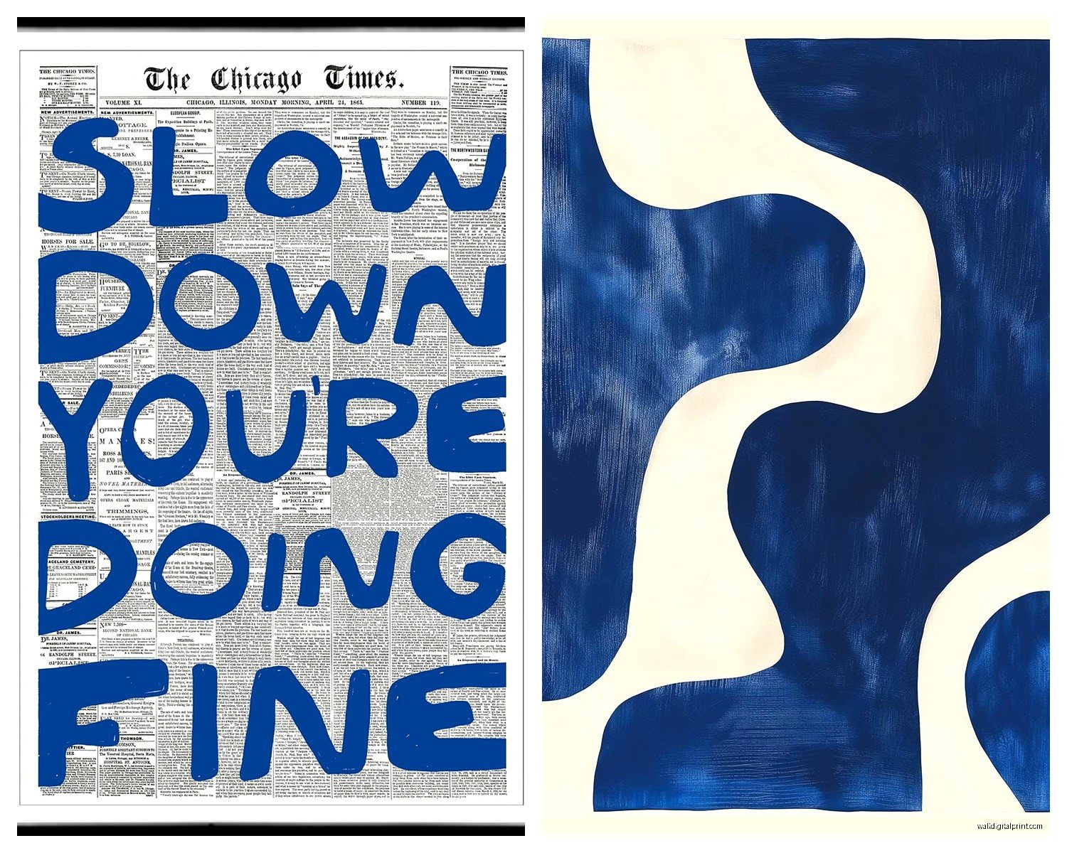
I’m gonna be real, most nautical quote prints are cheesy as hell. “Seas the Day” and all that – hard pass. BUT there are ways to do text-based art in blue and white that don’t make people cringe.
Single words work better. “SAIL” in navy serif font on white background. “COAST” in that cool modern typewriter font. Coordinates of your favorite beach location. Ship names if you have a family boat or whatever.
The key is keeping it simple and making sure the typography itself is actually good design. No curly beach-y fonts unless you want it to look like a HomeGoods clearance section (no shade to HomeGoods, I shop there, but you know what I mean).
Mixing Styles Without Looking Messy
So here’s where I see people freeze up – they find like five different blue and white pieces they love but don’t know if they can put them together. Real talk? You can mix way more than you think you can.
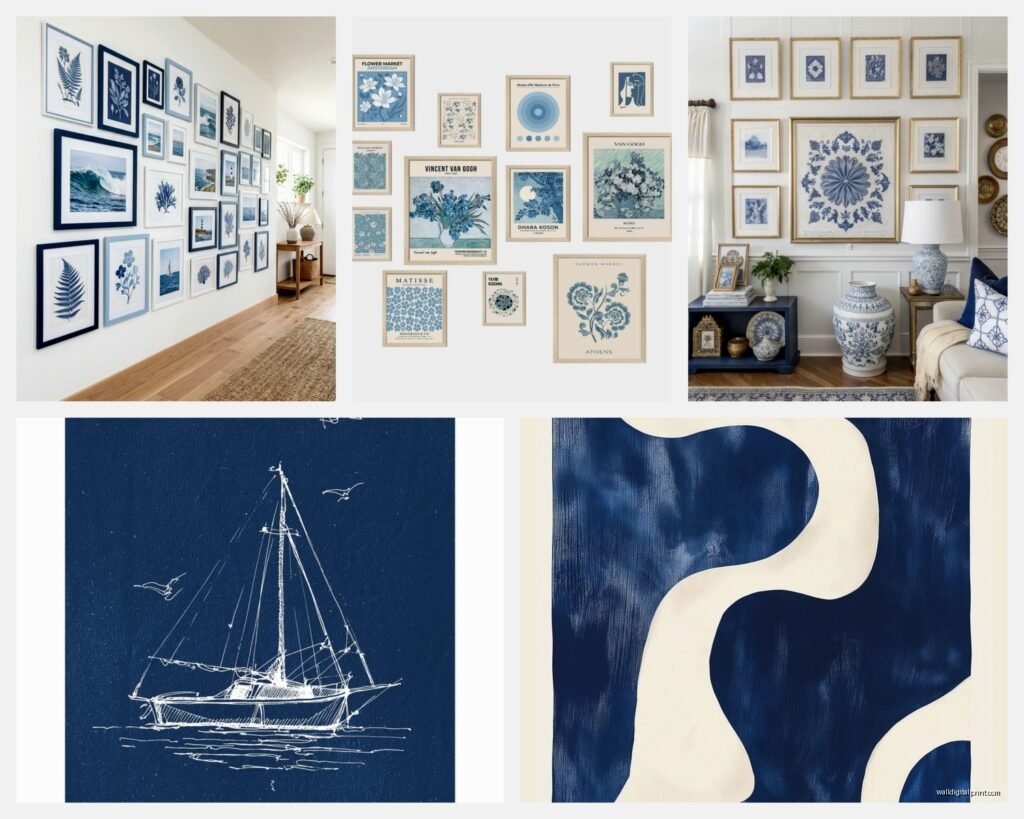
My formula: Pick one dominant style for the largest piece, then support it with 2-3 smaller pieces in different styles. Like maybe your main piece above the couch is an abstract ocean painting, then on the adjacent wall you do a small grouping of vintage nautical charts, and on another wall there’s a boat illustration.
What ties it together is the color consistency (keeping your blues in the same family) and the framing. I usually stick to two frame colors max in a space – like all natural wood and white, or all navy and brass, or all white with some white mats.
Oh and another thing – vary your sizes. All same-size frames in a room feels very doctor’s office waiting room. Mix it up with different dimensions.
Where to Actually Buy This Stuff
Etsy is honestly my first stop for most projects. Search terms: “nautical chart print,” “coastal line art,” “navy blue abstract art,” “sailing illustration.” Filter by your size needs and budget. Read the reviews because some sellers have terrible print quality.
West Elm and Serena & Lily if you want ready-made stuff that’s gonna look cohesive. More expensive but zero guesswork. Their coastal collections every summer are usually really strong.
Local frame shops for custom work – yes it costs more but if you find a vintage piece or want something specific matted, this is the way. I have a guy in my city who does incredible work with old maps and charts.
Antique stores and flea markets for unique finds. I’ve scored amazing vintage boat paintings and old ship diagrams this way. Just be prepared to reframe stuff because the existing frames are usually beat up.
DIY Options If You’re Crafty
I’m not super crafty myself – my cat knocked over my last attempt at anything DIY and honestly it was probably for the better – but I’ve had clients do their own blue and white pieces successfully.
Simplest method: Buy white canvas, blue acrylic paint, make abstract marks/waves. Sounds basic but if you keep it loose and intuitive it can look really good. Or do the pour painting thing with different blue shades and white.
Printing your own photography: If you take decent photos, print your own coastal shots through a service like Nations Photo Lab or Mpix. Way cheaper than buying photography prints. Just make sure your resolution is high enough.
Framing pressed seaweed or coastal botanicals: Sounds weird but I’ve seen this done really well. Press the specimens, mount on white paper, frame with navy mat. Very elegant and different from typical coastal art.
Common Mistakes to Avoid
Going too matchy-matchy with your blues. You want some variation in shade otherwise it looks flat. Mix navy with lighter blues, throw in some blue-gray maybe.
Hanging everything too high. The center of your art should be at eye level, which is like 57-60 inches from the floor. I see so many people hang stuff way up near the ceiling for some reason.
Forgetting about scale with gallery walls. Your pieces should have some relationship to each other size-wise. Not all identical but not one huge piece with tiny little ones floating around it either.
Buying everything from the same collection. It ends up looking like a hotel room. Mix sources and styles even if you’re keeping the color scheme consistent.
Using glass that’s too reflective. If you’re hanging across from windows, spring for the non-glare glass or acrylic. Regular glass just becomes a mirror and you can’t even see your art.
Styling Around Blue and White Wall Art
The art is obviously the focus but it’s gotta work with your room. Blue and white art is super forgiving though – works with white walls (classic), gray walls (modern), even beige/tan walls (warmer coastal).
For furniture and decor, you can go full blue and white throughout or use the art as your blue element and keep everything else neutral. I usually do the latter because all blue and white everything can feel kinda… intense? Like living in a china pattern.
Natural textures balance out the crispness – jute rugs, linen curtains, wood furniture, woven baskets. This keeps the blue and white from feeling too stark or nautical-themed-restaurant.
Small pops of other colors: sand tones, soft greens, warm brass or gold metallics. These warm up the palette without competing with your blue and white art.
Okay I think that covers most of what you need to know? The main thing is just start with pieces you actually like rather than trying to force a theme. The nautical coastal thing should feel natural and relaxed, not like you followed some strict decorating rules. Pick art that makes you happy when you look at it and the rest kinda falls into place.