Wall Art Guide, Wall Art Tutoriels
Gray Wall Art: Charcoal Slate Neutral Modern Designs
Oct
So I’ve been working with gray wall art for like three years now and honestly it’s become my go-to recommendation when clients don’t know where to start. Gray gets this weird reputation for being boring but that’s only if you’re doing it wrong, and lemme tell you exactly how to not mess this up.
Why Gray Actually Works When Other Colors Don’t
Okay so here’s the thing about charcoal and slate tones that nobody really explains properly. They’re not actually neutral in the way beige is neutral. Gray has undertones—cool, warm, sometimes even purple or green—and this is where people screw up their entire room. I had this whole situation last month where a client bought this “gray” abstract piece and it looked straight-up blue in her living room because her walls had warm undertones. We fixed it but it was a whole thing.
The charcoal shades (those really dark grays, almost black) work best when you’ve got good natural light. I’m talking big windows, south-facing if possible. Without that light, charcoal art just becomes this void on your wall and your room feels like a cave. But slate? Slate’s more forgiving. It’s that medium gray that has enough dimension to work in darker spaces.
Matching Gray Art to Your Actual Space
You gotta look at what you already have before buying anything. I learned this the hard way after impulse-buying this gorgeous charcoal geometric piece that clashed with literally everything in my dining room. Here’s what I do now:
- Take a photo of your wall in natural daylight
- Check what undertones your existing furniture has
- Look at your flooring—warm wood needs different grays than cool tile
- Consider your metal finishes (brass vs chrome makes a difference)
If you’ve got warm woods and gold accents, you want grays with warm undertones. Think greige territory, those grays that lean slightly taupe. For modern spaces with chrome, black furniture, white walls—go cooler. Those blue-grays and true charcoals will look chef’s kiss.
The Undertone Test That Actually Works
Put a pure white piece of paper next to your wall. Not off-white, pure white. The difference you see? That’s your undertone. If your wall looks yellowish next to it, you need warm-toned gray art. If it looks slightly blue or purple, cool tones. This sounds overly simple but I’ve used this trick with probably fifty clients and it works every single time.
Choosing Between Abstract, Geometric, or Minimalist
So abstract gray art is having this massive moment right now and I get why. It’s forgiving, works with multiple styles, and you can interpret it however you want. I’ve got this one piece in my office that’s charcoal and white brushstrokes—some days it looks like a storm, other days it’s just nice shapes. That flexibility matters when you’re staring at something every day.
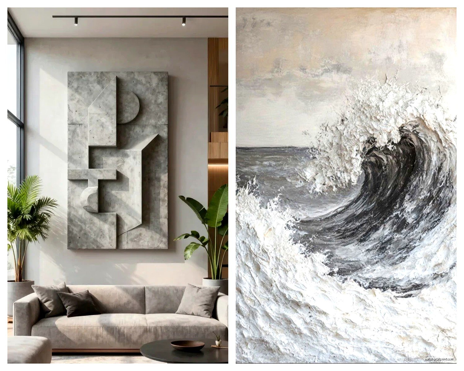
Geometric designs in gray are perfect for modern and contemporary spaces. We’re talking clean lines, shapes, maybe some optical illusion stuff. These work really well in offices, dining rooms, above console tables. Anywhere you want visual interest without chaos. The key with geometric gray art is scale—too small and it looks like a weird afterthought, too big and it overwhelms unless your ceiling height can handle it.
Minimalist gray pieces are my secret weapon for small spaces. One large minimalist print in slate or charcoal can make a tiny room feel intentional instead of cramped. I did this in my friend’s studio apartment—one massive 40×60 charcoal abstract above her bed—and suddenly the whole space looked curated instead of “I just graduated college.”
Size Guidelines That Don’t Suck
Okay so everyone says “go bigger than you think” but that’s not helpful right? Here’s actual measurements I use:
Above a sofa: Your art should be 2/3 to 3/4 the width of your sofa. So if you’ve got a 90-inch sofa, you’re looking at 60-67 inches of art width. This can be one large piece or a gallery wall that spans that width.
Above a bed: Same rule kinda. Queen bed? You want something around 50-60 inches wide. King? Go 60-70 inches. I see so many people put tiny pieces above beds and it just looks lost.
Dining room: This one’s trickier because you gotta account for the table width. I usually go with something that’s about half the table width, centered above it.
Oh and another thing—vertical vs horizontal matters more than people realize. Horizontal pieces make walls feel wider, vertical pieces make ceilings feel higher. I’ve got low ceilings in my place (thanks, 1950s construction) so I almost always go vertical with my gray art to create that upward movement.
Mixing Gray Art with Color
This is gonna sound weird but gray art is actually amazing for colorful rooms. Like, you’d think it would wash out but it doesn’t—it grounds everything. I worked with this client who had a teal sofa, mustard pillows, and terracotta accents, and we added this massive charcoal abstract piece and it suddenly all made sense. The gray acted like a visual pause.
If you’re adding gray art to an all-neutral room though, you need texture. Flat gray on gray on gray = sad hotel room vibes. Look for pieces with visible brushstrokes, mixed media elements, or varying shades of gray within the piece itself. Dimension is everything.
The Three-Shade Rule
When you’re picking gray art, make sure the piece itself has at least three different shades of gray. Light, medium, dark. This creates depth and keeps it from looking flat. I made the mistake of buying this “minimalist” print that was literally one shade of slate and it looked like I printed out a gray rectangle from my computer. Not cute.
Framing Matters More Than You Think
Okay so I spent like two hours yesterday comparing frame options because my cat knocked over one of my pieces (she’s fine, the frame is not), and here’s what I’ve figured out:
Black frames: Classic with gray art. Makes the charcoal tones pop, creates clear boundaries. Works in literally any style from modern to traditional. Can’t really go wrong here.
White frames: Better for lighter grays and slate tones. Creates a softer look, works well in Scandinavian or coastal styles. But with dark charcoal art? Sometimes looks too stark unless that’s specifically the vibe you want.
Natural wood: This is my personal favorite for gray art. Adds warmth without competing. Light oak or maple for modern spaces, darker walnut for traditional. The wood grain adds texture that complements the gray.
No frame/canvas wrap: Modern and clean but the edges better be finished nicely. I’ve seen too many cheap canvas wraps where you can see the staples and it just looks unfinished.
Where to Actually Buy Quality Gray Art
I’m not gonna lie, I’ve wasted money on cheap prints that looked great online and terrible in person. The gray was off, the print quality was muddy, whatever. Here’s where I actually shop now:
Online art marketplaces with independent artists usually have the best stuff. You can filter by color, size, style. The prices are better than galleries and you’re supporting actual artists. Just make sure you’re looking at the reviews and checking the return policy.
For affordable options, some big box stores have stepped up their game. I’ve found decent gray abstracts at places you wouldn’t expect. The key is going in person if possible because gray photographs terribly and what looks like charcoal online might be straight-up black in reality.
Custom prints are worth it if you’ve got specific dimensions or need to match exact shades. I had a piece made to match this slate tile in a client’s fireplace and it was perfect. More expensive but sometimes that’s what you gotta do.
The Print Quality Thing Nobody Talks About
Giclée prints are worth the extra money for gray art specifically. Regular prints can look flat and lose those subtle tonal variations that make gray interesting. Giclée printing captures all those nuances. If you’re spending money on a large piece, make sure it’s giclée.
Styling Around Your Gray Art
So you’ve got your gray wall art, now what? Don’t just hang it and walk away. Layer it properly:
- Add a console table or credenza underneath with decor
- Use lighting—picture lights or wall sconces make a huge difference
- Balance it with other elements on adjacent walls
- Consider a gallery wall if one piece feels lonely
I’m obsessed with adding brass or gold accents near gray art right now. Like, a brass table lamp next to a charcoal abstract? *Chef’s kiss*. The warm metal makes the cool gray feel more approachable.
Plants also work really well with gray art. The organic shapes and green tones create this nice contrast without being too matchy-matchy. I’ve got this huge monstera next to my slate-toned piece and it’s probably my favorite corner in my apartment.
Gallery Wall Configuration with Gray Pieces
Wait I forgot to mention—gallery walls with varying shades of gray are having a moment and they’re actually easier to pull off than colorful gallery walls. The cohesive color palette means you can mix different styles without it looking chaotic.
Here’s my formula: Pick 3-5 pieces in different shades from light gray to charcoal. Mix sizes but keep one piece as the anchor (usually the largest). Add one piece with a tiny pop of color—like gray with a hint of gold leaf or copper. Hang the anchor piece first at eye level (57-60 inches to the center), then build around it.
Keep spacing consistent—I do 2-3 inches between frames. Use paper templates first, tape them to the wall, step back, adjust. I learned this after putting like fifteen holes in my wall trying to wing it. Not fun.
Maintaining and Cleaning Gray Art
Okay this is boring but important. Dust with a microfiber cloth regularly because dust shows up on dark charcoal pieces like crazy. For framed art with glass, use regular glass cleaner but spray the cloth, not the glass directly. Learned that one when I accidentally got cleaner behind the glass and it left marks.
Canvas pieces without glass need gentler cleaning. Barely damp cloth, no chemicals. And keep gray art out of direct sunlight if possible—it can fade, especially if it’s a print rather than original work.
Common Mistakes I See Constantly
Hanging gray art too high. I don’t know why people do this but art should be at eye level, which is lower than you think. The center of the piece should be around 57-60 inches from the floor.
Choosing gray art with the wrong undertones for their space—we covered this but it’s worth repeating because it’s the number one thing that makes gray art look wrong.
Going too matchy-matchy with everything gray. Your art, your walls, your sofa… it all blends together. You need contrast somewhere.
Skipping the quality and buying the cheapest option. Gray art specifically shows quality issues more than colorful art because you notice things like poor print resolution and color inconsistency more easily.
Not considering the mood. Charcoal and dark grays create drama and sophistication but can feel heavy. Lighter slates feel calm and airy. Make sure that matches what you want from the space.
My Current Favorite Gray Art Trends
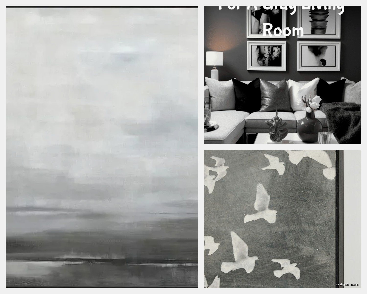
Okay so textured gray art is everywhere right now and I’m here for it. Think mixed media pieces with plaster elements, pieces that have actual dimension you can see from the side. They cast shadows and change throughout the day as the light shifts.
Organic shapes in gray tones—like abstract landscapes or fluid forms—are replacing the geometric stuff from a few years ago. Still modern but softer, more approachable.
Large-scale minimalism in charcoal is having this resurgence too. One huge simple piece instead of a busy gallery wall. Very much the “less is more” thing but done right it’s stunning.
The combination of gray with metallic accents (silver leaf, gold, copper) integrated into the artwork itself is super popular and actually works really well. Adds just enough visual interest without being too much.
Honestly gray wall art is one of those things that seems straightforward until you actually start picking pieces and then you realize there’s like a million decisions to make. But once you understand the undertones thing and get the sizing right, it’s pretty hard to mess up. Just trust your gut a little bit too—if you love a piece and it technically breaks some rule, who cares? It’s your wall.