
Wall Art Guide, Wall Art Tutoriels
Entryway Wall Art: Foyer First Impression Welcome Decor
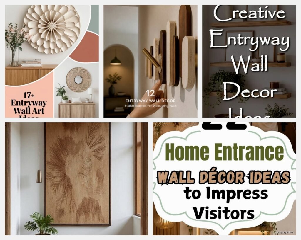
Oct
So I was literally just helping my sister pick out art for her entryway last week and honestly, the whole thing is trickier than people think because you’re working with this weird space that’s usually narrow and nobody spends “time” there but EVERYONE sees it, you know?
Figure Out Your Actual Wall Space First
Okay so first thing – measure the wall. I know, I know, everyone says this but I mean actually measure it. Not just the width but also where light switches are, where the doorframe ends, how far your console table (if you have one) sits from the wall. I cannot tell you how many times I’ve seen people buy this gorgeous oversized piece and then realize their light switch is right in the middle of where it needs to hang.
My rule is usually leave about 8-10 inches from the edge of your console table to the bottom of your art. If you go too high it looks like it’s floating away, too low and it feels crowded. The center of your art should be around 57-60 inches from the floor – that’s like standard gallery height and it actually works in most homes unless you have cathedral ceilings or something.
The Whole Mirror vs Art Debate
People always ask me this. Here’s what I’ve figured out through like, way too many projects – mirrors are GREAT for entryways that are dark or narrow because they bounce light and make the space feel bigger. But they’re not always the vibe. If your entryway gets tons of natural light or you want it to feel more personal, go with actual art.
I had this client who insisted on a mirror and her entryway faced west so every afternoon it was just this blinding reflection situation. We switched to a large abstract piece in blues and grays and it completely changed the feel. Sometimes you gotta live with something to know if it works.
When Mirrors Actually Make Sense
- Your entryway has zero windows
- The space is super narrow (less than 4 feet wide)
- You actually need a mirror there for last-minute checks before leaving
- The wall directly across is interesting – like a window with a garden view
Just don’t put a mirror directly facing your front door if you’re into feng shui stuff. Apparently it pushes energy back out? My mom is obsessed with this.
Scale Is Everything and Everyone Gets It Wrong
This is gonna sound harsh but like, those little 16×20 frames from HomeGoods? They’re gonna look lost on a big entryway wall. I see this constantly. People are afraid to go big because they think it’ll overwhelm the space but actually the opposite happens – too-small art makes your entryway look unfinished.
For a standard entryway wall (let’s say 4-6 feet wide), you want art that’s AT LEAST 24-30 inches wide. If you’re going above a console table, aim for the art to be about 2/3 the width of the table. Not exact, but roughly.
I’ve been loving oversized pieces lately – like 40×60 or even bigger if the space can handle it. One bold piece always looks more expensive and intentional than a bunch of small stuff clustered together. Unless you’re doing a gallery wall, which is a whole different conversation.
My Sizing Cheat Sheet
- Narrow entryway (3-4 feet): 24×36 vertical piece works great
- Standard entryway (4-6 feet): 30×40 or 36×48, can go horizontal or vertical
- Wide entryway (6+ feet): Go big, like 48×60, or do a diptych/triptych situation
- Above console table: Art should be 2/3 to 3/4 the width of the table
What Actually Works Style-Wise
Okay so I’ve tested a LOT of different art styles in entryways and here’s what I’ve learned. Abstract art is like the safest bet because it doesn’t compete with your furniture or make a super specific statement that you might get tired of. But it can also feel kinda generic if you’re not careful.
Photography can be stunning – I did this entryway with a massive black and white landscape photo and it was chef’s kiss. But it needs to be HIGH quality printing. Those cheap canvas prints from online… you can tell. The resolution looks fuzzy and the canvas texture is too obvious.
Botanical prints are having a moment and honestly they’re perfect for entryways. They feel fresh and welcoming without being too personal or weird. I found this set of vintage botanical drawings at an estate sale last month and framed them for my own entryway and I get compliments every time someone comes over.
Styles That Work Really Well
- Large-scale abstract in 2-3 colors that pull from your home’s palette
- Black and white photography (architecture, landscapes, not family photos tho)
- Botanical or natural elements
- Geometric patterns if your style is modern
- Vintage maps if you want something with a story
- Line drawings – super trendy right now and they feel sophisticated
Gallery Walls Are Great But Here’s the Thing
Everyone wants to do a gallery wall because they look so good on Pinterest but they’re actually kinda hard to pull off. You need an odd number of pieces (3, 5, 7, or 9 works best), they should have some unifying element like matching frames or a consistent color palette, and the spacing matters SO much.
I always lay everything out on the floor first. Take a photo from above. Live with that photo for a day or two. Then commit. The spacing between frames should be consistent – I usually do 2-3 inches between each piece.
Oh and another thing – start with your largest piece and build around it. Don’t just start randomly hanging stuff because you WILL end up with weird gaps and uneven spacing and then you’ve got 47 holes in your wall.
Gallery Wall Frame Options
All matching frames is the easiest and looks super clean. All black or all natural wood. You can get relatively cheap frames from IKEA (the RIBBA series is actually decent) or if you wanna splurge, Framebridge does custom stuff that’s really nice.
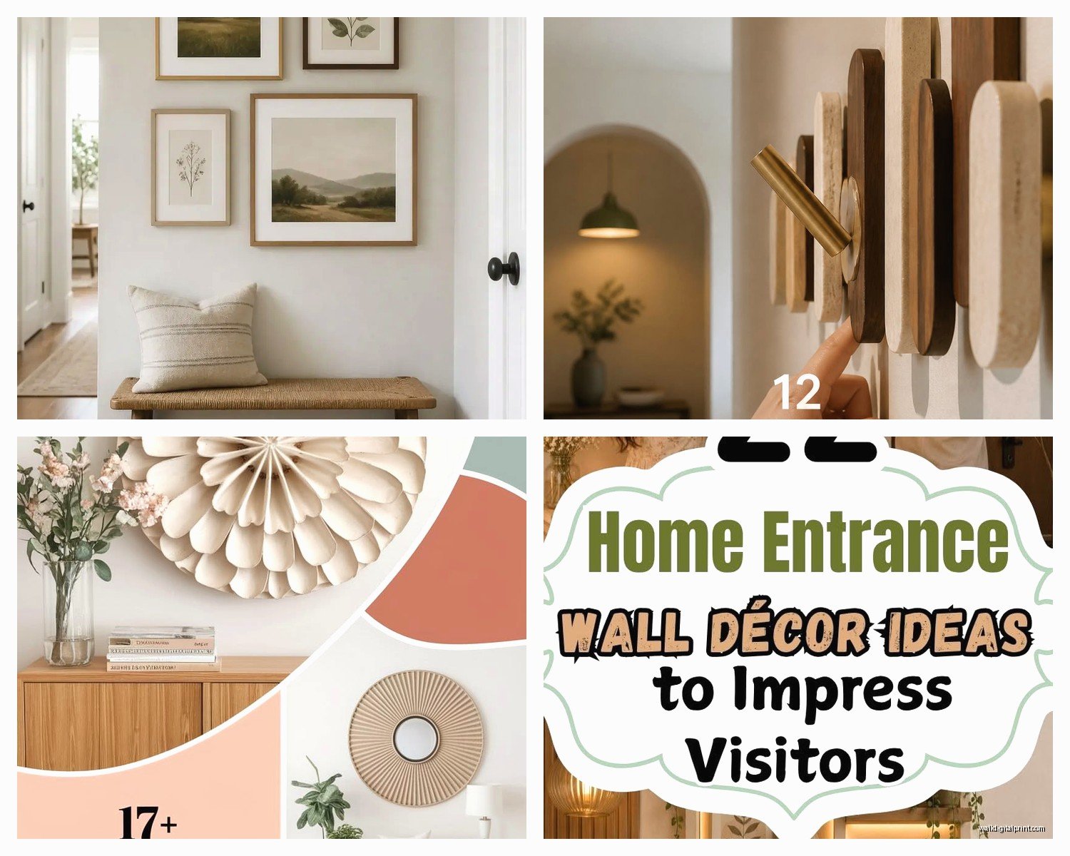
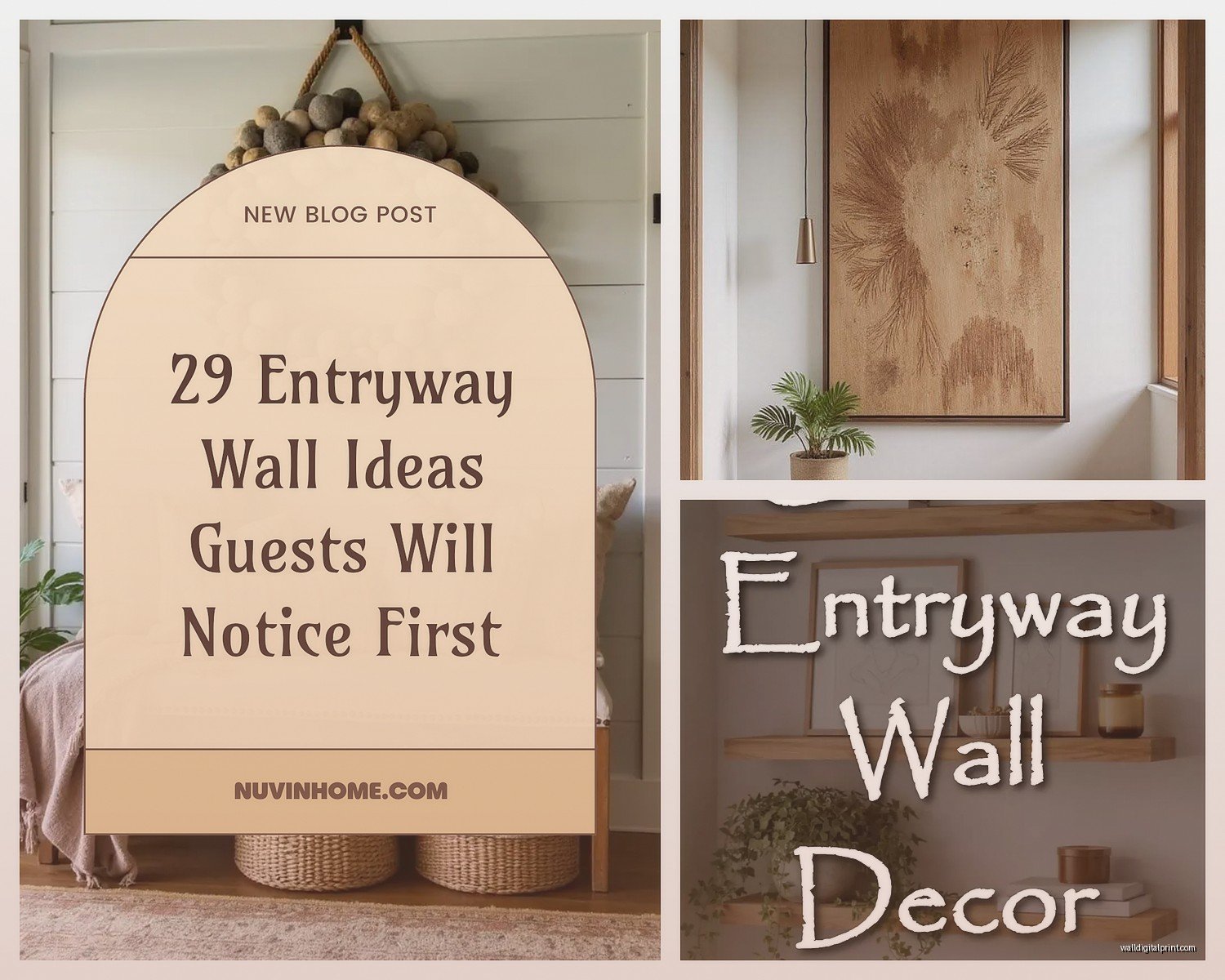
Mixed frames can work but it’s harder. You need something to tie them together – maybe they’re all gold, or all vintage, or all have white mats. Otherwise it just looks chaotic.
The Console Table + Art Combo
If you have a console table, the art above it becomes like… an anchoring moment for the whole entryway. I always style them together as one vignette. The art shouldn’t just float there unrelated to what’s below.
Here’s my formula that actually works: Large art on the wall, one taller object on the console (like a lamp or vase with branches), one medium thing (maybe a stack of books or a decorative box), and one small thing (a candle or small plant). Keep it asymmetrical – everything shouldn’t be centered.
And please, PLEASE don’t push your console table flush against the wall if you can help it. Pull it out like 4-6 inches. It gives the whole setup more depth and makes the art feel more intentional somehow. I learned this from this random styling workshop I took and it’s one of those things you can’t unsee once you know it.
Lighting Makes or Breaks Everything
This is gonna sound weird but I’ve seen beautiful art look terrible because the lighting was off. If your entryway doesn’t have good natural light, you gotta add something. Picture lights are the obvious choice – those little lights that mount above the frame. But they can look formal.
I’ve been using these wireless LED puck lights that you can stick anywhere. Put one on top of the frame angled down, or hide them behind a plant on your console table to create ambient light. Game changer and they’re like $20 for a three-pack.
Or if you have overhead lighting, make sure it’s warm-toned (2700-3000K bulbs). Cool white light makes art look washed out and weird.
Lighting Quick Fixes
- Battery-operated picture lights (no wiring needed)
- Uplighting from the console table
- Replace overhead bulbs with warm LED
- Add a table lamp on your console if there’s room
Where to Actually Buy This Stuff
Okay so everyone asks where I find art. Honestly it’s all over the place. For budget-friendly stuff, I hit up Etsy for digital downloads that I get printed at a local print shop. The quality is way better than those print-on-demand canvas things and you can choose your own frame.
Society6 and Minted have good options if you want something ready-made. The quality is decent for the price. I wouldn’t put them in a formal living room but for an entryway? Totally fine.
Thrift stores and estate sales are my secret weapon though. I found this gorgeous vintage oil painting for $35 last year and it’s probably my favorite piece. It just needed a new frame. You gotta go regularly because it’s hit or miss but when you find something good it’s SO worth it.
For higher-end stuff, Saatchi Art has original pieces from actual artists. It’s an investment but if you find something you love, it makes your entryway feel really special and collected over time.
My Actual Shopping List
- Etsy for printable art (then print at Costco or a local shop)
- Society6 for affordable ready-made pieces
- Minted for photography and modern designs
- Local estate sales for vintage finds
- Saatchi Art or Artfinder for original art
- West Elm or CB2 for modern pieces that feel expensive
- Anthropologie when they have sales (never full price tho)
Framing Is Where You Should Actually Spend Money
I’m gonna be real with you – cheap frames make expensive art look cheap, but nice frames make affordable art look expensive. If you’re gonna splurge on one thing, make it the frame.
Custom framing is pricey but sometimes worth it, especially for weird sizes. I use a local frame shop for special pieces and IKEA or Target for standard sizes. Michaels does custom framing too and they always have 50% off coupons if you sign up for their emails.
For a polished look, get a mat. Even a simple white mat elevates everything. Standard ratio is like, if your art is 16×20, get an 18×24 frame with a mat. The mat creates breathing room and makes the art feel more gallery-like.
Natural wood frames are having a moment and they work in literally any style home. Black frames are classic and modern. Gold or brass frames feel more traditional but can work if that’s your vibe. Just stay consistent – don’t mix metals unless you really know what you’re doing.
Hanging It Without Losing Your Mind
Use a level. I know it seems obvious but I’ve seen so many crooked entryway pieces and it drives me crazy. Get one of those small laser levels if you’re doing multiple pieces – they’re like $15 on Amazon and worth every penny.
For heavy pieces, use proper wall anchors. Don’t just hammer a nail into drywall and hope for the best. I use those monkey hook things for medium-weight frames and they’ve never failed me. For anything over 20 pounds, you want to hit a stud or use toggle bolts.
The Command picture hanging strips are actually pretty good for lighter pieces and renters. They hold more weight than you’d think and don’t damage walls. Just follow the directions exactly or they won’t work right.
Oh wait I forgot to mention – if you’re hanging something above a console table, hang the art first THEN position your table. Not the other way around. Otherwise you’ll end up with the art too high trying to accommodate where the table ended up. Trust me on this.
My cat just knocked over my coffee so I gotta wrap this up but honestly, the main thing with entryway art is just commit to something. I see so many people leave their walls bare for months because they’re waiting to find the “perfect” piece. Just hang something you like and see how it feels. You can always change it later. Art isn’t permanent even though we treat it like it is.
The entryway sets the tone for your whole house so yeah, it matters, but it doesn’t have to be precious about it. Pick something that makes you happy when you walk in the door and call it done.
