Wall Art Guide, Wall Art Tutoriels
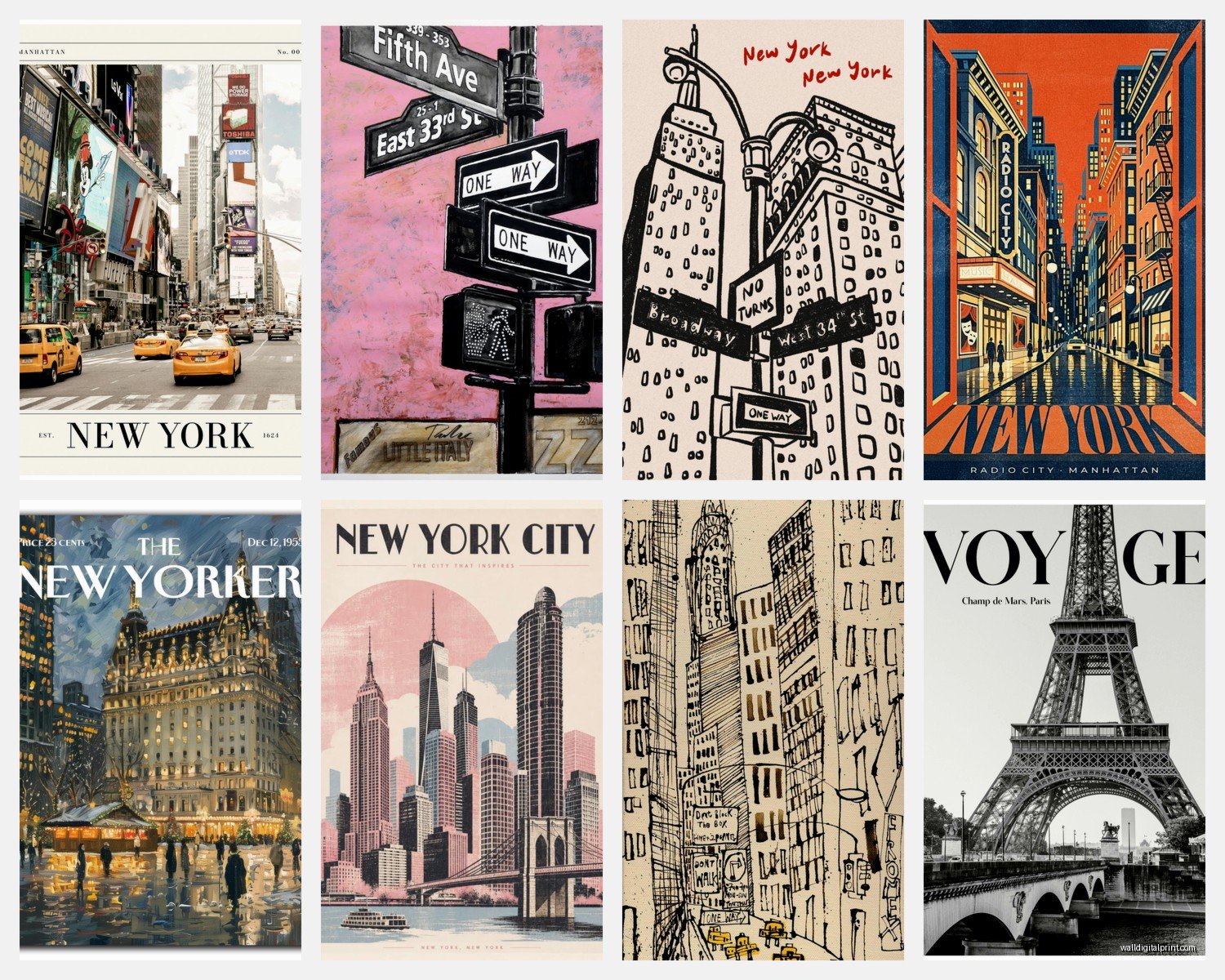
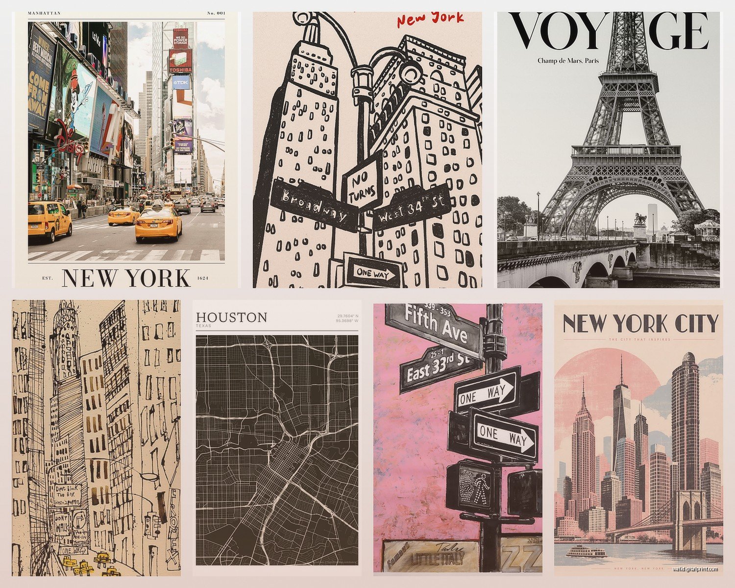
City Prints Wall Art: Urban Skyline Architecture Photography
Nov
So I’ve been completely obsessed with city prints lately and honestly it started because I had this massive blank wall in my living room that was driving me insane for like six months. Just staring at me every morning with my coffee. My cat would sit there and judge me too, I swear.
Anyway, here’s what I figured out after way too many late nights scrolling through print shops and basically turning my apartment into a testing ground.
The Whole Black and White vs Color Situation
Okay so first thing—you gotta decide if you’re going black and white or color because it completely changes the vibe. I thought I wanted color initially, right? All those vibrant sunset skylines looked amazing online. But here’s the thing… they can be really tricky to match with existing decor.
Black and white city prints are honestly your safest bet if you’re not 100% confident about your color scheme. They work with literally everything. I put a black and white Chicago skyline print in a client’s home office last month and it just disappeared into the space in the best way possible. Like it belonged there from day one.
But if you’re gonna go color, make sure you pull at least one shade from your existing room colors. I learned this the hard way with a Tokyo print that had this gorgeous pink-orange sunset… looked incredible online, clashed horribly with my grey-blue couch situation. Now it’s in my bedroom where the warmer tones actually work.
Print Quality Actually Matters More Than You Think
This is gonna sound obvious but the quality difference between a cheap print and a decent one is massive. I’m not saying you need to drop $500 on some limited edition gallery print, but don’t go for the absolute cheapest option either.
Look for prints that specify:
- Giclée printing (fancy word but it basically means high quality inkjet)
- Archival inks (won’t fade in like two years)
- At least 200gsm paper weight
- Acid-free materials
I tested three different prints of the same NYC skyline at different price points and the $25 one from a random seller looked washed out within six months. The $75 one from a specialty print shop still looks perfect two years later. Do the math on that.
Size is Where Everyone Messes Up
Oh and another thing—people always go too small with wall art. Always. I’ve done it, my clients do it, we all do it until we learn.
For a city skyline print above a couch or console table, you want it to be roughly 2/3 to 3/4 the width of the furniture piece. So if your couch is 84 inches wide, you’re looking at like 56-63 inches of art. That could be one large piece or a gallery wall situation.
Wait I forgot to mention—measure your wall space BEFORE you start shopping. Seriously. Take a piece of painter’s tape and mark out different size options on your wall. Live with it for a day or two. I know it sounds extra but I’ve returned so many prints because they looked huge online and then tiny on the actual wall.
Common Size Mistakes I See
- Buying an 18×24 print for a massive wall (it’ll look like a postage stamp)
- Getting a super wide panoramic print for a narrow wall (proportions will feel off)
- Forgetting to account for the frame adding 2-3 inches to each dimension
Frame or No Frame and Why It’s Complicated
Okay so framing is its own whole thing. You can get prints framed or unframed, and there’s pros and cons to both.
Unframed prints are cheaper and you have more control over the final look. But then you gotta actually frame them, which means a trip to the frame shop or IKEA, dealing with measuring and mounting… it’s a whole project. I usually go this route when I want something specific or I’m working with an unusual size.
Pre-framed prints are more expensive upfront but honestly? Sometimes worth it for the convenience. Especially if you’re not super handy or you just want it done. I got a framed London skyline print delivered and literally just hammered in a nail and hung it up. Done in five minutes.
If you’re getting it framed separately, simple black or white frames work best for city prints. The architecture should be the star, not some ornate gold baroque situation. Unless you’re going for that eclectic maximalist vibe, then sure, go wild.
Where to Actually Buy These Things
So I’ve ordered from probably twenty different shops at this point and here’s my honest take:
Etsy is great for unique perspectives and supporting independent photographers. The quality varies wildly though, so read reviews carefully and check their return policy. I’ve found amazing prints from photographers who actually live in the cities they shoot—those tend to be the most interesting compositions.
Society6 and Redbubble are solid mid-range options. Lots of variety, consistent quality, reasonable prices. The framing options are pretty basic but functional. My NYC nighttime skyline is from Society6 and it’s held up really well.
Juniqe and Desenio if you want that modern Scandinavian aesthetic. Their city prints tend to be more minimalist and graphic. Good quality, ships from Europe so factor in shipping time if you’re in the US.
This is gonna sound weird but I’ve also found incredible city prints at local art fairs and markets. There’s something cool about having a print from a photographer who actually stood on that rooftop at 5am to catch the light.
The Whole Canvas vs Paper Print Thing
Canvas prints are having a moment but honestly… for detailed architecture photography, I usually prefer paper prints behind glass. Canvas can soften the details and you lose some of that crisp line quality that makes cityscapes impressive.
But canvas works great if you want a more casual vibe or you’re going for a larger size on a budget. They’re also good for high-humidity spaces like bathrooms where paper prints might warp over time.
I have a canvas print of the San Francisco skyline in my hallway and it works because it’s more about the overall composition than fine details. But my detailed shot of Art Deco buildings in Miami? That needed to be a paper print to capture all the architectural elements.
Gallery Walls vs Single Statement Pieces
Okay so funny story—I spent three weekends creating this elaborate gallery wall of different city skylines. Nine prints total, all different sizes, representing places I’d traveled to. Looked amazing in my head and on the planning app.
Put it all up and… it was too busy. Too much competing for attention.
Sometimes one large statement piece is better than multiple smaller ones. Especially with city skylines where there’s already a lot of visual detail happening.
That said, gallery walls CAN work with city prints if you’re thoughtful about it. Stick to:
- Same city, different perspectives or times of day
- Same color treatment (all black and white, or all with similar tones)
- Similar framing style
- Not too many pieces—like 3-5 max
Lighting Makes or Breaks It
This is something I didn’t think about initially but it matters so much. If you’re putting a city print somewhere with no natural light and no good artificial lighting, you’re wasting your money.
I installed picture lights above my two main city prints and it completely transformed them. They look like gallery pieces now. You don’t need anything fancy—even a simple LED picture light from Amazon works.
For daytime, think about glare. If you’re hanging something across from a window, you might get annoying reflections on the glass. Either go with non-reflective glass (more expensive) or adjust your placement.
My Favorite City Print Subjects
After curating prints for myself and clients, these tend to be the most impactful:
Nighttime skylines with lights—Always dramatic, work in basically any room. The lit windows create this cool pattern that adds visual interest without being overwhelming.
Aerial/rooftop perspectives—More unique than street-level shots. I love that bird’s eye view of city grids and how buildings create geometric patterns.
Bridges and architecture details—Brooklyn Bridge, Golden Gate, that kind of thing. More focused than a full skyline but still clearly urban.
Rainy city streets with reflections—Moody and atmospheric. These work really well in bedrooms or reading nooks where you want a calmer vibe.
What doesn’t usually work: super touristy angles that everyone’s seen a million times. Like yes, we all know what the Eiffel Tower looks like from that one spot. Find something with a fresh perspective.
Trending Right Now
Minimalist line drawings of city skylines are everywhere right now. They’re fine, but they’re also gonna feel dated in like three years. If you want something more timeless, go for actual photography.
The Matting Question
White or cream matting around a city print can make it feel more elevated and gallery-like. It also helps if your print is slightly too small for your space—the mat adds visual weight.
But you don’t NEED matting. Lots of modern city prints look great edge-to-edge in a simple frame. It’s really about the vibe you want.
I usually do matting for black and white prints because it enhances that classic photography feel. For color prints, I go either way depending on the specific image.
Placement Tips That Actually Work
Hang your city print at eye level, which is roughly 57-60 inches from the floor to the center of the print. This is the standard gallery height and there’s a reason—it just looks right.
If you’re hanging above furniture, leave 6-8 inches between the furniture and the bottom of the frame. Not more, not less. I measured this obsessively and that’s the sweet spot.
For bedrooms, I like city prints above the bed or on the wall opposite the bed so you see it when you wake up. There’s something nice about seeing a skyline first thing in the morning, reminds you there’s a whole world out there or whatever.
oh and make sure you’re using the right hanging hardware for your wall type and the weight of your frame. Drywall anchors for anything over 10 pounds. Picture hanging strips work for lighter pieces but I don’t trust them for anything expensive.
Mixing City Prints with Other Art
You can totally mix city prints with other types of art, but keep some visual consistency. Same frame style, similar color palette, or a connecting theme.
I have a client who mixes black and white city prints with black and white nature photography and it works because the treatment is consistent even though the subjects are different.
What gets messy is mixing detailed city skylines with abstract art with botanical prints with vintage posters… too many visual languages competing. Pick a lane.
Maintenance and Care
Dust your frames regularly. Sounds basic but dust buildup on glass is so obvious with detailed prints.
If you’re hanging in direct sunlight, even archival prints will fade eventually. UV-protective glass helps but isn’t foolproof. I learned this when my San Francisco print started looking weirdly pink after two years in a sunny spot.
For paper prints, avoid humid areas. Bathrooms and kitchens are risky unless you have really good ventilation.
Budget Breakdown
Since you’re probably wondering about actual costs:
- Budget option: $30-60 for a decent quality print, $20-40 for a basic frame = $50-100 total
- Mid-range: $75-150 for a high-quality print, $50-100 for a better frame = $125-250 total
- Splurge: $200-500 for limited edition or large format prints, $150+ for custom framing = $350-650+ total
I think the sweet spot is around $150-200 for something that’ll look great and last. But I’ve also found amazing prints for $40 that looked way more expensive once framed nicely.
The thing about city prints is they’re one of those art categories where you can find quality at various price points. You don’t have to spend a fortune to get something that looks impressive and elevates your space. Just gotta be selective and know what to look for in terms of quality and composition.
Anyway, that’s basically everything I wish someone had told me before I started down this rabbit hole. My living room wall finally looks intentional now instead of sad and empty, so there’s that.