Wall Art Guide, Wall Art Tutoriels
Abstract Wall Art Prints: Modern Non-Representational Posters
Nov
So I’ve been obsessing over abstract wall art prints lately and honestly? It’s both easier and more complicated than you’d think. Like, I spent three hours last Tuesday reorganizing my client’s living room around one single poster and learned SO much about what actually works versus what just looks good on Instagram.
What Actually Makes Abstract Art Work on Your Wall
Okay so first thing – abstract art is basically anything that doesn’t look like a “thing.” No faces, no landscapes, no bowls of fruit. Just shapes, colors, lines, whatever. And the wild part is that it’s way more forgiving than people think because there’s no wrong way to interpret it. Your aunt can’t walk in and say “that tree looks weird” because there IS no tree.
The trick I’ve figured out is that abstract prints work best when they either complement your existing color scheme OR completely break it. There’s no middle ground. I had this beige-on-beige situation in my own apartment last year and added this bright coral and navy geometric print and suddenly the whole room felt intentional instead of just… bland.
Size Matters More Than You Think
This is gonna sound obvious but I see people mess this up constantly. Your print needs to be big enough to anchor the space. Like, don’t put an 8×10 above your couch unless you’re doing a gallery wall situation. For a standard sofa (around 7-8 feet), you want something that’s at least 2/3 the width of the furniture. So like a 40-50 inch wide piece or a series of smaller ones grouped together.
I learned this the hard way when I bought this gorgeous Kandinsky-inspired print that was way too small for my dining room wall and it just looked… sad and floaty. Had to frame it and move it to the hallway where it actually fits.
Types of Abstract Prints That Actually Exist
Okay so there’s different styles and knowing what they’re called helps when you’re searching online:
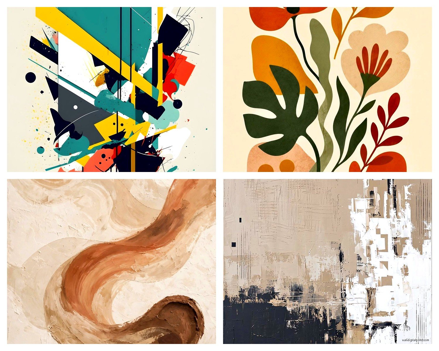
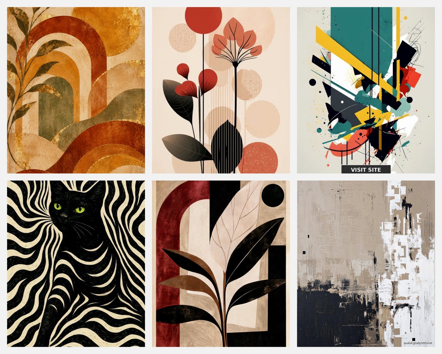
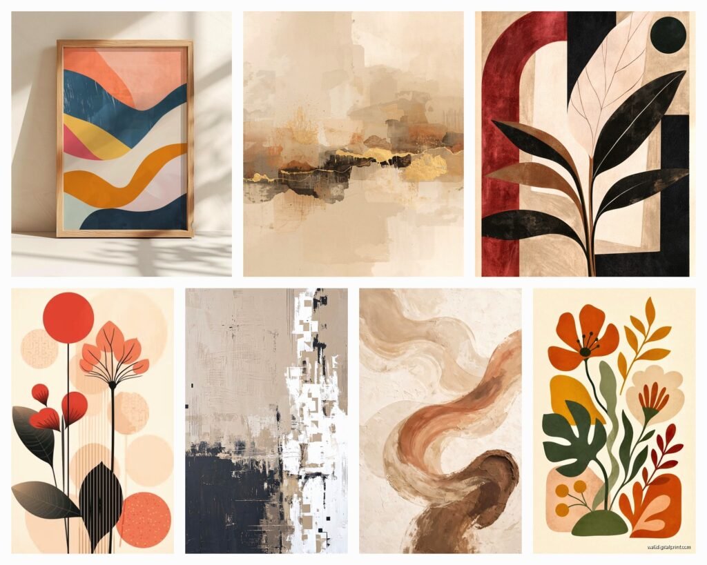
- Geometric abstract – all angles, shapes, clean lines. Think Mondrian vibes. Works great in modern or mid-century spaces
- Gestural/expressive – brushstrokes, movement, looks like someone was really feeling something when they made it. More emotional, works in eclectic or bohemian rooms
- Color field – big blocks of color, minimal shapes. Super calming, great for bedrooms
- Minimalist abstract – barely there, subtle, usually one or two elements. Perfect if you’re afraid of commitment
- Textural abstract – looks like it has dimension even though it’s flat. Adds visual interest without being loud
My cat knocked over my coffee while I was typing this but anyway – knowing these categories helps because you can search specifically for what matches your vibe.
Where to Actually Buy These Things
Oh and another thing – where you buy matters for quality. I’ve tested a bunch of sources:
Print-on-demand sites like Society6, Redbubble, Minted – these are great for budget-friendly options. The quality is decent, not amazing. Colors can be slightly off from what you see on screen. But for like $30-80 you can get a decent print. I use these for clients who are renting or aren’t sure what they want long-term.
Etsy is hit or miss. You can find incredible independent artists selling high-quality prints, but you gotta read reviews. I found this amazing abstract artist from Portland on there who does these dreamy watercolor abstracts and the print quality was better than some gallery pieces I’ve bought. But I’ve also received prints that were basically pixelated messes.
Art galleries and museum shops – if you want something that’ll last forever and looks professional, this is it. More expensive (think $150-500+) but the paper quality, the printing technique, it’s all superior. Plus you’re supporting actual artists usually.
Print Quality Stuff You Gotta Check
This is boring but important – ask about the paper and printing method. Giclée prints on archival paper are the gold standard. They won’t fade for like 100 years if you treat them right. Regular inkjet prints? Gonna fade in direct sunlight within a few years.
I always tell people to check:
- Paper weight (at least 200gsm)
- Acid-free paper
- UV-resistant inks if possible
- Whether it comes with a border for framing
Matching Abstract Art to Your Space
Okay so this is where it gets fun. You don’t need to know anything about art history or whatever. Just trust your gut but also follow some basic guidelines that actually work.
Pull colors from the print into your room – This is the easiest trick. If your abstract print has like a burnt orange accent, add a throw pillow in that color. Suddenly everything looks cohesive and intentional. I did this in my bedroom with a teal and gold abstract piece and added gold drawer pulls and a teal blanket and people think I hired a designer.
Or go completely neutral room with bold art – All white/beige/gray room with one massive colorful abstract print. This works SO well and is very trendy right now. The art becomes the focal point and you don’t have to worry about matching stuff.
Placement Things I’ve Learned
Hang art at eye level, which is usually 57-60 inches from the floor to the center of the piece. This is the standard gallery height. But honestly? In a bedroom you can go lower because you’re seeing it while lying down mostly.
Above a sofa, leave 6-8 inches between the furniture and the bottom of the frame. Too high and it looks disconnected. Too low and it feels cramped.
Wait I forgot to mention – in dining rooms, you can go a bit more dramatic with size and color because you’re usually in there for shorter periods. Like I have this massive red and black abstract print in my dining nook that would be overwhelming in a bedroom but works perfectly there.
Framing Options That Don’t Suck
So you can’t just tape a print to your wall (well, you CAN but don’t). Here’s what actually works:
Floating frames – these have a gap between the print and the frame edge, looks super modern and clean. Great for geometric abstracts.
Simple black or white frames – you literally cannot go wrong. They work with everything. I buy mine from Target or IKEA and they’re like $20-40 depending on size.
Natural wood frames – warmer vibe, works well with organic or gestural abstract pieces. Softens the look.
No frame at all – if you get a gallery-wrapped canvas print, you don’t need a frame. The image wraps around the edges. This works better for some abstract styles than others though.
This is gonna sound weird but I actually prefer frames for most abstract prints because it gives definition and makes the piece feel more finished. Unframed prints can look unfinished unless they’re specifically designed to be frameless.
Creating a Gallery Wall with Abstract Prints
Oh man, gallery walls are their own beast. I’ve done probably fifty of these for clients and here’s what I know:
Start with the largest piece and build around it. Lay everything out on the floor first – take a photo so you remember the arrangement. Keep spacing consistent between frames, usually 2-3 inches.
Mix sizes but keep a unifying element. Could be:
- All black frames with different colored abstract prints
- All the same color palette but different abstract styles
- All the same size frames in a grid pattern
- Mix of framed abstracts with one or two sculptural elements
I did a gallery wall in my hallway last month with six different abstract prints from different Etsy artists and unified them with identical white frames. Looks way more expensive than it was.
Common Mistakes People Make
Okay so after watching people (and myself) mess this up, here’s what NOT to do:
Buying art that matches your couch exactly – this looks matchy-matchy and dated. Pull accent colors instead, not the main color.
Going too small – already mentioned this but seriously, SIZE UP. Bigger almost always looks better.
Hanging everything too high – I see this constantly. People hang art way above eye level and it makes ceilings look lower and rooms feel weird.
Buying prints with weird sizes that are hard to frame – stick to standard sizes (11×14, 16×20, 18×24, 24×36) because frames are way cheaper and easier to find.
Forgetting about the room’s function – super intense, energetic abstract art in a bedroom might be too stimulating. Save that for living areas.
The Lighting Thing Nobody Talks About
Your print will look completely different depending on lighting. Natural light shows colors more accurately but can cause fading. Warm artificial light makes colors look more yellow/orange. Cool LED light can wash out warm tones.
I always recommend looking at prints in the actual room’s lighting before committing if possible. Or at least check return policies. I bought this gorgeous blue abstract print online that looked completely green in my north-facing living room. Had to return it.
Budget Breakdown from Someone Who’s Done This
Since you’re probably wondering about cost, here’s realistic numbers:
Budget option – $30-80 for print, $20-40 for frame = $50-120 total. This works fine for most spaces. Society6 or Desenio prints with IKEA frames.
Mid-range – $100-200 for quality print from independent artist, $50-100 for decent frame = $150-300 total. This is my sweet spot honestly.
Investment piece – $300-1000+ for limited edition print or original work, $150-400 for professional framing = $450-1400+. Only worth it for spaces you’re committed to long-term.
I usually tell clients to invest in one or two really good pieces for main living areas and go budget-friendly for bedrooms or transitional spaces.
Caring for Your Prints
This is simple – keep them out of direct sunlight, don’t hang them in super humid areas like bathrooms (the paper will warp), and dust frames occasionally. That’s it. If you got quality prints with UV-resistant inks and archival paper, they’ll last decades.
I have prints I bought eight years ago that still look brand new because I followed these basic rules. Meanwhile my sister hung a print in her sun-drenched kitchen and it faded to basically nothing in two years.
Finding Your Style When You Don’t Know What You Like
If you’re staring at thousands of options and feeling paralyzed, here’s what works: Start a Pinterest board or Instagram saved folder. Save EVERY abstract print that makes you pause. After you have like 30-40 saved, look for patterns. Are you gravitating toward certain colors? Geometric versus organic shapes? Bold versus subtle?
I did this before redecorating my office and realized I was consistently drawn to terracotta, navy, and cream color combos with geometric elements. Made shopping SO much easier once I knew that.
Also – you can totally change your mind later. Prints are not tattoos. I swap mine out seasonally sometimes just for fun. That’s the beauty of posters versus original paintings that cost thousands.
The main thing is just to start somewhere and not overthink it. I’ve seen people spend months deliberating over a $40 print when they could’ve just bought it, tried it, and returned it if it didn’t work. Most places have decent return policies anyway.