Wall Art Guide, Wall Art Tutoriels
Black and Gold Wall Art for Living Room: Luxury Main Space
Nov
So I’ve been obsessing over black and gold wall art lately because honestly, it’s the fastest way to make a living room look expensive without actually spending a fortune on like, new furniture or whatever. My client last month wanted that “luxury hotel lobby” vibe and we basically achieved it with three pieces of wall art and some strategic lighting.
Why Black and Gold Actually Works
Okay so here’s the thing about this color combo – it’s basically foolproof if you don’t go overboard. The black grounds everything so your space doesn’t feel too “bling” and the gold catches light in a way that adds depth. I learned this the hard way when I went full gold in my own apartment and it looked like a Vegas casino threw up on my walls.
The trick is ratio. You want like 70% black, 30% gold in most pieces. Sometimes 60/40 if the room is really dark. I have this one abstract piece in my living room that’s mostly black with gold leaf accents and people always ask where I got it, which is the ultimate compliment right?
What Actually Looks Good vs What Just Looks Expensive
There’s a huge difference and I cannot stress this enough. I see so many people buying these mass-produced gold foil prints from those Instagram ads and they just… they look cheap in person. The gold is flat, there’s no texture, no dimension.
What you wanna look for:
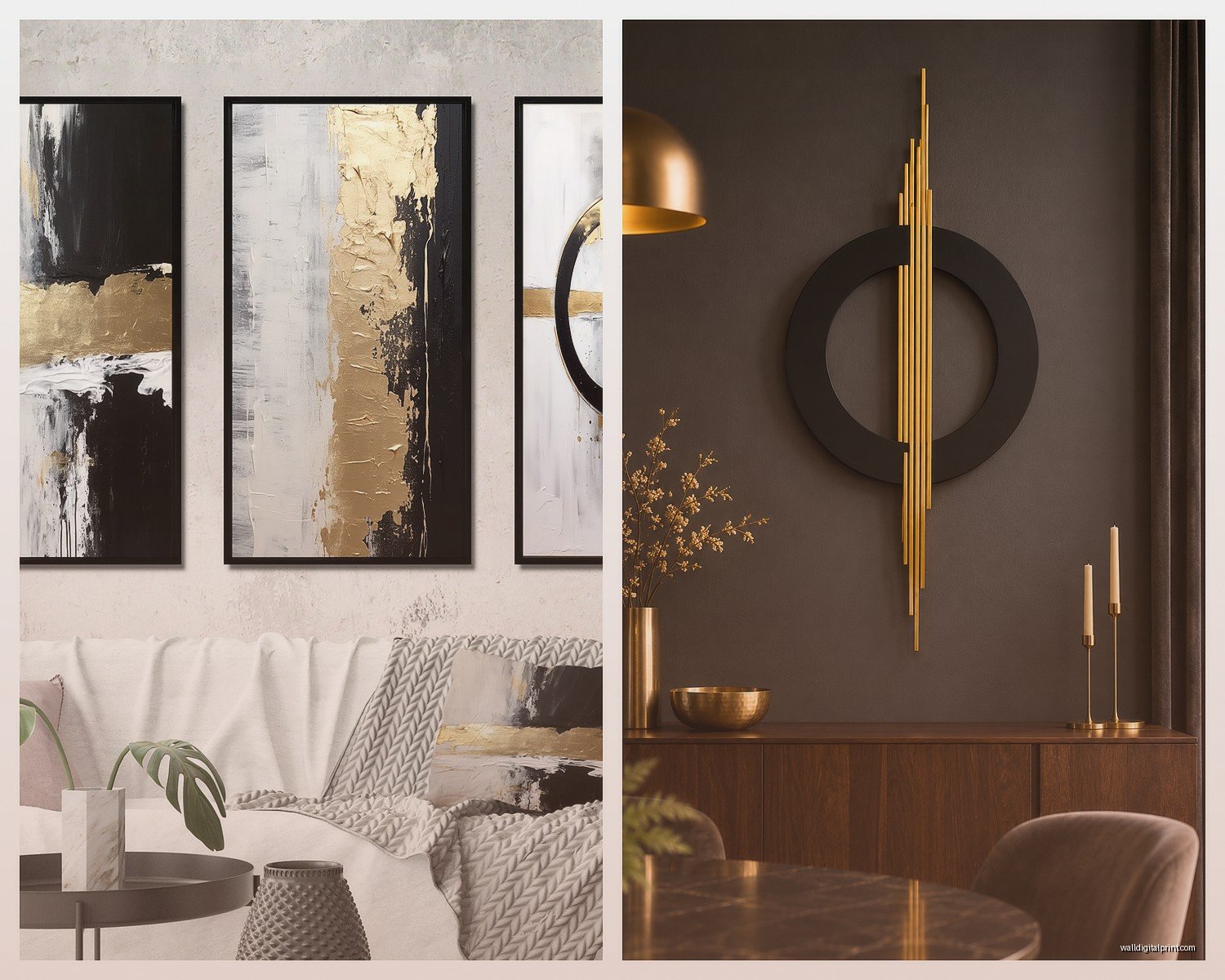
- Actual texture – either real gold leaf, embossed details, or thick paint application
- Matte black backgrounds rather than glossy (unless you’re going full glam, then maybe)
- Hand-painted elements even if it’s mixed with prints
- Gallery-wrapped canvas or floating frames – no thin plastic frames please
- Original artwork or limited editions when possible
I spent like three hours last Tuesday comparing pieces on Etsy vs the big box stores and the quality difference is insane. Yeah, you’ll pay $200 instead of $50, but it’s actually gonna look like art and not a poster.
Size and Placement Because Everyone Gets This Wrong
Okay so funny story – I once hung a piece that was way too small above a client’s sofa and had to go back and fix it. So embarrassing. Here’s what I’ve figured out through trial and error:
For above a sofa, your art should be 2/3 to 3/4 the width of the sofa. So if you have a 90-inch sofa, you’re looking at 60-68 inches of art width. You can do one large piece or a gallery wall situation, but that total width matters.
Hang it 6-8 inches above the sofa back. Not 12 inches, not 3 inches. Somewhere in that sweet spot. I measure from the top of the sofa cushions, not the frame.
The Gallery Wall Approach
If you’re doing multiple pieces, odd numbers look better – three or five pieces. I know everyone says this but it’s actually true. My own living room has three pieces in different sizes and the asymmetry makes it feel more curated.
Space them 2-3 inches apart. I use painters tape to map it out on the wall first because I’m paranoid about extra holes. My cat thinks this is a game and tries to pull the tape off so I gotta do it when she’s napping.
Styles That Work in Different Living Room Vibes
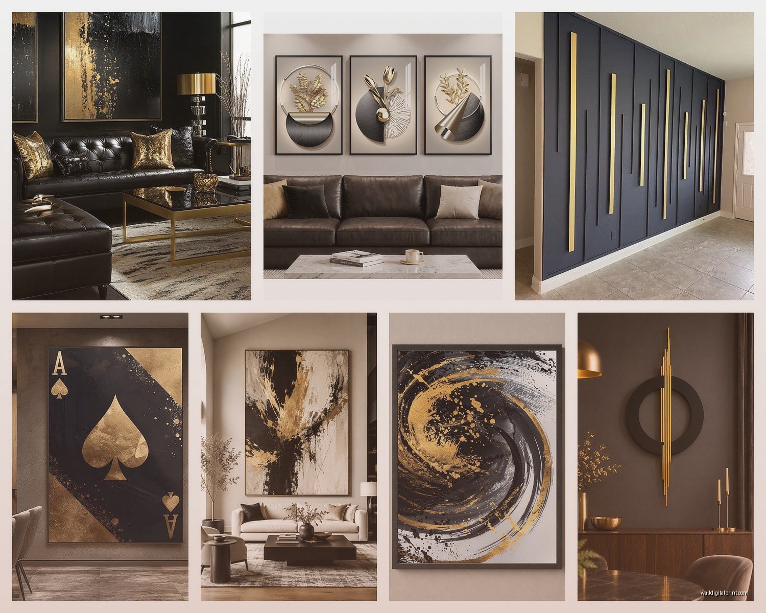
Modern Minimalist: Go for geometric abstracts. Clean lines, maybe some marble texture mixed with the gold. I’m obsessed with pieces that have gold circles or hexagons on black – very architectural. Keep it simple though, like one or two geometric elements max.
Glam/Maximalist: This is where you can go wild with gold leaf, ornate frames, maybe some figurative art like fashion illustrations or portraits. I did a client’s space with this huge black and gold peony painting and it was dramatic in the best way. Layer in some gold mirrors too if you’re really committing.
Mid-Century Modern: Look for stuff with that retro geometric vibe – sunbursts, atomic shapes, abstract landscapes with gold accents. The key is the gold should feel vintage, not shiny and new. Brass tones work better than bright gold here.
Contemporary Eclectic: Mix your metallics – some gold, some brass, maybe a hint of copper. Black and white photography with gold frames. Abstract pieces next to more traditional landscapes. This is actually my favorite because you have more freedom to experiment.
Where to Actually Buy This Stuff
Wait I forgot to mention – avoid HomeGoods for this unless you get really lucky. I’ve found maybe two good pieces there in five years. The quality is just inconsistent.
Etsy: Best for unique pieces and supporting actual artists. Search for “black gold abstract canvas” or “black gold leaf art” and filter by shops in your country to avoid crazy shipping. I’ve found amazing stuff from small studios.
West Elm: Overpriced but their quality is solid. Wait for 30% off sales which happen constantly. They have good modern options.
Society6 and Minted: Better than you’d think for prints. You can get large format stuff for reasonable prices. The framing options are decent too.
Local art fairs and galleries: Okay this is gonna sound pretentious but hear me out – you can actually negotiate at art fairs. I’ve gotten 20% off just by asking nicely. Plus you get original work.
Artfully Walls: Curated selection, good for when you want someone else to do the editing. Pricey but worth it for statement pieces.
The Lighting Situation
This is huge and people always forget about it. Black and gold art needs proper lighting or it just disappears into the wall. I learned this when I hung a gorgeous piece in a dim corner and it looked like a black hole.
Picture lights are your friend – those little LED strips or sconces that mount above the frame. They make the gold shimmer and create depth in the black areas. You want warm white bulbs, around 2700-3000K. Anything cooler looks harsh.
If you can’t install picture lights, get a floor lamp with an adjustable arm and angle it toward the art. I do this in rentals all the time. IKEA has cheap options that work fine.
Natural light is tricky – too much direct sun and the gold can look washed out during the day. I usually hang these pieces on walls that get indirect light or use sheer curtains to diffuse it.
Mixing Metals and Colors
So you’re probably wondering if you can have other stuff in your living room that isn’t black and gold. Obviously yes, but there’s a method.
Your other metals should be warm-toned. Gold plays nicely with brass, bronze, copper, and warm-toned silver. It does NOT play well with chrome or cool silver. I tried mixing them once and it looked confused.
Color-wise, black and gold is neutral enough to work with almost anything, but it looks especially good with:
- Deep jewel tones – emerald green, sapphire blue, ruby red
- Warm neutrals – cream, beige, camel, chocolate brown
- Blush pink (unexpectedly amazing together)
- Navy blue (very sophisticated)
- Burgundy or wine colors
I’d avoid pairing it with bright primary colors unless you’re going for an eclectic maximalist thing. Even then, be careful.
The Furniture Situation
Your sofa doesn’t need to be black or gold, thank god. Actually it probably shouldn’t be. I usually do neutral sofas – gray, beige, cream, navy – and let the art be the star.
Coffee tables and side tables can pick up the gold though. A gold-legged coffee table with a black and gold art piece above the sofa creates a nice visual connection. Or go full contrast with a light wood table and let the art pop.
DIY Options If You’re Crafty
Okay so I’m not super crafty but I’ve done this a few times when budgets were tight. You can make surprisingly decent black and gold art yourself.
Buy a canvas from Michael’s or wherever. Paint it matte black – might need 2-3 coats. Then use gold leaf sheets (the imitation stuff is like $15 for a pack) and apply them in abstract shapes with adhesive. Seal it with a matte varnish spray.
Or do a pour painting with black and gold acrylic paints. YouTube has a million tutorials. Add some texture medium to the paint so it’s not totally flat.
I’ve also done this thing where I printed black and white photography, mounted it on black foam board, and added gold leaf corners. Looked way more expensive than it was.
Common Mistakes I See All The Time
Hanging stuff too high. The center of your art should be at eye level, which is like 57-60 inches from the floor. Not ceiling level. Not seven feet up. Eye level.
Buying art that’s too small because you’re scared to commit. Go bigger than you think. A too-small piece just looks sad and unfinished.
Matching everything exactly. Your black and gold pieces don’t all need to be the same style or even the same shade of gold. Actually, mixing different golds (bright yellow gold, rose gold, antique brass) adds more interest.
Forgetting about the rest of the room. The art should complement your space, not fight with it. If you have a lot of busy patterns already, go for simpler geometric art. If your room is super minimal, you can do more complex pieces.
Cheap frames on nice art. Please don’t. A good piece in a bad frame looks worse than a mediocre piece in a good frame. Float frames or gallery wrapping is worth the extra cost.
Real Talk About Budget
You don’t need to drop thousands but you should probably spend at least $150-200 per piece if you want it to look legitimately luxurious. I know that sounds like a lot but this is your main living space and wall art is one of those things where quality really shows.
That said, I’ve mixed $50 prints with $500 originals in gallery walls and nobody could tell which was which because the framing was consistent and the sizing was right. So you can definitely mix price points.
Sales are your friend – sign up for emails from art sites, they’re always doing promotions. I got a huge black and gold abstract from Saatchi Art for like 40% off last Black Friday.
Maintenance and Care
Dust your art regularly with a microfiber cloth. Not Pledge or any spray cleaners – that can damage the gold leaf or the finish.
Keep it away from radiators or heating vents. Heat can warp canvases and dull metallic finishes over time.
If you have gold leaf pieces, don’t touch them. The oils from your fingers can tarnish real gold leaf. I know it’s tempting but resist.
UV protection if you’re in a sunny room – either UV-protective glass in frames or museum-grade varnish on canvases. The gold won’t fade but the black can turn brownish over time with too much sun exposure.
Oh and another thing – if you’re hanging heavy pieces, use proper anchors. I’ve seen a $600 piece crash down because someone used those cheap plastic anchors. Toggle bolts or proper drywall anchors rated for the weight.
Anyway that’s basically everything I’ve figured out through way too many hours of researching and installing this stuff. The black and gold combo really does make a space feel more pulled together and expensive, just gotta do it thoughtfully and not go overboard with the bling factor.