Wall Art Guide, Wall Art Tutoriels
Modern Wall Art Prints: Contemporary Poster Photography Gallery
Nov
So I was literally reorganizing my gallery wall last night at like 11pm because I couldn’t sleep, and I realized I’ve learned so much about modern wall art prints that I should probably share this before I forget half of it.
The Whole Size Thing That Everyone Gets Wrong
Okay first thing – people always buy prints that are too small. Like, always. I did this for YEARS before I figured it out. You walk into a room and see this tiny 8×10 print on a massive wall and it just looks sad and lost. Here’s what actually works:
For above a sofa, you want your print or gallery grouping to take up about two-thirds to three-quarters of the sofa width. So if your couch is 84 inches wide, you’re looking at around 56-63 inches of art space. That could be one massive print or a collection of smaller ones grouped together.
Single statement pieces work best at 24×36 inches minimum for most walls. I usually go 30×40 or even 40×60 for my clients’ living rooms. The 40×60 sounds huge until you actually hang it and then you’re like oh yeah, that’s perfect.
My Actual Print Size Go-Tos
- Bedroom above bed: 30×40 or 40×60 horizontal
- Dining room: 24×36 minimum, but I love 30×40 here
- Hallway: 16×20 or 18×24 works since the space is narrower
- Bathroom: 11×14 or 12×16, anything bigger gets weird with the humidity
- Office/workspace: 24×36 vertical looks really good
Where to Actually Buy These Things
Alright so I’ve probably spent way too much money testing different print sources. My dog literally chewed up a $200 print last month and I was NOT happy, but anyway…
Minted is consistently good quality. Their paper weight is substantial, the colors are accurate, and they have this independent artist thing going on so the designs don’t look like everyone else’s stuff. Pricier though – you’re gonna spend $150-300 for a large framed print.
Artfully Walls has some really cool contemporary photography. I used them for a client’s entryway and the print quality was chef’s kiss. They do a lot of abstract and architectural photography that reads as modern without being cold.
Etsy is hit or miss but when you find a good shop, bookmark it immediately. Look for shops that offer digital downloads if you want to print locally and save money. I found this amazing Icelandic landscape photographer on there who sells downloads for like $8 and I’ve printed three different images at my local print shop for way less than buying pre-printed.
Oh and another thing – Printique (used to be AdoramaPix) is what I use when I have my own photos or digital downloads. Professional quality, reasonable prices, and their framing options are actually good. Not that cheap frame nonsense that falls apart.
The Frame Situation
This is gonna sound weird but frames matter more than the actual print sometimes. I’ve seen beautiful photography ruined by terrible frames and mediocre prints elevated by the right framing.
Framebridge is my lazy option when I don’t wanna deal with it. You mail them your print, they frame it, send it back ready to hang. Expensive but so easy. Like $200-400 for a large piece with custom matting.
For DIY framing, Frame It Easy does custom sizes online and ships to you. Way cheaper than Framebridge. I used them for a series of 18×24 black and white architectural prints and they turned out great.
Frame Style Guide That Actually Helps
Thin black metal frames – this is the contemporary gallery look everyone wants right now. Works with literally everything. Cannot go wrong. I use these probably 70% of the time.
Natural wood frames – adds warmth to modern spaces that might feel too cold. Great for photography that has organic subjects like landscapes or botanical stuff.
White frames – trickier than you think. They can look cheap really easily. Only use with bright, colorful prints or very high-contrast black and white photography.
No frame/canvas wraps – I’m honestly not a huge fan unless it’s the right image. Most photography looks better with a frame, but abstract art and some landscape shots can work as gallery-wrapped canvas.
Creating an Actual Gallery Wall
Okay so funny story, I once spent four hours arranging and rearranging prints on my client’s floor before we hung anything. Her cat kept laying on them. But that’s actually the method – lay everything out on the floor first.
The Salon Style is where you mix different sizes and create this collected-over-time look. Start with your largest piece slightly off-center, then build around it. Keep 2-3 inches between frames consistently. This is harder than it looks, not gonna lie.
Grid Gallery is way easier. Same size frames, evenly spaced, done. I did nine 16×20 frames in a perfect grid in my office and it took like 30 minutes to plan. Use a level and measuring tape, mark everything with painter’s tape first.
Linear Gallery – just one horizontal row of prints. Super simple, looks intentional, can’t really mess it up. Different sizes work fine as long as you align them along the center or bottom edge.
Wait I forgot to mention – Command strips are your friend for testing layouts. The big ones hold way more weight than you’d think. I use them for everything under 16×20 and haven’t had anything fall yet.
What Actually Looks Good Right Now
Because trends change and what looked modern five years ago might look dated now…
Black and white photography never really goes out of style but the subject matter matters. Architectural details, abstract shapes, minimal landscapes – yes. Inspirational quotes over photos – please no.
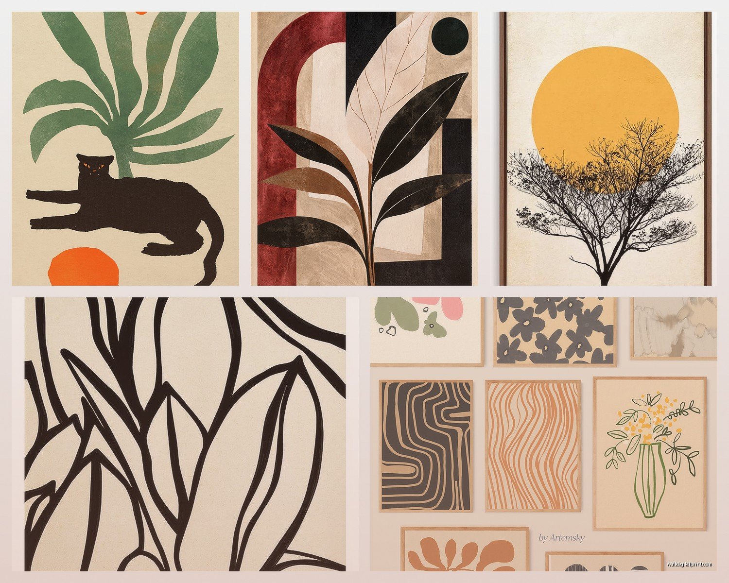
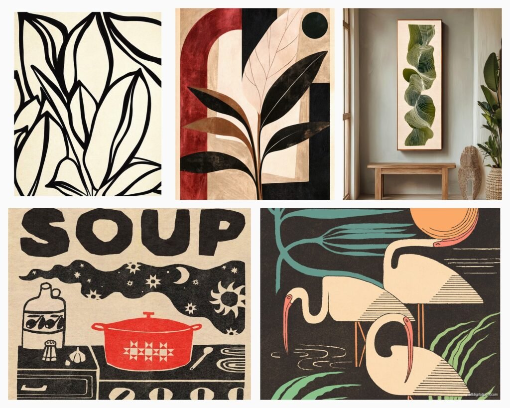
Earth-tone abstracts are having a moment. Those terracotta, sage, cream, rust color palettes. They photograph really well for Instagram which is probably why everyone wants them, but they actually do make spaces feel current.
Oversized botanical prints but like, close-up and graphic, not cutesy. Think one giant palm frond in black and white that takes up the whole frame.
Architectural photography especially minimalist buildings, geometric shapes, strong lines. This works really well in modern spaces with clean furniture.
Neutral landscapes – desert scenes, beaches, mountains but muted color palettes. Not your grandma’s vibrant sunset photos.
The Technical Stuff You Should Probably Know
Print quality matters more than you think. Here’s what to look for:
Paper weight – minimum 200gsm for unframed prints, 300gsm is better. Anything lighter feels flimsy.
Finish options – matte is usually the move for photography. Glossy can create glare and looks less sophisticated. Luster is okay as a middle ground.
Color space – if you’re printing from digital files, make sure your file is in RGB for digital displays or CMYK for printing. Most online print services want RGB though. This got technical, sorry.
Resolution – 300 DPI minimum for printing. If you’re buying digital downloads on Etsy, check the file size. A file that’s only 1000×1500 pixels is gonna look pixelated when printed large.
Hanging Height Rules
Center of your art should be at 57-60 inches from the floor. This is “gallery height” and it’s based on average eye level. I actually measure 58 inches up and mark it every time.
Over furniture, leave 6-8 inches between the furniture top and the bottom of your frame. Any less looks cramped, any more looks disconnected.
In hallways, you can go slightly lower since people are usually walking past, not standing and staring.
Budget-Friendly Options That Don’t Look Cheap
Because not everyone wants to drop $500 on a print, and honestly you don’t have to.
Buy digital downloads and print at Costco or your local print shop. Seriously, Costco does great prints for like $15-30 depending on size. Get them mounted on foam board for extra stability.
IKEA frames are actually fine. The Ribba and Hovsta lines look way more expensive than they are. I’ve used them in client homes and no one knows the difference.
Society6 has tons of independent artists and they run sales constantly. Sign up for their email list and wait for 30-40% off, which happens like every other week.
Print your own photos if you have any decent photography skills. I turned some vacation shots into a gallery wall in my hallway and people always ask where I bought them.
Common Mistakes I See All The Time
Hanging everything too high. I’ve literally gone into friends’ homes and been like “why is your art touching the ceiling” and they never even noticed.
Not considering the wall color. A print with a white background on a white wall loses all its impact. You need contrast or matting to make it work.
Buying a pre-made gallery wall set from one of those online retailers. They always look mass-produced and generic. Mix your own pieces even if they’re all from different sources.
Using wire hanging systems when you should use D-rings. Wire makes frames tilt forward and never sit flush against the wall. Just use D-rings and a level, I promise it’s worth it.
Forgetting about lighting. Art looks completely different depending on your lighting. If you’re hanging something in a dark hallway, either add a light or choose something with lighter tones.
My Current Favorite Sources for Specific Styles
For minimal black and white photography: The Poster Club, Desenio (European but ships to US)
For contemporary abstract: Minted, West Elm (surprisingly good art selection)
For affordable trendy prints: H&M Home, Zara Home (yes really, their art is actually decent)
For unique vintage photography: Etsy, eBay for actual vintage prints
For high-end investment pieces: Saatchi Art, Artsy
Practical Hanging Tips Nobody Tells You
Get a stud finder. Hanging heavy art on drywall anchors is fine but studs are better. I learned this the hard way when a 40×60 print fell at 3am and scared me half to death.
Use a laser level if you’re doing multiple pieces. That $25 tool has saved me so much time and frustration.
Painter’s tape is your planning tool. Tape out the exact dimensions of your frames on the wall before committing to holes. Stand back, live with it for a day, adjust if needed.
Take photos of your arrangement ideas. Your phone camera will show you things your eye misses about spacing and balance.
Oh and if you’re renting, those 3M picture hanging strips really do work. I was skeptical but I’ve moved apartments twice using only those and never lost a print.
The main thing is just start somewhere. Buy one print you actually love, frame it properly, hang it at the right height, and build from there. You don’t need a whole gallery wall planned out from day one. My living room wall took like two years to finish and it looks way better than if I’d rushed it all at once.