Wall Art Guide, Wall Art Tutoriels
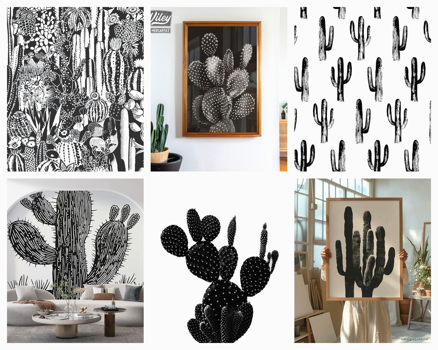
Black and White Cactus Wall Art: Minimalist Botanical Prints
May
So I’ve been obsessing over black and white cactus prints lately because honestly they’re like the easiest way to make a room look pulled together without actually trying that hard. Last month I was helping my sister redo her apartment and she wanted something that felt modern but not cold, you know? And these botanical prints just… worked.
Why Black and White Cactus Prints Actually Work
Okay so the thing about cactus art specifically is that the shapes are naturally graphic. Like, a cactus already looks minimalist even in real life, so when you strip away the color it becomes this perfect sculptural element on your wall. I tested this theory in three different rooms – my own bedroom, a client’s home office, and my friend’s living room – and it held up every time.
The black and white thing removes all the guesswork about color matching. You’ve got beige walls? Works. Gray couch? Works. That weird builder-grade cream paint you’re stuck with? Still works. I’m not gonna lie, this is why I recommend them to people who DM me at midnight panicking about decorating.
Size and Placement (This Matters More Than You Think)
So here’s where people mess up – they buy these tiny 8×10 prints and wonder why their wall still looks empty. For cactus prints to have that minimalist impact, you need size. I’m talking at least 16×20 for a single print, or go with a set of three 11x14s arranged horizontally.
Above a couch or bed, you want the art to take up roughly two-thirds of the furniture width. I learned this the hard way when I hung a single 12×16 print above my queen bed and it just looked… sad and floaty. Remeasured, got a 24×36 print instead, and suddenly the whole room felt intentional.
For gallery walls with multiple cactus prints:
- Keep spacing consistent at 2-3 inches between frames
- Odd numbers look better than even (three or five prints, not four)
- Mix vertical and horizontal orientations for visual interest
- The overall arrangement should form a rough rectangle or square shape
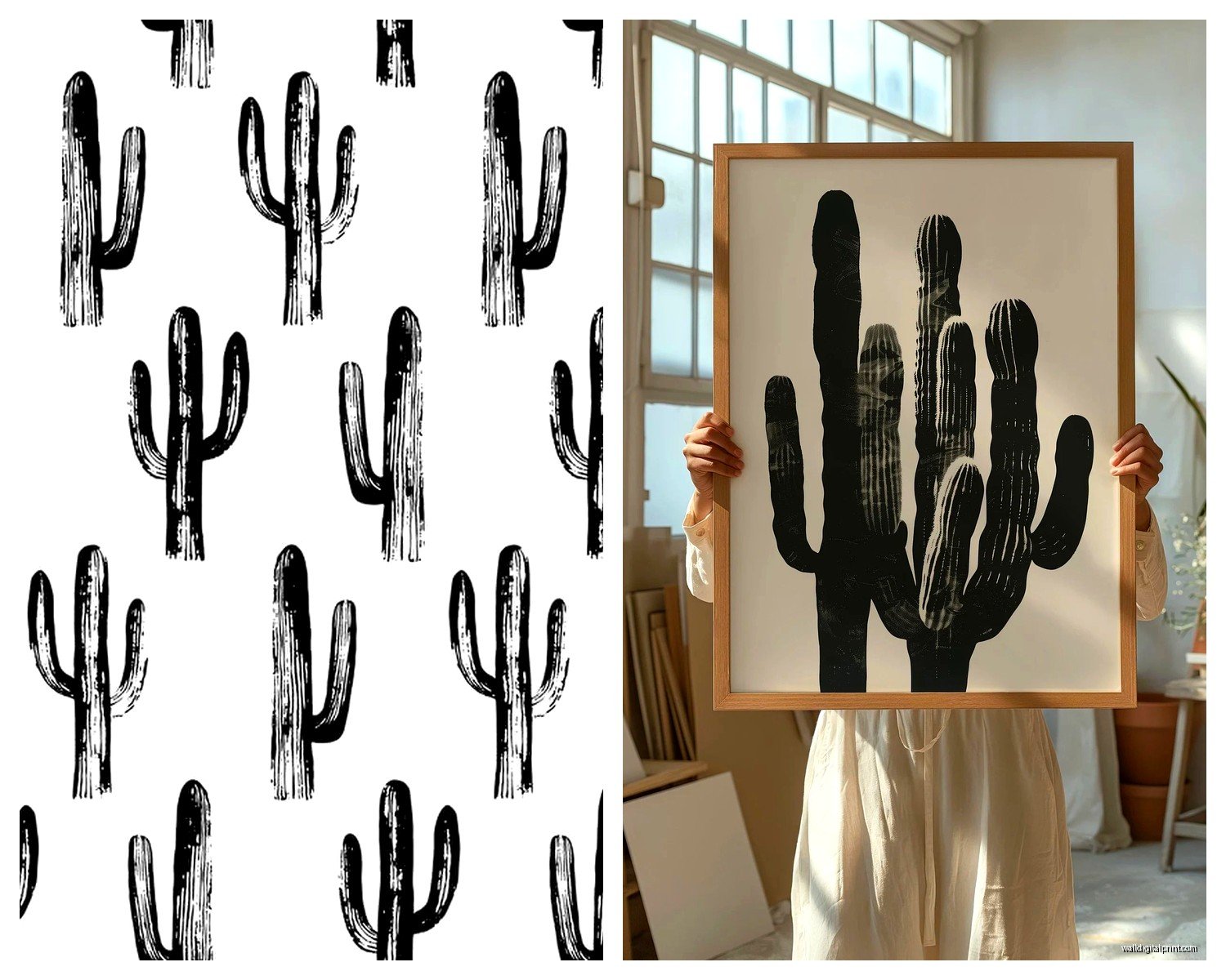
Frame Choices That Don’t Suck
Alright so frames can make or break this whole thing. Black and white art is forgiving but the frame needs to match your vibe. I’ve tried probably 15 different frame styles at this point because my cat knocked over a whole display last year and I had to replace everything anyway.
Black frames: Super safe choice, makes the art feel more gallery-like. I use these in modern or industrial spaces. The contrast is sharp and clean. Target actually has decent black frames in their Threshold line that don’t warp after six months.
Natural wood frames: This is my go-to for making minimalist art feel warmer. Light oak or maple keeps things Scandinavian and soft. I found these work better in bedrooms or spaces where you don’t want that stark gallery feel. IKEA’s RIBBA frames in birch are cheap and surprisingly good quality.
White frames: Controversial opinion maybe, but white frames can make black and white art disappear into the wall unless you have really dark walls. I only use these when there’s a bold black border or mat.
No frame at all: Canvas prints without frames give you that modern gallery wrapped edge look. Less formal, works great in casual spaces like home offices or kitchens. Just make sure the print wraps around the edges nicely.
Mat or No Mat
Mats add breathing room around the art and make smaller prints look more substantial. I default to white mats for black and white prints – it’s classic and extends the visual size. But honestly if you’re going for that really minimal look, skip the mat and let the print fill the frame edge to edge.
Where to Actually Buy These Prints
Okay so you’re probably wondering where to find good ones that don’t look like every other person’s apartment. I’ve ordered from like a dozen places and here’s what I actually recommend:
Etsy: Best selection hands down. Search “black and white cactus print” and you’ll find hundreds of independent artists. The quality varies wildly though – always read reviews and check if they’re selling digital downloads or physical prints. Digital downloads are cheaper and you can print them at your local print shop at whatever size you need. I do this all the time.
Society6: Good for when you want the print already framed and ready to hang. Their framing quality is decent and they have tons of cactus designs. Slightly more expensive but the convenience factor is real when you just don’t wanna deal with separate framing.
Desenio: Scandinavian company that does minimalist botanical prints really well. Their black and white cactus collection is chef’s kiss. Shipping takes a minute if you’re in the US but the print quality is excellent – thick paper, rich blacks.
Local print shops: Honestly this is underrated. If you buy a digital file from Etsy for like $5-8, you can take it to a local printer and get it printed on actual photo paper or cardstock. I did this last week with three cactus prints and spent $30 total for three 16x20s. Way cheaper than buying pre-printed ones online.
Styling Around the Prints
So you’ve got your cactus art up on the wall… now what? The room needs to support the minimalist vibe or it’ll just look like you slapped art on a cluttered wall.
Furniture and Textiles
Keep furniture lines clean and simple. That doesn’t mean everything has to be modern – I’ve paired cactus prints with vintage mid-century pieces and it looked great. Just avoid anything too ornate or fussy.
For textiles, you can go two directions:
- All neutral (whites, grays, beiges) to keep that minimalist monochrome thing going
- One accent color (terracotta, mustard, sage green) to add warmth without overwhelming the space
I did my living room with black and white cactus prints, a gray sofa, white walls, and then added terracotta pillows and a rust-colored throw. The warm earth tone plays off the desert plant theme without being too literal about it.
Actual Plants
Wait I forgot to mention – putting real cacti or succulents near your cactus art is either genius or too much, depending on execution. I think it works if you’re subtle about it. Like, don’t line up five potted cacti directly under your cactus print. That’s too on-the-nose.
Instead, scatter a few small succulents on shelves or a side table elsewhere in the room. It creates this cohesive botanical thread without being matchy-matchy. I keep a little jade plant on my desk across from my cactus gallery wall and it feels connected but not forced.
Room-Specific Tips
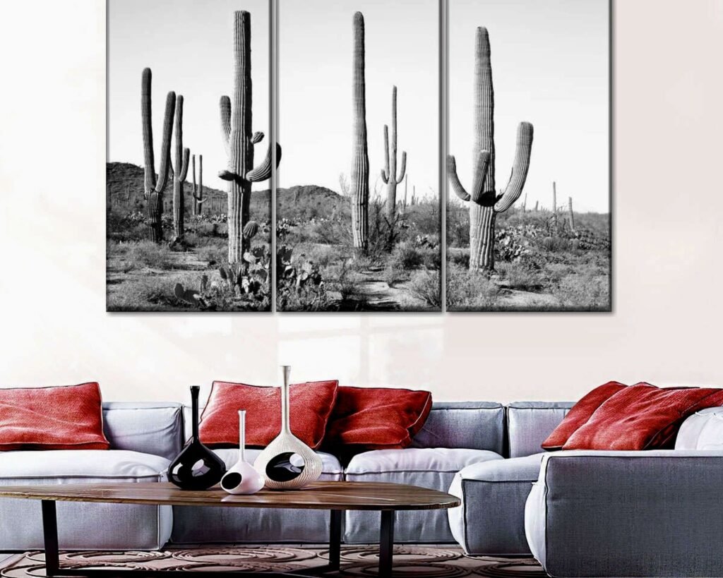
Living Room: Go bigger and bolder here. This is your statement space. I did a three-panel cactus print setup above the couch – each panel was 20×30 and they’re hung with about 3 inches between them. Creates this horizontal flow that makes the room feel wider.
Bedroom: Keep it calming. One large print above the bed or two medium prints flanking the headboard. I actually have a saguaro cactus print above my bed and it’s weirdly soothing? The vertical lines draw your eye up and make the ceiling feel higher.
Home Office: Smaller prints work fine here since you’re viewing them up close. I have two 11×14 cactus prints next to my monitor and they’re just enough visual interest without being distracting when I’m trying to work. Oh and another thing – the minimal black and white keeps your video call backgrounds looking professional.
Bathroom: This is gonna sound weird but cactus prints are perfect for bathrooms. The plants thrive in dry conditions so there’s this subtle thematic logic to it. Plus bathrooms are usually small, so the minimal aesthetic keeps them from feeling cluttered. I framed a small cactus print for my powder room and it elevated the whole space for like $25.
Kitchen: Works surprisingly well in modern kitchens with white cabinets. Hang a small cactus print or two on that awkward wall space near your breakfast nook. Keeps things feeling fresh and organic without the maintenance of real plants that’ll die when you forget to water them… speaking from experience here.
Common Mistakes to Avoid
Hanging too high – art should be at eye level, which is roughly 57-60 inches from the floor to the center of the frame. I see people hang stuff way too high all the time and it makes the room feel off.
Mixing too many different cactus styles – if you’re doing multiple prints, keep them cohesive. All line drawings, or all photographic, or all watercolor style. Mixing styles makes it look like you just grabbed random stuff.
Forgetting about lighting – black and white art needs good lighting to show the contrast and details. I added a simple picture light above my main cactus print and it made such a difference. Or just make sure there’s enough ambient light in the room.
Going too literal with the whole desert theme – you don’t need sand-colored everything and southwestern accents just because you have cactus art. The beauty of black and white is it’s versatile enough to fit lots of different aesthetics.
The Digital Download Route
Okay so if you’re on a budget, buying digital downloads is definitely the way to go. Here’s my process that I’ve refined over the past year:
- Buy high-resolution digital file from Etsy (look for at least 300 DPI)
- Download and check the file dimensions match what you want to print
- Email or upload to local print shop or Costco Photo Center (seriously, Costco’s print quality is surprisingly good)
- Pick up prints within a day or two
- Get frames separately from IKEA, Target, or Amazon
I printed three 16×20 cactus prints at Costco for $8 each, bought simple black frames from IKEA for $15 each, and had a full gallery wall for under $70. The same thing pre-framed from an online retailer would’ve been $200+ easily.
Mixing Cactus Prints with Other Art
You don’t have to do all cactus all the time. I mix my cactus prints with other minimalist botanical art – monstera leaves, eucalyptus branches, abstract line drawings. The key is maintaining that same black and white palette and minimal aesthetic.
In my hallway I have two cactus prints and one palm frond print, all in matching black frames. They create a cohesive botanical gallery without being repetitive. The different plant shapes keep it interesting.
Or you can mix in some abstract geometric art – black and white shapes and lines complement the organic forms of the cacti really well. I did this in a client’s bedroom and it added some edge to what could’ve been too soft and plant-focused.
Seasonal Flexibility
One thing I love about black and white cactus art is it doesn’t feel seasonal. You can keep it up year-round without it feeling weird. In winter I add cozy textiles and warm lighting. In summer the same prints feel fresh and airy with lighter fabrics and more natural light.
Compare this to like, bright floral art that can feel too summery in January, or dark moody landscapes that feel heavy in spring. The neutral palette of black and white cacti just… adapts. Low maintenance decorating which is my whole vibe honestly.
My dog just knocked over my water glass so I gotta wrap this up, but basically – black and white cactus prints are foolproof if you get the sizing right and don’t overthink it. Start with one or three prints, hang them at eye level, frame them in something simple, and build your room’s color palette around them. That’s it. You don’t need to be an interior designer to make this work, you just need to commit to the minimal aesthetic and not clutter everything up around it.