Wall Art Guide, Wall Art Tutoriels
French Country Wall Art: Provence-Inspired Vintage Decor
May
So I’ve been living and breathing French country wall art for like three years now and honestly it’s one of those things where I bought WAY too many pieces before I figured out what actually works. Like my storage unit can confirm this obsession.
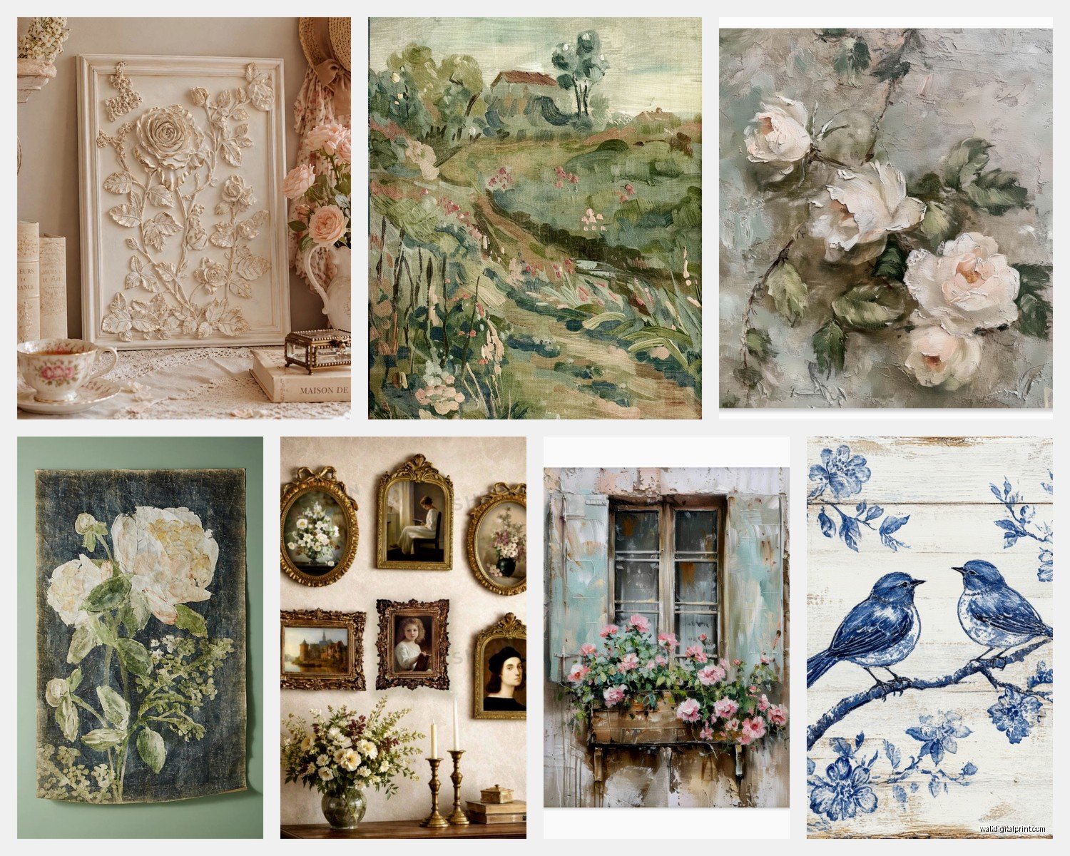
The Lavender Field Prints That Everyone Gets Wrong
Okay first thing – those lavender field prints from Provence look gorgeous online but here’s what nobody tells you. The super saturated purple ones? They’re gonna clash with literally everything in a real French country room. I learned this the hard way when I hung this massive lavender print above my client’s cream sofa and it looked like we were decorating a spa instead of a farmhouse kitchen.
What you actually want are the faded, almost dusty purple tones. The ones that look like they’ve been sitting in a sun-drenched window for decades. I found my favorite one at this random antique market in Vermont (I was visiting my sister, totally unplanned) and it had this pale lavender with lots of gray undertones. THAT’s the look you’re going for.
The dimensions matter too and I’m gonna sound super specific but hear me out. For lavender landscapes, horizontal pieces work better than vertical. Something around 24×36 inches hits that sweet spot where it feels substantial but not overwhelming. I tried a vertical lavender print once and it just looked… wrong? Like the fields were falling off a cliff or something.
Vintage French Posters vs Reproductions
This is where I spend way too much money but also where the magic happens. Real vintage French advertising posters from the 1920s-1950s are incredible but they’re also like $400-2000 depending on condition. I have one authentic Cassandre poster in my dining room and yes I baby it like crazy.
But here’s the thing – good reproductions are actually fine. The key is finding ones that use the right printing technique. You want lithograph-style prints or at least high quality giclée prints on textured paper. Those cheap digital prints on glossy paper? They scream fake from across the room.
Look for posters advertising:
- French railways and travel (especially the PLM railway posters)
- Provençal soap and olive oil
- Wine regions – Côtes du Rhône, Châteauneuf-du-Pape
- Vintage French cosmetics and perfumes
- Agricultural fairs and markets
I bought this reproduction poster for Savon de Marseille from Etsy last year and even my friend who collects actual vintage stuff couldn’t tell it wasn’t original until she got up close. Cost me like $45 versus the $800 original. Sometimes you gotta be smart about where you splurge.
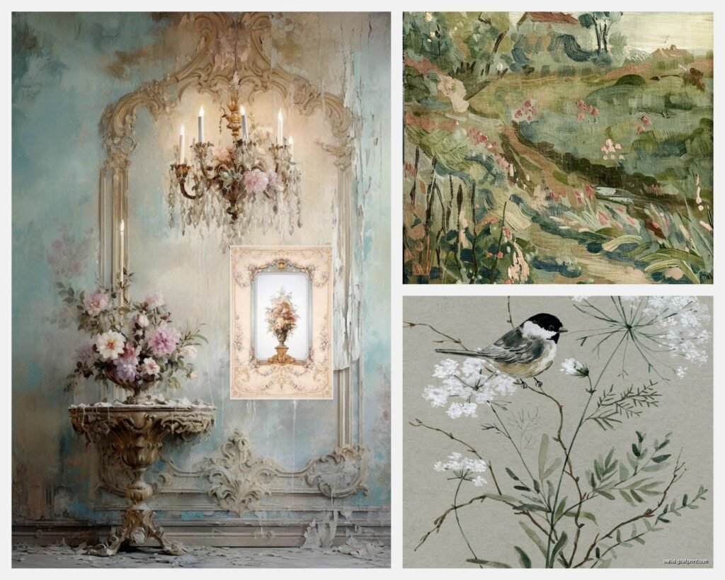
The Botanical Print Situation
French botanical prints are having a MOMENT right now but most people are doing them wrong. You don’t want those bright, colorful botanical illustrations – those are more English country house vibes. For French country you want herbs and plants that actually grow in Provence.
Think about it – what grows there? Lavender obviously, but also:
- Olive branches
- Rosemary and thyme
- Sunflowers (but not the giant bright yellow ones, the more muted varieties)
- Grape vines
- Fig leaves
I have this set of three herb prints in my kitchen that I found at HomeGoods of all places and they’re perfect. Simple line drawings with French text labels, mounted in distressed white frames. They were $12 each which felt like stealing.
Oh and another thing – the frames matter SO much with botanical prints. Skip the sleek modern frames entirely. You want painted wood (distressed white, cream, or that grayish blue-green), or simple aged brass frames. I made the mistake of putting gorgeous lavender botanicals in black frames once and it totally killed the French country vibe.
Where to Actually Hang This Stuff
Okay so funny story, I once hung like seven pieces of French country art in one room and my husband walked in and was like “did a Provence gift shop explode in here?” He wasn’t wrong. Less is more but also strategic placement is everything.
Kitchen and dining areas: This is where you can go a bit heavier with the theme. Vintage French food advertising, herb prints, market scenes, still lifes of bread and wine. I have a reproduction poster for a French cheese festival above my dining buffet and people always ask about it.
Living room: Keep it more subtle here. One large landscape of Provence fields or a vintage travel poster as your statement piece. Maybe a smaller botanical print on a side wall but don’t overdo it. My living room has one big lavender field print above the sofa and that’s it for the French stuff.
Bedroom: This is where softer pieces work well. Watercolor landscapes, gentle botanical sketches, vintage perfume advertisements. Nothing too bold or busy because you’re trying to sleep there.
Bathroom: Everyone forgets about bathroom art but it’s perfect for vintage French soap and cosmetic posters. Just make sure they’re properly sealed or framed with glass because humidity is real.
The Color Palette Thing Nobody Explains
Here’s what I wish someone had told me at the beginning – French country wall art should echo your room’s color palette but not match it exactly. Like if your room has a lot of cream and soft blue, look for art with those tones plus maybe some dusty purple or sage green.
The classic French country palette is:
- Creamy whites and warm beiges
- Soft weathered blues
- Dusty lavender and muted purple
- Olive green and sage
- Warm terracotta and rust
- Faded yellow (think old stucco walls, not sunshine bright)
I literally printed this list and take it with me when I’m shopping for art now. Sounds obsessive but it’s saved me from so many impulse purchases that wouldn’t have worked.
Mixing Vintage and New
You don’t need all authentic vintage pieces to nail this look. Actually, mixing old and new gives you more flexibility and honestly looks better sometimes. I have one real vintage poster from a Paris flea market, two high-quality reproductions, and three newer pieces from independent artists on Etsy, all hanging together in my hallway. Nobody can tell which is which unless they’re really examining them.
The trick is making sure everything has that aged, slightly worn quality. Even new pieces should look like they’ve lived a life. I actually distress new frames myself sometimes – just some sandpaper on the edges and maybe a bit of diluted paint for that worn look. Takes like 10 minutes and makes a huge difference.
Size and Scale Guidelines
This is where people mess up constantly. That tiny 8×10 print above your king-size bed? It’s lost up there, trust me. Here’s what actually works:
Above a sofa: Your art should be about 2/3 the width of the sofa. So if your sofa is 84 inches, you want art that’s roughly 56 inches wide. This could be one large piece or a gallery wall arrangement.
Above a console table or buffet: Similar rule – about 2/3 the width of the furniture piece.
Gallery walls: The whole arrangement should follow that 2/3 rule, not individual pieces.
I use painter’s tape to map out arrangements on the wall before I commit to any holes. Learned that lesson after putting like 30 nail holes in my dining room wall trying to get a gallery wall right.
The Gallery Wall Approach
French country gallery walls are different from those super curated Pinterest-perfect ones. They should feel a bit more… collected over time? Like you’ve been gathering these pieces from travels and markets over years.
Mix different sizes but keep the frames somewhat cohesive – all white, all wood tones, or all aged brass. I did one where I mixed cream and light gray frames and it worked really well. The art itself can vary more – a vintage poster next to a botanical print next to a small landscape.
Wait I forgot to mention – spacing matters. Keep about 2-3 inches between frames in a gallery wall. Too close looks cluttered, too far apart looks disconnected. I use these little level tools with measurements on them from Amazon, like $8 and saved my sanity.
Sources That Actually Have Good Stuff
Okay real talk about where to shop because I’ve wasted hours on sites with terrible selections:
Etsy: Hands down the best for reproduction vintage posters and botanical prints. Search for “French vintage poster reproduction” or “Provence travel poster.” I’ve bought probably 15 pieces from various Etsy sellers and only had one disappointment.
eBay: Great for actual vintage pieces if you know what you’re looking for. Just check seller ratings and ask for detailed photos. I scored an authentic 1930s French railway poster for $200 last year.
Local antique markets and flea markets: Hit or miss but when you find something good, you FIND something good. Plus you can inspect condition in person.
HomeGoods/TJ Maxx: Don’t sleep on these places. They get random French country art sometimes and it’s usually well-priced. Just gotta visit regularly because inventory changes constantly.
Ballard Designs: More expensive but their French-inspired prints are really well done. Wait for sales though – they have them constantly.
Framing Options That Won’t Break the Bank
Custom framing is insanely expensive – like I’ve paid $300 to frame a $40 print before and felt physically ill about it. Here’s what I do now:
Buy standard size prints (16×20, 18×24, 24×36) so you can use ready-made frames. Michael’s and Hobby Lobby have decent distressed white and wood frames, especially during their 50% off sales which happen like every other week.
For vintage posters that are weird sizes, I actually just float them in a larger standard frame with a mat. Gives them breathing room and solves the size problem. Did this with a French wine poster that was an odd 19×25 size – put it in a 24×36 frame with a wide cream mat and it looks intentional.
Oh and Aaron Brothers does decent affordable framing if you need custom. Not as cheap as DIY but way better than proper custom framers.
The Matting Question
Most French country art looks better with mats, specifically cream or warm white mats. Not bright white – that’s too stark and modern. The mat creates space between the art and frame which feels more elegant and less crafty.
Exception: vintage posters often look good without mats, especially if they have decorative borders already. I have a Provence travel poster with this gorgeous art deco border and adding a mat would’ve hidden part of it.
For botanical prints and watercolors, definitely use mats. Makes them feel more finished and museum-quality even if they’re prints from Etsy.
Lighting Makes or Breaks Everything
This is gonna sound weird but I’ve moved art around rooms based purely on lighting and it makes such a difference. French country art needs soft, warm lighting to look right. Those cool LED bulbs? They make everything look cold and wrong.
If you have art in a darker hallway or corner, consider adding a small picture light. I got these battery-operated LED picture lights from Amazon (around $25 each) and they’ve been great. Warm white temperature only though – the daylight temperature kills the vintage vibe.
Natural light is amazing but watch out for direct sunlight if you have any actual vintage pieces or watercolors. They’ll fade fast. I learned this when a beautiful lavender watercolor I had in my sunny breakfast nook turned basically gray in like 6 months. Now it lives in the hallway where it gets indirect light.
Maintaining That Aged Look
If you invest in real vintage pieces, they’re gonna need some care. I keep them out of direct sunlight like I mentioned, and I dust the frames gently with a microfiber cloth. Don’t use any cleaning products on old frames – just dry dusting.
For prints under glass, occasionally clean the glass with regular glass cleaner but make sure none of it seeps under the frame edges. I spray the cleaner on the cloth, not directly on the glass, to avoid this.
The distressed frames will continue to age and that’s actually good – embrace it. A little more paint chipping off just adds to the authenticity. My cat knocked one of my frames off a console table last month and honestly the new dings just make it look more vintage so… silver lining?
Anyway that’s basically everything I’ve figured out through way too much trial and error. Start with one or two pieces you really love and build from there. Don’t try to do a whole gallery wall in one shopping trip or you’ll end up with a bunch of stuff that doesn’t quite work together. Been there, done that, have the storage unit full of mistakes to prove it.