Wall Art Guide, Wall Art Tutoriels
Gothic Wall Art: Dark Victorian & Medieval Inspired Decor
May
So I’ve been completely obsessed with gothic wall art lately and honestly it started because a client wanted to turn their guest room into this moody Victorian library situation and I went down this massive rabbit hole. Like, I’m talking 2am scrolling through Etsy and eBay while my cat knocked over my coffee kind of obsessed.
The Actual Difference Between Gothic Styles
Okay so first thing – gothic isn’t just one thing and this matters when you’re buying art. Victorian gothic is gonna be more ornate, lots of damask patterns, those creepy cameo portraits, taxidermy vibes. Medieval gothic is more castle-y, think tapestries, religious imagery, knights and dragons type stuff. I made the mistake of mixing them randomly in my first attempt and it looked like a Halloween store exploded, so you gotta pick a lane or at least know what you’re combining.
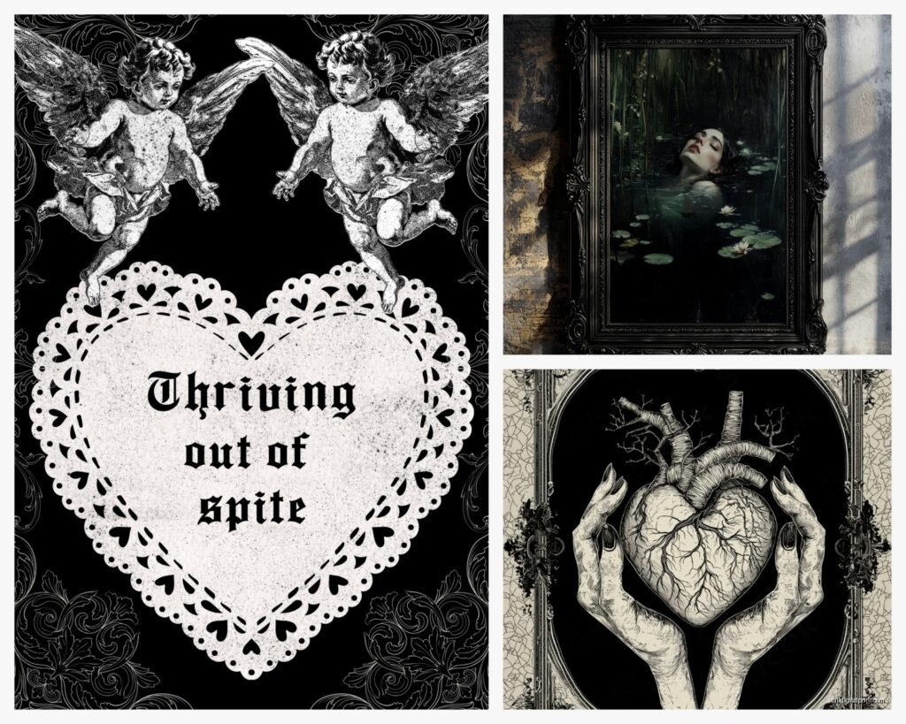
The Victorian stuff works better in smaller rooms honestly because it’s so detailed. I found these amazing reproduction mourning portraits on Etsy – they’re like $40-60 for decent prints – and they’re perfect for creating that dark romantic thing without going full costume party. Look for sellers who use actual archival paper because the cheap ones fade to this weird purple color after like six months near a window.
Where to Actually Find This Stuff
Real talk, most of the “gothic wall art” on Amazon is garbage. Like those polyester tapestries that smell like chemicals and fall apart. But there are some legit sources I keep going back to:
- Etsy shops that specialize in Victorian reproductions – search “Victorian mourning art” or “medieval manuscript prints”
- Estate sales and antique malls for actual vintage pieces (frames especially)
- Society6 and Redbubble have some artists doing really good dark academia gothic stuff
- Museum gift shops online – the Met and British Museum have insane medieval print collections
I got this incredible set of Gustave Doré prints from the Met store for like $25 each and they’re actually museum quality. His Dante’s Inferno illustrations are *chef’s kiss* for gothic spaces.
The Frame Situation
Oh and another thing – frames matter SO MUCH with gothic art. Like more than with any other style I’ve worked with. You can’t just throw these in basic black frames from Target (I mean you can but it’ll look flat).
Hunt for ornate frames at thrift stores. Seriously, every Goodwill has those heavy gold baroque frames that people donate because they’re “too fancy.” Spray paint them matte black or deep burgundy. I did this for my own hallway and it cost maybe $30 total for six frames that would’ve been $200+ new. The texture and detail makes everything look more expensive and intentional.
For larger pieces, those wooden frames with carved details – even if they’re damaged – add so much. I found one with a broken corner for $5, filled it with wood filler, painted it black, and now it holds this massive medieval battle scene print. No one notices the repair.
What Actually Works on Different Walls
This is gonna sound weird but wall color completely changes what gothic art you should buy. I learned this the hard way when I put these beautiful pale Victorian portraits on a dark gray wall and they just… disappeared.
Dark walls (charcoal, deep burgundy, forest green): You need art with lighter elements or metallic details. Those illuminated manuscript prints with gold leaf accents? Perfect. High contrast black and white engravings. Anything with bright focal points.
Light walls (cream, pale gray, white): You can go full dark and moody. Black and white photography of gothic architecture, those dramatic romantic paintings, really dark medieval stuff. The contrast does the work for you.
Colored walls (deep jewel tones): This is actually my favorite for gothic art. A deep plum or emerald wall with ornate gold-framed art looks SO expensive. Match your art to have similar undertones – cool art on cool walls, warm on warm.
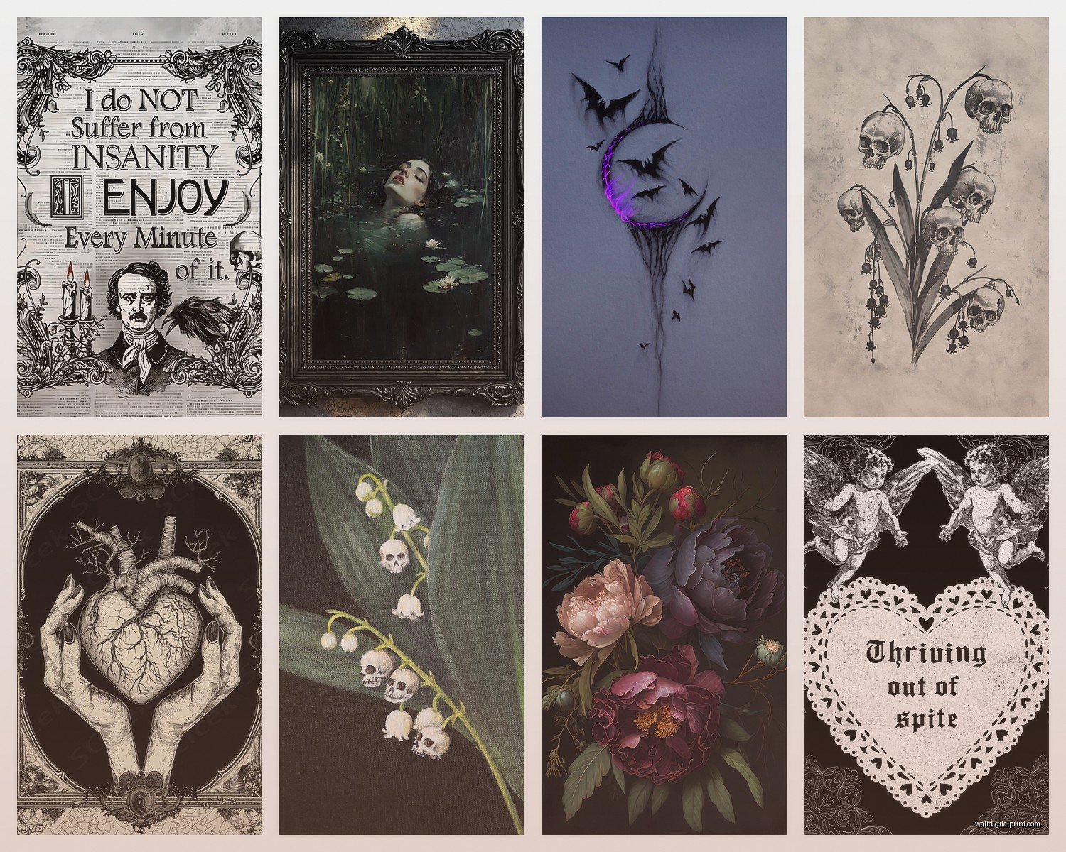
I just finished a dining room with this moody teal color and we hung a collection of Victorian botanical death studies (yeah that’s a thing, plants associated with mourning) and it’s honestly the best room I’ve done all year.
Creating a Gallery Wall Without It Looking Messy
Okay so funny story, my first gothic gallery wall looked like a conspiracy theorist’s vision board. Too many different styles, no cohesion, just chaos. Here’s what I figured out works:
Pick ONE unifying element:
- All black and white imagery with various frame styles
- All ornate gold frames with different art styles
- One specific theme (ravens, roses, skulls, architecture) in different artistic styles
- Same era but different subjects
For layout, I always do the paper template thing on the floor first. Trace your frames on craft paper, cut them out, arrange until it looks good, tape to wall, then hang. Sounds tedious but I’ve never regretted taking the time. Winging it always ends with extra holes.
The Victorian approach is symmetrical – like three pieces in a row, all same size, evenly spaced. Very formal. Medieval leans more organic, layered, like a castle wall that collected art over centuries. You can literally overlap frames slightly for that effect.
Specific Pieces That Always Work
Wait I forgot to mention – there are certain subjects that are basically foolproof for gothic spaces. After doing this for a while, these are my go-to recommendations:
Architectural prints: Gothic cathedrals, castle ruins, Victorian mansions. They’re dramatic but not trying too hard. Look for vintage photography or detailed etchings. The Library of Congress has free downloadable high-res images you can print at Costco for like $15.
Botanical darkness: Not your cheerful sunflower prints. Think thorny roses, poisonous plants, autumn decay. There’s this artist on Society6 who does these incredible black and white botanical studies that feel scientific and eerie at the same time.
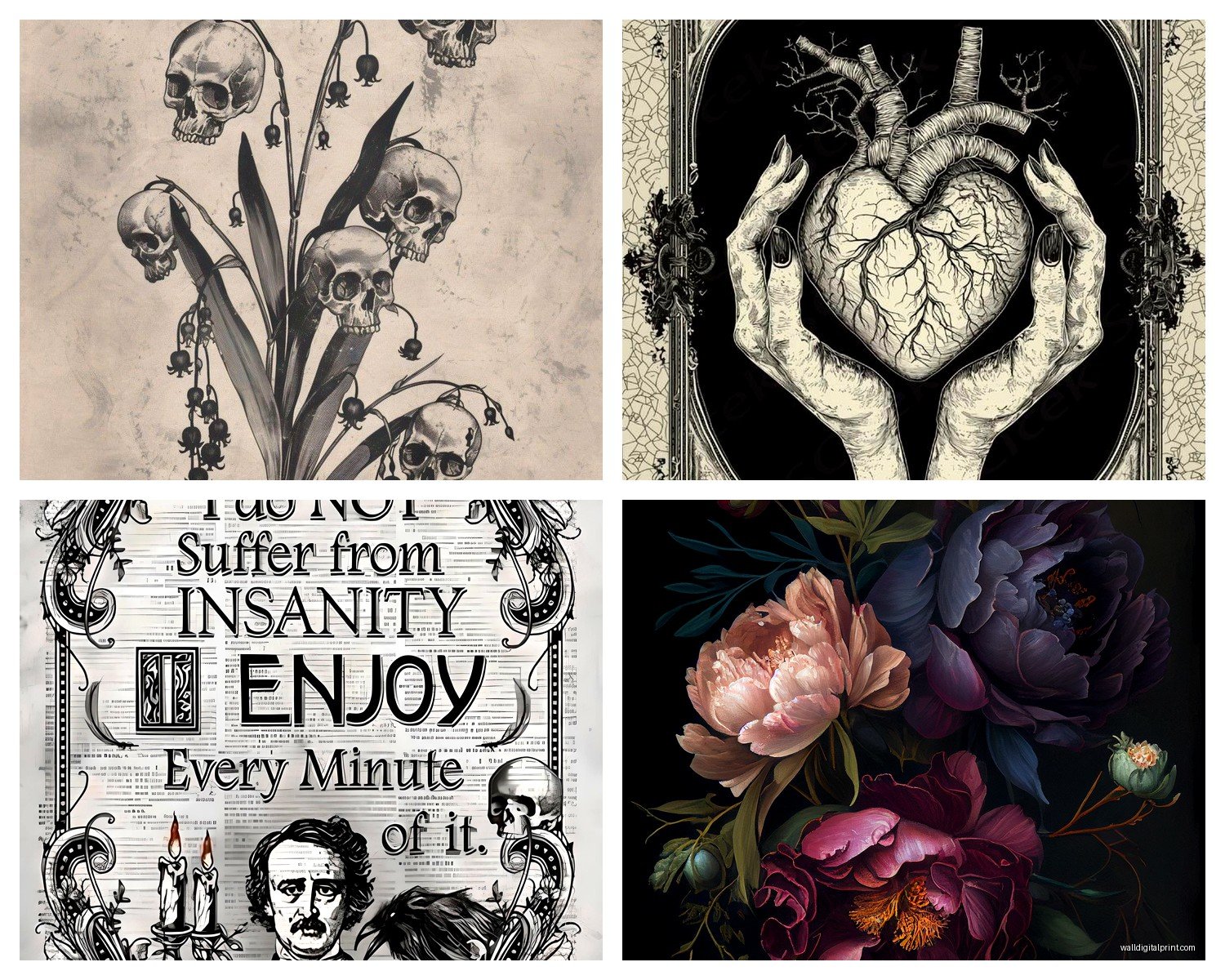
Literary references: Illustrations from Poe, Dante, gothic novels. The Edmund Dulac fairy tale illustrations work surprisingly well in gothic spaces – they’re dark enough but add some fantasy elements.
Medieval manuscripts: Those illuminated letters, pages from Books of Hours, medieval maps. They bring in pattern and color without being too literal about the gothic thing.
I have a client who’s obsessed with Edgar Allan Poe and we did an entire wall of vintage Raven illustrations – like eight different artistic interpretations from different eras. It’s weirdly cohesive because it’s the same subject but each piece is unique.
The Weird Stuff That Shouldn’t Work But Does
This is gonna sound random but mixing in some unexpected elements keeps gothic from feeling like a theme park. I love adding:
- One piece of classical sculpture photography (those Renaissance death masks are perfect)
- Vintage anatomy or medical illustrations – Victorian doctors were gothic as hell
- Old maps, especially of Gothic regions or historical battle maps
- Pressed flowers in shadow boxes (very Victorian mourning tradition)
I found these antique funeral cards at an estate sale – Victorians made like trading cards for funerals, it’s wild – and framed a collection of them. Everyone who sees them is fascinated.
Size and Scale Matters More Than You Think
Big mistake people make is going too small. Gothic art needs presence. One large dramatic piece (like 24×36 or bigger) makes more impact than five small ones scattered around.
For a standard bedroom wall, I usually do either:
- One massive statement piece above the bed (40×60 range)
- A gallery of 6-9 medium pieces (11×14 to 16×20) arranged tightly
- A diptych or triptych situation – medieval art was big on these
Living rooms can handle larger scale. I did a 4×6 foot tapestry reproduction of a medieval hunting scene in someone’s living room and it completely transformed the space. But in a small room that would be overwhelming.
Also consider your ceiling height. If you have tall ceilings, you can go vertical with your arrangements – stack pieces, use tall narrow frames. Standard 8-foot ceilings work better with horizontal arrangements.
The Lighting Thing Nobody Talks About
Okay so lighting can make or break gothic art. Natural light can actually be too harsh – it washes out the moodiness. I always recommend:
Picture lights on individual pieces (those brass gallery lights are like $30 on Amazon). They create this museum vibe and add drama at night.
Wall sconces flanking major pieces. Doesn’t have to be expensive – I found iron gothic-style sconces at Hobby Lobby for $20 each during a sale.
Never overhead spotlights directly on gothic art. Too harsh. You want ambient, moody lighting that creates shadows.
My own study has gothic art lit only by table lamps and one picture light, and people always comment on the atmosphere. Meanwhile my friend has similar art with bright LED overheads and it just looks flat.
Mixing Medieval and Victorian Without Looking Confused
So you can combine these but you need a strategy. What works:
Use black and white photography/prints for one era, color for the other. Like B&W Victorian portraits mixed with color medieval manuscript pages. The processing difference separates them visually while the subject matter still vibes together.
Different walls for different eras. Victorian stuff on one wall, medieval on another. They can exist in the same room but having defined territories helps.
Find the overlap subjects – roses, ravens, religious imagery, death themes (morbid but true). These subjects appear in both eras so they bridge the gap.
The transitional piece technique – I’ll use something from the Pre-Raphaelite movement which was Victorian artists obsessed with medieval stuff. It literally bridges both aesthetics.
I mixed a Victorian mourning portrait collection with medieval heraldic crests in a home office and it worked because I kept everything in matching black frames and used the same mat color. The consistency in presentation unified the different eras.
Budget Breakdown for Different Approaches
Let me give you actual numbers because this can get expensive or stay cheap depending on your approach:
Budget gothic (under $200 for a full wall):
- Print public domain images at Costco or your local print shop ($10-20 each)
- Thrift store frames spray painted ($3-8 each)
- Dollar store black mats
- Maybe one Etsy print as your focal piece ($30-50)
Mid-range ($500-800):
- Mix of quality prints from museum shops and Etsy ($30-80 each)
- Better frames, maybe some new ornate ones mixed with thrifted ($20-60 each)
- One or two actual antique pieces from estate sales
- Professional matting and maybe one custom frame
Investment level ($1500+):
- Original antique prints and artwork
- Custom framing throughout
- Rare or signed pieces
- Maybe a legit antique tapestry or large-scale vintage piece
I usually tell people to start budget and upgrade pieces over time. Your eye will develop and you’ll figure out what you actually want to invest in versus what’s just filling space.
Mistakes I See All the Time
Too matchy – everything the same size, same frame, same subject. It looks like a hotel.
Going too literal with skulls and crosses everywhere. Unless you’re actually goth (respect), it reads as trying too hard.
Ignoring the rest of the room. Gothic art needs supporting elements – the right furniture style, appropriate textiles, complementary colors. Otherwise it’s just weird art on normal walls.
Overcrowding. Gothic art needs breathing room. White/dark space around pieces is crucial.
Using only prints found on Pinterest. Everyone has seen that same “The Raven” print. Hunt for unique stuff.
There’s this one print of a Victorian woman with a bird that’s on literally every gothic decor blog and I swear I see it in every third house now. Find your own pieces, even if they’re less “perfect.”
Anyway, that’s basically everything I’ve learned through trial and error and way too many client projects. The main thing is just to start with one or two pieces you genuinely love and build from there rather than trying to buy everything at once. Gothic spaces should feel collected over time, not purchased in one Target run… even though I know that’s tempting when you just want it done.