Wall Art Guide, Wall Art Tutoriels
Modern Farmhouse Wall Art: Rustic Contemporary Decor
May
So I’ve been obsessing over modern farmhouse wall art for like three months now because my client wanted this whole rustic vibe but didn’t want it to look like a Cracker Barrel exploded in her living room, you know? And honestly the balance between contemporary and farmhouse is trickier than you’d think.
The Thing About Scale Nobody Tells You
Okay so first thing, and I cannot stress this enough, people always go too small with their wall art. Like way too small. I had this whole moment last week where I was installing what my client thought was a “big” piece above her sectional and it looked like a postage stamp. Modern farmhouse especially needs that impact because the style itself is so understated.
Here’s what actually works: measure your wall space and go with something that’s at least 2/3 the width of your furniture below it. So if you’ve got a 90-inch sofa, you want your art or gallery wall to span roughly 60 inches. I learned this the hard way after returning SO many pieces that just looked lost on the wall.
For above beds, I usually do 3/4 the width of the headboard. And if you’re doing a gallery wall situation, treat the whole collection as one piece when you’re measuring, not the individual frames.
Single Statement Pieces vs Gallery Walls
The modern farmhouse aesthetic works with both but they give totally different vibes. Single large pieces feel more contemporary and cleaner, which I’m personally leaning toward lately. Gallery walls read more rustic and collected over time.
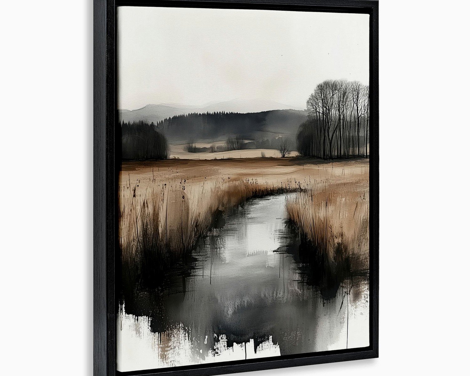
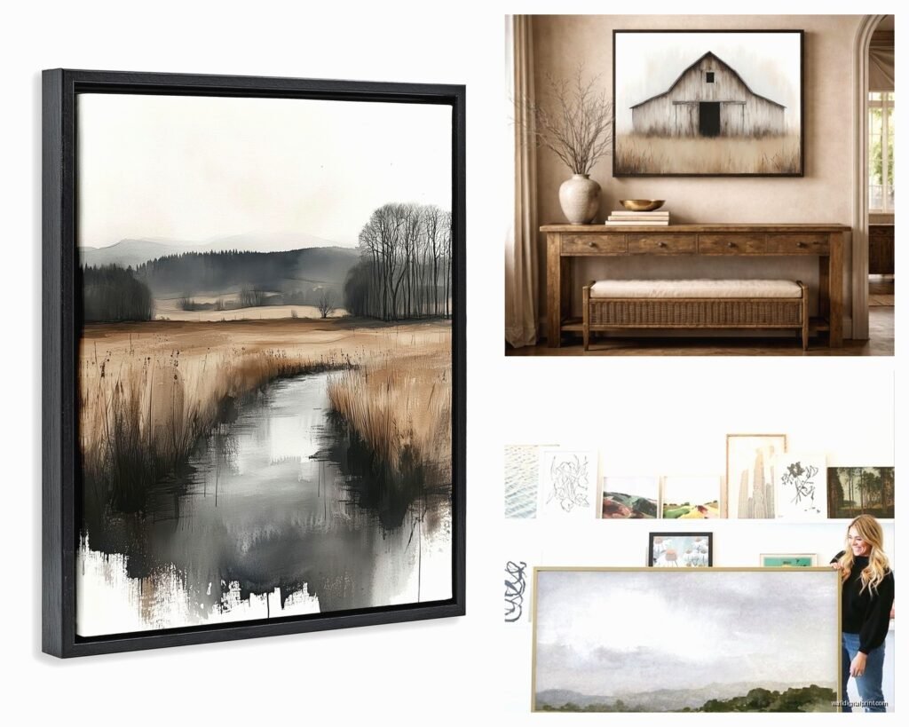
I’ve been using these oversized black and white landscape prints lately and they’re doing all the heavy lifting. Like a 48×36 inch print of wheat fields or misty mountains in a simple black frame. The key is keeping the subject matter organic but the presentation minimal. No ornate frames, no going too literal with the farm stuff.
What Actually Looks Good (After Testing Like 50 Options)
Okay gonna break down what I’ve found actually works:
Botanical prints but not the fancy vintage ones. More like simple line drawings of eucalyptus branches or cotton stems on cream backgrounds. I found this Etsy shop that does custom sizes and my dog literally knocked one off the wall last month and it didn’t even crack because they use this lightweight material.
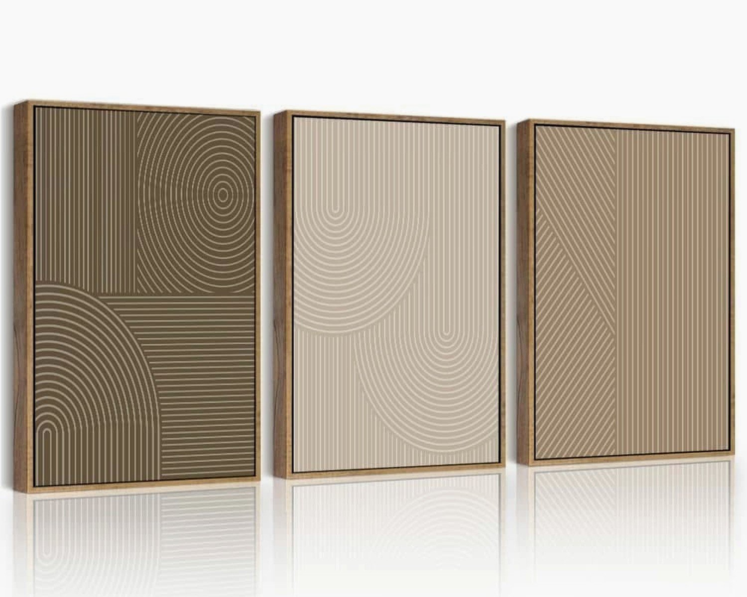
Abstract neutrals are your best friend. Think beige, cream, charcoal, maybe a tiny bit of sage green. I did this whole living room with three abstract pieces that were basically just brushstrokes in taupe and white and it was *chef’s kiss*. The contemporary part comes from keeping the colors super restrained.
Black and white photography of rural landscapes, architecture, farm animals but shot in a really artsy way. Not like cutesy cow paintings. More like a stark black and white photo of a weathered barn from an interesting angle.
Typography art but you gotta be careful here because it can go cheesy fast. I only use it in kitchens or dining rooms and stick with single words or very short phrases in simple fonts. “Gather” is overdone at this point tbh. I’ve been doing family names or the year the house was built.
The Frame Situation
Frames make or break this whole thing. Modern farmhouse is all about that mix of refined and rustic so your frames need to walk that line.
My go-to is black frames with white or cream mats. It’s simple, it works with everything, and it keeps things feeling contemporary. The white mat gives you that breathing room which keeps it from feeling too heavy.
Natural wood frames work too but they need to be the right tone. Light oak or whitewashed wood, not that orange-y pine from the 90s. And the frame itself should be simple, like maybe an inch wide, nothing chunky or carved.
I did this one project where we mixed black and natural wood frames in a gallery wall and honestly? It looked amazing. The trick was keeping all the mats the same color (white) so there was still cohesion.
Wait I forgot to mention, if you’re doing floating frames (the ones where the art seems to float inside), those read super contemporary and can modernize rustic subject matter really well.
DIY vs Buying Ready-Made
So here’s the thing, I’ve done both extensively and they each have their place. Ready-made stuff from places like Target or Hobby Lobby is fine for filling space quickly and it’s obviously cheaper. But it’s gonna look like everyone else’s house.
For clients with bigger budgets, I’m sourcing from smaller artists on Etsy or even commissioning custom pieces. The difference is noticeable. The quality is better, the subject matter is more unique, and you can get exactly the size you need.
But real talk, I’ve also done some gorgeous gallery walls mixing affordable prints from online with a few investment pieces and nobody can tell which is which when it’s all framed nicely.
Gallery Wall Layouts That Don’t Look Chaotic
Okay so funny story, I used to freestyle gallery walls and they’d take me like four hours of moving things around. Now I template everything on the floor first or use painter’s tape on the wall to map it out.
For modern farmhouse, I’m doing either a grid layout or a salon-style but keeping it symmetrical. The asymmetrical organic gallery walls feel too eclectic for this aesthetic.
Grid layout: Same size frames, equal spacing, hung in perfect rows. This is the most contemporary option and it’s actually the easiest to execute. I usually do 3×3 or 2×4 grids depending on the wall space. Spacing should be 2-3 inches between frames.
Symmetrical salon: Different sized frames but arranged symmetrically around a center point. So like a large piece in the middle with smaller pieces balanced on each side. This takes more planning but still feels organized.
The spacing thing is crucial. Too close together and it looks cluttered, too far apart and they don’t read as a collection. I measure everything out and use a level because my client last month tried to eyeball it and… let’s just say we had to redo it.
Where to Actually Hang This Stuff
Living room: Above the sofa is obvious but I’m also loving a large piece above a console table behind the sofa if you have that setup. Or a gallery wall on the wall opposite your seating area so you’re actually looking at it.
Dining room: This is where I go bigger and bolder. A massive abstract piece or a series of three large botanical prints. The dining room can handle more drama because you’re not staring at it all day from the couch.
Bedroom: Above the bed obviously, but I’ve also been doing art walls in bedrooms lately, like the whole wall opposite the bed becomes a gallery. Keeps you from having to buy a giant headboard and makes the room feel more curated.
Kitchen: Smaller pieces here usually. I’ll do a little shelf with small framed prints or a single piece on an empty wall. Nothing too precious because kitchens are messy.
Hallways: Perfect for gallery walls since you’ve got that long narrow space. I do floor to ceiling sometimes if the ceilings are high enough. It makes boring hallways feel intentional.
Color Schemes That Work
Stick with neutrals as your base. Cream, beige, taupe, charcoal, black, white. Then you can add one accent color if you want but keep it muted. I’ve been using sage green, dusty blue, or terracotta as accent colors lately.
The modern part of modern farmhouse comes from restraint. You’re not doing bright colors, you’re not mixing a bunch of different tones. Everything should feel cohesive and calm.
I did mess up once and added too much color variation in a gallery wall and it just looked busy. Had to swap out like four prints to tone it down.
Mixing Textures and Materials
This is gonna sound weird but adding dimensional elements makes a huge difference. Not just flat prints but also:
- Woven wall hangings in neutral colors
- Small wooden signs with simple typography
- Metal elements like iron brackets or hooks used decoratively
- Floating shelves with a mix of art and objects
- Mirrors with black or wood frames mixed into gallery walls
The texture thing is what makes it feel collected and not like you bought everything in one trip to HomeGoods. Even though sometimes you did, but we don’t need to advertise that.
Lighting Your Wall Art
Nobody thinks about this but lighting changes everything. I add picture lights to important pieces or use track lighting to highlight gallery walls. It makes cheaper art look more expensive honestly.
For modern farmhouse, I’m using matte black picture lights or simple track lighting in black or brushed nickel. Nothing shiny or ornate.
If you can’t do hardwired lighting, there are battery operated picture lights now that work surprisingly well. I tested a bunch for a rental property project and found some on Amazon that lasted like six months before needing new batteries.
Budget Breakdown
Since you’re probably wondering what this actually costs, here’s what I typically spend:
Small gallery wall (6-9 pieces): $200-400 if you’re buying affordable prints and framing them yourself or buying pre-framed
Single large statement piece: $150-500 depending on whether it’s a print or original and how you frame it
Full wall gallery (15+ pieces): $600-1200 mixing affordable and investment pieces
I always tell people to start with one wall and do it right rather than trying to fill every wall with mediocre stuff. Better to have one amazing gallery wall and some empty walls than everything looking cheap.
Common Mistakes I Keep Seeing
Hanging things too high. The center of your art should be at eye level, which is roughly 57-60 inches from the floor. Everyone hangs stuff too high and then it feels disconnected from the furniture.
Going too matchy-matchy. Like buying a set of three prints that are clearly from the same collection. It looks catalog-staged. Mix it up even if you’re buying from the same place.
Forgetting about the rest of the room. Your wall art needs to work with your furniture, rug, curtains, all of it. I’ve seen people do perfect gallery walls that clash with everything else in the room.
Using command strips for heavy pieces. Girl, no. Get proper wall anchors. I’ve seen too many pieces crash down because someone trusted command strips with a 15 pound frame.
Oh and another thing, not considering the wall color. Modern farmhouse usually has white or light neutral walls, but if you’ve got a darker wall, you need to adjust your art choices. Light art on dark walls needs more contrast in the framing.
Where I’m Actually Buying This Stuff
Etsy: For unique prints and custom sizing. Search for “modern farmhouse art” or “neutral abstract art” or “minimalist botanical prints”
Minted: Higher end but really good quality and tons of sizing options
Framebridge: For custom framing, worth it for special pieces
Target/Hobby Lobby: For affordable options and frames, just gonna be less unique
Local art fairs: I’ve found amazing pieces at local markets that nobody else has
Facebook Marketplace: For frames especially, people are always getting rid of nice frames
The key is mixing sources so it doesn’t all look like it came from one place. Even if most of it did, throw in something different to make it feel collected.
Anyway that’s basically everything I’ve learned from doing this for clients and my own place for the past few years. The main thing is starting with good proportions and keeping the color palette restrained. The rest is just personal preference really.