Wall Art Guide, Wall Art Tutoriels
Preppy Wall Art: Classic Coastal & Collegiate Decor
May
So I’ve been working on this preppy wall art project for like three clients in a row and honestly it’s become my whole personality at this point. My dog literally watched me arrange nautical prints for two hours yesterday and judged every decision.
The thing about preppy wall art is it’s way more specific than people think. You can’t just slap up any beach photo and call it coastal preppy. There’s this whole vibe that’s like… New England yacht club meets liberal arts college meets your grandmother’s summer house in the Hamptons. It’s very particular.
Start With Your Base Layer
Okay so the foundation is usually gonna be one of three things: vintage regatta prints, botanical illustrations, or architectural drawings of classic buildings. I always tell people to pick one as their anchor piece because otherwise it gets too chaotic.
The regatta prints are my personal favorite because they’re so obviously preppy without trying too hard. Look for ones that have those old-school sailboats, like J-class yachts or schooners. Not modern sailboats. There’s a difference and you’ll know it when you see it. The vintage ones from the 1920s-1950s are ideal but obviously expensive, so I usually hunt on Etsy for reproduction prints. There’s this seller who does amazing work but I gotta find the name… anyway, the prints should have that faded quality, maybe some text in a classic serif font announcing “Newport Regatta 1934” or whatever.
Frame Choices That Actually Matter
This is where people mess up constantly. The frames are like 60% of making preppy wall art work. You want slim profiles, nothing chunky or distressed farmhouse style. Think:
- Gold leaf frames (but thin, delicate ones)
- Navy blue painted wood frames
- Natural wood in light oak or maple
- White frames but only if they’re gallery-style modern
- Tortoiseshell pattern frames for a more maximalist preppy look
I did this whole gallery wall last month where we mixed gold and navy frames and it looked SO good. The client was worried it would be too much but the trick is keeping the same slim profile across all frames even when you mix finishes.
The Coastal Preppy Route
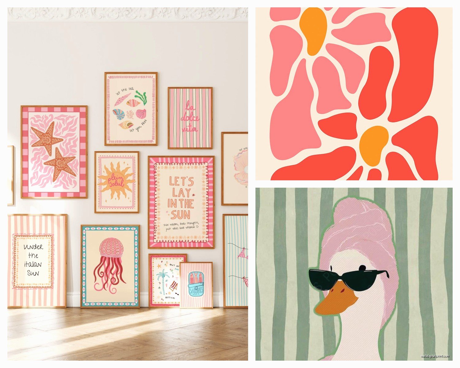
If you’re going coastal, you need to avoid anything that screams “beach house” in that overdone way. No “Life is Better at the Beach” signs. No distressed wood starfish. We’re talking more refined here.
What actually works:
Vintage nautical charts are incredible and you can find them everywhere. I frame historical maps of coastal areas, especially New England waters, Cape Cod, Nantucket, Martha’s Vineyard. The old navigation charts with the depth markers and compass roses are perfect. You can get reproduction ones printed on that slightly yellowed paper that looks authentic.
Antique shell prints but not photographs. I mean those old scientific illustration style prints, like what you’d see in a Victorian natural history book. The kind with Latin names under each shell specimen. There’s something very preppy about that academic approach to beach stuff.
Rowing club and yacht club pennants either vintage real ones if you can find them at estate sales, or good reproductions. Mount them in shadow boxes with white or navy matting.
Oh and another thing, watercolor paintings of coastal scenes work but they have to be somewhat understated. Not sunset-y and romantic. More like… overcast day, sailboats at anchor, New England architecture in the background. Muted blues and grays and tans.
Mixing In The Stripes
You gotta have stripes somewhere. It’s basically a requirement. I usually do this with:
- Framed pieces of vintage awning fabric in navy and white stripes
- Framed snippets of regatta flags
- Graphic prints that incorporate the stripe pattern
I saw someone frame actual pieces of Ralph Lauren fabric once and honestly it looked amazing. You can buy a yard of their classic stripe fabrics and cut it into multiple frames.
The Collegiate Preppy Angle
This is where it gets fun because you can really play with the academic thing. I’m working on a home office right now that’s going full library vibes.
Start with vintage university pennants. Real ones are best but they’re expensive and kinda hard to find unless you’re hitting up estate sales constantly. Etsy has reproduction felt pennants that look pretty authentic. Arrange them in a cluster, overlapping slightly, all in matching frames or shadow boxes.
Architectural prints of collegiate buildings are super preppy. Like engravings or etchings of ivy-covered halls, libraries, chapels. Doesn’t even have to be from a specific school you attended. Just that classic collegiate Gothic or Georgian architecture.
Vintage book pages framed individually. I take pages from old textbooks, poetry collections, Latin primers, stuff like that. Frame them in simple gold or wood frames. It’s giving English professor’s study in the best way.
Wait I forgot to mention botanical prints. These work for both coastal AND collegiate preppy because they have that scientific illustration quality. Look for vintage prints of:
- Ferns
- Hydrangeas (very New England summer)
- Ivy (obviously)
- Beach grass and dune plants
The Monogram Situation
Okay so monograms are tricky because they can go wrong fast. But when done right they’re SO preppy. I usually incorporate them through:
Custom prints with classic monogram styling in navy or forest green. Not cutesy fonts. Think more like what you’d see embroidered on a blazer pocket.
Vintage handkerchief art where you frame antique monogrammed handkerchiefs. My grandmother had a drawer full of these and they’re perfect for this aesthetic.
Color Palette Rules
This is gonna sound strict but the color palette really makes or breaks preppy wall art. You’re working within:
Primary colors: Navy blue, crisp white, classic red (more burgundy than fire engine)
Secondary colors: Kelly green, sunny yellow, pink (salmon or coral, not hot pink), tan/khaki
Accent colors: Gold, chocolate brown, hunter green
The thing is, you don’t use all of these at once. Pick like three main colors and stick with them. My current favorite combo is navy, white, and gold with touches of green. Very classic.
Layout Strategies That Work
I’ve tried every gallery wall configuration and here’s what actually looks good with preppy art:
The symmetrical grid is the most obviously preppy. Same size frames, evenly spaced, perfectly aligned. It’s very orderly and WASPy in the best way. I usually do this with a collection of similar prints like all botanical studies or all nautical charts.
The salon style but organized means you’re still doing that clustered gallery wall thing but with some structure. Maybe all the frames touch each other but you keep a consistent spacing. Or you arrange them within an imaginary rectangle shape.
The single statement piece can be very preppy too, especially in a powder room or hallway. One large vintage regatta poster in a gold frame, centered perfectly. Very confident.
This is gonna sound weird but I sometimes use painter’s tape on the wall to map everything out before hammering any nails. I’ll arrange all the frames on the floor first, take a photo, then recreate it on the wall with tape marking where each piece goes.
Mixing Art With Objects
Preppy wall decor isn’t just flat art. You can mix in:
- Vintage wooden oars mounted on the wall
- Antique tennis rackets in wooden frames
- Shadow boxes with vintage golf balls or other sporting equipment
- Mounted rowing oar plaques with names and dates
- Vintage croquet mallets
I did this mudroom last year where we mounted vintage wooden tennis rackets on either side of a mirror and it was perfect. Very country club.
Where To Actually Buy This Stuff
Because everyone always asks me this. Etsy is obviously huge for reproduction prints. Search terms that work: “vintage regatta print,” “antique nautical chart,” “botanical illustration print,” “preppy wall art.”
Estate sales and antique shops for real vintage pieces. I’ve found amazing yacht club pennants, old sporting equipment, vintage botanical prints. You gotta dig but that’s part of the fun.
Society6 and Minted have some preppy-ish options but you have to search carefully. Look for artists doing watercolor sailboats, vintage-style patterns, that kind of thing.
Honestly though, making your own prints is super easy. I’ll find vintage images in the public domain, edit them slightly in Canva or whatever, and get them printed at a local print shop on nice paper. Way cheaper than buying ready-made.
The Small Space Approach
If you’re working with limited wall space, focus on one really good piece rather than trying to cram in a whole gallery. A single large vintage-style map of Nantucket in a gold frame says preppy just as much as a whole wall of stuff.
Or do a small tight cluster of four matching frames with coordinating prints. Like four different shell illustrations, all same size, in a perfect square arrangement.
My apartment is tiny so I get the struggle. I have three nautical flags in navy frames above my desk and that’s it, but it totally works.
Avoiding The Costume-y Look
The biggest mistake is going too literal with the theme. You don’t need anchor prints AND rope AND sailboats AND “nautical” spelled out in rope letters. Pick a few elements and keep it subtle.
Same with collegiate stuff. Don’t make it look like a dorm room. One or two university-related pieces mixed with other preppy elements. The goal is sophisticated, not themed.
I always tell people to step back and squint at their wall. If it reads as “beach store” or “college bookstore” you’ve gone too far. It should just feel classic and pulled together.
Lighting These Pieces
Quick thing about lighting because it matters more than you’d think. Preppy wall art looks best in natural light or warm white artificial light. Those cool blue LED lights make everything look wrong.
If you’re doing a gallery wall, consider picture lights for the larger pieces. Very traditional and adds to that collected-over-time feeling.
Okay so that’s basically everything I’ve learned from doing this style for like two years straight now. The key is really just staying within that specific aesthetic lane and not mixing in other styles. Keep it classic, keep it somewhat understated, and invest in good frames. That’s it.