Wall Art Guide, Wall Art Tutoriels
Large Blue Wall Art: Oversized Ocean Sky Color Pieces
May
So I literally just hung this massive 72-inch blue abstract piece in a client’s living room yesterday and my back is still killing me but okay, let me tell you what I’ve learned about these oversized blue art pieces because I’ve been obsessing over them for like three years now.
First Things First About Scale Because Everyone Gets This Wrong
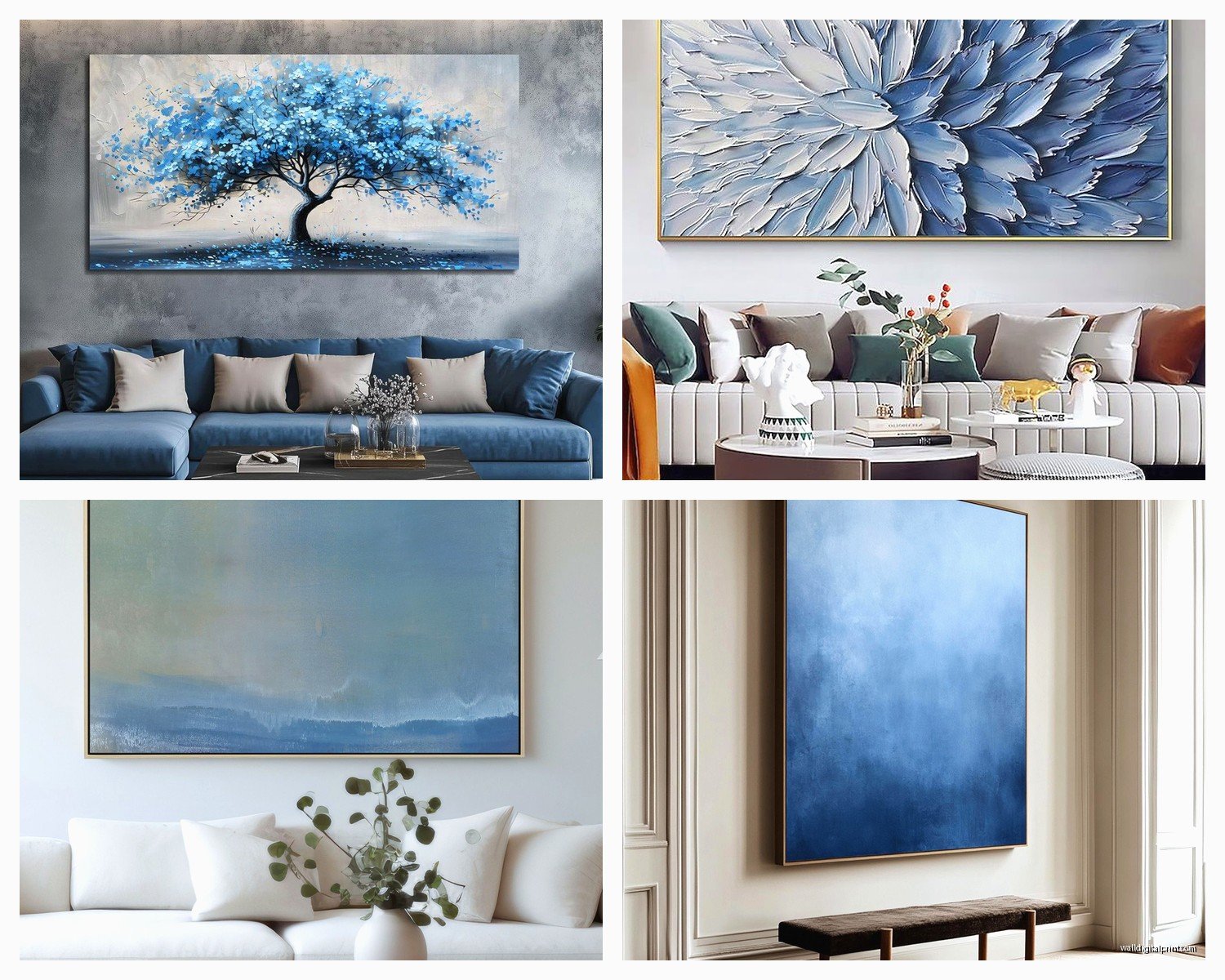
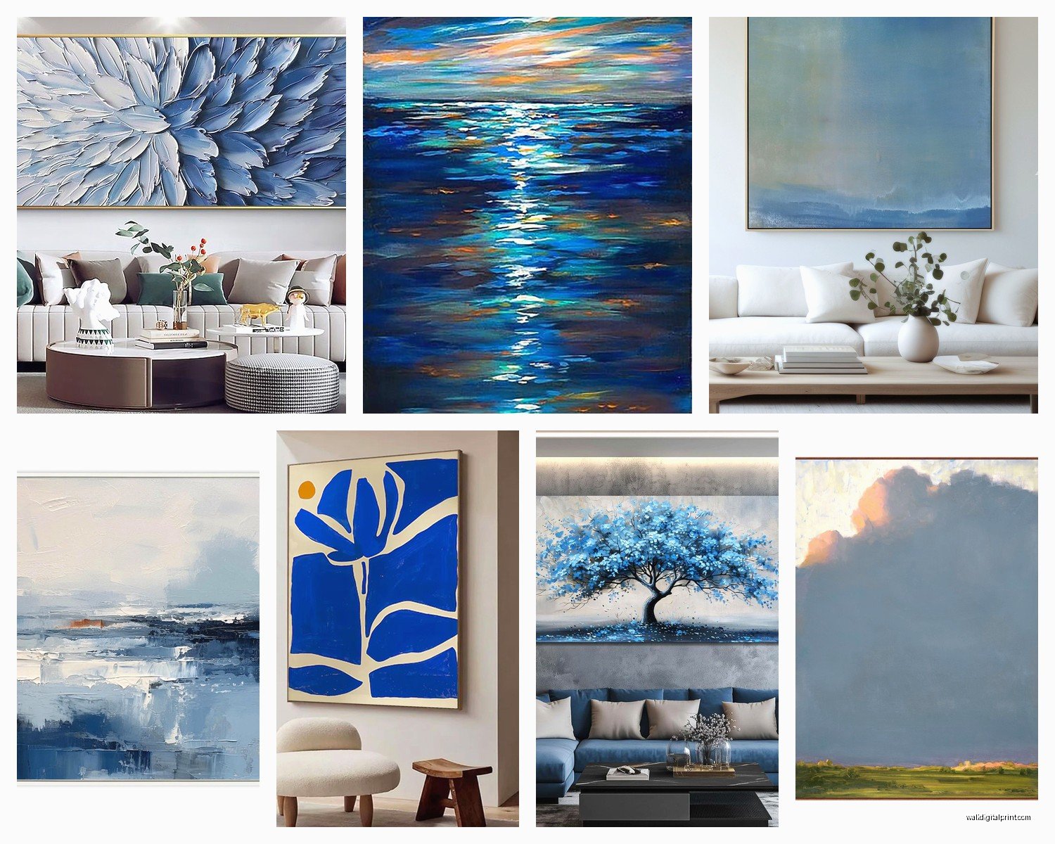
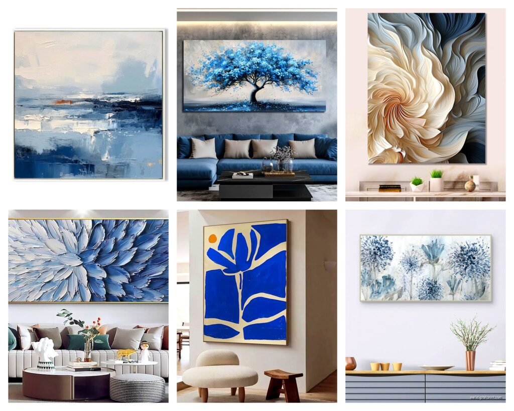
The biggest mistake I see is people buying art that’s way too small. Like you’ll have this huge blank wall and someone hangs a 24×36 print and it just looks… sad? For large blue wall art you’re looking at minimum 40 inches on the shortest side. I usually tell people to go 60+ inches for a statement wall.
Here’s the thing though, you gotta measure your wall and then take painter’s tape and actually map out the dimensions on the wall. I know it sounds extra but trust me, what looks huge in the store or online photos will shrink the second you get it home. My cat knocked over my tape measure the other day so I’ve been using this app called MagicPlan but honestly the tape method works better.
The Ocean vs Sky Blue Situation
Okay so there’s a difference and it actually matters for your room. Ocean blues tend to have more green undertones, they’re deeper, sometimes almost teal. Sky blues are cleaner, brighter, sometimes with gray mixed in.
Ocean blues work better in:
- Rooms with warm wood tones
- Spaces that get harsh afternoon light because they can handle it
- Coastal or Mediterranean vibes obviously
- Rooms where you want it to feel cozy despite the size
Sky blues are better for:
- Modern minimalist spaces
- North-facing rooms that need brightening
- Pairing with cooler grays and whites
- Creating that airy Scandinavian thing everyone’s still doing
I have this one piece in my own bedroom that’s this gorgeous gradient from deep ocean at the bottom to almost white-blue at the top and it literally changes the whole mood depending on time of day.
Materials and Why It Actually Matters
Canvas is gonna be your most common option and honestly it’s pretty foolproof. The stretched canvas pieces are lighter than you’d think for their size which makes hanging easier. But here’s what nobody tells you, cheap canvas prints get this weird texture where you can see the print dots if you’re close up. Spend the extra $50-100 for a higher quality print or go with a hand-embellished one.
Acrylic prints are having a moment right now and I’m kind of obsessed? The colors are SO vivid, especially blues. They have this depth that regular prints don’t. Downside is they’re heavy as hell and they show every fingerprint, which drives me crazy. I hung one in a hallway last month and had to clean it twice already.
Metal prints are interesting for blue art because they give this almost ethereal quality. The aluminum backing makes the blues look slightly cooler and more reflective. Good for modern industrial spaces but they can feel cold in traditional rooms.
Framed vs Unframed Debate
Large pieces over 48 inches get really expensive to frame. Like custom framing a 60×40 piece can easily cost $400-600. Sometimes the frame costs more than the art which feels wrong but whatever.
For blue ocean pieces I usually skip the frame and go with gallery-wrapped canvas where the image continues around the edges. It’s cleaner and doesn’t compete with the art. But for sky blue pieces especially abstract ones, a simple float frame in natural wood or white can actually make it feel more intentional? Less like a poster.
Wait I forgot to mention, if you’re buying online make sure the edges are finished properly. I got burned once with a piece that had ugly staples showing on the sides.
Placement and Height Rules That Actually Work
Standard rule is center the art at 57-60 inches from the floor which is “gallery height” but for oversized pieces I cheat this a bit. If your ceilings are 9+ feet, you can go higher. If they’re standard 8 feet, sometimes centering a massive piece makes it feel too low.
Above a sofa, leave 6-8 inches between the furniture and the bottom of the art. I’ve seen people leave like 18 inches and it just floats there awkwardly. The art should feel connected to your furniture arrangement.
The Whole Wall vs Focal Point Thing
Okay so you can either go with one massive statement piece or do a gallery wall effect with multiple blue pieces. I’m gonna be honest, the single oversized piece is easier and usually looks better. Gallery walls with large art get tricky because you need serious wall space and if the pieces don’t relate to each other it looks chaotic.
If you do want multiple pieces, keep them in the same blue family. Like all ocean tones or all sky tones. Mixing that deep navy with a bright cerulean usually doesn’t work unless you really know what you’re doing.
Lighting Makes or Breaks This
This is gonna sound weird but I always test art placement at different times of day before permanently installing. Blues can look completely different in morning light vs evening.
Picture lights are overrated for large abstract pieces in my opinion. Instead, use adjustable track lighting or even smart bulbs in nearby lamps that you can dim. You want to avoid glare especially on acrylic or glossy finishes.
Natural light is tricky with blue art. Too much direct sunlight will fade it over time, but blues actually look amazing with indirect natural light. If your art wall gets direct sun, consider UV-protective glass or acrylic, or just plan to replace the piece eventually.
What to Pair It With
My client yesterday had this all-white room and was worried the blue would be too much but honestly it was perfect. White walls make blue art pop without competing.
Colors that work:
- Warm whites and creams as a base
- Natural wood tones in any finish
- Brass or gold metal accents
- Terracotta or rust for contrast
- More blue in different shades because why not
What doesn’t work as well:
- Cool grays can make it feel too cold unless that’s your vibe
- Too much black makes blue look muddy
- Competing bold colors like red or orange unless you’re going maximalist
The easiest formula is blue art + white walls + warm wood + one metallic accent. Done.
Hanging Heavy Pieces Without Destroying Your Walls
Anything over 40 pounds needs to go into studs. Use a stud finder, mark them with pencil, and use proper picture hanging hardware. I like the heavy-duty picture hangers that have multiple hooks, rated for like 75-100 pounds.
For drywall only, those toggle bolts or molly bolts work but make bigger holes. French cleats are honestly the best system for really large heavy pieces, they distribute weight evenly and the art sits flat against the wall.
Get someone to help you hang it. I tried doing a 60-inch piece alone last year and almost dropped it on my toe. Not worth it.
The Wire vs D-Ring Debate
For large pieces I prefer D-rings or a sawtooth hanger over wire. Wire can stretch over time with heavy art and you get that tilted look. Plus with oversized art you want it perfectly level and wire makes that harder to achieve.
Budget Breakdown Because It Varies So Much
You can find large blue prints on sites like Etsy or Society6 starting around $150-200 for a 40×60 canvas. These are usually reproductions or digital art which is totally fine if you like the image.
Mid-range is $400-800 for better quality giclée prints or hand-embellished pieces. This is my sweet spot honestly, you’re getting good quality without the investment piece price tag.
High-end original paintings or limited edition prints from known artists start at like $1500 and go up to… I’ve seen $15,000+ for really large commissioned pieces. My wealthiest clients do this but it’s definitely not necessary for a beautiful room.
Oh and another thing, local art fairs and university gallery shows are goldmines for finding affordable large-scale work. I found this incredible 5-foot blue abstract at a student show for $600 that would easily cost $2000 in a gallery.
Style-Specific Recommendations
For coastal modern you want those ocean blues with texture, maybe some white caps or foam suggested in the brushwork. Abstract but recognizable as water.
Minimalist spaces need clean sky blues, maybe geometric or with lots of negative space. Think Mark Rothko color field vibes but in blue.
Traditional or transitional rooms can handle more detailed blue art, maybe a seascape with some realism mixed with abstraction. The oversized scale keeps it from feeling too stuffy.
Bohemian or eclectic spaces are fun because you can go wild with blues, mix in some indigo, turquoise, even purple-blues. Layered textures work here.
Common Problems I’ve Fixed
Problem: Art makes the room feel cold
Fix: Add warm textiles, wood tones, warm lighting. The blue isn’t the problem, the supporting elements are.
Problem: Blue doesn’t match the “blue” pillows or rug
Fix: Stop trying to match exactly. Blues should coordinate not match. Different shades of blue in one room is actually good.
Problem: Art overwhelms the space
Fix: Either the room is too small for that size art, or there’s too much other stuff competing. Edit down accessories and furniture.
Problem: Can’t commit to one huge piece
Fix: Start with removable options, some companies do peel-and-stick large canvas prints now. Or rent art through services like Turning Art to test it.
I was watching this show the other night about interior design and they hung this massive blue piece in like 30 seconds with perfect placement and I was like yeah that’s not how it actually works.
Anyway, measure twice, hang once, and don’t be afraid to go bigger than you think. The worst that happens is you return it, but usually people regret going too small way more often than too large. And if you’re still unsure just text me a pic of your wall with measurements, I can usually eyeball what size would work.