Wall Art Guide, Wall Art Tutoriels
Black and White Coastal Wall Art: Minimalist Beach Photography
May
So I’ve been obsessing over black and white coastal photography for like three months now and honestly it started because a client wanted to do this whole minimalist beach house thing but didn’t want the typical turquoise and coral everyone does. And let me tell you, once you start looking at b&w beach prints, you can’t stop.
Why Black and White Actually Works Better Than Color Sometimes
Okay so here’s the thing about coastal art that nobody really talks about. Color beach photos can be SO specific. Like that perfect turquoise only works with certain wall colors and then you’re stuck. But black and white? It’s basically a neutral that adds texture and mood without fighting with your sofa or that weird green your landlord painted the accent wall.
I tested this in my own living room first because I’m not gonna recommend something I haven’t lived with. Put up this massive black and white wave photograph above my couch and it literally made the whole room feel calmer? My sister came over and was like “did you repaint” and nope, just the art doing its thing.
The minimalist beach photography specifically works because it strips away all the distraction. You’re not looking at someone’s beach umbrella or a random jetski. It’s just forms and light and water and sand. Very zen without trying too hard to be zen, you know?
Where to Actually Find Good Prints
This is gonna sound weird but I’ve had the best luck on Etsy for instant downloads that I then get printed locally. There’s this whole community of photographers who shoot film on beaches and the grain quality is just *chef’s kiss*. Search for “black and white coastal fine art photography” not just “beach print” because you’ll get way better results.
Also check out:
- Minted for curated collections, though they’re pricier
- Desenio has surprisingly good minimalist beach stuff
- Local art fairs if you want something actually unique
- Instagram photographers directly, like just DM them
I bought three prints from a photographer I found on Instagram who shoots exclusively on the Oregon coast and they were half the price of getting them through a gallery. Plus she sized them custom for my wall which was clutch.
The Print Quality Thing You Gotta Know
Don’t cheap out on the actual printing if you’re doing digital downloads. I learned this the hard way with a print that looked amazing on my screen but came out all muddy and grey. You want:
- At least 300 DPI resolution
- Giclée printing if possible (fancy inkjet basically)
- Matte finish for that gallery feel
- Acid-free paper so it doesn’t yellow
My local print shop does giclée for like $40 for a 24×36 which is way cheaper than buying pre-made framed prints online when you factor in shipping.
Sizing and Placement Because This Trips Everyone Up
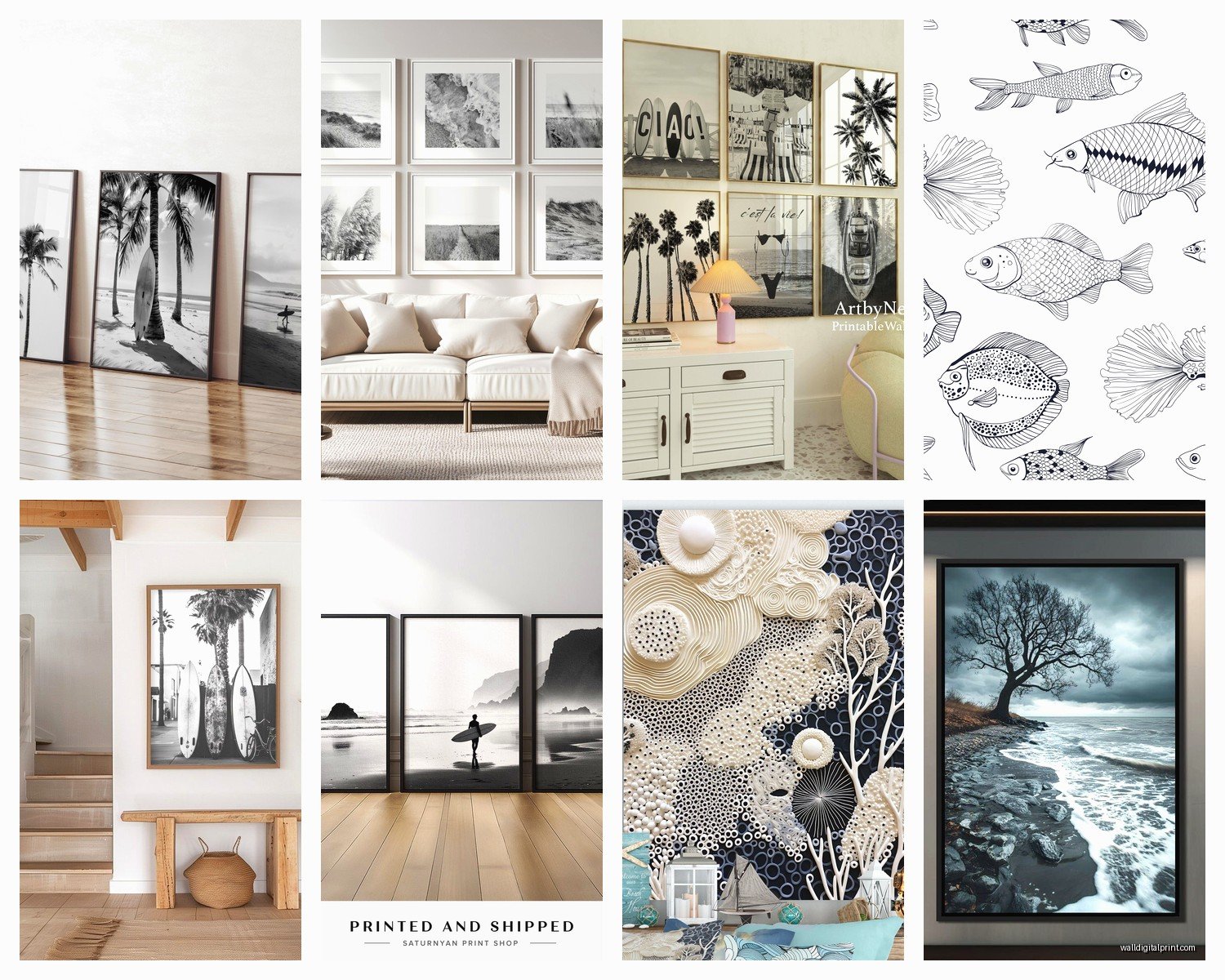
Okay so I have this whole formula now after hanging probably 50+ pieces in client homes. For black and white coastal art specifically, you want it LARGE. Like bigger than you think. Small black and white prints just look like… I dunno, filler? They don’t have the same impact.
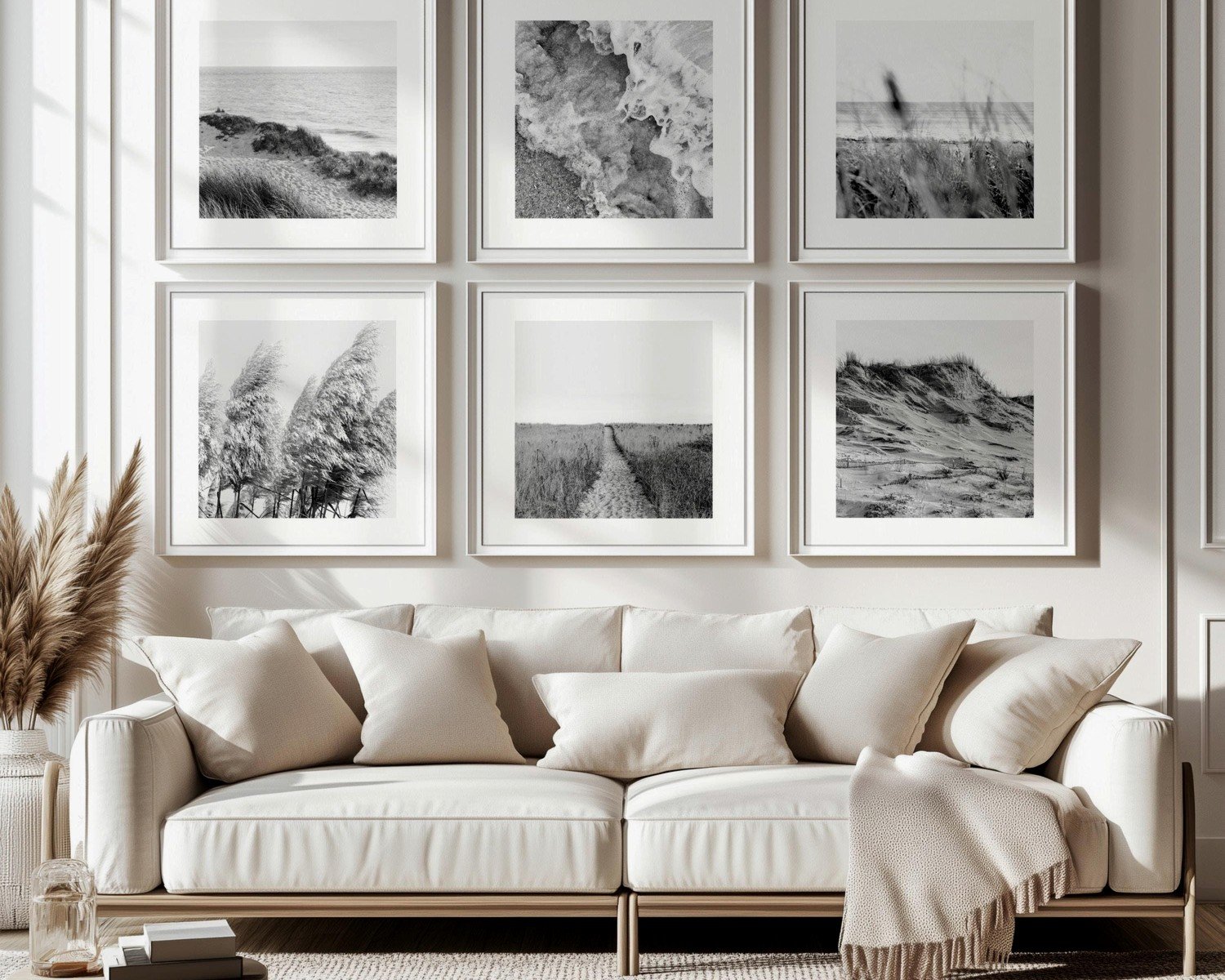
Over a sofa: go for 2/3 to 3/4 the width of the sofa. So if your couch is 84 inches, you want something in the 56-63 inch range. You can do a single large piece or a diptych (two panels).
I did a diptych in my client’s bedroom last month, two 24×36 prints of the same beach at different tide levels, hung them about 3 inches apart, and it created this really cool narrative thing without being matchy-matchy.
The Height Thing
Center of the artwork should be at 57-60 inches from the floor. That’s standard gallery height. But honestly if you’re putting it above furniture, I do 6-8 inches above the furniture top and then just make sure it looks right to YOUR eye. Stand back, take a photo, see if it feels balanced.
Oh and another thing, in bedrooms I go slightly lower because you’re seeing it from bed mostly. Like 54-55 inches to center. Makes it feel more intimate somehow.
Framing Options That Don’t Cost a Fortune
Michaels and Hobby Lobby have those big 40-50% off sales literally every other week. I stock up on their gallery frames during sales. The simple black or white frames work perfectly for this style.
For the minimalist look you want:
- Simple black frame with white mat (classic, always works)
- Natural wood frame for warmer spaces
- No frame at all, just mounted on foam board for a modern gallery look
- Floating frames if you wanna get fancy
The white mat is key though. It gives breathing room around the image and makes even a smaller print feel more substantial. I usually do 3-4 inch mats on all sides.
Wait I forgot to mention, if you’re doing the no-frame mounted thing, you can get prints mounted to gatorboard or dibond at most print shops. It’s more expensive but looks SO good and very contemporary. Did this for a client’s bathroom with a black and white aerial beach shot and people always ask about it.
Mixing Multiple Pieces Without It Looking Chaotic
This is where people usually mess up with coastal art. They buy like five different beach scenes in different styles and wonder why their gallery wall looks like a Pinterest fail.
For black and white beach photography, stick to:
- Same or similar frame style across all pieces
- Consistent mat treatment
- Related subject matter (all waves, all aerials, all beach textures)
- Similar tonal range
I did a gallery wall in my hallway with all black and white coastal textures, like one was just ripples in sand, one was foam on a rock, one was a wave detail. All different but they talked to each other because the scale and contrast were similar.
My dog knocked one off the wall last week though so now I’m down to two until I can get it reframed, but honestly it still looks fine with just two? Sometimes less is actually more with this stuff.
The Grid vs Salon Hang Debate
For minimalist beach photography I’m team grid. The salon hang (asymmetrical gallery wall) can work but it fights against the calm minimalist vibe. A simple grid of four squares or three horizontal pieces feels more intentional.
That said, I broke my own rule in my office with this organic salon-style arrangement and I love it, so like… rules are meant to be broken if it feels right to you.
Specific Subjects That Work Really Well
After working with this style for a while, certain subjects just hit different:
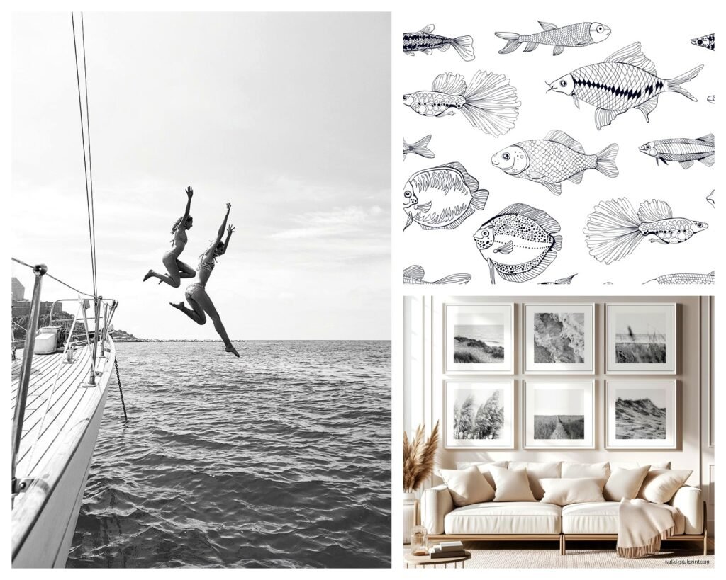
Aerial beach shots: These are having a moment and for good reason. The patterns of waves and sand from above are so graphic. Look almost abstract. I have one over my bed that’s just the edge where water meets sand and the patterns are insane.
Minimalist horizons: Just sky and ocean, that’s it. Super calming. Works great in bedrooms or above bathtubs. There’s this one photographer who shoots nothing but horizon lines and every single one is slightly different and I’m obsessed.
Wave details: Close-ups of waves with all that texture and movement. These have more energy so they work better in living spaces than bedrooms.
Beach grass and dunes: Softer than waves, adds organic lines. Really pretty in entryways.
Pier or dock shots: Leading lines are your friend. Creates depth. Can make a small room feel bigger if you position it right on the wall.
Rocks and tide pools: More texture, darker tones usually. Works if your space needs something with more weight to it.
Pairing With Your Existing Decor
Okay so this is where it gets fun. Black and white coastal photography is stupid versatile but you can enhance it with your styling choices.
With modern/minimalist decor: Keep everything clean. Let the art be the focal point. Maybe add one piece of driftwood or a simple ceramic vessel in white or black.
With coastal/beachy decor: The b&w photography actually ELEVATES the coastal theme instead of making it too literal. Pair with natural textures like jute, linen, rattan. Skip the literal seashells and starfish though, it’s too much.
With traditional decor: Use more ornate frames maybe? Or stick with simple frames but do a more traditional layout. Works surprisingly well.
With boho spaces: Natural wood frames, mix with woven wall hangings. The contrast between the structured photography and organic textiles is really nice.
I had a client who was worried black and white beach photos would be too cold with her all-white Scandinavian-style living room but we added warm wood tones in the frames and some textured throw pillows and it totally worked.
Colors That Play Well
Pretty much everything honestly, but especially:
- Soft greys and whites (obviously)
- Navy blue as an accent
- Warm woods and natural materials
- Sage green or dusty blue
- Terracotta for contrast
- Black accents to echo the frames
What doesn’t work as well: really bright colors can fight with the calm vibe, but even then I’ve seen it done successfully with like one bright yellow chair against b&w beach art.
Lighting Makes or Breaks It
This is gonna sound obvious but proper lighting is SO important with black and white photography. The whole point is the tonal range and contrast, so if your lighting is off, you lose that.
Natural light is ideal but avoid direct sunlight hitting the print because fading. I use picture lights on some of my larger pieces, the battery-operated LED ones from Amazon work great and they’re like $25.
In my bedroom I have sconces on either side of my diptych and turning those on at night creates this whole moody situation. Very hotel-like in a good way.
For gallery walls, track lighting or recessed lights aimed at the wall work well. Just make sure they’re not creating glare if you used glass in your frames.
Maintenance and Long-term Stuff
Black and white prints show dust like crazy, especially on the mat and frame. I dust mine monthly with a microfiber cloth. For the glass, regular glass cleaner but spray it on the cloth first, not directly on the frame.
If you didn’t use UV-protective glass (which is expensive, I get it), just keep them out of direct sun. I rotate prints sometimes between rooms if one wall gets a lot of sun exposure.
The nice thing about b&w photography is it doesn’t really go out of style? Like you’re not gonna look at it in five years and be like “wow that’s so 2024.” It’s pretty timeless which makes it a good investment if you’re buying quality pieces.
Budget Breakdown Real Talk
You can do this at different price points:
Budget option: Digital download $10-30, print at Costco or local shop $15-40, frame from Target or Michaels on sale $20-50. Total per piece: $45-120.
Mid-range: Pre-made print from Minted or similar $80-150, custom frame $100-200. Total per piece: $180-350.
Investment: Original photograph or limited edition print $300-1000+, professional framing $200-500. Total per piece: $500-1500.
I usually tell people to do one really good large piece rather than multiple cheap small ones. The impact is better and it looks more intentional.
My own collection is honestly a mix. I have one piece I splurged on from a photographer I love, and then several budget prints that I got framed nicely and they all work together.
Common Mistakes I See All the Time
Hanging it too high. Seriously everyone does this.
Going too small. Bigger is almost always better with this style.
Mixing too many different photo styles. Stick with one photographer or very similar aesthetics.
Forgetting about scale in relation to furniture. The art and furniture need to have a relationship.
Using colored mats. Just… don’t. White or black only for minimalist beach photography.
Not considering the room’s function. Super dynamic wave crashes might be too energetic for a bedroom where you want calm.
Okay I think that’s everything I’ve learned from living with and styling black and white coastal photography for the past few months. It’s honestly become my go-to recommendation for clients who want that calm, elevated coastal vibe without it being too beachy or themed. The versatility is unmatched and you can really make it work in almost any space with the right approach to sizing, framing, and placement. Just remember to go bigger than you think and keep it simple with the framing and you’ll be fine.