Wall Art Guide, Wall Art Tutoriels
Blue and Gold Abstract Wall Art: Luxury Modern Contrast
May
So I’ve been totally obsessed with blue and gold abstract pieces lately and honestly it started because a client backed out of a meeting last month and I ended up just scrolling through art sites for like three hours. My cat kept walking across my laptop which didn’t help but anyway, here’s what I’ve actually figured out about making these work without your space looking like a hotel lobby.
The Actual Color Thing Everyone Gets Wrong
Okay so the blue matters SO much more than you’d think. Navy blue with gold? That’s gonna give you traditional, almost nautical vibes even if the art is super abstract. I tested this in my own dining room and it felt too… I dunno, preppy? But when you go with a deeper cobalt or even better, those really saturated royal blues, the gold pops differently. It’s richer.
And here’s what no one tells you—the temperature of your gold changes everything. Warm antique gold against cool blue creates this vintage luxury thing (which I love for bedrooms actually), but bright metallic gold with cerulean blue? That’s contemporary, almost edgy. I hung a piece with really shiny gold leaf in my studio space and it literally reflects light differently throughout the day which sounds pretentious but it’s actually just cool to watch while you’re working.
Size and Placement Because This Is Where People Panic
The scale question comes up every single time. You want that piece above your sofa but is 48 inches too big or too small and everyone’s just guessing. Here’s what I actually do: the art should be roughly two-thirds to three-quarters the width of your furniture. So if your sofa is 84 inches, you’re looking at something around 56-63 inches wide.
But also—and this is gonna sound weird but trust me—blue and gold abstracts can handle being oversized in a way that other art can’t. The contrast is so strong that a large piece doesn’t overwhelm, it just anchors. I put a 60×40 inch piece in a client’s entryway (pretty small space, maybe 6 feet wide) and instead of swallowing the area, it made it feel intentional. Luxe, even.
Height-wise, center the piece at eye level, which is usually 57-60 inches from the floor to the center of the art. Unless you’re hanging it above furniture, then you want 6-8 inches between the furniture top and the bottom of the frame.
The Multi-Panel Situation
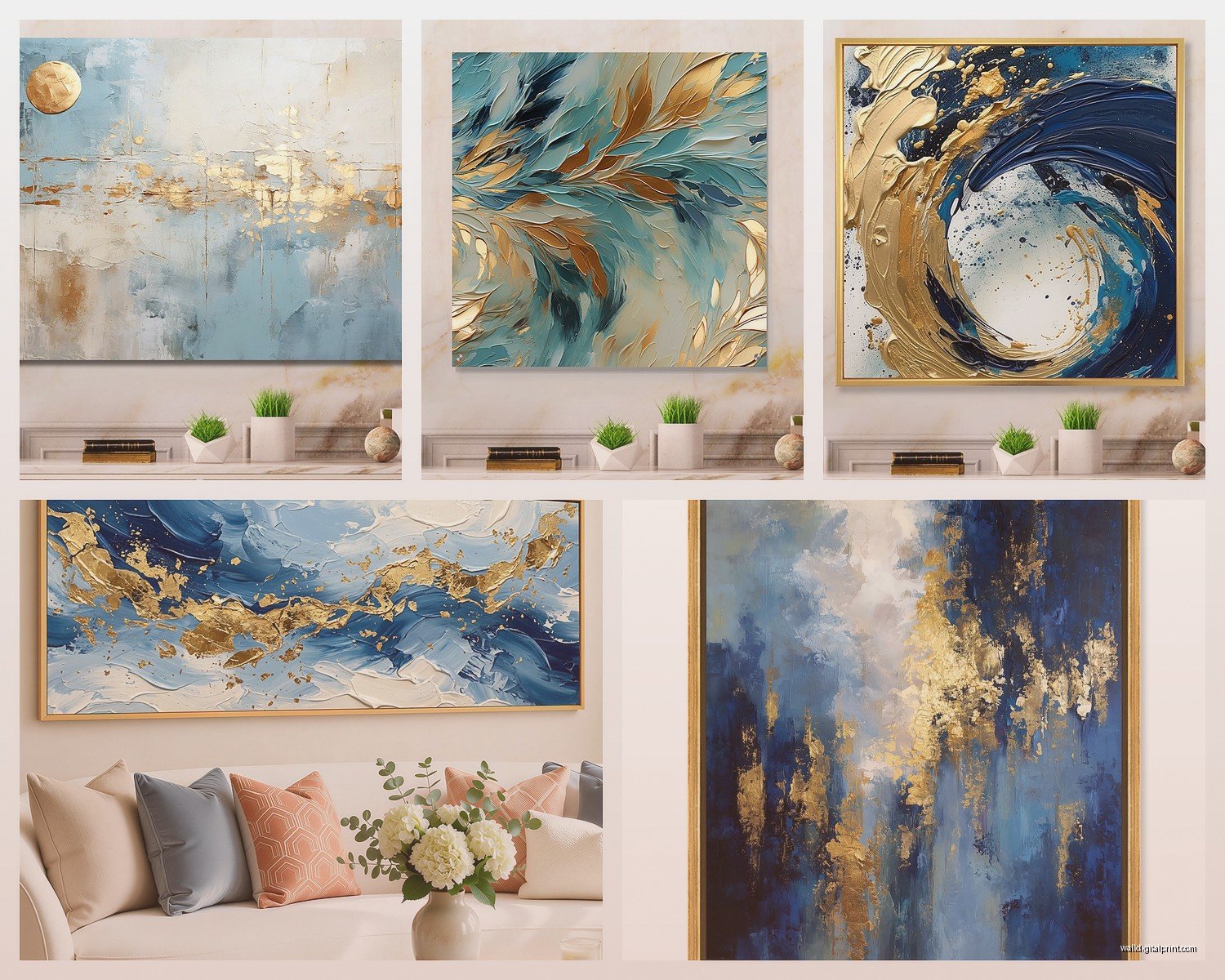
Triptychs are having a moment with these colors. Three panels of blue and gold abstract work creates movement across your wall, and you can actually play with the spacing between panels. I usually do 2-3 inches apart for a cohesive look, but I saw someone do 6 inches in a modern loft and it was stunning, just gave each piece room to breathe.
Oh and another thing—you don’t have to align them perfectly horizontally. Staggering them slightly (like half an inch difference in height) adds this organic feel that keeps the formality of gold from being too stuffy.
What Room and Why It Actually Matters
Living rooms are the obvious choice but bedrooms are where these colors really do something special. Blue’s naturally calming but the gold adds warmth so you don’t get that cold minimalist vibe. I have a predominantly gold abstract with navy accents above my bed and it’s the first thing I see in the morning and somehow it doesn’t feel aggressive? The gold catches morning light in this soft way.
Dining rooms though—this is where you can go dramatic. High contrast blue and gold abstract art in a dining space creates conversation (literally, people will talk about it) and it elevates the whole experience of the room. I did a deep prussian blue and rose gold piece in a client’s dining room and she said dinner parties feel fancier now which sounds silly but also that’s the whole point of art isn’t it.
Kitchens are tricky. If you’ve got a lot of stainless steel, gold can clash or compete. But if your kitchen has brass fixtures or gold hardware (which everyone’s doing now), a blue abstract with gold accents ties it together. Just keep it smaller—maybe 24×24 or so—because kitchens have so much visual noise already.
Bathrooms Yes Really
Okay so funny story, I was watching this restoration show while unpacking art for my storage unit and they put a blue and gold piece in a bathroom and I thought they were nuts but then I tried it. In a powder room especially, where you can be more bold, the combo is incredible. The gold reflects light (good for windowless bathrooms) and blue feels clean and spa-like. Just make sure it’s sealed properly or use a print instead of original paint because humidity will destroy actual gold leaf.
Pairing It With Your Existing Stuff
Wall color is where people freeze up. White walls are the safe choice and yeah, they work, but they’re also kinda boring with these pieces. I’ve had really good results with:
- Greige walls (the beige-gray hybrid everyone has)—they warm up the blue and make gold feel more organic
- Charcoal gray—creates a gallery feel, super modern, makes both colors pop
- Soft blush or dusty rose—I know this sounds random but the warmth plays beautifully with gold and creates unexpected contrast with blue
- Deep navy accent wall—monochromatic but the gold becomes the star
Furniture-wise, you’d think you need fancy stuff but honestly mid-century modern pieces work great because they’re usually walnut or teak which bridges that warm-cool gap. I’ve also seen blue and gold art look amazing with all-white contemporary furniture—it becomes the only color moment in the room.
Metallics in the space should echo the gold. If your art has warm gold, bring in brass or copper accessories. Cooler gold? Go with polished nickel or even silver. Mixing metals is fine (I do it constantly) but try to have the art’s gold be the dominant metallic tone.
Lighting This Is Actually Critical
Picture lights are your friend here. A small LED picture light mounted above the frame will make the gold shimmer and bring out the depth in the blue. I use them on about 70% of the pieces I style for clients now.
But also consider your room’s overall lighting. Warm LED bulbs (2700K-3000K) make gold feel richer and more antique. Cool bulbs (4000K+) make everything feel more contemporary and can actually make blues look more vibrant. I have both in my living room on different circuits which is extra but it means I can change the mood.
Natural light changes these pieces throughout the day. Morning light (cooler) brings out blues, afternoon/evening light (warmer) emphasizes gold. If you’re hanging in a room with big windows, watch where the light hits at different times before you commit to placement.
Frame Choices Because Yes This Matters Too
Floating frames (where there’s space between the art and frame) are super modern and work well with abstract pieces. For blue and gold art, I usually go with:
- Natural wood frames (oak, ash) for a Scandinavian-luxury hybrid look
- Black frames for maximum contrast and contemporary feel
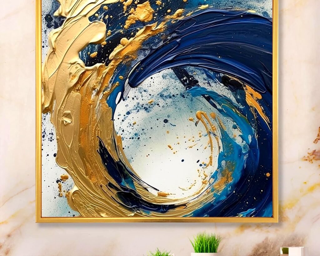
- Gold frames but only if the gold in the art is subtle—otherwise it’s too much
- No frame at all if it’s a gallery-wrapped canvas, keeps it casual
White frames can work but they often feel too safe with these bold colors. I’d rather see a raw wood or black frame that gives the art some edge.
Styling Around It The Actual Practical Stuff
You don’t need to redecorate your entire room but a few strategic touches help the art feel integrated:
Throw pillows in either blue or gold (not both usually—that’s overkill). I like a solid velvet pillow in a blue that pulls from the art, or a subtle gold geometric pattern.
A gold-framed mirror somewhere else in the room creates repetition without being matchy-matchy. Same with gold candlesticks or a gold tray on your coffee table.
Plants actually look incredible with blue and gold art. The green creates a triad with blue and adds life that keeps the gold from feeling too formal. I’ve got a fiddle leaf fig next to my blue and gold piece and it’s *chef’s kiss*.
Books with blue or gold spines on a nearby shelf—this sounds so specific but it’s those tiny repetitions that make a room feel curated instead of like you just hung one piece of art and called it done.
What Not to Do
Don’t add more abstract art in other colors nearby. It competes. If you want a gallery wall, make it all blue and gold abstracts in different sizes, or pair your blue and gold piece with black and white photography.
Don’t match your gold exactly. If your art has brushed gold and you go find brushed gold accessories in the exact same tone, it feels forced. Variation in shades and finishes looks more collected, more real.
Don’t hang it too high. I see this constantly and it makes even expensive art look like an afterthought.
Where to Actually Buy These Without Getting Scammed
Original pieces from local artists are my favorite—check Instagram for artists in your area doing abstract work. You can often commission custom sizes and they’re usually way more affordable than galleries.
For prints, Minted and Artfully Walls have good options and the quality is decent. Etsy is hit or miss but you can find some really unique pieces if you’re willing to scroll. Just read reviews about print quality and shipping.
If you’re going the affordable route, even places like West Elm and CB2 have blue and gold abstracts now. They’re mass-produced but if you style them right, most people can’t tell the difference.
Wait I forgot to mention—textured pieces (with actual raised paint or mixed media) photograph terribly online but look SO much better in person. If you can, try to see the piece physically or at least ask for detailed close-up photos before buying.
The metallic element matters too. Real gold leaf is gonna cost more but has this depth that metallic paint doesn’t quite achieve. For most rooms though, quality metallic acrylic or gold foil is totally fine and way more budget-friendly.
Making It Work Long-Term
Here’s the thing about blue and gold—it’s trendy right now but the color combination itself is pretty classic. Navy and gold has been around forever. If you’re worried about it feeling dated, go for more abstract compositions rather than geometric patterns (which feel more of-the-moment).
You can also swap out your accessories seasonally. In fall, I add warmer golds and deeper blues in textiles. Summer, I go lighter—pale blue linens, brighter gold accents. The art stays but the vibe shifts.
And if you get tired of it? Blue and gold is easy to sell or donate because it’s popular. Unlike that weird purple phase I went through (we don’t talk about that), these pieces have staying power.