Wall Art Guide, Wall Art Tutoriels
Champagne Wall Art: Luxury Celebration Bar Decor
Jun
So I’ve been obsessing over champagne wall art lately because honestly, it’s one of those things that can either look incredibly chic or super tacky depending on how you approach it. Like, my neighbor just redid her home bar and went full Vegas with it and I’m still trying to figure out how to tell her it’s… a lot.
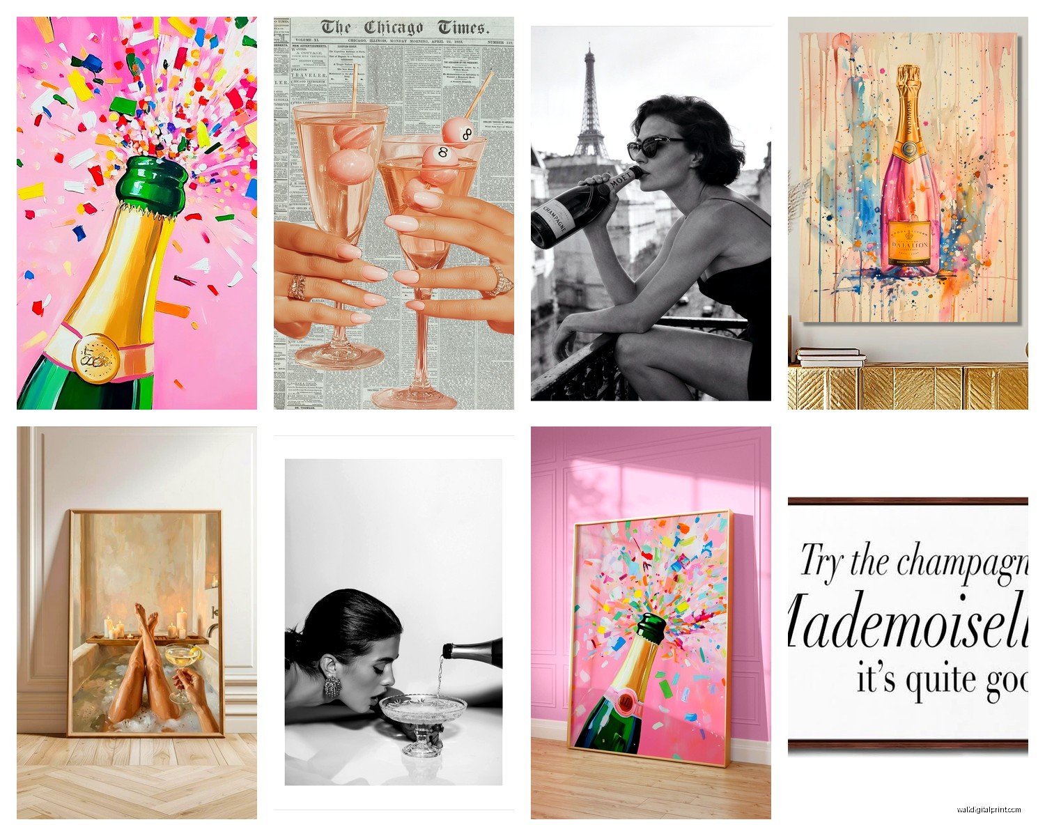
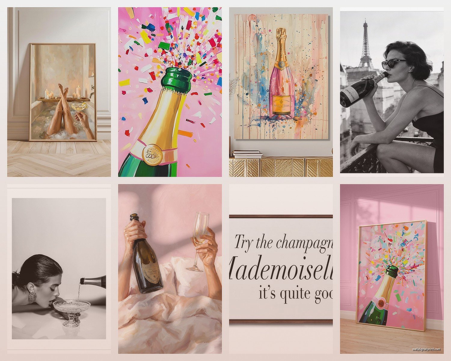
The thing with champagne-themed art is you gotta decide what vibe you’re actually going for. Are we talking subtle luxury with maybe some abstract gold pours and bubbles, or do you want literal vintage champagne posters that scream “I have a serious Dom Pérignon problem”? Both are valid but they create completely different moods.
I tested this in my own space first before recommending it to clients because I needed to see what actually works day-to-day. Started with a large canvas print of champagne bubbles in black and white – super minimalist, around 40×60 inches. Hung it above my bar cart and it immediately elevated the whole corner. The key was keeping it monochrome so it didn’t compete with the actual bottles and glassware. Color can get really overwhelming really fast when you’re dealing with a bar area that already has metallic accents and glass reflecting everywhere.
Oh and another thing, scale matters way more than people think. I see so many people buying these tiny 8×10 prints and wondering why their bar area looks sad. If you’re doing a gallery wall situation, sure, mix sizes, but your anchor piece needs to be substantial. I’m talking at least 30 inches on the shortest side. Otherwise it just looks like you printed something from Google Images and called it a day.
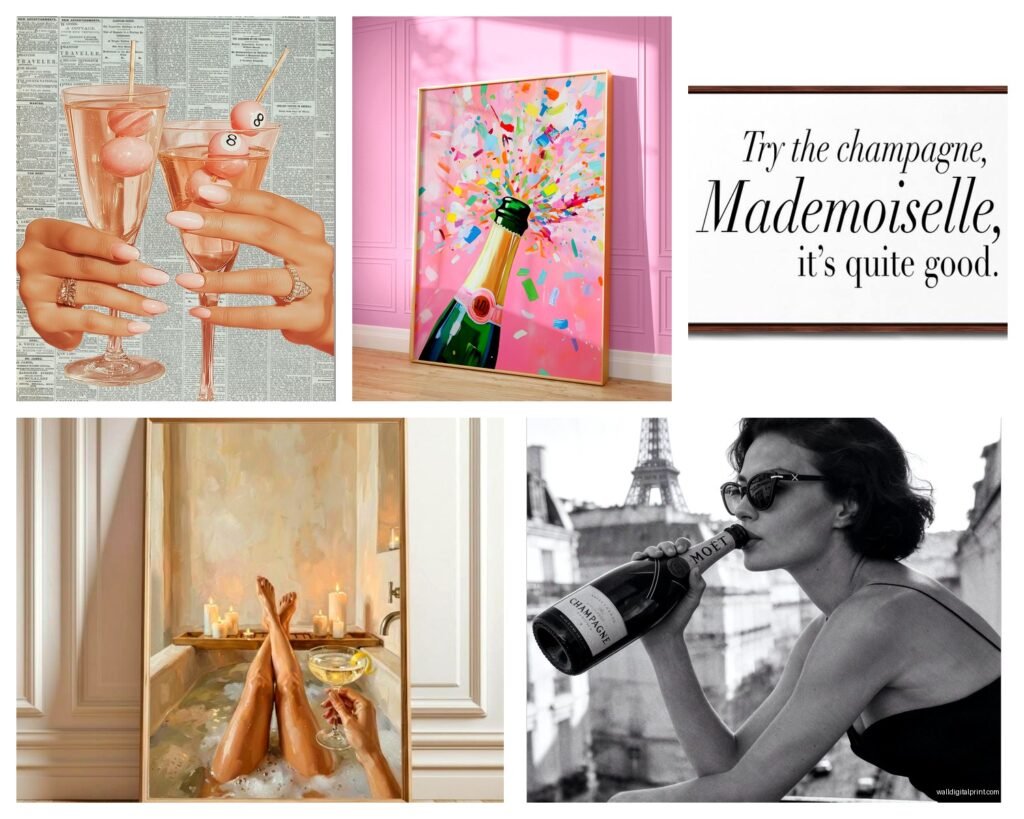
For actual art styles that work, vintage champagne advertisements are having this huge moment right now. The old Moët & Chandon posters, the Art Nouveau stuff with the elaborate typography – that aesthetic is gold. But here’s where it gets tricky… you can’t just throw any vintage poster up there. The colors need to coordinate with your existing palette. I made this mistake with a client’s space last year, got this gorgeous 1920s Veuve Clicquot print with orange and yellow tones, and it clashed horribly with their cool-toned gray and silver bar setup. Had to return it and find something with more champagne golds and blacks instead.
Photography prints work surprisingly well too, especially close-ups of champagne being poured or those gorgeous macro shots of bubbles. There’s this one shot I keep seeing on Etsy (I think?) that’s just the inside of a champagne flute with bubbles rising and the light catching them perfectly. Super elegant, works in modern spaces, doesn’t feel too themed if that makes sense. You want it to feel sophisticated, not like a frat house party poster.
wait I forgot to mention framing – this is gonna make or break your whole situation. Cheap frames immediately cheapen the art, doesn’t matter how nice the print itself is. I learned this the hard way spending like $200 on a beautiful champagne illustration only to stick it in a $15 Amazon frame and having it look like dorm room decor. Invested in proper frames with museum glass (the non-reflective kind) and it was night and day difference.
For bar areas specifically, you gotta think about lighting. If you’ve got backlit shelving or pendant lights, your art needs to hold up under that specific lighting situation. Matte finishes work better than glossy if you have a lot of direct light – less glare. I spent an entire Saturday (my cat knocked over a wine glass during this process, it was a whole thing) repositioning art around different light sources to see what worked.
Okay so funny story, I once tried to DIY champagne wall art by literally gluing champagne corks to a canvas in a pattern and spray painting the whole thing gold. Do not recommend. It looked crafty in the bad way, plus it started smelling weird after a few months? Not sure what that was about but yeah, some DIY projects should stay on Pinterest.
Color schemes that actually work: black and gold is classic for a reason, super luxe without being over the top. Rose gold and blush if you want something softer and more feminine. Navy and gold is underrated – gives you that rich, library bar vibe. All white with just hints of gold or silver if you’re going ultra-modern. What doesn’t work as well? Bright colors unless your entire bar aesthetic is already colorful. Champagne art should feel refined, and neon anything just doesn’t hit that mark.
Multi-panel pieces (triptychs or diptychs) are having a moment too. I just installed a three-panel champagne pour sequence in a client’s basement bar and it’s stunning. The movement across the panels creates this dynamic thing that makes the wall feel alive. But you need wall space for this – we’re talking at least 6 feet of horizontal space to do it right. Don’t try cramming multi-panel art into a small area, it’ll feel claustrophobic.
Abstract interpretations work better than you’d think. Not everything needs to literally show a champagne bottle or glass. I’ve got this piece in my dining area that’s just gold leaf with texture that suggests bubbles and effervescence without being literal about it. It reads as champagne-themed without hitting you over the head with it, which is the sweet spot you’re looking for if you want something that’ll age well.
Typography art is tricky territory. “Pop Fizz Clink” and “But First Champagne” – these can work if your space is more casual and fun, but they date themselves pretty quickly. I’m not saying don’t do it, just be aware that in five years you might be over the cutesy phrase thing. If you go this route, make sure the typography itself is beautiful and well-designed. Bad fonts make everything look cheap.
Real talk about where to actually buy this stuff – Etsy has tons of options but quality is wildly inconsistent. Read reviews carefully and check if they’re selling actual art or just drop-shipping prints from China. Minted has some gorgeous options, more curated, better quality but pricier. Society6 is hit or miss. Local art fairs can be amazing for finding unique pieces nobody else will have, plus you’re supporting actual artists which feels good.
Oh and another thing, consider the moisture factor if your bar area is near a kitchen or if you’re pouring drinks regularly. You want sealed prints or canvases, not just paper behind glass where condensation could potentially cause issues. I’ve seen paper prints get water-damaged from humidity in bar areas, it’s not pretty.
Mixed media pieces are really interesting for this theme – think gold leaf combined with acrylic, or resin pours that actually look like champagne. These tend to be pricier but they add dimension and texture that flat prints can’t match. I’ve got a resin piece in my office that has actual gold flakes suspended in it and catches light amazingly. It’s technically champagne-themed but works year-round, doesn’t feel too celebratory for everyday.
The gallery wall approach can work but it’s gotta be cohesive. All black frames with varied champagne-themed art in different styles, or all gold frames with black and white photos, something that ties it together. Random frames with random champagne stuff just looks cluttered. I spent three hours mapping out a gallery wall layout on my floor before hanging anything, using painter’s tape on the wall to mark positions. Tedious but necessary.
Size proportions matter relative to your bar furniture too. If you’ve got a massive bar cart or built-in shelving, your art needs to balance that visual weight. Small art above big furniture looks weird and unanchored. I usually aim for art that’s about 2/3 the width of the furniture below it, gives you good proportional balance.
Texture matters more than people realize. Smooth canvas prints can feel flat and boring. Look for pieces with actual texture – brushstrokes you can see, embossed elements, metallic accents that catch light. These details make art feel more expensive and intentional even if you didn’t spend a fortune.
This is gonna sound weird but smell is a consideration? Some cheaper canvas prints have this chemical smell when you first get them that takes forever to air out. Not ideal for a space where you’re consuming food and drinks. If you order something and it reeks when it arrives, return it. Quality prints shouldn’t smell like a factory.
Seasonal rotation is something I do that clients love – having different champagne art for different times of year. More celebratory, glittery stuff around holidays, subdued elegant pieces for everyday. But this only works if you have storage space and don’t mind the hassle of switching things out.
For really small bar areas, one statement piece is better than trying to do too much. A single oversized champagne photograph or painting, properly lit, makes more impact than a cluttered gallery wall situation. Know when to edit yourself, less is usually more with themed decor.
The metallic accent thing is crucial – if your bar has gold hardware, your art should incorporate gold tones. Silver bar tools? Cool-toned art. Mixing metals can work but it’s advanced level decorating and easy to mess up. Stick with one metal family to start.
I’m realizing this is getting long but there’s so much to cover with this theme. Last thing I’ll say is think about longevity. Are you gonna love champagne-themed art in five years or is this a phase? If you’re not sure, start with less expensive prints you won’t feel bad about swapping out later. Save the investment pieces for classic designs that’ll age well. That vintage Moët poster will still look good in 2030, but that glittery “Sip Sip Hooray” canvas might not.