Wall Art Guide, Wall Art Tutoriels
Ferrari Wall Art: Italian Sports Car Automotive Decor
Jun
So I’ve been totally obsessed with Ferrari wall art lately and honestly it started because this client wanted to redo his home office but didn’t want it looking like a teenage boy’s bedroom, you know? Like sophisticated automotive decor is actually tricky to pull off without it feeling like a garage poster situation.
Finding the Right Style Without Making It Look Like a Dorm Room
Okay so first thing – there’s actually a huge difference between “car poster” and “automotive art” and it comes down to how it’s presented and the image quality. I spent like three hours one night (my dog kept wanting to go out so it took forever) comparing different Ferrari prints and here’s what I figured out.
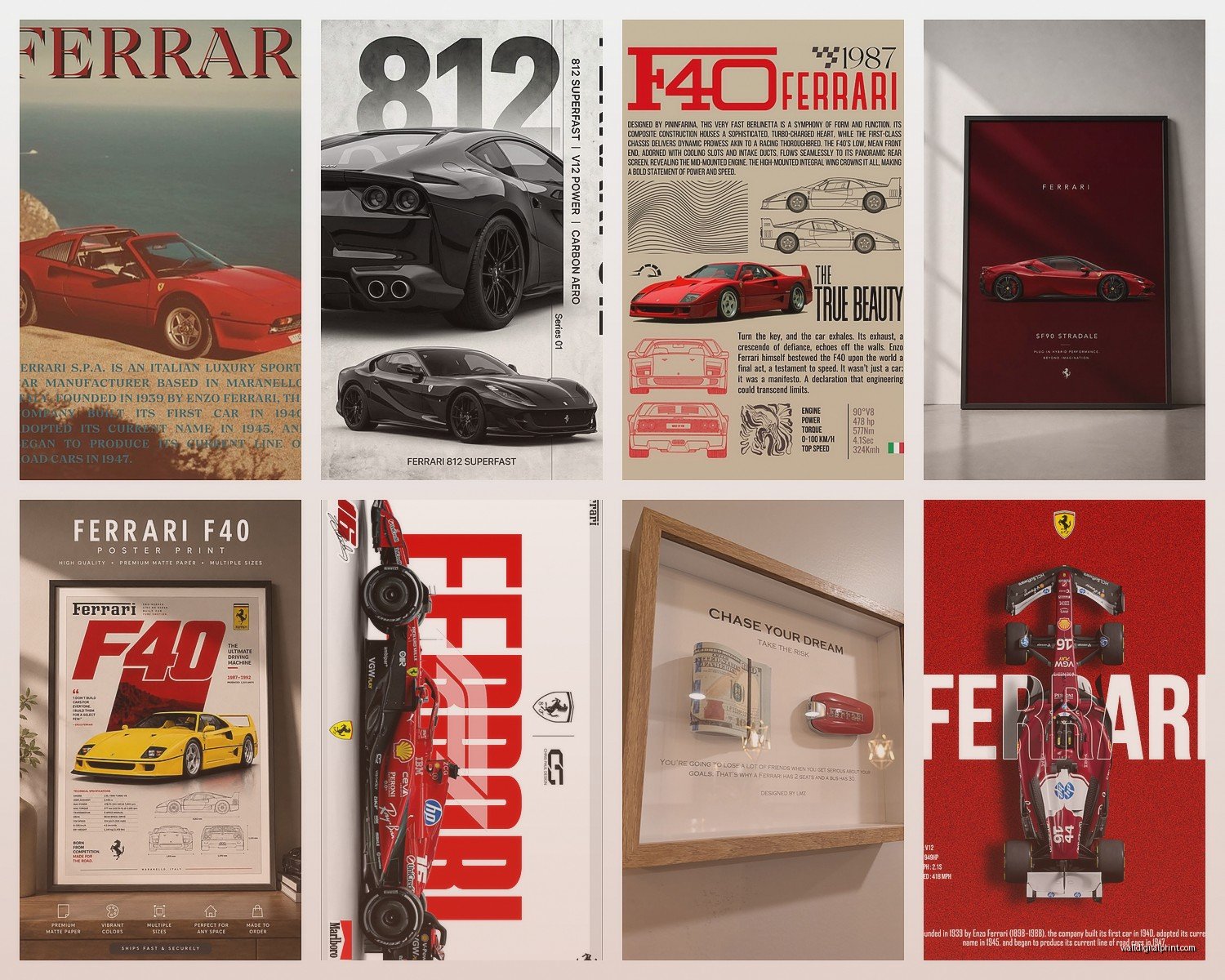
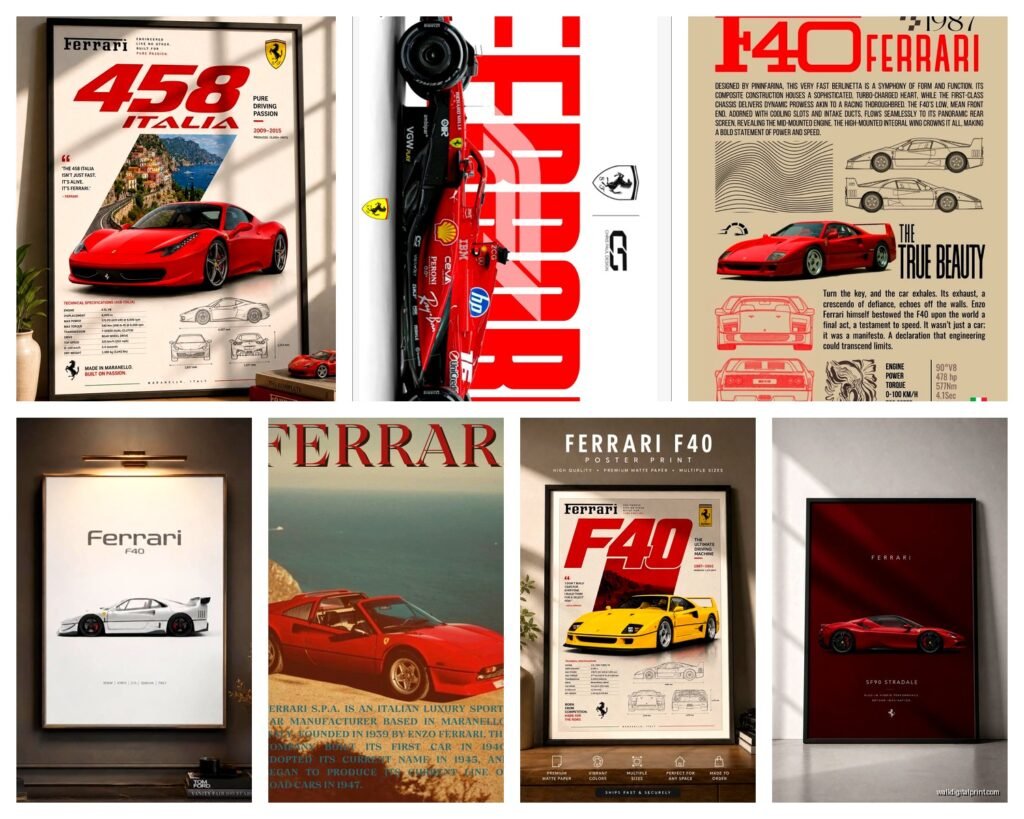
The abstract or minimalist Ferrari silhouettes? Those are gonna be your safest bet if you’re decorating an actual adult space. I’m talking about clean line drawings, maybe just the iconic Ferrari logo treatment, or those really gorgeous side-profile shots with lots of negative space. There’s this one canvas I keep recommending that’s just the Ferrari 250 GTO outline in matte black on cream canvas and it looks expensive even though it’s like $80.
But if you want actual photography or realistic artwork, you gotta go for museum-quality prints. The difference is insane. Cheap prints look flat and the reds don’t pop right – and Ferrari red is like THE thing, so if that looks dull you’ve basically missed the entire point.
Material Choices That Actually Matter
Canvas is obviously the most popular but here’s something I learned the hard way – not all canvas is created equal. Gallery-wrapped canvas (where the image wraps around the sides) looks way more finished than the kind with white edges. You don’t need to frame it which saves money and honestly looks cleaner for automotive art.
Metal prints though… okay this is gonna sound weird but metal prints of Ferraris are absolutely stunning. The way the light reflects off the metal surface makes the car look like it’s actually gleaming. I installed one in a modern loft last month and the client literally just stared at it for like five minutes. It was a Ferrari F40 in red and the metallic finish made it look three-dimensional almost. They’re more expensive – usually $150-300 depending on size – but worth it if your space is contemporary.
Acrylic prints are another option I’ve been testing. They have this really glossy, high-end look that works great in offices or modern spaces. The depth is cool because the image is printed on the back and you see it through the acrylic so there’s this floating effect.
Size and Placement Without Overthinking It
Everyone asks me about sizing and honestly the general rule is bigger than you think. Like your brain tells you “oh a 24×36 will be perfect” and then it shows up and looks tiny on your wall.
For over a couch or bed, you want the art to take up about two-thirds to three-quarters of the furniture width. So if your couch is 90 inches, you’re looking at 60-70 inches of art width. This could be one large piece or a set of three smaller ones.
I did a triptych setup with three different Ferrari models – a vintage 250 California, an F40, and a modern LaFerrari – all in matching frames and it looked incredible. Each piece was 20×30 and hung with like 3 inches between them. The progression from vintage to modern told a story which sounds cheesy but actually worked really well in the space.
The Multi-Panel Thing Everyone’s Doing
Oh and speaking of multiple pieces – those 3-panel or 5-panel split canvas prints are everywhere right now. You’ve definitely seen them. One image split across multiple canvases. They can look amazing with Ferraris because you can do like a panoramic garage shot or a detail-focused series.
But here’s the thing nobody tells you – hanging them is annoying. You need to get the spacing exactly right or it looks off. I use painter’s tape to mark everything out first, measure twice, and use a level. Still messed it up once and had to redo it. My cat was very judgemental about the whole thing.
Color Schemes That Won’t Fight With Your Space
Ferrari red is iconic but it’s also LOUD. If your room already has a lot going on colorwise, that bright red might be too much. I’ve found black and white Ferrari photography works in almost any space – it gives you that automotive edge without demanding that everything else be neutral.
There are these gorgeous black and white shots of vintage Ferraris at Monza or classic racing scenes that feel more timeless than the bright red modern cars. They work in traditional spaces, modern spaces, industrial lofts, whatever.
But if you want color, think about your existing palette. Red Ferrari art works great with:
- Charcoal gray or black walls (creates drama)
- White or cream walls (classic, lets the art pop)
- Navy blue (surprisingly good combination)
- Warm grays or greiges (sophisticated)
What doesn’t work well is competing warm tones. If you’ve got terracotta walls or lots of orange undertones, that Ferrari red is gonna clash. Trust me on this one – I tried it in a client’s den and it looked like everything was yelling.
Framing Choices When You Actually Need Them
Most canvas prints don’t need frames which is great. But if you’re doing photographic prints or posters, framing makes a massive difference.
Floating frames (where there’s space between the art and the frame) look really modern and work well with automotive art. Black metal frames are pretty much always a safe choice – they’re sleek, they reference the mechanical nature of cars, and they don’t compete with the image.
I’ve also used brushed aluminum frames for Ferrari prints and they look sick. The metal-on-metal vibe just works. They’re harder to find and more expensive but if you’re going for that high-end garage aesthetic, worth it.
Wood frames can work too but you gotta be careful. Dark walnut or black-stained wood feels sophisticated. Light wood or natural finishes can make Ferrari art look… I dunno, wrong? Unless you’re specifically going for like a vintage Italian villa vibe, stick with darker frames.
Where to Actually Buy This Stuff
Okay so Etsy has a ton of Ferrari art but quality varies wildly. Read the reviews and check if they’re actually selling licensed prints or just random downloads they’re printing. Some sellers are amazing though – I’ve found several who do custom sizing and really beautiful work.
Society6 and Redbubble have Ferrari designs but again, hit or miss on quality. The advantage is you can get the same design on different materials – canvas, metal, framed print, whatever.
For higher-end stuff, there are galleries that specialize in automotive art. They’re pricey (like $500-2000+ for original pieces) but if you’re serious about it, the quality is completely different. I’m talking hand-signed prints, limited editions, that kind of thing.
I found this one artist who does oil paintings of classic Ferraris and they’re stunning but like $3000 minimum so that’s more investment art territory.
Making It Work in Different Room Types
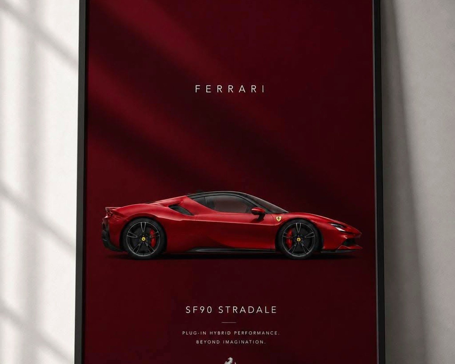
Home offices are probably the easiest. Ferrari art in an office reads as success, speed, Italian craftsmanship – all good associations. You can go bolder here than in other rooms. A large Ferrari LaFerrari or SF90 print behind your desk? Perfect.
Living rooms need more restraint usually. Unless your whole aesthetic is automotive, one statement piece is better than multiple. I did a huge Ferrari 458 Italia canvas (like 60×40) above a gray sectional and kept everything else minimal. It became the focal point without overwhelming the space.
Bedrooms are tricky. Ferrari art can work but it needs to be more subtle – maybe a black and white vintage racing scene or a minimalist line drawing. The bright red modern cars feel too energetic for a bedroom in my opinion.
Garages or man caves or whatever you wanna call them – go crazy. This is where you can do the full automotive theme. Multiple pieces, bright colors, racing memorabilia, the whole thing. I helped someone set up their garage with a huge Ferrari F1 car wrap-around mural and it looked like a showroom.
The Details That Elevate It
Lighting makes such a huge difference and people forget about it. If you’re investing in nice Ferrari wall art, put a picture light on it or use track lighting to highlight it. The way light hits a glossy Ferrari print or metal artwork completely changes how it looks.
I installed LED strip lighting behind a metal Ferrari print once and the glow effect was insane. Very modern, very dramatic.
Also think about what’s around the art. Ferrari wall art looks better when it’s not competing with clutter. Clean lines, minimal shelving, maybe a sleek console table underneath. The art should feel intentional, not just slapped up.
Mixing Ferrari with Other Automotive Art
You can absolutely mix Ferrari with other brands but there’s an art to it. Mixing Ferrari with Lamborghini or Porsche works if they’re all done in the same style – like all black and white photography or all minimalist line drawings. Don’t mix artistic styles or it looks chaotic.
Some people do a “dream garage” wall with their favorite cars from different brands and if it’s curated well, it works. I saw someone do vintage Ferrari, classic Porsche 911, and an Aston Martin DB5 all in matching sepia-toned prints and it was beautiful.
Budget-Friendly Options That Don’t Look Cheap
Not everyone wants to drop $500 on wall art and that’s totally fair. You can find decent Ferrari prints for $30-80 if you know where to look. Printable downloads from Etsy are cheap – like $5-10 – then you just gotta get them printed and framed locally.
Ikea actually has some decent affordable frames that work well with automotive art. Their ribba frames in black are like $15 and look way more expensive.
I’ve also done DIY canvas mounting where you buy the print separately and stretch it over a canvas frame yourself. It’s not that hard and saves money, though it takes time and you gotta be careful to keep it tight and even.
Wait I forgot to mention – there are Ferrari calendar prints that people sell after the year ends. They’re usually high-quality photography and you can get them super cheap since they’re “outdated” but the images are still gorgeous.
What to Avoid
Low-resolution images blown up too large look terrible. If you can see pixelation in the preview, it’s gonna look worse in person. Don’t do it.
Overly busy racing scenes with tons of cars and crowds and sponsors everywhere – they just look chaotic on a wall. Simple, focused compositions work better.
Anything that looks too much like an advertisement. There’s Ferrari art and then there’s basically a Ferrari dealership poster, and you want the former.
Also skip the super glossy prints unless you’re putting them somewhere without glare issues. I hung a glossy Ferrari print across from a window once and you literally couldn’t see it during the day because of reflection. Matte or satin finish is safer.
The whole thing is really about balancing your love for Ferraris with creating a space that feels sophisticated and intentional. You can totally have amazing automotive art without it feeling juvenile – it’s all in how you select and present it.
Oh and one more thing – if you’re renting, command strips make hanging canvas prints super easy without putting holes in walls. Just make sure you get the right weight rating because some of these pieces are heavier than you’d think.