Wall Art Guide, Wall Art Tutoriels
Coastal Wall Art: Beach Ocean Nautical Shore Decor
Aug
So I’ve been working with coastal wall art for like 7 years now and honestly it’s one of those things where people overthink it way too much. Let me just dump everything I know because I literally just finished staging a beach house in Malibu and my brain is still in ocean mode.
The Main Types You’ll Actually See
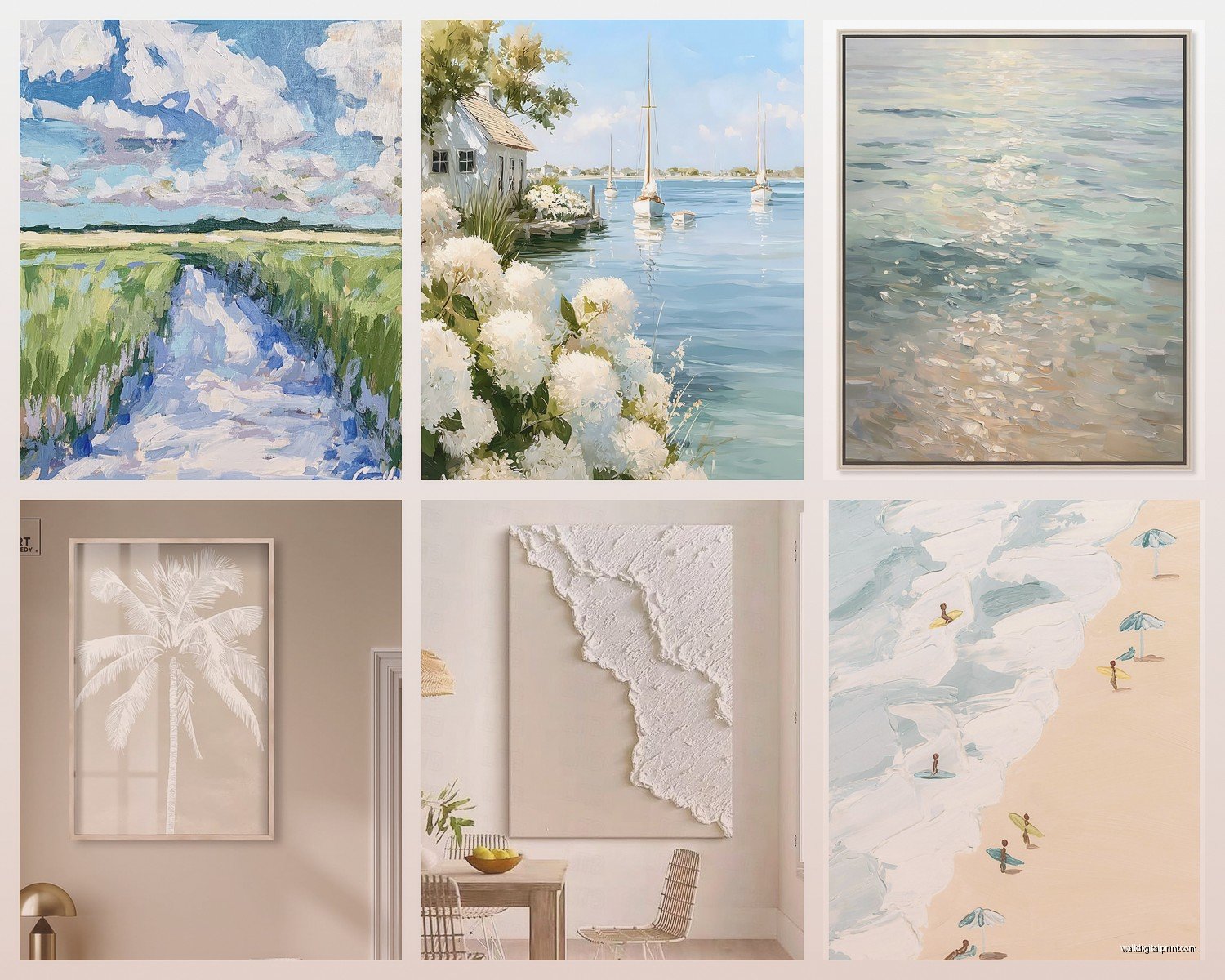
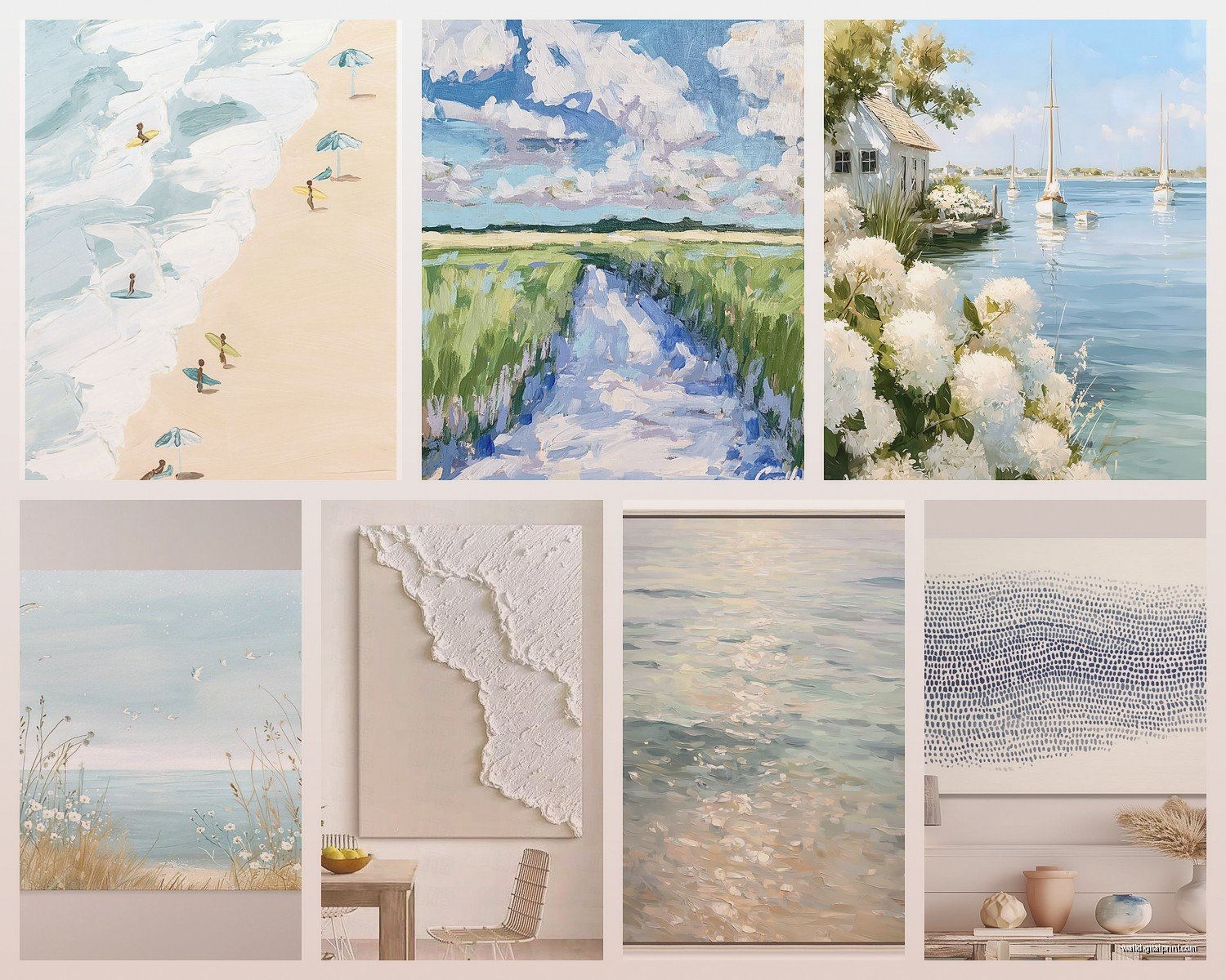
Okay so coastal art basically breaks down into a few categories and knowing this will save you from buying random stuff that doesn’t work together. You’ve got your classic photography prints – waves, beaches, piers, all that. Then there’s nautical stuff which is like anchors and rope and compasses. Abstract ocean art which is more about colors and movement. And then vintage maps and charts which honestly I love but they can read really stuffy if you’re not careful.
The photography route is probably the safest if you’re just starting. I usually tell people to look for large-scale prints because tiny ocean photos just look sad? Like you went to the beach once in 2015 and printed a 4×6. Go big or skip it entirely.
What Actually Works on Your Walls
Here’s what I’ve learned from actual installations and not just Pinterest boards. Horizontal pieces work better for coastal themes because the ocean is inherently horizontal. Sounds obvious but I see so many people buying tall skinny prints of beaches and it just feels wrong. The exception is if you’re doing a gallery wall then mix it up.
For colors you want to think about what’s already in your space. If you’ve got a lot of warm woods and beiges go for those sandy beach prints with warm golden tones. If your space is more modern with grays and whites then cooler toned ocean photography or abstract pieces work better. I made the mistake once of putting this gorgeous turquoise abstract piece in a client’s living room that had orange-toned hardwood and it looked like it was from a completely different house.
Size matters more than people think. For over a sofa you want something that’s at least two-thirds the width of the sofa. I usually go for 48-60 inches wide for a standard couch. Too small and it looks like you’re afraid of commitment.
The Frame Situation
Frames can make or break coastal art and this is where I see people mess up constantly. White frames are the safe choice and they work like 90% of the time. Natural wood frames in lighter tones – think oak or maple – give you that relaxed coastal vibe without being too beachy. Black frames can work but they need to be in a more modern coastal space otherwise it feels too formal.
I’m not gonna lie, I hate those distressed painted frames that are supposed to look weathered. They almost always look cheap unless you’re spending serious money. Just get a clean frame.
Oh and another thing – if you’re buying from places like Etsy or online print shops, most don’t come framed. Budget for framing because it’s gonna cost you. I usually send people to Frame It Easy or Framebridge for custom sizes. Michael’s works if you can find standard sizes but their quality is hit or miss.
Where to Actually Buy This Stuff
Okay so I’m gonna be real with you about where I source coastal art because some places are way overpriced for what you get.
Etsy is actually great for prints if you know what to search for. Look for “coastal photography print” or “ocean wall art printable” – the downloadable ones are cheapest but you gotta deal with printing yourself. I’ve used a shop called Coastal Wall Art Co and another one called Beach House Prints. Quality varies wildly though so read reviews.
Minted has really nice curated coastal art and their printing quality is solid. More expensive but you’re paying for better paper and printing. They also do framing which is convenient if you don’t wanna deal with it separately.
Society6 and Artfully Walls are good for more artistic interpretations. Less literal beach photos and more abstract ocean vibes. I got this amazing teal and navy abstract piece from Society6 that I use in staging all the time.
For vintage nautical charts and maps check eBay honestly. You can find actual vintage pieces for reasonable prices. Just make sure they specify the condition clearly. I found an original 1960s nautical chart of the California coast for like $40 and had it framed and it looks expensive.
West Elm and Serena & Lily if you’ve got budget. Their stuff is pricey but it’s curated well and you’re not gonna end up with something that looks cheap. Serena & Lily especially does that elevated coastal look really well.
Avoid HomeGoods and TJ Maxx for coastal art unless you have a really good eye. There’s SO much bad beachy art there – like the kind with “Beach Please” written in cursive over a sunset. Just no.
The Gallery Wall Approach
If you wanna do a gallery wall with coastal stuff here’s what actually works. Pick a color palette first – like maybe navy, white, and natural wood tones. Then get pieces in different sizes but keep them in that palette. Mix photography with maybe one abstract piece and possibly a small vintage element like a compass print or something.
I usually do an odd number of pieces – 5 or 7 works well. Layout on the floor first because rearranging on the wall sucks. Take a photo of your floor layout so you remember it when you’re hanging.
My cat knocked over my coffee while I was doing this last week and I had to restart the whole layout so maybe do it in a room you can close off lol.
For hanging I use these 3M Command picture hanging strips for anything under 8 pounds because I’m lazy and they work fine. Heavier stuff needs actual nails or screws obviously.
Styling Specific Rooms
Living room is where you can go bigger and bolder. This is your statement piece moment. One large horizontal ocean scene or abstract wave painting over the sofa. Or do the gallery wall thing I mentioned. Keep it as the focal point and don’t compete with it – so if you’ve got a bold coastal piece don’t also have crazy patterned throw pillows.
Bedroom should be calmer. I like soft beach scenes, maybe a misty morning ocean photo or gentle wave abstracts in muted colors. Nothing too dramatic because you’re trying to sleep in there. Over the bed or on the wall opposite the bed works best.
Bathroom is tricky because of humidity. If you’re doing real art in there make sure it’s sealed properly or behind glass. I usually suggest smaller nautical prints or vintage maps in simple frames. Nothing too precious because bathrooms are brutal on art.
Hallways are perfect for a series of smaller coastal prints all in matching frames. Like four 11×14 beach grass photos in white frames lined up. Creates a nice moment without overwhelming a narrow space.
The Colors That Actually Matter
Everyone thinks coastal means blue and white but that’s honestly limiting. The best coastal spaces I’ve designed pull from the actual beach palette which is wider than you think.
You’ve got sandy beiges, weathered grays, driftwood browns, sea glass greens, navy, soft corals, and yes blues ranging from pale aqua to deep ocean. The key is not using ALL of them. Pick like 3-4 colors max for your art selections.
Wait I forgot to mention – if your walls are already a color this changes everything. White walls can handle pretty much any coastal art. Gray walls look amazing with navy and white art. Beige walls need warmer coastal tones. I had a client with pale blue walls who wanted ocean art and we had to be really careful not to make it too matchy-matchy.
Common Mistakes I See All the Time
Okay so things to avoid because I’ve seen these go wrong repeatedly. Don’t buy art with words on it unless you’re decorating a beach rental. “Seas the Day” and “Life’s a Beach” stuff is just… it’s too much. Let the imagery speak for itself.
Don’t go too literal with nautical elements. Like you don’t need an anchor AND a rope AND a ship wheel. Pick one nautical motif if you’re going that route and keep it subtle.
Matching sets from the same collection can look really catalog-y. It’s better to curate pieces that work together but aren’t obviously from the same series. This is gonna sound weird but I actually prefer when things almost-but-not-quite match.
Hanging stuff too high is a universal problem not just with coastal art but I’m mentioning it anyway. The center of your art should be at eye level which is roughly 57-60 inches from the floor. So measure from the floor to where the center of the piece will be, not from the floor to where the nail goes.
The Texture Thing
This might be beyond what you’re asking but texture makes such a difference with coastal art. Flat prints behind glass are fine but if you can find pieces with actual texture – like canvas prints, or artwork with raised elements, or even woven pieces – it adds so much depth.
I’ve been using these rope-wrapped frames lately and they’re really cool for the right space. Also three-dimensional pieces like shadow boxes with sand and shells but you gotta be careful those don’t veer into craft-store territory.
Natural fiber art is having a moment and it works really well for coastal themes. Macrame isn’t just for plant hangers anymore. I’ve hung large-scale macrame pieces in beach houses and they read as elegant not hippie when done right.
Budget Real Talk
You can do coastal wall art on basically any budget but you gotta be strategic. If you’re working with like $100 total, get one really good large print and frame it nicely rather than buying three mediocre pieces. Quality over quantity always.
Printable downloads from Etsy are cheapest – usually $5-15 per print. Then you’re looking at printing costs which vary. I use a local print shop that does 24×36 for about $25 on nice paper. Framing is where it gets expensive – budget $50-150 per frame depending on size.
Mid-range you’re looking at $150-300 per piece for framed prints from places like Minted or West Elm. These are good quality and you’re not worrying about the printing process yourself.
High-end original art or limited edition prints start around $500 and honestly the sky’s the limit. I’ve spec’d pieces over $3000 for luxury projects but that’s obviously not necessary for most people.
Making It Feel Collected Not Decorated
The best coastal spaces look like you’ve collected art over time not like you went to HomeGoods on a Saturday and bought everything at once. So if you’re starting from scratch maybe don’t buy everything right away? Get one piece you really love, live with it, then add another when you find something that works with it.
Mix in some non-coastal elements too. Like maybe your coastal photography but then also a vintage portrait or a abstract piece that just happens to have ocean colors. It keeps things from feeling theme-y.
Oh and another thing – personal photos from your actual beach trips can work if they’re printed large and framed well. I had a client who took this amazing photo of their kids running into the ocean at sunset and we blew it up to 40×60 and it’s honestly the best piece in their house. Just make sure the photo quality is actually good enough to print that large.
I think that’s most of what I know? Obviously every space is different and you gotta trust your gut but these are like the baseline rules I work from. The main thing is don’t overthink it – coastal art should make your space feel relaxed and connected to the ocean, not like you’re trying too hard to prove you live near the beach.