Wall Art Guide, Wall Art Tutoriels
Contemporary Kitchen Wall Art: Current Modern Cooking Designs
Aug
So I’ve been completely obsessed with kitchen wall art lately because my own kitchen looked like a sad beige prison and honestly, the transformation is wild. Let me tell you what actually works because I’ve tested SO much of this stuff in client homes and my own space.
The Scale Thing Nobody Talks About
Okay first thing – everyone gets the size completely wrong. I had this client last month who bought these tiny 8×10 prints for her massive kitchen wall and it looked like she’d accidentally hung postage stamps. Here’s what I do now: measure your wall space, then think bigger than feels comfortable. For a standard wall above a breakfast nook or between cabinets, you want something that’s at least 24×36 inches, or a gallery wall that takes up about two-thirds of the available space.
I use my phone to mock it up now. Take a photo of your wall, then use painter’s tape to outline where the art would go. Sounds extra but I’ve saved myself from so many returns doing this.
What’s Actually Working Right Now
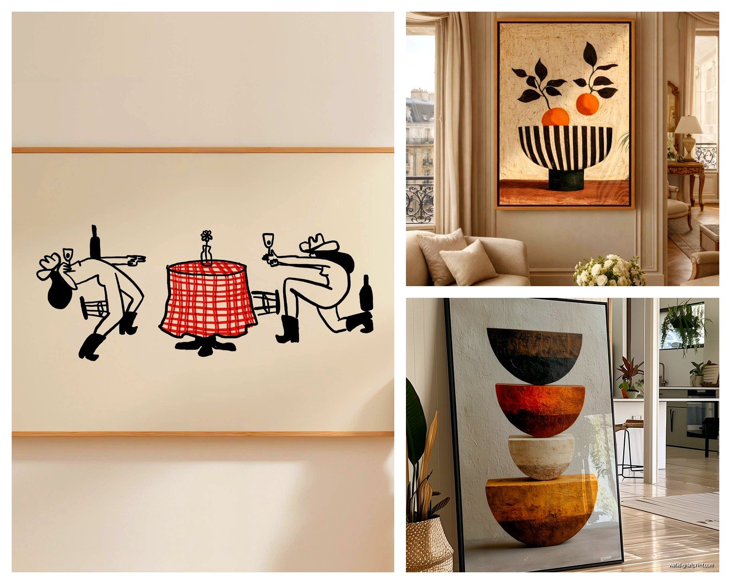
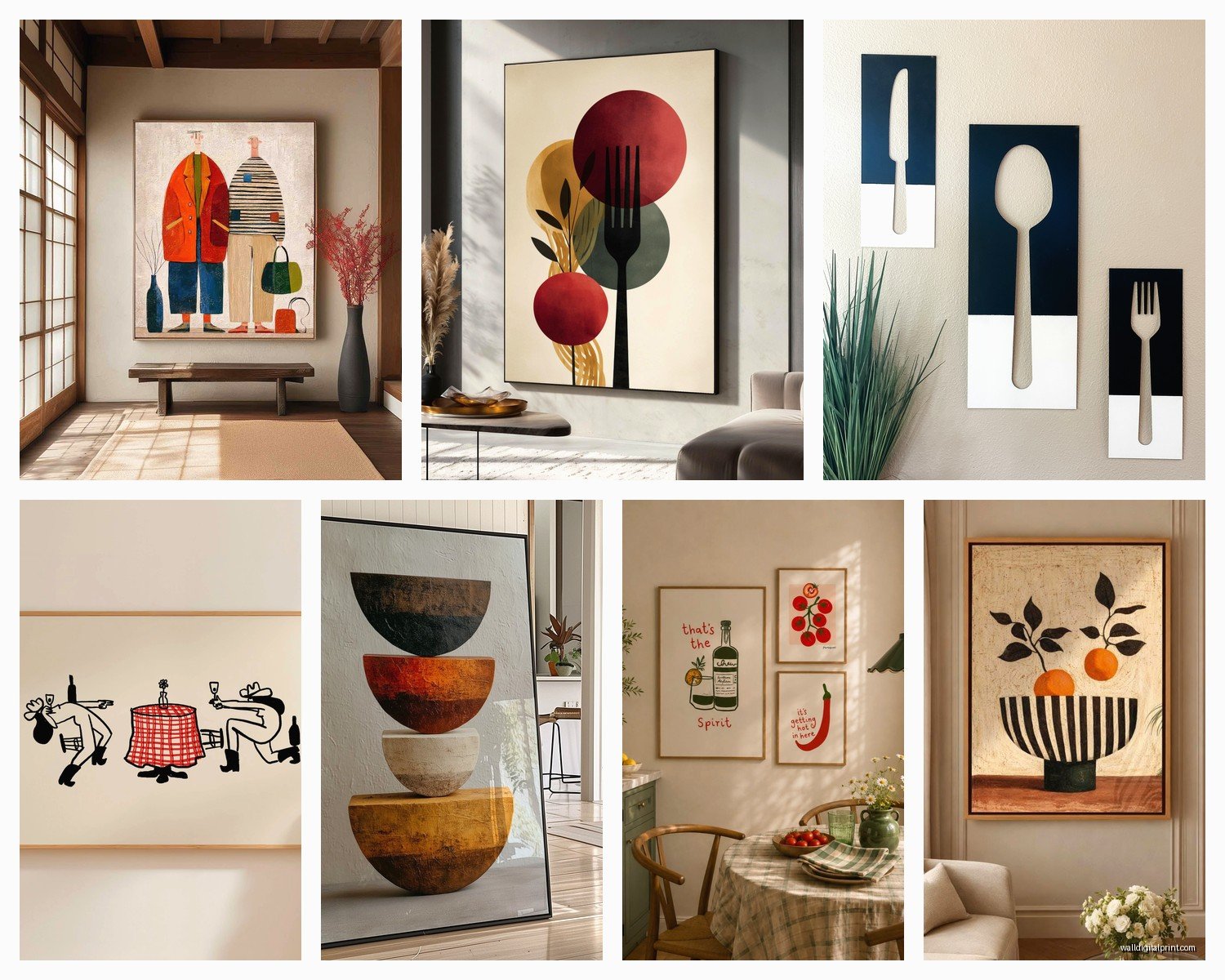
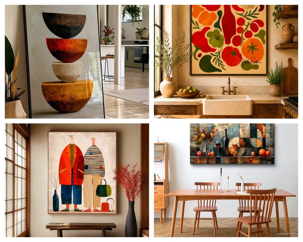
Abstract food art is having a moment but not the cheesy stuff with wine bottles and “EAT” in cursive. I’m talking about those organic shape prints in terracotta and sage – very California minimalist. I found this set on Etsy last week that’s basically blobs that vaguely suggest vegetables and my client was obsessed. The key is they read as sophisticated, not obvious.
Line drawings of kitchen tools are also everywhere. Single-line illustrations of whisks, coffee pots, that kind of thing. They work surprisingly well in modern kitchens because they’re simple enough not to compete with everything else going on. I was skeptical until I hung a set in my friend’s galley kitchen and even her husband who “doesn’t notice things” commented on them.
The Color Situation
This is where people panic but honestly it’s not that deep. Your kitchen already has a color story – your cabinets, your countertops, maybe a backsplash. The art should pull from those colors but not match exactly because that looks too planned.
If you’ve got white cabinets (which, same), you can basically do whatever. I’ve been loving warm neutrals lately – ochre, rust, clay colors. They make white kitchens feel less sterile without being too bold. Oh and another thing, if you have stainless steel appliances, cooler grays and blues actually complement that better than warm tones. I learned this the hard way when I put a burnt orange print in a kitchen full of chrome and it just felt… off.
For darker cabinets, you need contrast. Light-colored art or stuff with a lot of white space. I did a charcoal kitchen last year and we used black and white photography with really bright white mattes and it was *chef’s kiss*.
Where to Actually Find This Stuff
Okay so Etsy is obvious but you gotta know how to search. Don’t search “kitchen art” because you’ll get garbage. Try “modern food illustration,” “abstract botanical print,” or “minimalist cooking poster.” I have a whole folder of Etsy shops I go back to but my cat just walked across my keyboard so gimme a sec…
Society6 is hit or miss but when you find something good, you can get it printed on different sizes which is clutch. I use them for oversized prints because their quality is consistent. Just avoid anything that looks too digital or flat – you want some texture.
Minted is pricier but their art is actually curated so you’re not wading through thousands of options. Worth it when you’re overwhelmed. They also do custom framing which sounds expensive but sometimes the time savings is worth the money, especially if you’re doing multiple pieces.
Target and West Elm have surprisingly good options now? Like actually good. West Elm has these textured prints that look expensive and Target’s Threshold line has some abstract stuff that doesn’t scream “I cost $30.” I furnished a whole rental kitchen with Target art and nobody knew.
The Gallery Wall Approach
Gallery walls in kitchens stress people out but they’re actually more forgiving than single large pieces because you can adjust as you go. Here’s my cheat: start with three pieces, not seven. Three is enough to look intentional but not so many that you’re there for three hours with a level.
I do a triangle formation usually – one larger piece at eye level, then two smaller pieces flanking it either above or to the sides. Use the same frames or the same mat color to tie them together. Mixing frame styles in a kitchen specifically tends to look messy because kitchens already have so much visual noise with cabinets and appliances and stuff.
Wait I forgot to mention – don’t hang art directly above your stove unless you hate that art. Grease splatters are real and even with a good hood, things get gross. I’ve cleaned too many canvases that absorbed cooking oil. Keep art at least three feet away from active cooking zones.
DIY vs. Buying Finished
I’m gonna be honest, framing is annoying and expensive. If you find an unframed print you love, price out custom framing before you commit because sometimes it’s literally cheaper to buy the art already framed. Michael’s and Hobby Lobby have sales constantly though – I never pay full price for frames there, just wait for the 50% off coupon.
IKEA frames are fine for casual spaces. Their RIBBA frames are like $15 and they look clean and modern. I’ve used them in tons of client kitchens. The black ones especially just work.
For canvas prints, you don’t need frames at all which is nice. Just make sure the sides are finished or it looks cheap. Gallery-wrapped canvases where the image continues around the edges are way better than stapled backs showing.
Stuff That Looks Good But Doesn’t Work
Vintage food advertisements – everyone thinks they want these but they usually look dated unless your whole kitchen has a retro vibe going on. I had a client insist on vintage French cafe posters and we had to redo the whole thing three months later because she got sick of them.
Chalkboard art that’s like hand-lettered recipes or menus. So trendy five years ago, very tired now. Also they collect dust like crazy and you can’t really clean them properly.
Anything too literal. A giant photo of a tomato or whatever. It’s too on the nose and you’ll hate it in six months. The best kitchen art suggests food or cooking without being obvious about it.
The Practical Stuff Nobody Mentions
Glass fronts on frames show every fingerprint and if you have kids, just don’t. Matte acrylic or no glass at all if possible. Kitchen air gets humid and sometimes condensation builds up behind glass anyway which is annoying.
Hang things with proper hardware. I use picture hanging strips for lighter pieces because they’re renter-friendly and you don’t need to find studs. For anything over 5 pounds, use actual picture hangers with the nail that angles down. The adhesive strips have a weight limit and I’ve seen art crash down at 2am which is not fun.
Level apps on your phone work great but also just step back frequently while hanging. I’ve spent 20 minutes getting something perfectly level according to the app only to realize it looks crooked because my floor isn’t level. Sometimes you gotta go with what looks right visually.
My Current Favorites
I’m really into terrazzo-style prints right now – those speckled patterns in muted colors. They feel modern but not cold, and they hide imperfections on your walls if you have texture issues. There’s this artist on Etsy, can’t remember the shop name but she does terrazzo in custom colors and I’ve ordered from her like four times.
Botanical prints but make it herbs and vegetables. Detailed illustrations of basil, tomatoes, peppers – they’re kitchen-appropriate without being cheesy. I found a set of herb prints at Anthropologie that I almost bought for myself but they were like $200 for three so I found similar ones on Etsy for $45. Just gotta dig a little.
Oh and this is gonna sound weird but topographic maps of food-related places? Like Napa Valley or Tuscany or wherever. They’re subtle, they look sophisticated, and they give you a conversation starter. I did this in a wine-lover’s kitchen and it was perfect.
The Money Thing
You don’t need to spend a fortune. Seriously. I’ve done stunning kitchen art installations for under $100 total. Print your own from digital files if you’re crafty – there are tons of artists on Etsy who sell instant downloads for like $5-10, then you just get them printed at Staples or wherever for cheap.
Frame swaps make a huge difference too. I’ve taken mediocre art and put it in a really good frame and suddenly it looks expensive. Sometimes I hit up thrift stores for vintage frames, paint them all the same color, and boom – cohesive gallery wall for like $30.
Making It Work With Your Space
Open shelving kitchens need art that doesn’t compete with all the dishes and stuff on display. I go more minimal in these spaces – maybe one large simple piece instead of a busy gallery wall. The art becomes a visual rest point between all the other stimulation.
For galley kitchens, art on the narrow end wall makes the space feel wider. Don’t put it on the long walls because it emphasizes how narrow the space is. I learned this from a designer friend and it’s actually true.
If you have a breakfast nook or eat-in area, that’s prime art real estate. You can go bigger and bolder here because people are sitting and actually looking at the wall. I did a huge abstract piece above a banquette recently and it totally made the space.
The space above cabinets is tricky. If you have that awkward gap between your cabinets and ceiling, art can work but it needs to be tall and narrow or it looks lost up there. I usually lean large pieces against the wall up there rather than hanging them because it’s more casual and you don’t have to drill into weird spots.
Rotating Your Art
This might sound extra but I actually swap out kitchen art seasonally sometimes. Not in client homes usually but in my own space. Summer gets brighter, more citrus-y prints. Fall gets those warm terracotta tones. It’s an easy way to refresh without spending money – just rotate what you already have.
Command strips make this way easier if you’re into switching things up. They hold more weight than you’d think and you can remove them without wall damage. I keep my “off-season” prints in a portfolio case under my bed.
Okay so I think that covers most of what I’ve learned through trial and error. The main thing is just start with one piece you genuinely love and build from there. Don’t try to do the whole kitchen at once because your taste will probably evolve as you live with the first piece. And honestly? Sometimes the art you think you want looks completely different once it’s actually on your wall, so be prepared to return stuff and that’s totally fine.