
Wall Art Guide, Wall Art Tutoriels
Cow Print Wall Art: Black White Animal Pattern Farmhouse
Oct
So I’ve been obsessing over cow print lately and honestly it started because a client asked me to find something “farmhouse but not too country” and I fell down this whole rabbit hole. Let me tell you what actually works because I’ve tested like fifteen different pieces in various spaces.
Where to Actually Use Cow Print Without Looking Like a Themed Restaurant
Okay so first thing – cow print is weirdly versatile but you gotta be strategic. I put a large black and white cow print canvas in my own dining room last month and my sister was like “are you opening a steakhouse?” but then everyone else loved it, so there’s that learning curve.
Best spaces for cow print wall art:
- Entryways – makes a statement without overwhelming since people don’t linger there
- Home offices – adds personality but the pattern isn’t distracting when you’re on Zoom calls
- Dining rooms – works surprisingly well, especially if you have modern furniture to balance it
- Bedrooms – but only if you’re doing like one piece above the bed, not a whole gallery wall situation
- Mudrooms or laundry rooms – honestly perfect for these spaces
I wouldn’t put it in living rooms unless your whole aesthetic is already leaning farmhouse or you’re mixing it with really contemporary stuff. The contrast actually works better than you’d think.
Size Matters More Than You Think
This is where I see people mess up constantly. They buy these tiny 8×10 cow prints and wonder why it looks like wall decor from a craft store clearance section.
For a statement piece, you want at least 24×36 inches. I have a 30×40 in my office and it’s perfect – big enough to anchor the wall but not so massive that it’s all you see. My dog keeps barking at it though which is… anyway.
If you’re doing a gallery wall situation, mix sizes but keep one piece as the anchor – maybe 16×20 with some 8x10s around it. But honestly? I think cow print works better as a single bold piece rather than multiples. Too much and you’re definitely entering steakhouse territory.
Frame or Canvas or What
Okay so I’ve tried framed prints, canvas wraps, and even this weird metal print version. Here’s what actually works:
Canvas wraps are my go-to for cow print. The texture adds something and you don’t need to worry about framing costs. Look for gallery-wrapped edges (where the print continues around the sides) because it looks more expensive. I got one from this Etsy seller – wait I forgot to mention, Etsy is honestly where the good stuff is for this. Amazon has options but they’re hit or miss on quality.
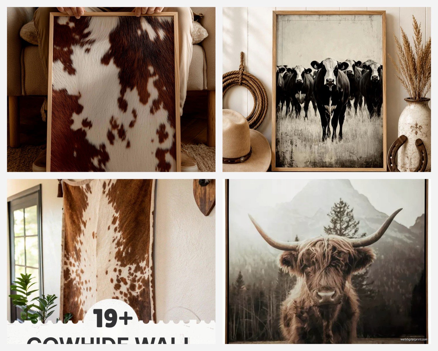
Framed prints work if you want a more refined look. Black frames are the obvious choice but I actually love them in natural wood frames – it softens the whole vibe. White frames can work too but they need the right space, like everything else has to be pretty minimal.
Metal prints – I tried this once and returned it. The cow print on metal felt too industrial and cold. Maybe it works in super modern spaces but I haven’t found the right application yet.
The Actual Pattern Variations You’ll See
Not all cow prints are created equal and this is gonna sound weird but some look way more authentic than others.
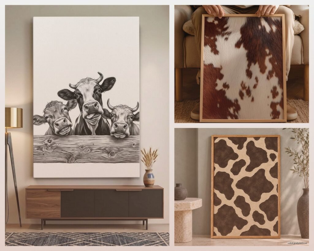
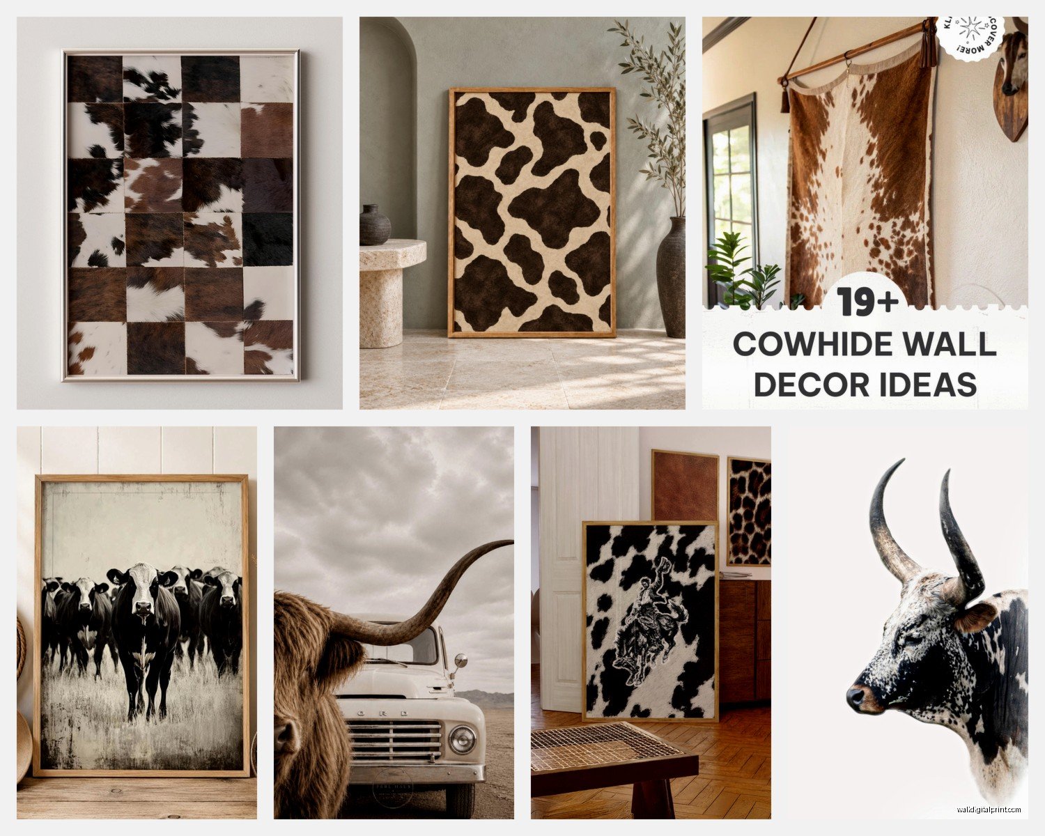
You’ve got your realistic photographic cow hide patterns – these are actual photos of cowhide. They look expensive and organic. The spots are irregular and natural-looking. This is what I use most often.
Then there’s the illustrated/graphic versions where someone has drawn or digitally created a cow pattern. These can be cute but often read more playful or kid-friendly. I used one in a nursery design and it was perfect there, but probably wouldn’t work in my own space.
Abstract interpretations where it’s like… inspired by cow print but artistic? Hit or miss. Saw one that was watercolor cow spots and it was actually beautiful, but I’ve also seen some that look like the designer just gave up halfway through.
What to Look for in Quality
My client canceled yesterday so I spent an hour comparing cow print options online and here’s what separates good from bad:
- Resolution – zoom in on the product photos, the edges of the black spots should be crisp not pixelated
- Color depth – pure black and white looks better than grayish black and cream
- Pattern variety – the spots should be different sizes and shapes, not repetitive
- Print method – giclee or archival prints last longer and don’t fade
Styling It So It Doesn’t Look Random
This is where I see the most disasters. Someone buys cow print because it’s trendy and just slaps it on a wall with no thought to what’s around it.
Color palette matters: Cow print is black and white obviously, so you need to echo those colors elsewhere. I have black window frames and white walls, so it ties in naturally. If your space is all beige and navy, the cow print is gonna stick out like… well, like a cow in your living room.
Add in some black accessories – candlesticks, picture frames, a throw pillow. Not cow print pillows though, that’s too much. Just solid black to create visual connections.
Texture layering: This is key. Cow print is already a strong visual element, so balance it with softer textures. I have a chunky knit throw on the chair near my cow print art, some linen curtains, a jute rug. It keeps the space from feeling too graphic or harsh.
Mix in natural elements: Wood tones, plants, woven baskets – these ground the cow print and make it feel intentional rather than themey. I’ve got this fiddle leaf fig next to mine and it somehow makes the whole thing work better.
What NOT to Pair It With
Learned these the hard way:
- Other bold patterns – no leopard print, no buffalo check, no nothing. Keep everything else solid or very subtle
- Too much farmhouse stuff – if you’ve already got the “gather” sign and the metal windmill and the galvanized buckets, skip the cow print
- Red accents – I know red barns and cows and all that, but red with cow print looks very literal and kinda cheap
- Multiple animal prints in the same room – one animal print per space, that’s the rule
Where I Actually Buy Mine
Okay so after trying a bunch of sources, here’s what I recommend:
Etsy: Best for unique pieces and you’re supporting actual artists. Search for “cow print canvas art” and filter by reviews. I’ve ordered from three different sellers and quality was good across the board. Shipping takes longer but it’s worth it. Prices range from like $30 for smaller prints to $150+ for large canvases.
Society6 or Redbubble: Good if you want options. Tons of artists upload cow print designs. Quality is consistent because it’s print-on-demand from the same facilities. I got a 24×36 from Society6 for around $85 with a sale.
Local print shops: If you find a high-res image you love (make sure it’s legal to use), you can have it printed locally. This is actually more affordable than you’d think – I paid $60 for a 30×40 canvas print at a local shop.
HomeGoods/TJ Maxx: Hit or miss but I’ve found some surprisingly good cow print art there. You gotta go regularly because inventory changes constantly. Usually $25-40 for decent sizes.
Skip Target and Walmart unless you’re desperate. The quality is pretty meh and for the same price you can get better stuff online.
DIY Options If You’re Into That
I’m not super crafty but I’ve done this and it turned out okay. You can buy actual cowhide fabric (not real hide, the printed fabric) and stretch it over a canvas frame. Got the fabric from Joann’s for like $12 a yard and a canvas frame for $15. Took maybe thirty minutes and looked custom.
Or there’s the contact paper method – buy black and white contact paper and cut out irregular organic shapes, layer them on a canvas. More time-intensive but completely customizable.
Honestly though? Unless you really enjoy DIY, just buy something. Your time is worth more than the $20 you’ll save.
The Lighting Thing Nobody Talks About
This is gonna sound weird but lighting changes everything with cow print. Under warm yellow light, it can look dingy. Under bright white light, it’s crisp and modern. I have a picture light above mine and it makes such a difference.
If your room has warm lighting, consider a cooler temperature bulb near the cow print art. Or embrace it and let it look softer and more vintage – both work depending on your vibe.
Mixing Cow Print with Different Style Aesthetics
So you’d think cow print only works with farmhouse style but I’ve successfully used it in like four different aesthetic directions.
Modern Farmhouse: Obviously this is the most natural fit. Pair with shiplap, sliding barn doors, industrial lighting. Keep it simple and let the cow print be the organic element among cleaner lines.
Scandinavian/Minimalist: This actually works really well. The black and white fits the Nordic color palette perfectly. Keep everything else super minimal – white walls, light wood, maybe one plant. The cow print becomes the focal point without fighting for attention.
Boho: Layer it with warm woods, macrame, plants, and neutral textiles. The cow print adds a grounding graphic element to all the organic textures. I did this in a client’s bedroom and she gets compliments constantly.
Contemporary: Pair with chrome accents, glass, concrete or marble surfaces. The contrast between the organic pattern and sleek materials is actually really striking. This is harder to pull off but when it works, it looks expensive.
Seasonal Switching
One thing I love about cow print – it’s not seasonal. Unlike some decor that feels very fall or very summer, cow print works year-round. I leave mine up constantly while I switch out other accessories.
That said, you can style around it seasonally. In fall I add some dried wheat stems and warm-toned pillows. In summer, I bring in white and green with fresh flowers and lighter fabrics. The cow print stays put and everything else rotates.
Common Mistakes I See All the Time
Hanging it too high – the center of your art should be at eye level, which is usually around 57-60 inches from the floor. I see so many cow prints mounted way too high like they’re floating to the ceiling.
Making it too matchy – don’t buy cow print art AND cow print pillows AND a cow print rug. Pick one application and keep everything else solid.
Wrong size for the wall – measure your wall space and leave breathing room. A 16×20 print on a huge empty wall looks lost. A 40×60 canvas in a tiny space feels overwhelming.
Ignoring the rest of your house – if literally every other room is coastal or glam or whatever, one random cow print room is gonna feel weird. There should be some thread connecting your spaces even if each room has its own vibe.
Real Talk About Trends
Yeah, cow print is trendy right now. It peaked maybe two years ago but it’s still going strong. The question is whether you actually like it or you’re just seeing it everywhere on Instagram.
I think cow print has more staying power than like… that weird triangle geometric phase or the arrow obsession. It’s a natural pattern that’s been around forever in fashion and interiors. If you love it, go for it. If you’re buying it because everyone else has it, maybe skip it.
The nice thing is cow print art is relatively affordable so if you get sick of it in two years, you’re not out hundreds of dollars. It’s not like you’re installing cow print tile backsplash or something permanent.
oh and another thing – if you’re renting, cow print art is perfect because it’s completely removable and makes a statement without any permanent changes. I recommend it to renters all the time who want personality but can’t paint or make structural changes.
Anyway that’s basically everything I’ve learned from working with cow print in probably twenty different spaces by now. Start with one piece, keep everything else simple, and don’t overthink it. It either works for your space or it doesn’t, and you’ll know pretty quickly once you get it on the wall.
