Wall Art Guide, Wall Art Tutoriels
Dining Table Wall Art: Eating Area Focal Point Placement
Oct
So I was literally just hanging this massive abstract piece above my friend’s dining table last week and realized I’ve been doing this wrong for YEARS. Like, all those pinterest-perfect dining rooms? There’s actual math involved and nobody tells you this stuff.
The Height Thing Everyone Gets Wrong
Okay so here’s what I learned the hard way – you want the center of your artwork to hit around 57-60 inches from the floor. But here’s where it gets tricky with dining tables because you’re not standing there looking at it most of the time, you’re sitting. So I actually started measuring from a seated eye level perspective and everything changed.
When you’re sitting at a standard dining chair (around 18 inches seat height), your eye level is roughly 40-44 inches off the ground. The art should feel like it’s floating just above the table but not so high that you’re craning your neck during dinner. I usually aim for the bottom of the frame to sit about 6-8 inches above any furniture below it. Sometimes I cheat and go up to 10 inches if the piece is really large or the ceiling is high.
My dog knocked over my measuring tape twice while I was figuring this out last Tuesday and I almost gave up but stick with me here.
Scale Is Literally Everything
This is gonna sound weird but I actually take photos of the wall on my phone first, then use this free app to mock up different sizes. Because buying a piece that’s too small is the most common mistake I see. The general rule is your art should be about 2/3 to 3/4 the width of your dining table.
So if you have a 60-inch table, you’re looking at art that’s roughly 40-45 inches wide. But honestly? I sometimes go bigger if the room can handle it. I just finished a project where we hung a 72-inch wide piece above a 60-inch round table and it looked incredible because the ceilings were 10 feet high.
Quick Size Reference
- Small table (36-48 inches): 24-36 inch artwork
- Medium table (48-72 inches): 32-48 inch artwork
- Large table (72+ inches): 48-60+ inch artwork
- Gallery wall option: total width should follow the 2/3 rule
Oh and another thing – if your dining table has leaves that you actually use, measure based on the expanded size. I learned that one when a client extended their table for Thanksgiving and suddenly the art looked ridiculous.
What Actually Works Above Dining Tables
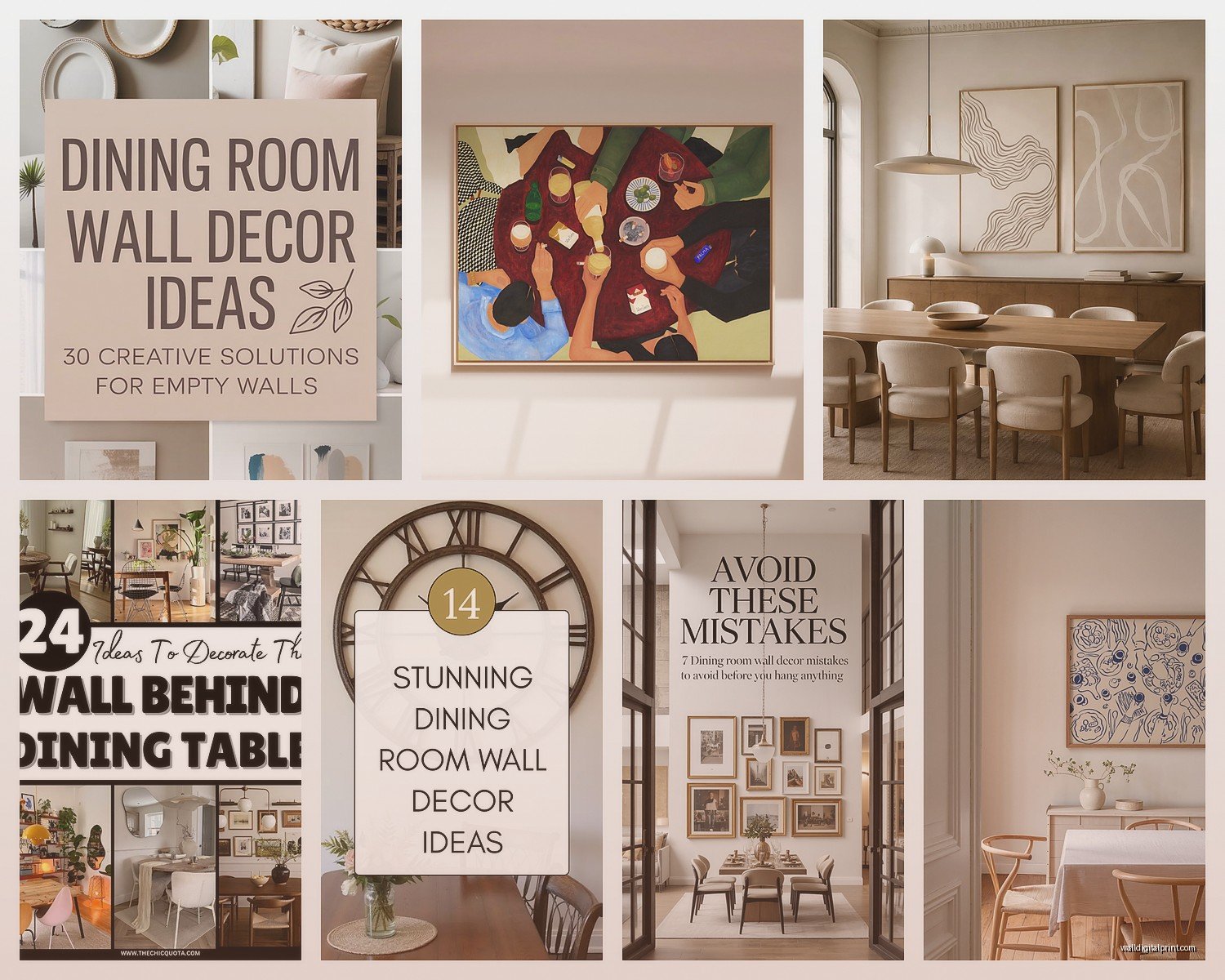
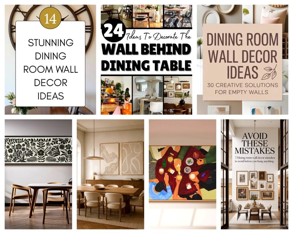
I’ve tested so many different styles and here’s what I’ve noticed. Abstract art is super forgiving because it doesn’t compete with table settings or food. Landscapes can work but they sometimes feel too… I dunno, vacation-y? Unless that’s your vibe.
Black and white photography is having a moment right now and it’s actually genius for dining areas because it won’t clash with your changing table decor. I hung this series of three black and white architectural prints above my own table and they literally go with everything from casual Tuesday pasta to fancy dinner parties.
Styles That Work Well
- Large-scale abstracts in 2-3 colors max
- Botanical prints (but oversized, not dainty)
- Black and white photography series
- Modern line drawings
- Textural pieces like woven fiber art
- Mirrors (wait I’ll explain this)
Okay so mirrors above dining tables is controversial but I’m obsessed with them lately. They bounce light around which is amazing for dinner ambiance, but you gotta make sure they’re not positioned where people see themselves eating because that’s just weird. Angle matters here.
The Gallery Wall Approach
If you’re not into one big statement piece, gallery walls can look amazing but they’re trickier to pull off. I literally spent three hours last month arranging and rearranging frames on my studio floor before hanging anything.
Start with the largest piece and position it first, then build around it. Keep the spacing consistent – I use 2-3 inches between frames usually. The outer perimeter should still follow that 2/3 width rule I mentioned earlier.
Pro tip that’s gonna save you: use painter’s tape to map out the arrangement on the wall first. Take a photo. Live with it for a day. I’ve avoided so many holes in the wall this way.
Gallery Wall Framework
- Odd numbers work better visually (3, 5, 7 pieces)
- Mix frame styles but keep a unifying element (all black frames, or all natural wood)
- Vary the sizes but make sure they’re proportional to each other
- Keep the overall shape rectangular or square, not too sprawling
Lighting Makes or Breaks This
Something nobody talks about enough – you need to light your dining art properly or it just disappears at night. I installed picture lights above my client’s artwork last week and the transformation was insane.
If you have a chandelier or pendant light above your table, make sure it’s not casting weird shadows on the art. Sometimes you gotta adjust the height or position. I use those battery-operated LED picture lights when I can’t hardwire anything – they’ve gotten really good and you can’t even tell they’re not permanent.
Wait I forgot to mention – if you’re hanging art on a wall with a window, consider how natural light hits it throughout the day. Direct sunlight will fade prints and paintings over time. UV-protective glass is worth it for anything valuable or meaningful.
The Actual Hanging Process
Okay so you’ve picked your piece, you know the height, now the scary part. I always use two hooks for anything over 20 pounds. Always. And I find the studs if possible because drywall anchors make me nervous for heavy pieces.
Here’s my process and I swear this works: measure the distance from the top of the frame to the hanging wire when it’s pulled taut. Subtract that number from your desired height. That’s where your hook goes. Mark it with a pencil, level it if you’re hanging multiple pieces, then commit.
I use a laser level now after years of the bubble level thing and honestly it’s a game changer. Cost like $25 and saves so much frustration.
Hanging Hardware Options
- Standard picture hangers: fine for lightweight pieces under 20 lbs
- Wall anchors: okay for medium weight if you can’t hit a stud
- Heavy-duty anchors: anything over 40 lbs needs these or studs
- French cleats: my favorite for large heavy pieces, super secure
- Picture rail systems: great if you change art frequently
Common Mistakes I See All The Time
Hanging art too high is the biggest one. People default to that 57-inch center rule without considering the furniture and it floats way up near the ceiling looking lost. In dining rooms specifically, you gotta think about the seated perspective.
Another thing – choosing art that’s too busy or chaotic. Your dining table already has visual interest with place settings, centerpieces, food. The wall art should complement not compete. I steered a client away from this super intricate maximalist piece they loved and toward something more minimal and they thank me every time I see them.
Oh and matching the art too literally to your decor. Like if you have a coastal dining room, you don’t need a beach painting. That’s too on the nose. Something abstract in blues and sandy neutrals would be way more sophisticated.
Shapes and Orientation
Horizontal pieces work best above rectangular tables – they echo the shape and feel balanced. But I’ve broken this rule plenty of times. Square or even vertical pieces can work above round tables actually.
I hung a tall vertical piece above a round table in a breakfast nook last month and it worked because the space itself was narrow. The vertical orientation drew your eye up and made the low ceiling feel higher. Sometimes the room dimensions matter more than the table shape.
This is gonna sound random but I was watching this show about Japanese design while measuring a dining room yesterday and it reminded me – negative space is your friend. You don’t need to fill every inch of wall. Sometimes a smaller piece with lots of breathing room around it is more impactful than going big just because you can.
Budget-Friendly Options That Don’t Look Cheap
You don’t need to drop thousands on dining room art. I’ve found amazing pieces at estate sales, vintage shops, even Etsy. Large-scale prints have gotten really affordable – you can get museum-quality reproductions for under $200 if you frame them yourself.
Speaking of framing, that’s where I invest more money. A cheap print in a nice frame looks expensive. An expensive print in a cheap frame looks… well, cheap. Custom framing is pricey but places like Frame Bridge or even Target’s framing service have stepped up their game.
Where I Actually Shop
- Etsy for downloadable prints you can print large format locally
- Society6 for affordable printed and framed options
- Local art fairs and open studio events
- Estate sales for vintage pieces and frames
- Minted for curated contemporary art
- Even HomeGoods sometimes has surprisingly good oversized art
Dealing with Difficult Walls
Textured walls are the worst for hanging art. I use those heavy-duty adhesive strips sometimes if the texture isn’t too crazy. They actually hold really well and you can remove them without damage if you follow the instructions exactly.
Rental situations are tricky but picture rail molding or those tension rod systems can work. I helped a friend create a whole gallery wall using a picture ledge shelf – basically floating shelves where you lean the art instead of hanging it. Super renter-friendly and you can switch things up easily.
Brick or concrete walls need masonry bits and anchors. Not gonna lie, I usually hire this part out because I don’t trust myself not to crack something expensive.
Seasonal Switching
I’m really into the idea of rotating art seasonally now. Got this idea from a museum curator I worked with on a project. You don’t need different pieces for every season, but having two sets you swap between keeps the space feeling fresh.
I keep my “winter” art more moody and dramatic – darker colors, more contrast. Summer pieces are lighter, brighter, more minimal. It’s like redecorating without actually redecorating and it only takes 20 minutes twice a year.
The key is storing the off-season art properly – wrapped in acid-free paper, lying flat if possible, in a climate-controlled space. My basement ruined a print once because of humidity and I’m still not over it.
Anyway that’s basically everything I’ve learned about dining table wall art through years of trial and error and some expensive mistakes. The main thing is don’t overthink it too much – you can always move it if it doesn’t feel right. I’ve rehabg the same piece four times in my own dining room before I was happy with it and that’s totally normal.