Wall Art Guide, Wall Art Tutoriels
Fish Wall Art: Aquatic Ocean & Lake Fishing Decor
Jun
So I’ve been totally deep in the fish wall art world lately because my sister’s boyfriend just bought this lake house and honestly the walls are SO blank it’s painful, and she keeps texting me at like midnight asking what to put up. And okay, fish art is actually way more complicated than you’d think? Like there’s the whole ocean vibe versus lake fishing versus tropical reef situation and they’re completely different aesthetics.
Ocean vs Lake vs Tropical – They’re Not Interchangeable
First thing – you gotta figure out which direction you’re going because mixing them looks weird. I learned this the hard way in a client’s beach condo where they had this gorgeous sailfish print next to a bass jumping out of murky water and it just… didn’t work. Ocean fish art tends to be more dramatic, bigger scale, lots of blues and teals. Lake fishing stuff is earthier – browns, greens, that whole cabin aesthetic with wood frames.
Tropical fish art is its own beast entirely. Super colorful, works great in modern spaces or kids’ rooms, but if you’re going for that sophisticated coastal look it’s gonna read too playful. I used some clownfish prints in a pediatric office once and they were perfect, but in a dining room? Nah.
Size Actually Matters More Than You Think
Okay so this is gonna sound obvious but I see people mess this up constantly. A tiny 8×10 fish print on a massive wall looks lost. You need something that takes up roughly two-thirds to three-quarters of the width of your furniture below it. So if you’ve got a 60-inch console table, you’re looking at 40-48 inches of art width minimum.
I usually go bigger than I think I need and it almost always looks better. My client last month was nervous about this huge marlin piece – like 48×36 – and kept saying “isn’t it too big?” but once we hung it above her sofa it was absolutely perfect. The scale made the whole room feel more intentional.
Or you can do a gallery wall situation which I’ll get to in a sec but honestly those are more work than one big statement piece.
Frame Choices Change Everything
White or light wood frames = coastal and airy
Dark wood or black frames = traditional fishing lodge
Metal frames = modern/industrial
No frame with wrapped canvas = casual contemporary
I’m personally obsessed with the natural wood frames right now for fish art because they bridge that gap between beachy and rustic. There’s this white oak frame style that’s been popping up everywhere and it works with both ocean and lake themes somehow.
Oh and another thing – if you’re doing multiple pieces, keep the frames consistent. I see people mixing frame styles thinking it looks eclectic but with fish art specifically it just looks like you couldn’t decide on a theme. Pick one frame style and stick with it across all your pieces in that room.
The Matte Situation
White mattes make everything look more expensive and gallery-like. I almost always recommend them for fish prints unless you’re going super rustic. The white space around the image gives your eye a place to rest and makes the colors pop more.
Cream or off-white mattes work better in warmer-toned rooms but honestly white is safer if you’re not sure.
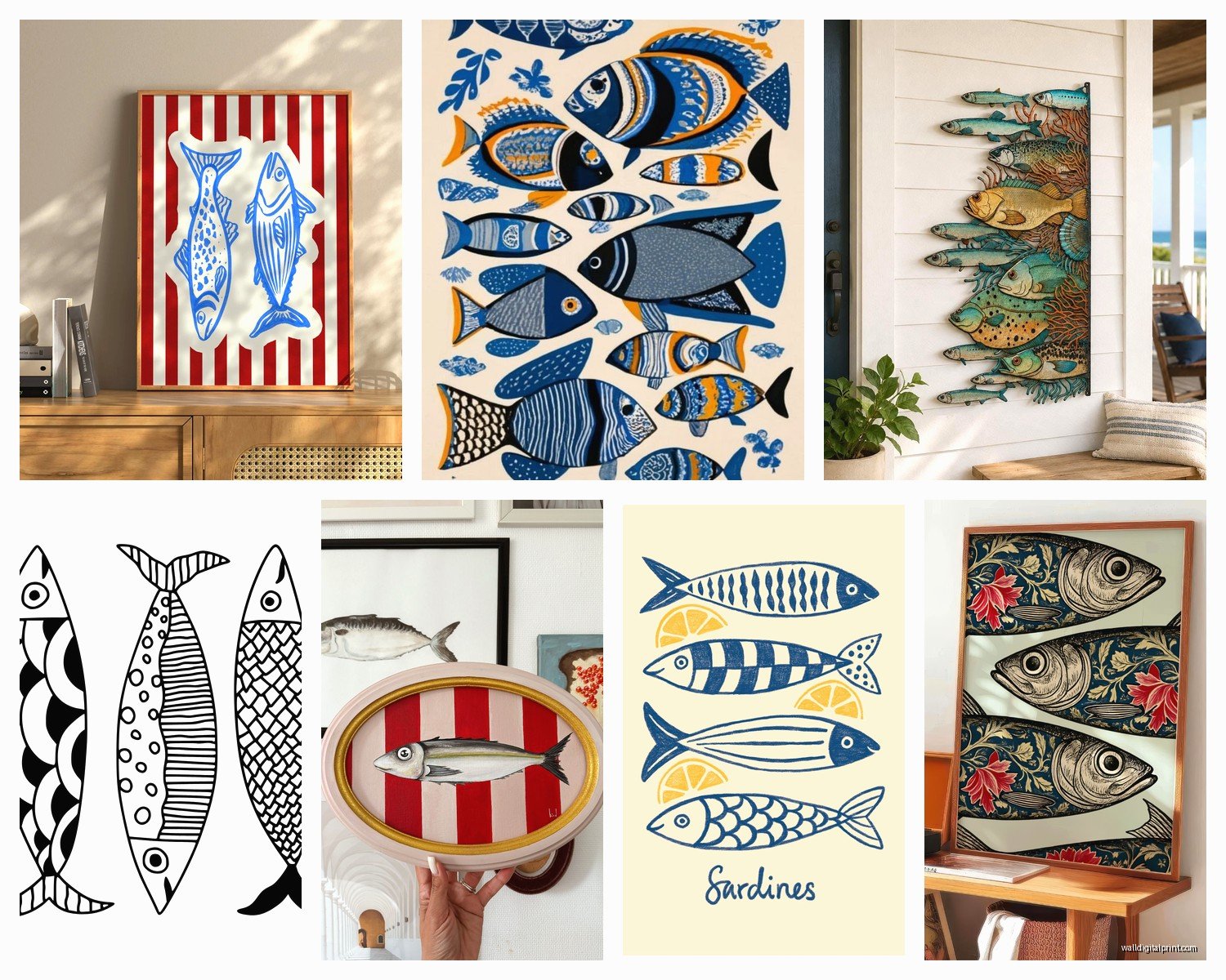
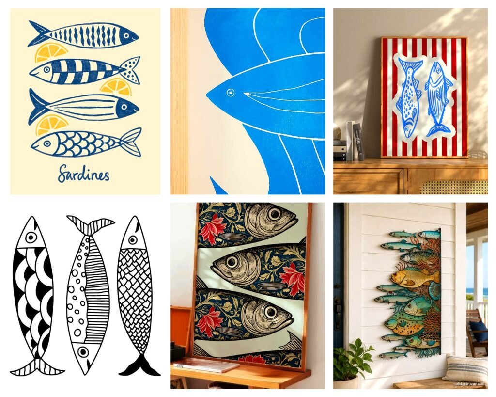
Actual Fish Species and What They Communicate
This is where it gets weirdly specific but also important? Different fish read differently.
Sailfish/Marlin: Dramatic, sporty, kind of masculine energy. Great for offices or game rooms. They’re always depicted mid-jump which adds movement.
Bass: Classic American lake fishing. Reads as traditional, outdoorsy, cabin-core. My dad has like six bass prints in his den and it totally works for that space.
Trout: More refined than bass somehow? Fly fishing association makes it feel more sophisticated. Works in dining rooms and libraries.
Tropical reef fish: Fun, colorful, vacation vibes. Kids’ rooms, bathrooms, casual spaces.
Koi: Technically pond fish but they’re having a moment. More Asian-inspired, works in zen/minimalist spaces.
Sharks: Edgy, modern, great for kids who are into ocean stuff. Can go either scientific/educational or more graphic and bold.
Jellyfish: Super trendy right now, more artistic than fishy if that makes sense. Works in contemporary spaces.
Wait I forgot to mention – vintage scientific fish illustrations are HUGE right now. Like those old-school naturalist drawings with the Latin names underneath. They work in literally any style home because they’re more about the art than the fish. I’ve been using them in traditional homes, modern apartments, everywhere.
Color Coordination Without Being Matchy-Matchy
You don’t need your fish art to exactly match your throw pillows but you should pull at least one color from your existing palette. If your room is all grays and whites, a super colorful tropical fish piece might feel jarring. Unless that’s intentional and you want it as a focal point, which can work.
I did this cool thing in a client’s bathroom where we pulled the exact teal from her shower curtain into a school of fish print and it tied everything together so nicely. But like, I spent an embarrassing amount of time holding paint chips up to fish prints online to match that color.
For neutral rooms, fish art in blues and greens adds color without committing to a whole new palette. It’s why ocean fish art is so popular – those blues work with everything.
Gallery Wall Configurations for Fish Art
Okay so if you’re doing multiple pieces, here’s what I’ve found actually works:
Grid layout: Same-size frames in a perfect grid. Super clean, modern. Works best with 4, 6, or 9 pieces. I usually do different fish species in similar styles – like all vintage illustrations or all photographs.
Horizontal row: Three or four pieces in a line. This is probably the easiest to pull off. Keep them the same height and space them evenly – I do about 2-3 inches between frames.
Salon style: Different sizes arranged organically. This is the hardest to get right. You gotta lay it out on the floor first and take a photo before committing. Start with your largest piece and build around it.
I did a salmon-focused gallery wall for a Seattle client (obviously) with like seven different prints ranging from 16×20 down to 5×7 and it took me THREE TRIES to get the arrangement right. Had holes all over that wall by the end but it looked amazing.
The Template Trick
Cut paper templates of your frames and tape them to the wall first. I know everyone says this but seriously do it. I got lazy once and just started hammering and ended up with this wonky arrangement that was impossible to fix without leaving a million holes.
Where to Actually Buy This Stuff
So my cat just knocked over my coffee which is perfect timing for a break in thought but anyway – where to shop.
Etsy: Best for vintage fishing prints and unique stuff. You can find actual vintage pieces or digital downloads you print yourself. The downloadable prints are usually way cheaper and you can get them custom-sized at a local print shop.
Society6 and Redbubble: Tons of artist-made designs, you can get them printed on canvas or framed. Quality is pretty consistent. I’ve ordered probably 20 pieces from Society6 for various projects.
HomeGoods/TJ Maxx: Hit or miss but when they have good fish art it’s super affordable. I found this amazing set of three bass prints for $30 total last year.
West Elm/Pottery Barn: If you want something that looks expensive and don’t wanna hunt. Their coastal collections usually include fish art. Pricey but good quality.
Local artists at coastal towns: If you’re near the ocean or a big fishing lake, local artists often have the most authentic stuff. It’s more expensive but you’re getting original work.
I’m personally obsessed with finding vintage pieces on eBay right now. You can get actual old fishing prints from the 70s and 80s that have this cool retro vibe.
Placement Beyond the Obvious
Everyone puts fish art in their living room or den but there are other spots that work really well:
Bathrooms: Especially powder rooms. Fish prints in a bathroom feel intentional and themed without being too precious. Just make sure the humidity won’t damage your print – go for canvas or get it professionally sealed.
Mudrooms: If you’ve got a lake house or coastal home, fishing art in the mudroom sets the tone immediately. Plus it’s practical – people expect that casual vibe in a mudroom.
Stairway walls: That long vertical space is perfect for a series of fish prints going up the stairs. I did this with trout species – each step featured a different type.
Home offices: Especially for Zoom backgrounds. A nice fish print behind you looks put-together without being too corporate.
Kid’s rooms: Obviously. But go for the more artistic or scientific prints rather than cartoonish unless they’re really young.
The Lighting Thing Nobody Talks About
Your fish art is gonna look completely different depending on lighting. Natural light shows true colors but can cause fading over time if it’s direct sunlight. I always recommend UV-protective glass if a piece is getting direct sun.
Warm artificial lighting makes blues look greenish sometimes. Cool-toned LEDs show fish art more accurately. I learned this when a client complained her teal marlin print looked “weird” and it was literally just her warm bulbs making it look muddy.
Picture lights are kinda extra but they do make fish art look gallery-quality. There are these battery-operated LED ones now that are pretty affordable and you don’t need an electrician.
Mixing Fish Art with Other Decor
You can totally mix fish prints with other coastal elements – shells, coral, driftwood – but don’t go overboard or it starts feeling theme-park-ish. I usually limit myself to two or three coastal elements per room max.
Fish art plus nautical stuff (anchors, ropes, ship wheels) can work but it’s a fine line. Keep it minimal. Like maybe fish art on the walls and one vintage oar as a decorative element, not a full maritime museum situation.
In lake houses, fish art mixes really well with plaid textiles, leather furniture, and antler stuff if that’s your vibe. That whole rustic lodge aesthetic.
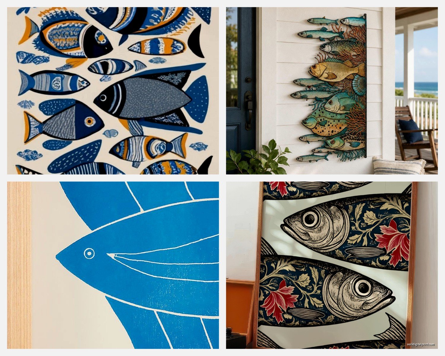
Canvas vs Framed Prints vs Metal Prints
Canvas wraps are the most casual and affordable. They’re lightweight, easy to hang, and you can find them everywhere. The downside is they can look cheap if the print quality isn’t great.
Framed prints under glass look more sophisticated and protect the art better. More expensive and heavier to hang but worth it for main living spaces.
Metal prints are having a moment – the image is infused onto aluminum. They’re super modern-looking, really vibrant colors, and practically indestructible. I used metal prints of tropical fish in a beach condo kitchen and they still look perfect three years later despite the humidity and cooking splatters.
There’s also wood prints where the image is printed directly on wood planks. Very rustic, works great for lake fishing themes.
The Scale Thing for Different Room Sizes
Small rooms need smaller pieces or they’ll overwhelm the space. Like in a powder room, I usually stick to 16×20 or smaller.
Large rooms with high ceilings can handle those massive oversized prints – I’m talking 40×60 or bigger. Don’t be timid in a big space or your art will disappear.
Average-sized bedrooms and living rooms work best with pieces in the 24×36 to 30×40 range.
And honestly if you’re unsure, there are apps now where you can upload a photo of your wall and superimpose art to see how it’ll look. I use one called WallApp sometimes when I’m shopping online.
Dealing with Different Wall Colors
White walls – anything works, you’ve got the most flexibility
Gray walls – cooler-toned fish art looks best, warm tones can clash
Beige/tan walls – warmer fish art or go with the vintage illustration route
Navy/dark walls – lighter fish prints with white mattes create good contrast
Wood paneling – embrace the cabin vibe with bass or trout in natural frames
I had this whole thing planned about seasonal rotation but honestly who actually does that except me when I’m procrastinating other work.
The main thing is just commit to a direction – ocean, lake, or tropical – pick your fish species, get the scale right, and don’t overthink the frame situation too much. Fish art is supposed to be fun and remind you of water and relaxation, not stress you out about design decisions.
Oh and one last thing – if you’re hanging anything heavy, use proper anchors. I’ve seen too many beautiful fish prints end up shattered on the floor because someone used those cheap plastic anchors that come in the package. Get the good wall anchors or find a stud.