Wall Art Guide, Wall Art Tutoriels
Floral Prints Wall Art: Flower Photography & Illustrations
Jul
So I’ve been obsessing over floral prints lately because my sister asked me to help with her bedroom makeover and honestly, I went down this massive rabbit hole of flower photography versus illustrations and now I have like… way too many opinions about this.
The Real Difference Between Photography and Illustrations
Okay so first thing – flower photography and floral illustrations are completely different vibes and I feel like nobody talks about this enough. Photography gives you that realistic, sometimes almost too-perfect look. You know those close-up shots of peonies where you can see every petal detail? That’s gonna read more modern, more boutique hotel than cozy cottage. Illustrations on the other hand – whether they’re watercolor, line drawings, or vintage botanical prints – they have this softer, more interpretive feel.
I tested this in my own dining room last month and the photography felt too formal for the space, but when I swapped it for these loose watercolor prints I found on Etsy, suddenly everything clicked. My dog knocked one off the wall during installation though so that was fun.
When to Choose Photography
Go with flower photography when you want:
- A contemporary or minimalist space
- Bold statement pieces that anchor a room
- Something that feels luxe without being fussy
- To complement modern furniture with clean lines
The best flower photography I’ve found has negative space – like a single stem against a white background or those overhead shots of blooms on a plain surface. Too much detail and it starts feeling cluttered on your wall.
Size Actually Matters More Than You Think
This is gonna sound weird but I’ve made the size mistake so many times. A tiny 8×10 floral print above a couch looks lost and sad. You need at least 24×36 inches for a statement piece, or you gotta do a gallery wall situation.
For photography specifically, I usually tell people to go bigger than they think. A massive 40×60 inch rose print can be absolutely stunning in a bedroom – I did this for a client last year and she was nervous about the scale but it completely transformed the space. With illustrations you have more flexibility because they tend to feel less heavy visually.
Gallery Wall Combinations That Actually Work
Okay so mixing photography and illustrations in a gallery wall… I’ve seen this go wrong so many times. Here’s what I’ve learned works:
Option 1: Stick to one style but vary the flower types and colors. Like all photography but different flowers – a rose, a tulip, some wildflowers. Keep the background treatment similar (all white backgrounds or all moody dark ones).
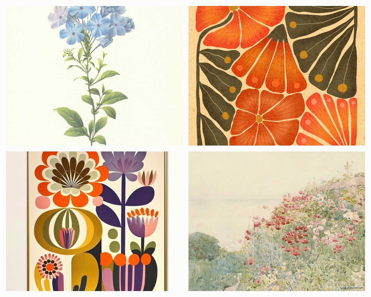
Option 2: Mix vintage botanical illustrations with modern line drawings. Both are illustrations but different eras. This creates interest without chaos.
Option 3: If you’re gonna mix photography and illustrations, make sure there’s a strong color story connecting them. I did this with all blush pink tones – some photos, some watercolors – and it worked because the color unified everything.
Color Considerations Nobody Warns You About
Real talk – those vibrant flower photos you see online? They’re gonna look different on your wall depending on your lighting. I learned this the hard way when I ordered these gorgeous bright red poppy prints and they looked almost orange in my client’s north-facing room.
For rooms with limited natural light, go for:
- Lighter colored blooms (whites, pale pinks, soft yellows)
- Prints with bright or white backgrounds
- Watercolor illustrations which tend to be more luminous
South-facing rooms with tons of light can handle deeper colors – those moody burgundy dahlias or navy backgrounds that are everywhere right now.
The Undertone Thing
Oh and another thing – watch your undertones. If your room has warm undertones (beige walls, wood furniture, brass fixtures), cool-toned floral prints with lots of purple and blue can look off. I usually match the undertone of the flowers to the room’s existing palette. Warm rooms get peachy roses, golden sunflowers, coral peonies. Cool rooms get lavender, white hydrangeas, blue thistles.
Where to Actually Buy This Stuff
So I’ve bought from like every source imaginable at this point. Here’s my honest breakdown:
Etsy: Best for unique illustrations and digital downloads you can print yourself. Way cheaper if you’re willing to handle the printing and framing. I probably get 60% of my illustration prints here. Search for “botanical print” or “vintage floral illustration” for the good stuff.
Society6 and Redbubble: Great for photography prints. Artists upload their flower photos and you can get them in tons of sizes. Quality is pretty consistent. My sister got this amazing cherry blossom photo from Society6 and it’s held up really well.
Local photographers: Check Instagram for photographers in your area who do flower photography. Often they’ll sell prints directly and the quality is usually superior to mass-market stuff. Plus you’re supporting local artists which feels good.
Vintage shops and estate sales: If you want authentic vintage botanical illustrations, this is where it’s at. I found a set of six 1960s pressed flower prints at an estate sale for like $30 total and they’re some of my favorite pieces.
Framing Strategies That Won’t Break the Bank
Okay so framing is where costs explode if you’re not careful. Custom framing a large print can run $200-400 easily. Here’s what I actually do:
Buy standard sizes. Seriously. An 18×24 or 24×36 print can go in a ready-made frame from Target, IKEA, or Amazon for $30-80. Custom sizes force you into custom framing.
For a cohesive look without spending a fortune, I bulk-buy the same frame style. IKEA’s RIBBA frames are my go-to for modern spaces – clean lines, come in black or white, super affordable. I literally have like fifteen of them scattered across various projects.
Mat or No Mat
Mats create breathing room and make smaller prints feel more substantial. A 16×20 photo in a 20×24 frame with a mat looks way more expensive than the same photo in a 16×20 frame with no mat. But for oversized prints, skip the mat – you want the full impact of the image.
wait I forgot to mention – if you’re doing botanical illustrations, especially vintage ones, a mat is basically mandatory. It gives them that collected, curated feel. Photography can go either way depending on the style.
Placement Tips From Real Projects
So placement is where I see people struggle most. You’ve got this beautiful floral print and then you just… stick it somewhere random and wonder why it doesn’t look like Pinterest.
Above the bed: This is prime real estate for a large-scale floral piece. Center it on the wall, not on the bed (if your bed is off-center). Hang it so the center of the print is about 57 inches from the floor – standard gallery height. Or go lower, like 6-8 inches above the headboard for a more intimate feel.
Living room: Over the sofa is obvious but make sure it’s the right scale. The print or gallery wall should take up about two-thirds to three-quarters of the sofa’s width. I measured this out after hanging a piece that was way too small and having to redo it.
Dining room: Floral prints work amazing here but go for something with personality. I love a good botanical illustration series – like different herbs or garden flowers. Makes the space feel thoughtful.
Bathroom: Honestly underutilized space for floral art. Small botanical prints in simple frames can make a boring bathroom feel spa-like. Just make sure they’re not directly in the shower spray zone because humidity is real.
Mixing Floral Prints With Other Art
You don’t have to commit to all florals all the time. I usually mix them with abstract pieces or landscapes. The key is balancing busy with simple.
If you have a detailed flower photograph, pair it with minimal abstract art – think simple brushstrokes or geometric shapes. If you’re doing delicate line-drawing florals, you can get away with more pattern elsewhere.
My own living room has two large flower photos and three abstract pieces in similar colors. The florals anchor each end of the wall and the abstracts fill the middle. It creates flow without being matchy-matchy.
Seasonal Swapping
This is gonna sound extra but I actually rotate some of my floral prints seasonally. Not everything, just a few key pieces. Spring gets tulips and cherry blossoms, summer is roses and wildflowers, fall brings in dahlias and dried botanicals, winter I swap in amaryllis or evergreen branches.
It keeps things feeling fresh without a major overhaul. I store the off-season prints in those under-bed storage bags. My client thought I was nuts when I suggested this but then she texted me six months later like “okay you were right, the seasonal thing is addictive.”
Digital Prints vs Original Art
Real quick – digital prints are totally fine. Most of what you’re buying online is a digital reproduction anyway. Original artwork obviously has more value but for decorating purposes? A high-quality print of a beautiful flower photograph looks just as good on your wall as an original, especially behind glass.
I only go for originals when it’s a smaller piece and the price is reasonable, or if it’s from an artist I really want to support. For large statement pieces, prints are the practical choice.
Common Mistakes I See All the Time
Hanging things too high. I cannot stress this enough. Art should be at eye level, not floating near the ceiling. The center of your print should be around 57-60 inches from the floor.
Choosing florals that don’t match the room’s personality. Super romantic, soft watercolor roses in a modern industrial loft? Probably not gonna work. Match the style of the floral art to your overall aesthetic.
Overcrowding. Just because you love flowers doesn’t mean every wall needs a floral print. Give your pieces room to breathe. I usually do one major floral moment per room, maybe two if it’s a large space.
Ignoring scale with furniture. A massive print above a small console table looks awkward. A tiny print above a king-size bed looks lost. The art should feel proportional to the furniture it’s near.
Trending Styles Right Now
Okay so if you want your space to feel current, here’s what’s having a moment:
Oversized single bloom photography – like one massive peony or rose that fills the entire frame. Very editorial, very chic.
Vintage botanical illustrations, especially the really detailed scientific drawings. People are framing these in simple black frames and they look incredible.
Pressed flower art – actual pressed flowers arranged and framed. More DIY vibes but really pretty for a bedroom or office.
Monochromatic floral photography – all the flowers are white, or all pink, or all black and white. Creates impact without color chaos.
Line drawing florals – minimal, modern, usually black on white. These work everywhere and don’t compete with other decor.
DIY Options If You’re Crafty
If you wanna save money or have something truly unique, you can create your own floral art. I’ve done this a few times when budgets were tight.
Press your own flowers and frame them. Get a flower press or use heavy books, wait a few weeks, arrange them on nice paper, frame under glass. Costs like $20 in materials.
Print digital downloads from Etsy. You can get high-res botanical illustrations for $5-10, take them to a print shop or use an online service like Printique, and frame them yourself. Total cost per piece is usually $30-50.
Take your own flower photos. If you have a decent camera or even a newer smartphone, you can photograph flowers at markets or gardens. Edit them to your liking and print them large. I did this with tulips from the farmers market and people always think they’re professional prints.
The thing about floral wall art is it’s super forgiving. Flowers are universally appealing so even if you’re not sure about your design skills, you’re probably gonna end up with something that looks good. Just pay attention to scale, color, and placement and you’ll be fine.