Wall Art Guide, Wall Art Tutoriels
Fox Wall Art: Woodland Clever Animal Forest Decor
Jul
So I’ve been obsessing over fox wall art lately because honestly, it started when a client asked me to do a woodland nursery and I fell down this rabbit hole of fox designs that I’m still not out of. Like, I probably have 47 browser tabs open right now with different fox prints.
Why Fox Art Actually Works (When Other Animal Prints Don’t)
Okay so here’s the thing about foxes that makes them different from like, generic deer or bear art. They’ve got this clever, almost mischievous vibe that reads as sophisticated instead of cutesy. I tested this theory in my own living room—put up a watercolor fox print next to where I had this generic woodland scene, and the fox one just had more… personality? My partner who usually doesn’t notice when I change stuff actually commented on it.
The color palette is the secret weapon though. Foxes give you those burnt oranges, deep rusts, cream, black accents. It’s warm without being aggressively fall-themed, which means you’re not gonna feel weird having it up in March.
The Main Styles You’ll Actually See
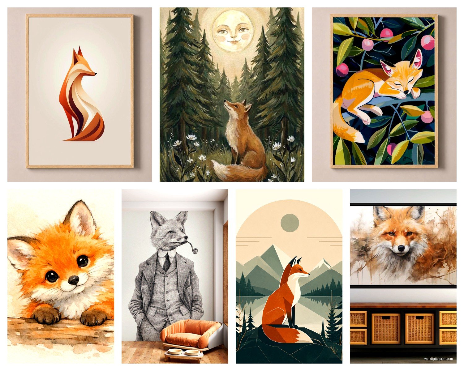
Geometric/Minimalist Fox Designs
These are the ones made of triangles and angular shapes. I’ve used them in like six different projects now because they work in modern spaces without looking cold. The best ones I’ve found are actually on Etsy from this shop that does custom colors—wait I forgot to mention, if you’re doing a specific color scheme, always check if the seller offers color customization because most digital print shops totally will and they don’t advertise it clearly.
The geometric ones look killer in black frames with white matting. Very clean. I put three different geometric fox faces in varying sizes in my friend’s home office and it created this whole focal wall situation without spending ridiculous money.
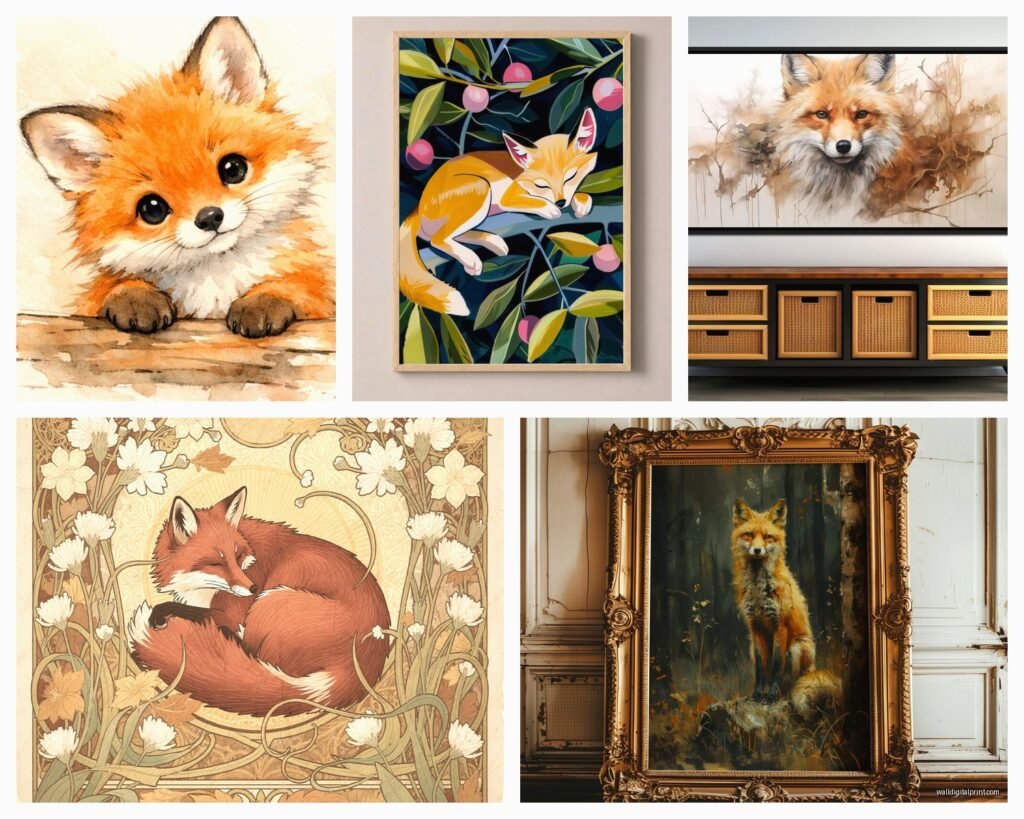
Watercolor Fox Art
This is gonna sound weird but watercolor fox prints are like… the safe choice that doesn’t look like you played it safe? They’ve got enough artistic merit that people think you have taste, but they’re not so abstract that your mom will ask what she’s looking at.
I’m personally obsessed with the ones that have color bleeds and splatters—looks way more expensive than it is. Found this print on Society6 that has a fox with autumn leaves kind of dissolving around it, and I’ve literally bought it three times for different spaces. Living room, guest bedroom, gave one to my sister.
Pro tip: watercolor prints NEED good paper quality or they look cheap. If you’re ordering online, look for descriptions that say “museum quality” or at least 200gsm paper weight. I learned this the hard way when I ordered something that arrived looking like it was printed at a FedEx.
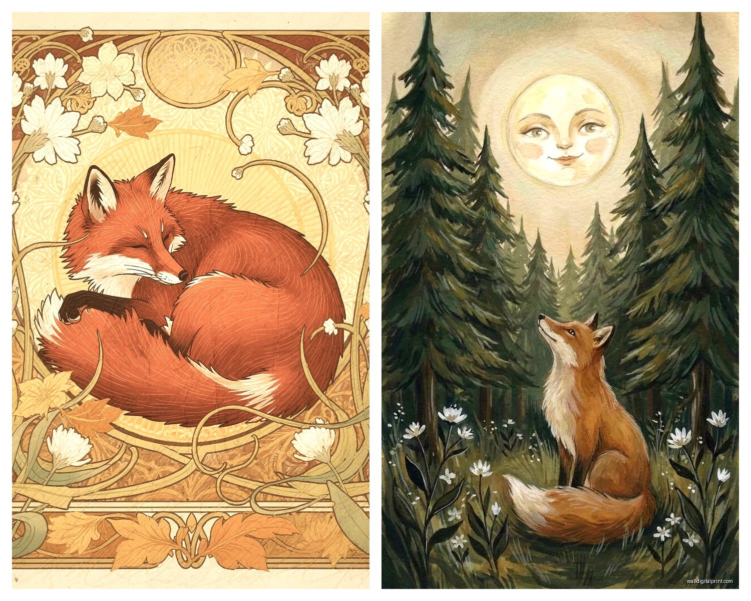
Vintage/Naturalist Fox Illustrations
These are the old-school scientific drawing style ones. Very British countryside energy. They work shockingly well in modern farmhouse spaces or if you’re going for that collected-over-time gallery wall look.
I mixed a vintage fox illustration with some botanical prints and old maps in my dining room and everyone asks where I got them. The fox one was literally $12 as a digital download that I got printed at a local print shop for another $15. Framing was the expensive part honestly.
Photography of Actual Foxes
Real talk—these can go either Disney cute or actually striking, there’s no middle ground. The good ones are usually close-up portraits with shallow depth of field, or foxes in snow which gives you that nice contrast.
My cat knocked over a plant while I was writing this section, there’s dirt everywhere, gonna deal with that later…
Anyway, the wildlife photography route works best in spaces where you want that National Geographic sophisticated vibe. I used a large-scale fox-in-snow photograph in a client’s reading nook and it became the whole room’s vibe. But you gotta go big with these—at least 24×36 inches or it just looks like a calendar page.
Sizing This Stuff (Because Everyone Gets This Wrong)
Okay so funny story, I used to just eyeball art sizing and wonder why things looked off. Then I actually learned the rules and now I’m annoying about it.
For above a sofa or bed: your art should be roughly two-thirds to three-quarters the width of your furniture. So if your couch is 90 inches wide, you want art that’s around 60-67 inches wide total. This can be one large piece or a gallery wall grouping.
Single fox print as a statement piece: go bigger than you think. Like, uncomfortably big when you’re holding it. I promise it’ll look right on the wall. I see people buy 11×14 prints for massive walls and then text me asking why it looks weird.
Gallery wall with multiple fox prints: the overall grouping should follow that two-thirds rule, but individual pieces can be mixed sizes. I usually do one larger focal piece (maybe 20×24) with smaller ones (8×10, 11×14) clustered around it.
Actually Hanging This Stuff Without Losing Your Mind
Command strips are your friend for anything under 5 pounds and if you’re renting. I use them constantly and yeah, sometimes they fail spectacularly, but mostly they’re fine. Just follow the weight limits and actually wait the full hour before hanging.
For heavier pieces or if you own your place: learn to use a drill, it takes 10 minutes and there are literally thousands of YouTube videos. I resisted this for years and used so many command strips unnecessarily.
The 57-inch rule: center of your artwork should be 57 inches from the floor. This is average eye level and it’s what galleries use. I measure up 57 inches and make a tiny pencil mark where the center of my frame will be, then measure up from there to where the hanger needs to go.
Gallery Wall Layout Trick
Trace all your frames on paper (or use the paper that sometimes comes in the frame). Tape them to the wall with painter’s tape in different arrangements until you find one you like. Take a picture of it. Then nail through the paper where the hangers go. Remove paper, hang art. This is the only method that actually works without you losing your mind and making 47 holes in the wall.
Color Coordination Without Overthinking It
Fox art naturally gives you orange/rust/cream/black to work with. Here’s what I’ve learned actually placing these in real rooms:
With neutral walls (white, beige, gray): literally any fox art works. You can’t mess this up. The fox becomes your color moment.
With dark walls (navy, forest green, charcoal): go for fox prints with white or cream backgrounds, or use a wide white mat. Otherwise it gets lost. I made this mistake in my own bedroom with a dark print on a dark teal wall and you literally couldn’t see it unless the light was perfect.
With colored walls: pull one of the fox’s colors into your wall choice. Like, if your fox art has prominent rust orange, a warm terracotta or deep cream wall makes it sing.
I’m watching this show about interior design scandals while writing this and it’s wild how much money people spend on bad decisions…
Where to Actually Buy This Stuff
Etsy: best for digital downloads and custom work. You can find fox art in literally any style. Read reviews though because quality varies wildly. I look for shops with hundreds of sales and recent reviews.
Society6: good for contemporary art prints, they handle printing and framing which is convenient. Prices are medium-range. I’ve ordered probably 20 things from them and quality is consistent.
Minted: more expensive but really good quality. They have fox art by actual artists. Their framing options are excellent if you don’t wanna deal with finding frames yourself.
Local print shops for digital downloads: this is my secret weapon. Buy a digital file for like $5-15, take it to a local printer, get it done on good paper for $15-30 depending on size. Way cheaper than buying pre-printed.
HomeGoods/TJ Maxx: sometimes you find amazing fox art here for nothing. It’s random but I’ve scored some really good pieces. You gotta go regularly though because it’s luck-based.
Target’s threshold line: occasionally has woodland stuff including fox art. Very affordable, decent quality for the price. Good for kids’ rooms or if you’re not sure about the commitment.
Styling Around Your Fox Art
Okay so you’ve got your fox print, now what. I’m gonna tell you what actually works instead of what design blogs say should work theoretically.
Lean into the woodland theme but keep it subtle: add some natural wood elements, maybe a plant or two, some neutral textiles. You don’t need to go full forest cabin unless that’s your thing.
Mix it with other art: fox prints work great in gallery walls with landscapes, botanical prints, abstract art. Don’t make it a whole fox situation unless it’s a kid’s room.
Balance the warmth: fox colors are warm, so add some cooler elements—gray throw pillows, black frames, white space—or it gets too autumn-catalog.
I tested this in my studio space: fox print + eucalyptus in a simple vase + gray wool throw over my chair + black desk accessories. It’s cohesive without being themed to death.
Lighting Matters More Than You Think
If your fox art is behind glass, watch out for glare. I’ve repositioned art so many times because of lighting issues. Either angle it slightly or use non-glare glass, which is pricier but worth it for statement pieces.
Also, if you have warm-toned art like fox prints, warm white bulbs (2700-3000K) make the colors look richer. Cool white bulbs make them look kinda flat and sad.
For Kids’ Rooms vs Adult Spaces
The approach is totally different and I wish someone had told me this earlier.
Kids’ rooms: you can go full cute, multiple fox characters, bright colors, mix in some text art with woodland quotes. It’s expected and looks intentional. I did a whole fox-themed nursery with like eight different fox prints in various styles and it was adorable without being sickly sweet because I kept the color palette consistent—just rust, cream, sage green, and charcoal.
Adult spaces: one statement fox piece or a subtle inclusion in a gallery wall. Keep it sophisticated—geometric, watercolor, or photographic rather than illustrated characters. The fox should feel like an artistic choice, not a theme.
I broke this rule once and put too many fox things in a living room and it looked like I was *really* into foxes as a personality trait, which… I mean I kinda am now but you don’t want it to read that way.
Common Mistakes I See Constantly
Hanging art too high—seriously, people do this all the time. Remember that 57-inch center point.
Buying art that’s too small for the space. Go bigger.
Not considering the frame—a $10 print in a $5 cheap frame looks like a $5 piece of art. A $10 print in a $30 good frame looks like a $100 piece of art.
Matching everything too perfectly. Your fox art doesn’t need to exactly match your throw pillows. Coordinating is better than matching.
Getting stuck on “authentic” themes—like you don’t need to live in a cabin to have fox art. It works in modern apartments, traditional homes, whatever.
The Framing Situation
This is where your budget can go either way. Custom framing is insanely expensive—like $200+ for a single frame. But it looks amazing and lasts forever.
Cheaper route: buy ready-made frames from Target, Ikea, or Amazon. The Ikea Ribba frames are honestly great for the price and come in tons of sizes. If your print is a standard size (8×10, 11×14, 16×20), ready-made frames work fine.
Medium route: places like Michael’s do custom framing but watch for their 50-60% off sales which happen constantly. I literally never pay full price there.
For a cohesive gallery wall, I usually stick to one frame style—either all black, all wood, or all white. Mixing frame colors can work but it’s harder to pull off and honestly I don’t bother unless I’m going for an eclectic collected look.
Mat or no mat: mats make everything look more expensive and gallery-like. Standard is a 2-3 inch mat border. White and cream are most versatile. Black mats look dramatic with the right art.
Okay I think that’s everything I’ve learned from probably too much time thinking about fox wall art. It’s midnight and I’m gonna stop here before I start rambling about fox symbolism in different cultures or something.