Wall Art Guide, Wall Art Tutoriels
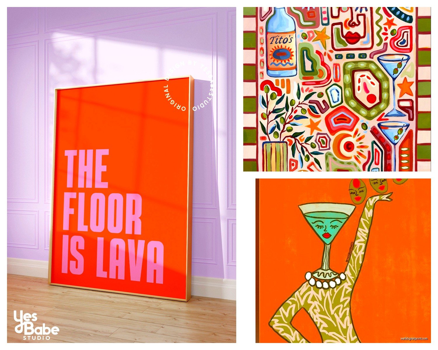
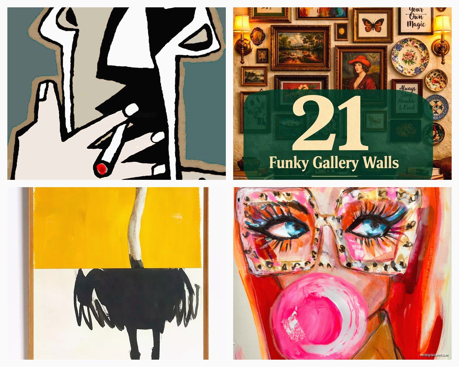
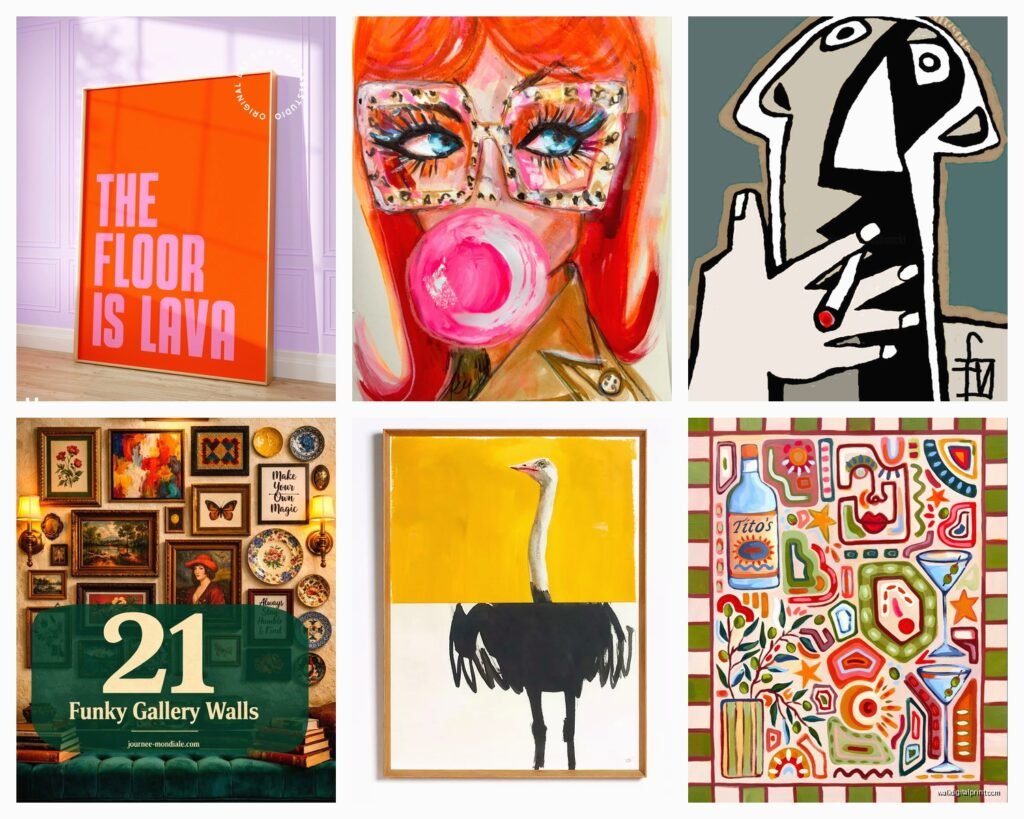
Funky Wall Art: Bold Quirky Eclectic Fun Designs
Oct
So I’ve been completely obsessed with funky wall art lately and honestly it started because I walked into this client’s apartment and their walls were just… beige nothing. Made me realize how much personality you can inject into a space with the right pieces, and not in that boring “live laugh love” way everyone’s tired of.
Where to Actually Start Without Losing Your Mind
Okay so the biggest mistake I see is people buying one weird piece and then freaking out because it looks random. Here’s the thing – funky wall art works best when you commit to a vibe but keep it slightly chaotic. I usually tell people to pick a “weird factor” and stick with it. Like maybe you’re into:
- Bold geometric shapes with clashing colors
- Vintage-inspired quirky illustrations (think 70s mushrooms, retro space stuff)
- Abstract faces and figures that look a bit wonky
- Maximalist collage-style pieces
- Neon or high-contrast pop art vibes
I spent like three hours last Tuesday (my afternoon meeting got rescheduled) just scrolling through Etsy and Society6 comparing different styles, and what I noticed is that the best eclectic walls have maybe 60% of pieces sharing ONE element. Could be color, could be style era, could be subject matter. The other 40% is whatever makes you happy.
The Gallery Wall Approach That Actually Works
Gallery walls get a bad rep because people make them too matchy. For funky art, you wanna embrace the chaos but with intention, if that makes sense?
Start with your largest piece – this should be your weirdest or boldest. I’m talking the one that made you go “is this too much?” when you saw it. That’s your anchor. Then build around it with smaller pieces that either complement or deliberately contrast.
My favorite trick is mixing frame styles. Black frames, natural wood, white, even no frame on some pieces. Just lay everything on the floor first and take a photo from above. Move stuff around until it feels balanced but not boring. You’re looking for what I call “organized mess” energy.
Oh and another thing – don’t hang everything at the same level. Vary the heights, let some pieces sit lower, some higher. Real eclectic energy comes from breaking those perfect alignment rules.
Colors That Make Funky Art Pop
This is gonna sound weird but I actually keep a note in my phone of color combos that work for bold art. Here’s what I’ve learned works:
Jewel tones with neutrals: Deep emerald, sapphire blue, or ruby red against cream or gray walls. The contrast makes the funky pieces feel intentional instead of chaotic.
Mustard yellow with literally anything: I don’t know why but mustard yellow in art pieces just works. Pairs it with dusty pink, with navy, with black and white. My cat knocked over a mustard-colored piece I was staging last month and I nearly cried.
Terracotta and sage: If you want funky but slightly earthy. Good for abstract shapes and botanical-adjacent weird art.
Hot pink and orange: For when you’re feeling brave. This combo screams fun and works amazing in spaces that get good natural light.
The key is picking art that has 2-3 of your chosen colors but in different proportions. One piece might be mostly pink with orange accents, another mostly orange with pink details. Creates cohesion without being matchy-matchy.
Where I Actually Buy This Stuff
Real talk – I’ve wasted money on pieces that looked cool online but arrived looking cheap or the colors were way off. Here’s where I shop now:
Society6: Great for prints from independent artists. I love that you can get the same design in different sizes. Their framing options are decent too. Pro tip: wait for their sales, they happen constantly.
Etsy: Obviously. But be picky about sellers. I look for shops with lots of reviews and photos from actual buyers. Search terms like “maximalist print,” “quirky illustration,” “bold abstract art,” “eclectic poster.”
Local art fairs and markets: This is where you find truly one-of-a-kind pieces. Yeah it’s more expensive usually, but you’re not gonna see the same print in every other apartment.
Thrift stores for frames: Buy the art online, get unique frames secondhand. I found this amazing ornate gold frame at Goodwill for $8 and put a super modern abstract face print in it. The contrast is *chef’s kiss*.
Minted: When clients want something funky but still polished. Their limited edition prints feel special and the quality is consistently good.
Mixing Different Art Styles Without It Looking Like a Mess
Okay so this is where people get nervous. You’ve got a vintage travel poster, an abstract blob painting, a quirky line drawing of a face, and a geometric print. How do you make them work together?
The answer is repetition of elements. Even if the styles are different, repeat certain things:
- Color palette (even just one shared color helps)
- Frame style or color
- Similar subject matter undertones (all have organic shapes, all have hard edges, all feature faces, etc.)
- Consistent era vibes even if the actual style differs
I worked with this couple last year who wanted their bedroom to feel playful, and we mixed 60s-inspired psychedelic prints with modern line art and some abstract watercolors. Sounds chaotic right? But we kept everything in warm tones – oranges, pinks, yellows, creams – and used thin black frames throughout. Looked intentionally eclectic instead of “we just bought random stuff.”
Size and Scale Matters More Than You Think
Don’t buy all medium-sized pieces. You need variety. I usually go for:
- One large statement piece (24×36 or bigger)
- A few medium pieces (16×20 or thereabouts)
- Several small pieces (8×10 down to 5×7)
The small pieces are actually crucial because they fill gaps and add density to your gallery situation. Plus they’re cheaper so you can experiment more.
Also consider shapes. Not everything needs to be rectangular. I love throwing in a round piece or an unusual shape to break up the predictability. Saw this amazing hexagon-shaped abstract piece last week that I’m still thinking about.
DIY Options If You’re On a Budget
Look, original art is expensive and even prints add up. Here’s what I do when I’m staging on a tight budget:
Print your own: Download art from sites that offer free prints (many artists have free sections), take the file to a print shop. Way cheaper than buying the finished product. Just make sure the resolution is high enough – you want at least 300 DPI.
Paint abstract stuff yourself: I’m serious. Get some acrylic paint, a canvas, and just make bold shapes and color blocks. Funky abstract art is forgiving because “imperfect” is kinda the point. I did this for my own apartment and people always ask where I bought the pieces.
Magazine and book pages: Frame interesting pages from vintage magazines or old books. Especially good for that eclectic collage vibe. I framed botanical illustrations from an old encyclopedia and they look intentionally quirky.
Fabric as art: Found some wild patterned fabric? Stretch it over a canvas frame or just frame it like a print. Works great for adding texture and pattern to your wall.
Placement Tips That Interior Stylists Actually Use
Height matters. The center of your art should generally be at eye level, which is around 57-60 inches from the floor. But with funky eclectic walls, you can play with this more. Let some pieces hang lower, especially if you’re creating a salon-style wall that goes from high to low.
Leave some breathing room. Even though we’re going for bold and busy, pieces still need space around them. I usually leave 2-3 inches between frames in a gallery wall. Closer than that and it starts feeling cluttered instead of curated.
Consider what’s below the art. Funky pieces look amazing above a simple sofa or console table. The furniture grounds the chaos above it. If everything is busy – busy furniture, busy art, busy wall color – it becomes overwhelming.
The Leaning Method
Wait I forgot to mention this – you don’t have to hang everything. Leaning art against walls on shelves or the floor creates a more casual, collected-over-time vibe. Mix leaned pieces with hung pieces for maximum eclectic energy. Just make sure heavier pieces are secure so they don’t slide and fall.
Common Mistakes I See All The Time
Being too timid: If you’re going for funky, commit. One weird piece surrounded by basic stuff looks accidental. Multiple weird pieces looks like a choice.
Ignoring lighting: Bold art needs good lighting to pop. Add picture lights or position pieces where natural light hits them. Colors look muddy in dark corners.
Everything matchy: We covered this but seriously, matching frames, matching mats, matching sizes = boring. Variety is your friend.
Buying everything at once: Your eclectic wall should feel collected. Buy pieces over time, let your style evolve. Some of my favorite walls took clients months to complete.
Forgetting about scale in relation to furniture: A tiny piece above a large sofa looks lost. Your art should be roughly 2/3 to 3/4 the width of the furniture below it, or go full gallery wall to fill the space.
Specific Styles to Search For
When you’re shopping, these search terms will help you find actually funky stuff:
- “Memphis design” for that 80s geometric vibe
- “Matisse inspired” for bold cutout shapes
- “Mid century modern quirky”
- “Maximalist art print”
- “Abstract faces line art”
- “Retro psychedelic poster”
- “Boho eclectic illustration”
- “Colorful surreal art”
- “Playful contemporary print”
I keep a Pinterest board of styles I like and then search for similar pieces. Instagram is also great for discovering artists – search hashtags like #funkywallart #eclecticdecor #boldart
Making It Work in Different Rooms
Living room: Go biggest and boldest here. This is where you can really make a statement. I love a full gallery wall behind the sofa or one massive funky piece as a focal point.
Bedroom: You can still do funky but maybe slightly more calming colors? Or not, if you’re into it. I have hot pink and orange abstract art in my bedroom and I love waking up to it. Just consider what energizes vs. relaxes you.
Bathroom: Such an underrated spot for fun art. Small space means you can go wild without it being overwhelming. Plus humidity-resistant prints are easy to find now.
Kitchen: Food-related quirky art, vintage advertisements, colorful abstract pieces that pick up your kitchen colors. Keep it behind glass if it’s near cooking areas.
Hallways: Perfect for that salon-style gallery wall. Hallways are usually narrow so the walls are right there in your face – make them interesting.
Protecting Your Investment
Even affordable prints deserve proper care. Use UV-protective glass if pieces get direct sunlight. Keep art away from humidity sources when possible. Dust frames regularly because buildup makes everything look dingy.
For paper prints, acid-free mats and backing boards prevent yellowing over time. Worth the extra few bucks if you actually love the piece.
Oh and take photos of your walls from different angles once you’re done. Sounds silly but it helps you see what’s working and what might need adjusting. Plus you’ll have documentation if you ever need to recreate a similar vibe elsewhere.
The whole point of funky wall art is that it should make you happy every time you look at it. Not impressive or sophisticated or whatever – just genuinely fun. If a piece makes you smile or feel energized or just seems interesting, that’s the one. Trust your weird taste, embrace the chaos a little, and don’t overthink it too much. Your walls should tell a story about what you actually like, not what design blogs say you should like.