Wall Art Guide, Wall Art Tutoriels
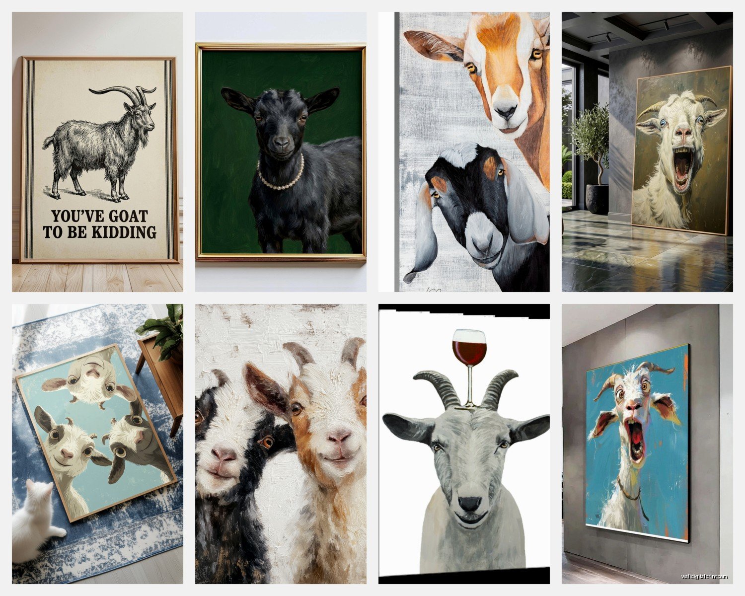
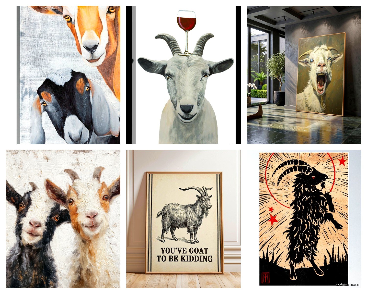
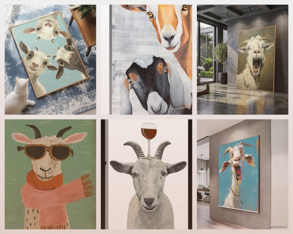
Goat Wall Art: Farm Animal Mountain Climbing Decor
Jul
So I’ve been down this whole goat wall art rabbit hole for like three months now and honestly it started because a client wanted “something quirky but sophisticated” for their mountain house and I was like… goats? And now I have goat art in my own office so here we are.
Why Goat Art Actually Works (I Was Skeptical Too)
Okay so the thing about goats is they’re weirdly versatile? Like you’d think farm animal = country kitsch automatically but that’s not really true anymore. I’ve used goat prints in minimalist Scandinavian spaces, rustic cabins, even this ultra-modern loft in Denver. The key is the goat’s posture and the art style.
Mountain goats especially have this incredible balance thing going on where they’re literally defying gravity on cliff faces and it reads as both whimsical AND badass. My nephew saw one of the prints I was curating and said “that goat is cooler than most people I know” which… yeah, actually.
The Different Vibes You Can Get
There’s basically four categories I’ve noticed after going through probably 200+ options:
- Vintage botanical style illustrations – very scientific looking, usually black and white or sepia
- Watercolor whimsical goats – these lean cute, work in nurseries or breakfast nooks
- Photography of actual mountain goats – dramatic, nature-focused, kinda epic
- Modern minimalist line drawings – single line art or geometric interpretations
The vintage botanical ones are my secret weapon honestly. They look expensive and collected even when you get them as prints from like Society6 or Etsy. I put three different goat breeds in matching black frames for a client’s study and people thought they were antique.
Sizing This Stuff Without Making It Weird
Here’s where people mess up – they either go too small and it looks like an afterthought, or they get one massive goat that’s just… staring at you while you eat dinner.
For a single statement piece, you want it taking up about two-thirds to three-quarters of the wall space you’re dedicating to it. So if you’ve got a 4-foot wide section above a console table, you’re looking at like 28-36 inches wide for the frame.
But honestly? I almost always do groupings instead. Three medium prints (around 16×20 each) arranged horizontally or in a triangle configuration works better than one huge piece. It feels more intentional and less like you panic-bought the first goat you saw.
Oh and another thing – if you’re doing the mountain climbing goat photos, vertical orientation just makes sense because that’s how they climb. I did horizontal mountain goat prints once and it felt wrong, like the goat was lying down which defeats the whole gravity-defying thing.
Color Schemes That Don’t Make It Too Farmhousey
This is gonna sound weird but the frame color matters MORE than the actual art colors for controlling the vibe.
Black frames = modern, gallery-like, sophisticated
Wood frames = rustic but can still be elegant if the wood is walnut or dark oak
White frames = coastal, airy, casual
Gold/brass frames = eclectic, maximalist, vintage
I used the exact same goat print in a black frame for one client’s minimalist bedroom and a gold ornate frame for another client’s eclectic entryway. Completely different results.
For the actual art colors, here’s what I’ve learned:
- Black and white photography or illustrations work literally everywhere
- Sepia tones add warmth without being too country
- Muted watercolors (sage green, dusty blue, terracotta) feel modern farmhouse
- Bold colors (the goat against a bright blue sky) need the rest of the room to be pretty neutral
My own goat print is this black and white photograph of a mountain goat on a rocky outcrop and it’s just… chef’s kiss. Works with everything, never feels dated.
Where to Actually Hang This Stuff
Okay so funny story, I initially thought goat art was only for like cabins and mountain homes but then I started seeing it pop up in unexpected places and it totally worked.
Living rooms are obvious – above the sofa, above a console table, on that weird wall between windows that you never know what to do with.
But I’ve also done:
- Home offices (the mountain climbing thing feels motivational without being cheesy)
- Mudrooms (farm animals just make sense here)
- Powder rooms (small space, can handle something quirky)
- Kitchens (if you’re going for any kind of rustic or farmhouse vibe)
- Kids rooms (the baby goat prints, not the dramatic mountain ones)
The one place I’d avoid? Formal dining rooms. Unless you’re really committing to an eclectic maximalist thing, goats in a formal dining space read as trying too hard to be quirky.
Height Matters More Than You Think
Standard gallery height is 57-60 inches to the center of the frame. But with goat art, especially the climbing ones, I sometimes cheat this higher because the upward movement of the composition pulls your eye up anyway.
If the goat is climbing upward in the image, hanging it slightly higher (like 62-65 inches to center) actually feels more natural. Your eye follows the goat up and it doesn’t feel weirdly low on the wall.
Mixing Goat Art With Other Stuff
So you probably don’t want ONLY goat art unless you’re opening a goat sanctuary or something. Here’s how I mix it:
With other animal art: Keep the style consistent. All vintage illustrations, or all modern photography, or all watercolor. Don’t mix a realistic goat photo with a whimsical fox illustration – it’ll look random.
With landscape art: This works great actually. Mountain landscapes + mountain goat = cohesive theme. I did a gallery wall with two landscape prints and one goat print and it felt like a collected-over-time situation.
With botanical prints: Vintage botanical goat illustrations + vintage botanical plant illustrations = that collected naturalist vibe that’s super popular right now.
With abstract art: Okay this is trickier but it CAN work if the goat art is minimalist line drawing style and the abstract pieces share similar colors.
Wait I forgot to mention – texture matters too. If you’re doing a printed goat on paper, consider mixing in some other textures in the room. A woven wall hanging, some wood elements, maybe a macrame thing (if that’s your jam). Otherwise it can feel flat.
Budget Options That Don’t Look Cheap
My cat just knocked over my coffee but anyway – you don’t need to spend a fortune on this.
Etsy: This is where I get like 60% of my goat prints. Search “vintage goat illustration” or “mountain goat print” and filter by your size needs. Most sellers offer instant download options for like $5-8, then you just get it printed at a local print shop or even Staples if the resolution is good enough.
Society6: They have a decent selection and the quality is pretty consistent. Framing options are available but honestly overpriced – buy the print only and frame it yourself.
Desenio/Printler: European print shops with good minimalist goat options. Shipping takes a minute but prices are reasonable.
Vintage shops and estate sales: This is more of a treasure hunt situation but I’ve found incredible vintage goat illustrations at estate sales for like $10-15 already framed. Just gotta be willing to hunt.
For frames, Target and Ikea are your friends for standard sizes. Michael’s if you need custom but wait for the 50% off framing sales because their regular prices are insane.
The Technical Stuff Nobody Tells You
Print resolution matters – you want at least 300 DPI for anything you’re printing larger than 8×10. I learned this the hard way when a client approved a low-res digital download and it looked pixelated at 16×20. Had to reorder, whole thing was annoying.
Paper type affects the vibe too:
- Matte paper = sophisticated, gallery-like, no glare
- Glossy paper = makes colors pop but can have glare issues
- Textured watercolor paper = adds dimension, great for watercolor-style goat art
I almost always go matte unless the art is specifically a vibrant photograph where I want the colors to really punch.
Glass vs acrylic for framing – glass looks better and doesn’t scratch as easily, but it’s heavier and can break. Acrylic is lighter and safer for high-traffic areas or if you have kids. I use acrylic for anything going in a kid’s room or above a spot where people might bump into it.
Lighting Your Goat Art
Okay this is gonna sound extra but proper lighting makes such a difference. If you have the budget, small picture lights or even just a well-placed spotlight can make cheap art look expensive.
But also just consider natural light – don’t hang valuable prints in direct sunlight because they’ll fade. I made this mistake in my own house with a print I really loved and it got all washed out after like eight months.
For goat photography especially, the dramatic lighting in the image works best when the actual lighting in the room is relatively simple. Don’t overcomplicate it.
Specific Pieces I Keep Coming Back To
There’s this one vintage mountain goat illustration from the 1800s that’s in the public domain and I’ve probably used it in five different projects. It’s just perfectly detailed and scientific-looking. You can find it on various print sites, sometimes labeled “Capra ibex” which is the scientific name.
For modern stuff, there’s photographers on Etsy who do these incredible black and white mountain goat portraits that are just… *chef’s kiss*. Search “alpine goat photography” and you’ll find them.
The watercolor baby goat prints are hit or miss – some are adorable, some are too precious and start feeling like nursery decor even when they’re not in a nursery. I look for ones with more muted colors and less “cutesy” facial expressions.
Common Mistakes I See People Make
Going too literal with the farm theme – like putting goat art with chicken wire decor and barn wood and suddenly it’s Cracker Barrel. You can have goat art in a sophisticated space, you just gotta balance it with modern elements.
Hanging it too low – I mentioned this before but seriously, people hang art too low all the time and with goat art it’s especially noticeable because the animals are often positioned in upward-climbing poses.
Mixing too many art styles in one space – if you’ve got a minimalist line drawing goat, don’t put it next to a realistic oil painting landscape. Pick a lane.
Forgetting about scale in relation to furniture – your art should relate proportionally to the furniture below it. A tiny goat print above a king-sized bed looks lost. A massive goat above a small side table looks top-heavy.
Making It Work in Different Design Styles
Modern Farmhouse: This is the easiest – black and white goat prints in black frames, mixed with other farm animal illustrations or botanical prints. Keep it simple.
Minimalist/Scandinavian: Single-line goat drawings or stark black and white photography. Less is more. One statement piece rather than a gallery wall.
Rustic/Cabin: Vintage-style illustrations in wood frames, or dramatic mountain goat photography. This is where you can lean into the mountain theme hard.
Eclectic: Mix vintage goat illustrations with other collected pieces. Vary frame styles. Add in some unexpected colors. This is the most forgiving style for goat art honestly.
Coastal: Okay this is harder but I’ve done it – watercolor goats in white or light wood frames, keeping the palette very soft and muted. It’s unexpected but can work.
The TV show I was watching last night had this whole farmhouse makeover thing and they used goat art in literally every room and it was too much. Like, we get it, you like goats. Restraint is your friend.
Anyway I think that covers most of what I’ve figured out through trial and error and lots of client projects. The main thing is just don’t overthink it – if you see a goat print that makes you happy, it’ll probably work in your space as long as you’re thoughtful about framing and placement. Start with one piece, see how you feel, then build from there if you want more.